Note
Go to the end to download the full example code.
Legend Placement
publiplots offers three complementary legend-placement knobs:
Per-axis inside:
legend_kws={'inside': True, 'loc': 'upper right'}drops the legend inside the axes using matplotlib’s corner-based placement. No reactor, no layout reservation — just a local legend.Figure-anchored group:
pp.legend(side=...)(no anchor) spans the full subplot grid on the chosen side. The figure grows on that side to accommodate the legend; panel sizes stay inviolate.Axes-anchored group:
pp.legend(anchor=axes[r,c], side=...)pins the band to a single cell. The corresponding per-cell reservation (right[c]forside='right',xlabel_space[r]forside='bottom', …) absorbs the band width, pushing just that axes’ column/row larger.
pp.legend_group also chooses its orientation and alignment
per side by default:
side='top'/'bottom'→orientation='horizontal'(entries run along the edge,ncoldefaults tolen(handles)) andalign='center'(centered along the anchor edge).side='left'/'right'→orientation='vertical'andalign='start'(legend begins at the anchor’s top corner).
Override either with orientation='vertical'|'horizontal' or
align='start'|'center'|'end' when the default isn’t what you want.
This gallery walks through each mode.
import publiplots as pp
import pandas as pd
import numpy as np

# Shared fixture --------------------------------------------------------------

np.random.seed(42)
_df = pd.DataFrame({
    "x": np.random.randn(240),
    "y": np.random.randn(240),
    "group": np.tile(["Control", "Low", "High"], 80),
    "panel": np.repeat(["A", "B", "C", "D"], 60),
})
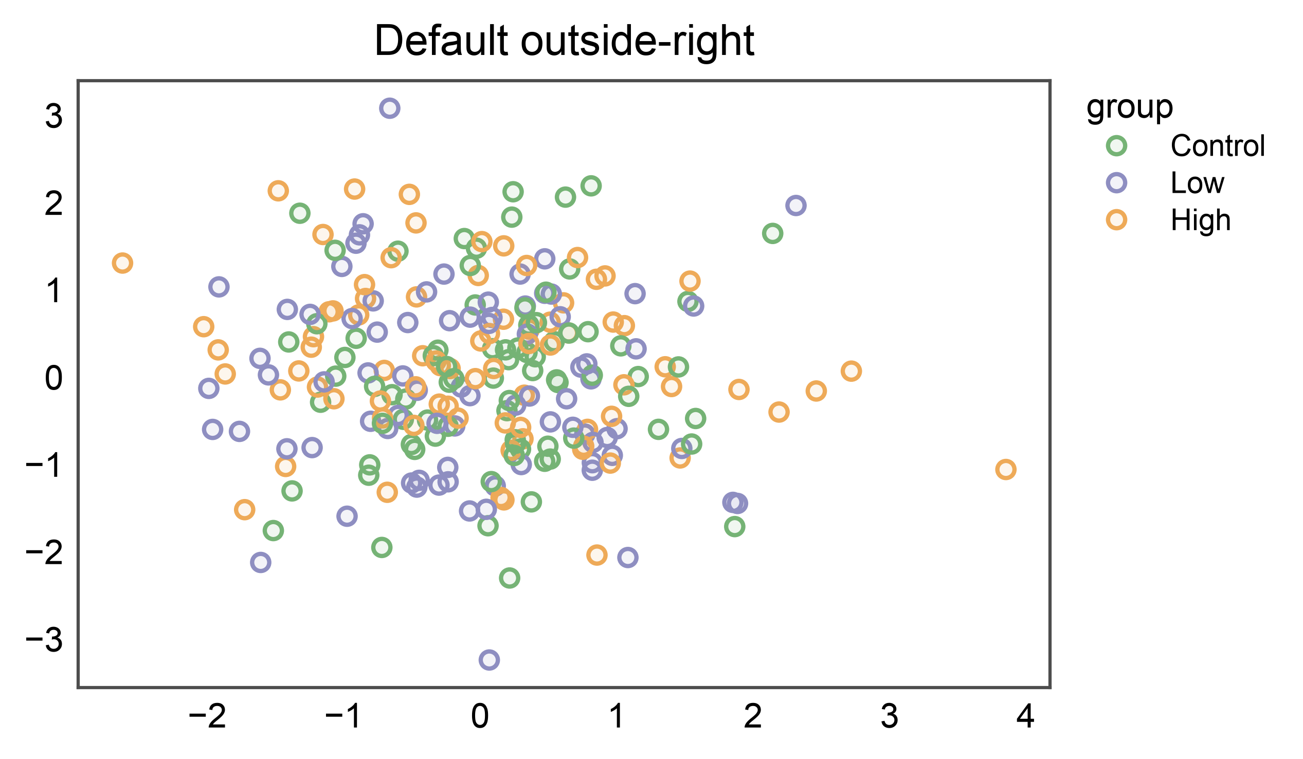
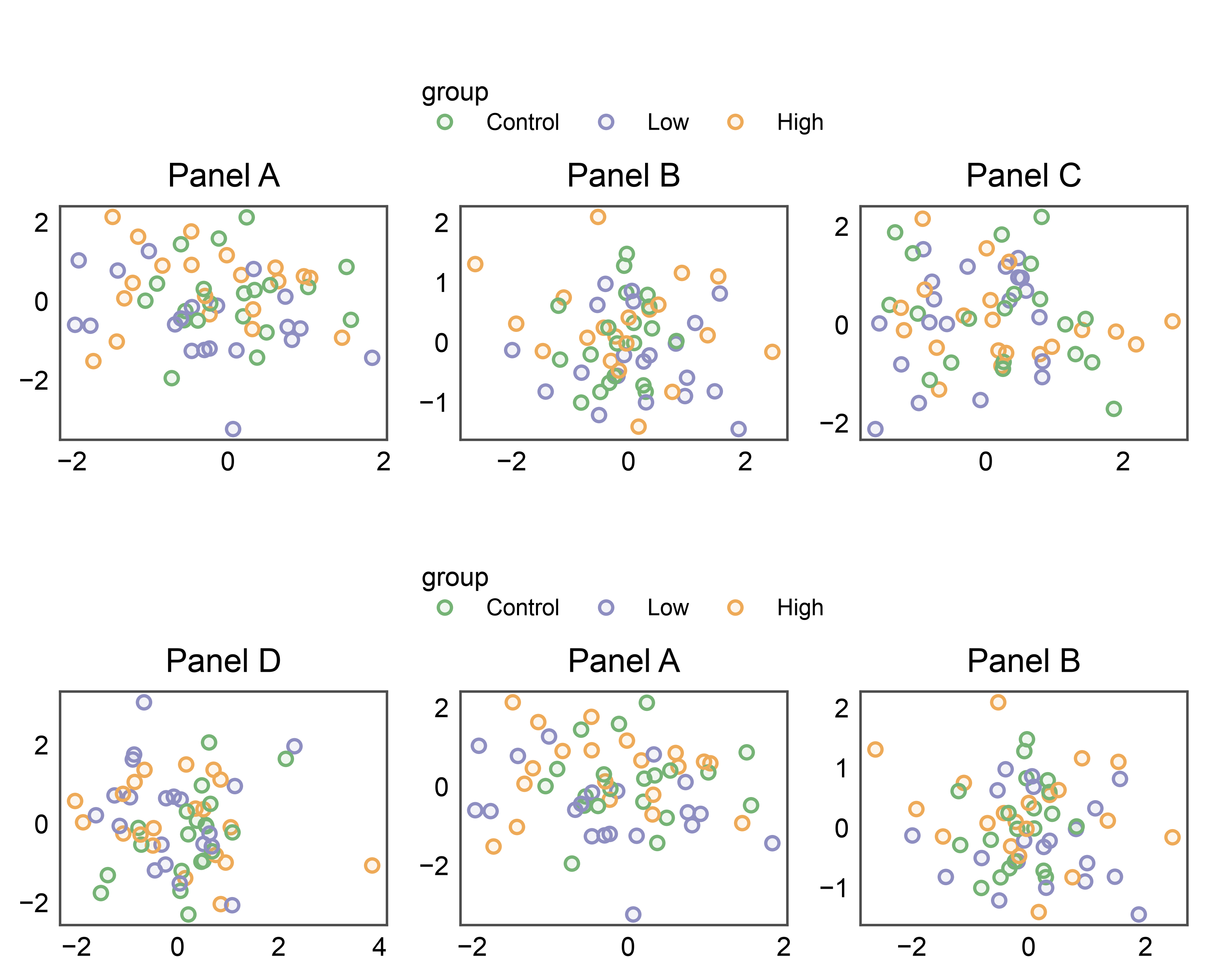
1. Default outside-right (no legend_group)
A single pp.scatterplot with a categorical hue renders its legend
just past the axes’ right edge — the publication-ready default.
pp.scatterplot(
    data=_df, x="x", y="y", hue="group", palette="pastel",
    title="Default outside-right",
)
pp.show()
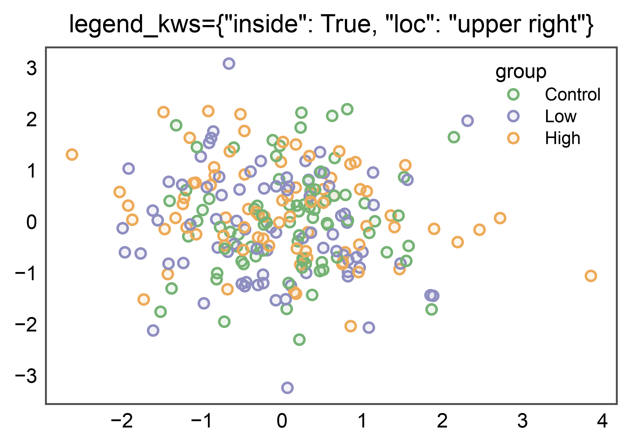
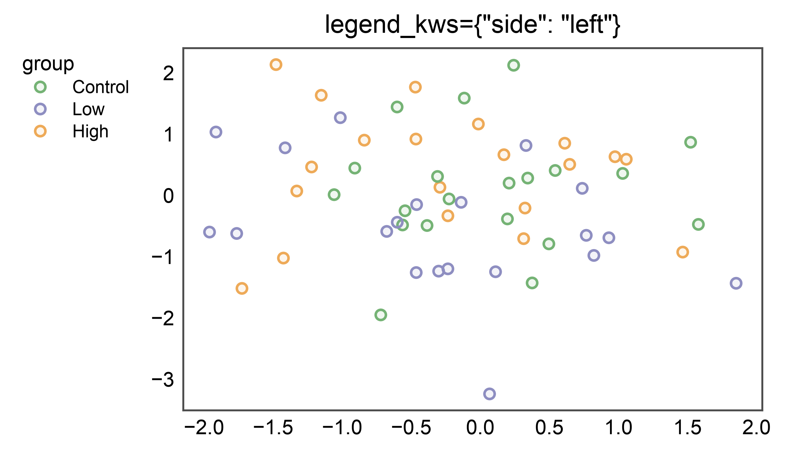
2. Per-axis inside legend
legend_kws={'inside': True, 'loc': ...} keeps the legend local to
the axes. Useful when vertical real estate is precious or the data
leaves a natural empty corner.
pp.scatterplot(
    data=_df, x="x", y="y", hue="group", palette="pastel",
    legend_kws={"inside": True, "loc": "upper right"},
    title='legend_kws={"inside": True, "loc": "upper right"}',
)
pp.show()
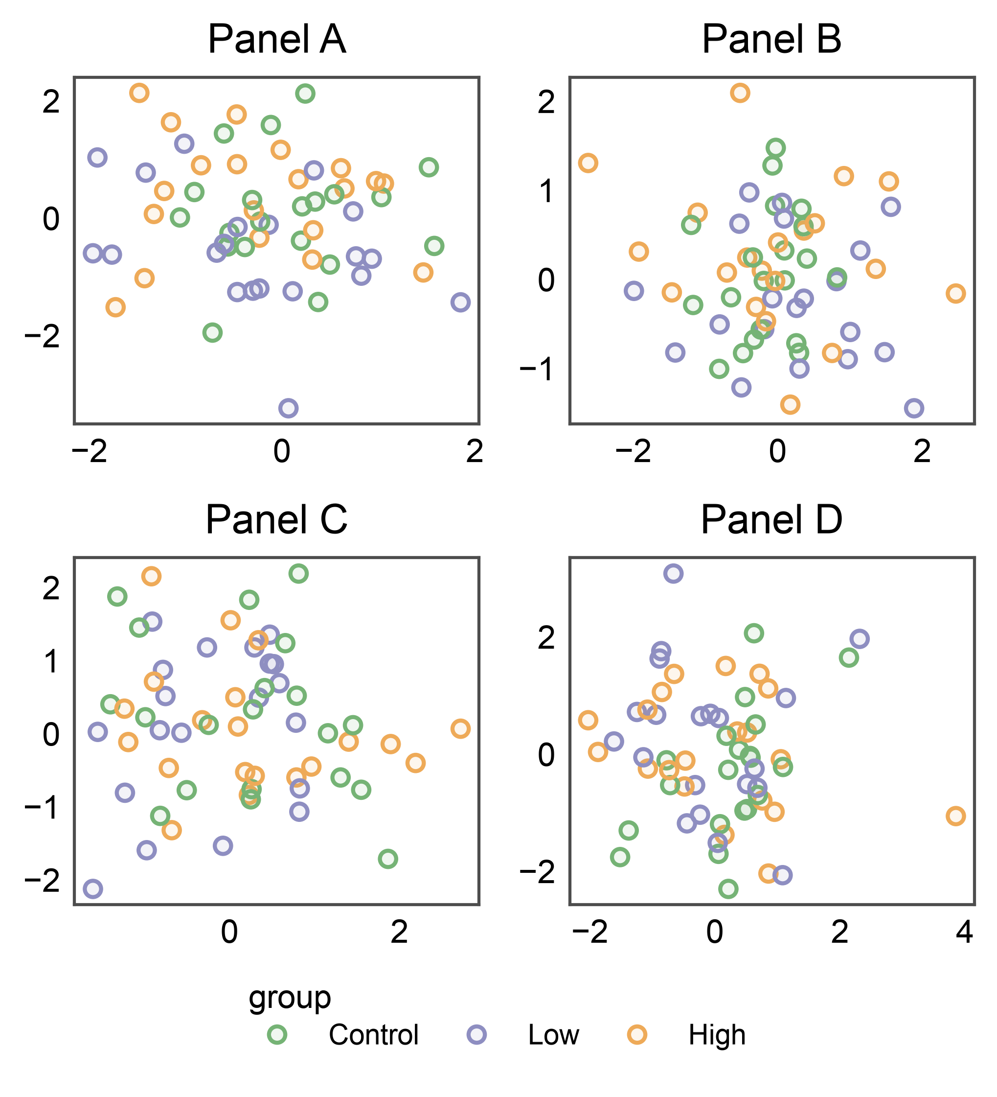
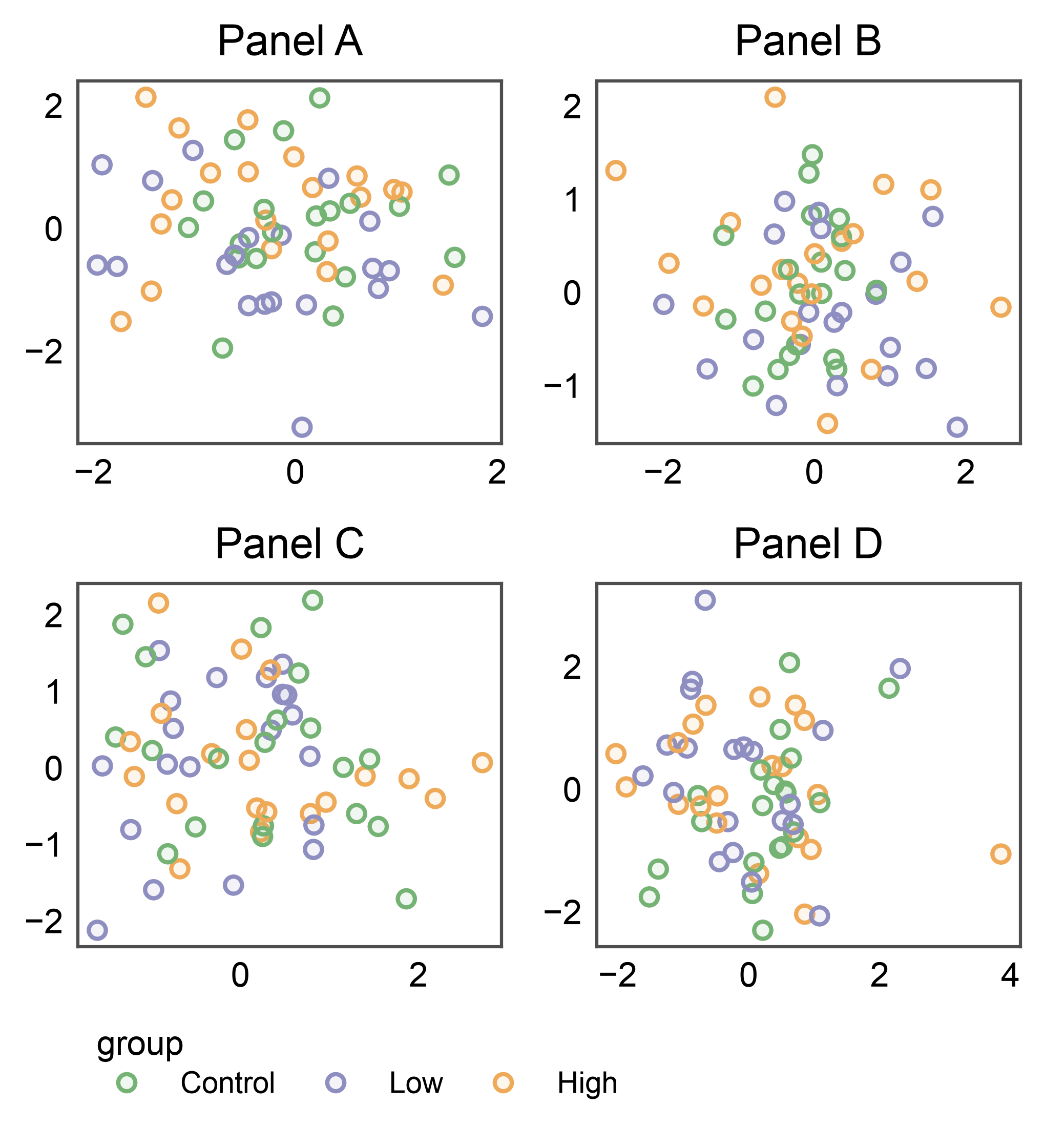
3. Figure-anchored side='right' on a 2×2 grid
pp.legend() without an anchor= spans the full figure
vertically, tucked past the rightmost column. Auto-collects every
stashed entry from every panel; dedupes by name.
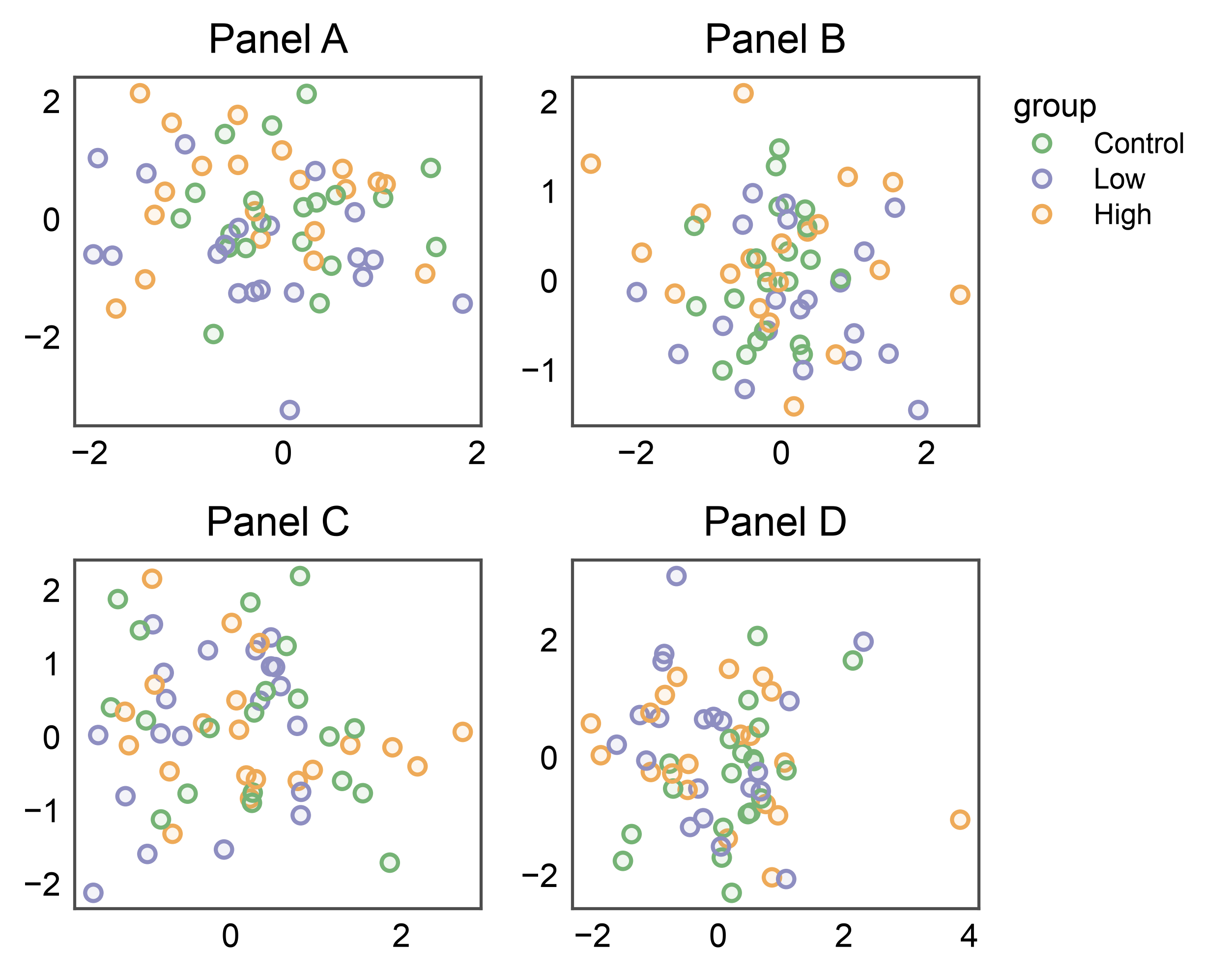
4. Figure-anchored side='bottom' on a 2×2 grid
When panels leave spare vertical headroom, a bottom-anchored legend
uses that space instead of the figure’s right column. Same call, just
side='bottom'. The default orientation flips to horizontal
(entries run along the edge) and align='center' keeps the block
balanced under the grid.
4b. Bottom with align='start'
Override the default center-alignment to pin the legend to the left edge of the grid — a common choice when the legend should align with the first panel column rather than the figure midline.
fig, axes = pp.subplots(2, 2, axes_size=(35, 30))
pp.legend(side="bottom", align="start")
for (r, c), panel in zip([(0, 0), (0, 1), (1, 0), (1, 1)], "ABCD"):
    pp.scatterplot(
        data=_df[_df["panel"] == panel], x="x", y="y",
        hue="group", palette="pastel",
        title=f"Panel {panel}", ax=axes[r, c],
    )
pp.show()
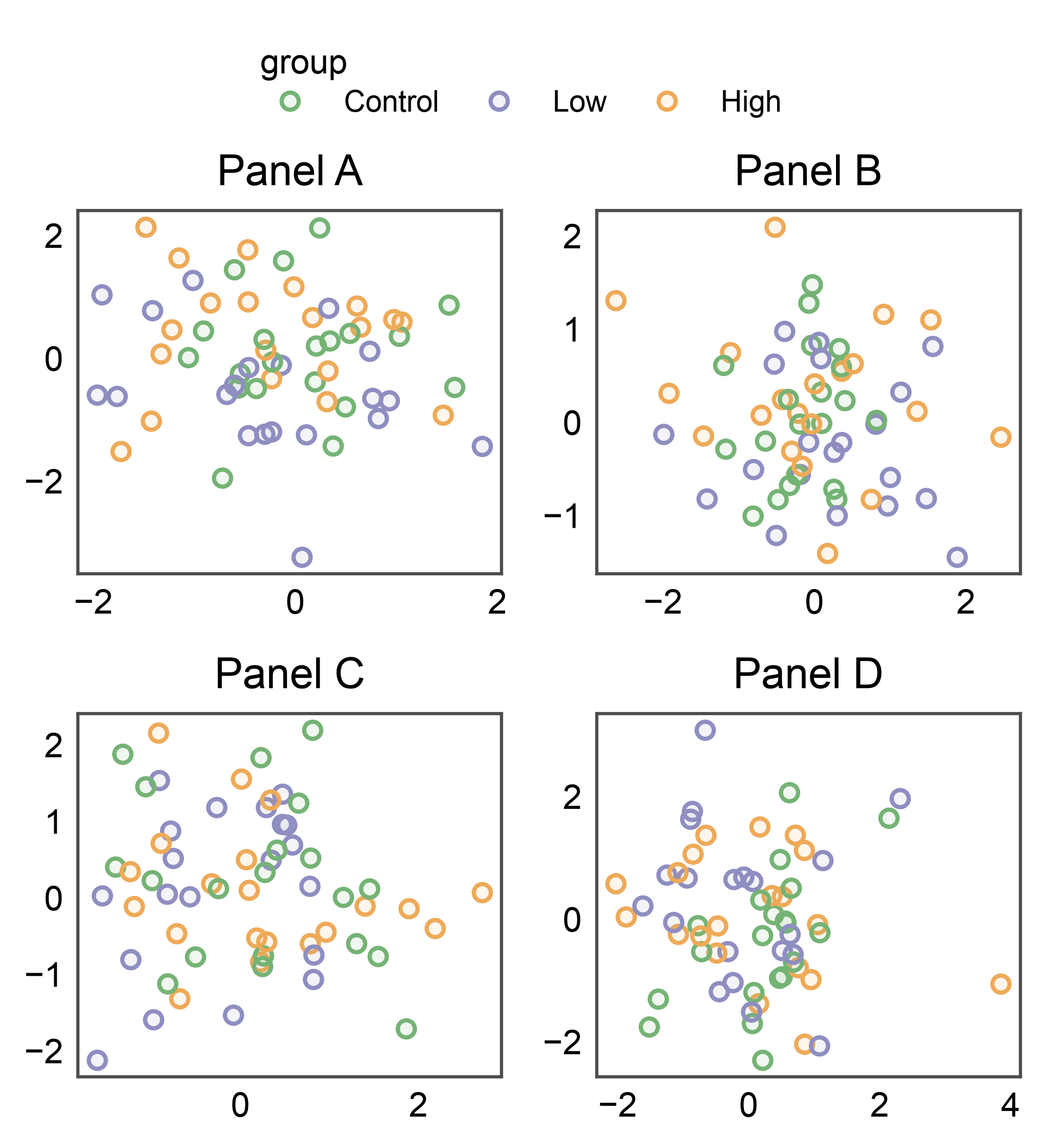
5. Figure-anchored side='top' + side='left'
All four sides are supported. Top/left are less common but useful for figures with a strong vertical hierarchy or right-to-left reading order.
fig, axes = pp.subplots(2, 2, axes_size=(35, 30))
pp.legend(side="top")
for (r, c), panel in zip([(0, 0), (0, 1), (1, 0), (1, 1)], "ABCD"):
    pp.scatterplot(
        data=_df[_df["panel"] == panel], x="x", y="y",
        hue="group", palette="pastel",
        title=f"Panel {panel}", ax=axes[r, c],
    )
pp.show()

fig, axes = pp.subplots(2, 2, axes_size=(35, 30))
pp.legend(side="left")
for (r, c), panel in zip([(0, 0), (0, 1), (1, 0), (1, 1)], "ABCD"):
    pp.scatterplot(
        data=_df[_df["panel"] == panel], x="x", y="y",
        hue="group", palette="pastel",
        title=f"Panel {panel}", ax=axes[r, c],
    )
pp.show()
5b. Figure title (pp.suptitle) above a side='top' band
pp.suptitle hooks into the same auto-layout engine as the legend
bands: it measures the text’s height and grows the figure to reserve
a dedicated suptitle_space band above everything else. No
manual y=... nudge, no overlap with the top row of axis titles —
and a side='top' legend band slots in cleanly between the
suptitle and the axes.
fig, axes = pp.subplots(2, 2, axes_size=(35, 30))
pp.legend(side="top")
for (r, c), panel in zip([(0, 0), (0, 1), (1, 0), (1, 1)], "ABCD"):
    pp.scatterplot(
        data=_df[_df["panel"] == panel], x="x", y="y",
        hue="group", palette="pastel",
        title=f"Panel {panel}", ax=axes[r, c],
    )
pp.suptitle("Experiment 42")
pp.show()

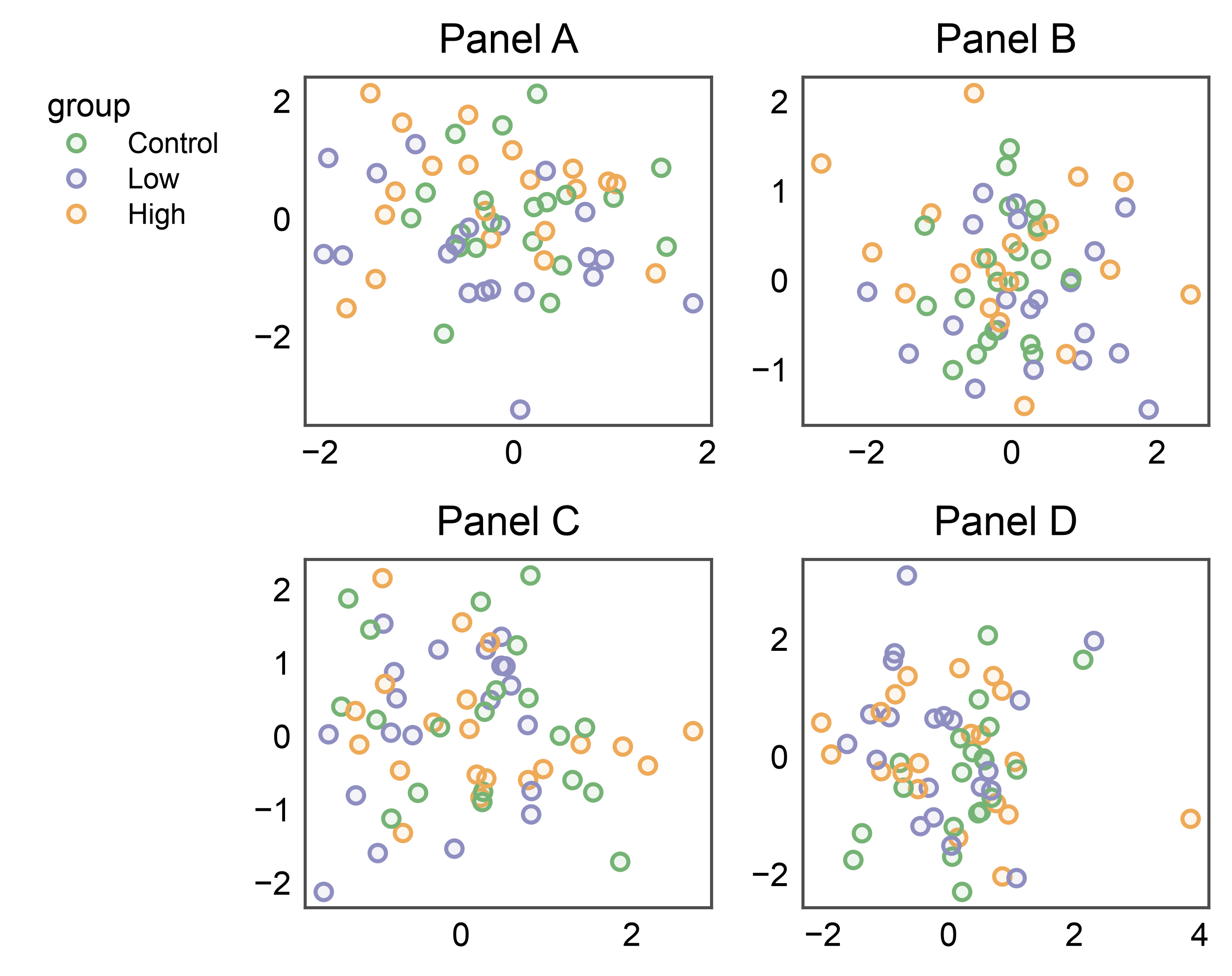
6. Axes-anchored: pin the band to a single cell
Pass anchor=axes[r, c] to pin the band to one cell. The
corresponding per-cell reservation (the column’s right for
side='right', the row’s xlabel_space for side='bottom',
etc.) absorbs the band width. Useful when one panel deserves its own
annotation band without growing the rest of the figure.
fig, axes = pp.subplots(2, 2, axes_size=(35, 30))
# Anchor the band to the top-right panel only.
pp.legend(anchor=axes[0, 1], side="right")
for (r, c), panel in zip([(0, 0), (0, 1), (1, 0), (1, 1)], "ABCD"):
    pp.scatterplot(
        data=_df[_df["panel"] == panel], x="x", y="y",
        hue="group", palette="pastel",
        title=f"Panel {panel}", ax=axes[r, c],
    )
pp.show()

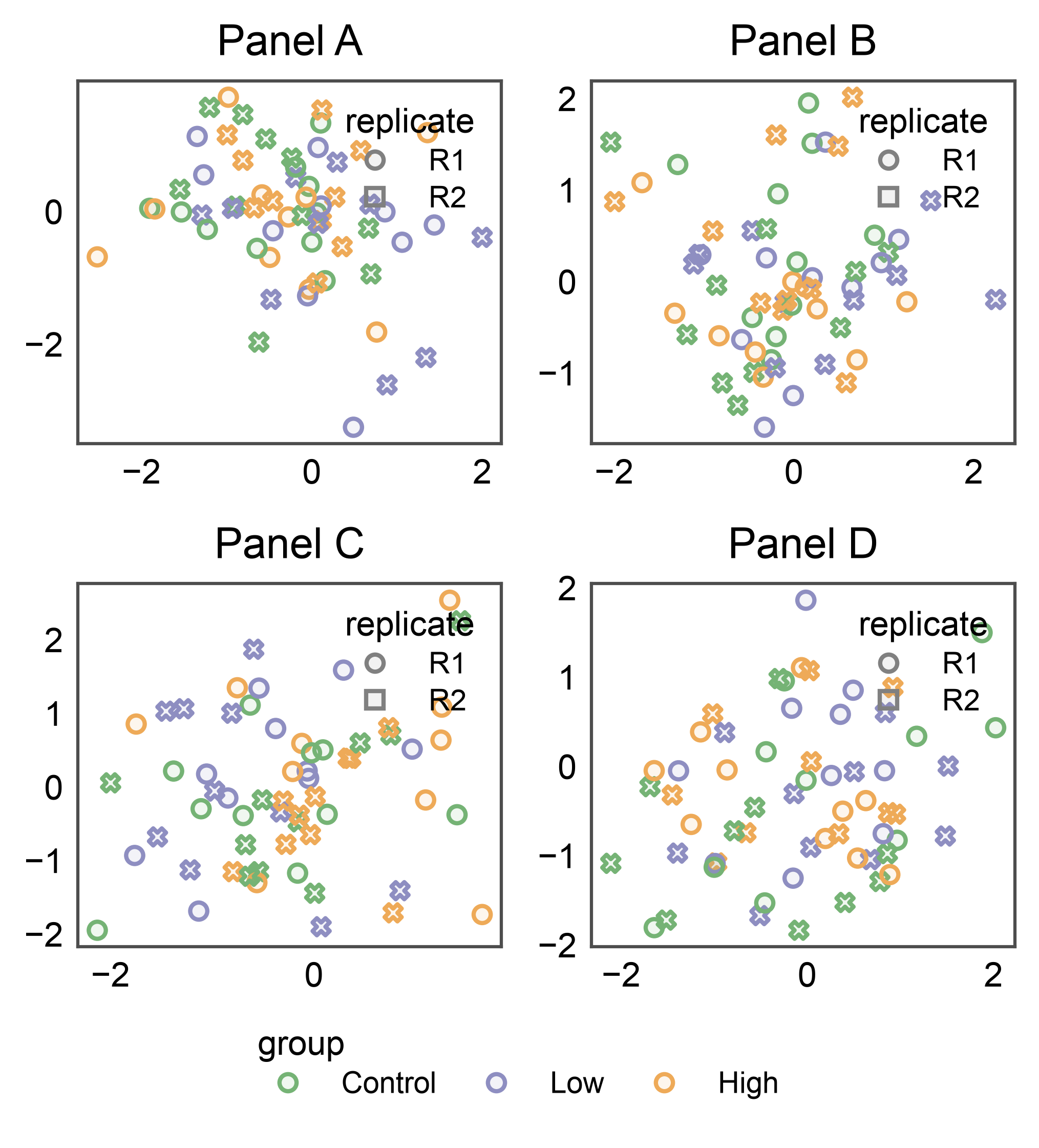
7. Combining inside + figure-anchored group
The two modes compose: collect one shared dimension into the
figure-level group (here group) and render other per-panel
legends inside each axes. collect=['group'] filters the group’s
auto-collect pass; legend_kws={'inside': True} on each scatter
renders the non-collected style (replicate below) as a local
legend in each panel.
rng = np.random.default_rng(7)
split_df = pd.DataFrame({
    "x": rng.normal(size=240),
    "y": rng.normal(size=240),
    "group": np.tile(["Control", "Low", "High"], 80),
    "replicate": np.tile(["R1", "R2"], 120),
    "panel": np.repeat(["A", "B", "C", "D"], 60),
})

fig, axes = pp.subplots(2, 2, axes_size=(35, 30))
pp.legend(side="bottom", collect=["group"])
for (r, c), panel in zip([(0, 0), (0, 1), (1, 0), (1, 1)], "ABCD"):
    pp.scatterplot(
        data=split_df[split_df["panel"] == panel], x="x", y="y",
        hue="group", style="replicate", palette="pastel",
        title=f"Panel {panel}", ax=axes[r, c],
        legend_kws={"inside": True, "loc": "upper right"},
    )
pp.show()
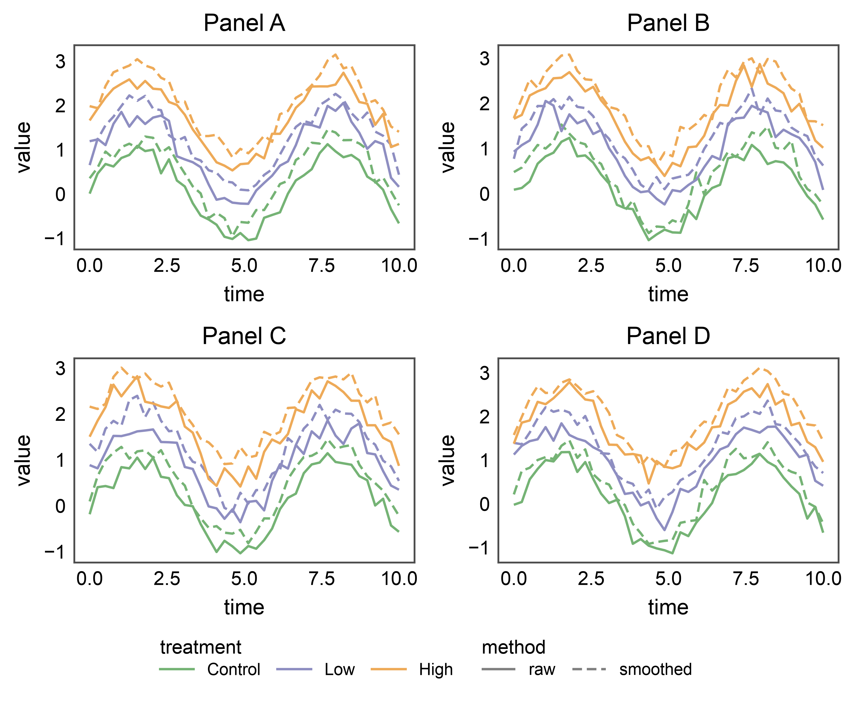
8. Multi-kind legends: lineplot (hue + linestyle)
When a plot exposes several orthogonal legend kinds — e.g., a
lineplot with both hue= (3 colored lines) and style= (2
dash styles) — pp.legend_group collects each kind as its own
legend entry. On a bottom/top horizontal band they sit side-by-side
along the edge, centered as a block; the two-kind layout is a good
stress test for the along-edge cursor advancing between successive
legends. markers=False (the default) keeps the lines crisp —
markers would overlap awkwardly with this many time points.
rng = np.random.default_rng(11)
t = np.linspace(0, 10, 40)
_line_rows = []
for panel in "ABCD":
    for treatment, offset in [("Control", 0.0), ("Low", 0.8), ("High", 1.6)]:
        for method, jitter in [("raw", 0.0), ("smoothed", 0.3)]:
            for tt in t:
                _line_rows.append({
                    "panel": panel, "time": tt,
                    "value": np.sin(tt) + offset + jitter + rng.normal(0, 0.15),
                    "treatment": treatment, "method": method,
                })
line_df = pd.DataFrame(_line_rows)

# Define the palette as a mapping BEFORE the loop so each treatment
# keeps the same color across every panel — otherwise a panel that
# only saw a subset of treatments would hand out colors positionally
# and the merged legend would render inconsistent colors.
treatment_palette = dict(zip(
    ["Control", "Low", "High"],
    pp.color_palette("pastel", 3),
))

fig, axes = pp.subplots(2, 2, axes_size=(50, 30))
pp.legend(side="bottom")
for (r, c), panel in zip([(0, 0), (0, 1), (1, 0), (1, 1)], "ABCD"):
    pp.lineplot(
        data=line_df[line_df["panel"] == panel], x="time", y="value",
        hue="treatment", style="method", palette=treatment_palette,
        dashes={"raw": (1, 0), "smoothed": (4, 2)},
        title=f"Panel {panel}", ax=axes[r, c],
    )
pp.show()
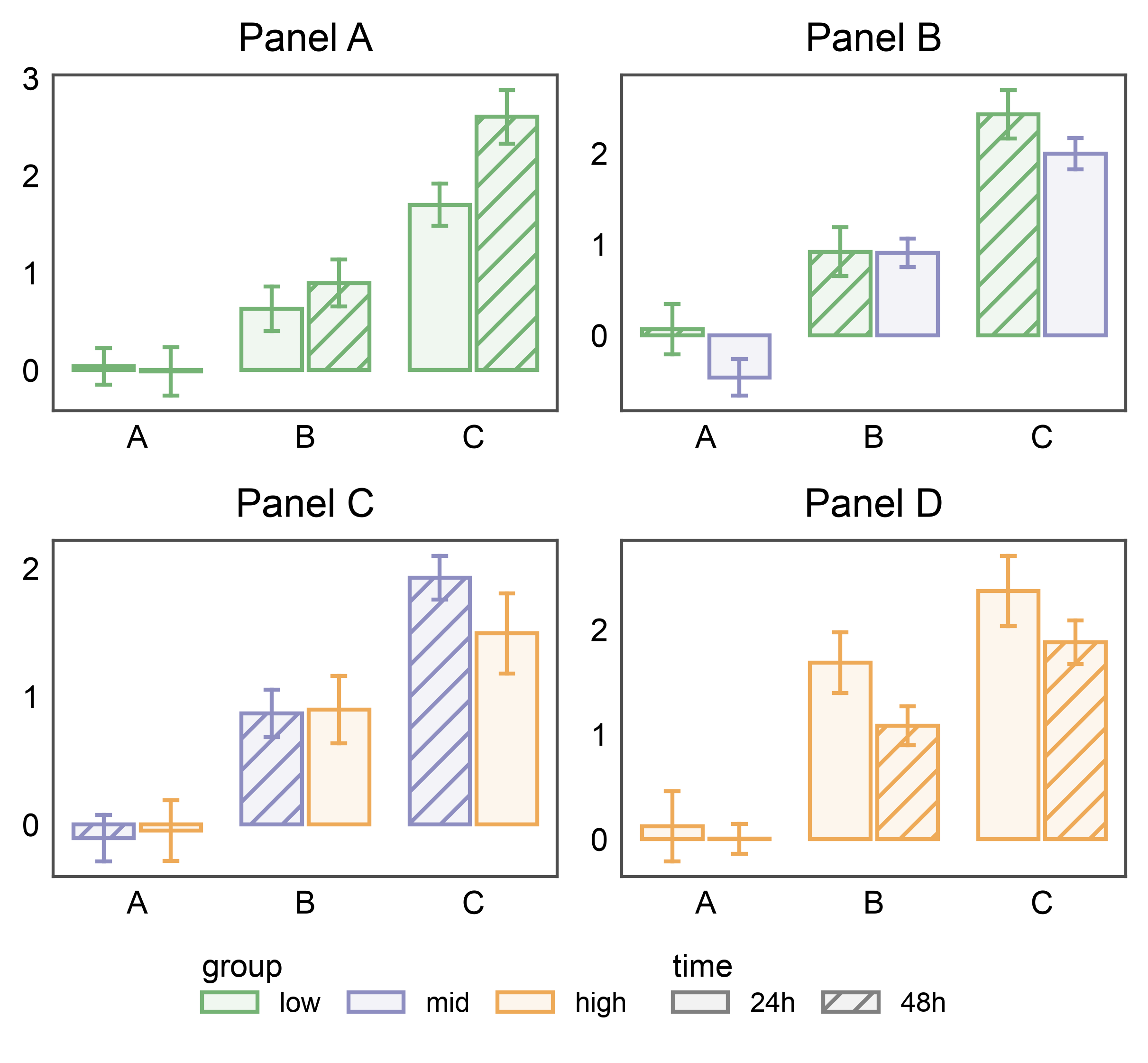
9. Multi-kind legends: barplot (hue + hatch)
Barplots with both hue= (color) and hatch= (pattern) stash
two entries per panel — pp.legend_group places them side-by-side
on the bottom band. Three hue levels × two hatch levels = five
handles across two legends, exercising horizontal layout with
non-trivial widths.
rng = np.random.default_rng(17)
bar_df = pd.DataFrame({
    "cat": np.tile(["A", "B", "C"], 160),
    "val": rng.normal(size=480) + np.tile([0, 1, 2], 160),
    "group": np.repeat(["low", "mid", "high"], 160),
    "time": np.tile(np.repeat(["24h", "48h"], 80), 3),
    "panel": np.repeat(list("ABCD"), 120),
})

# Pin each group level to a specific color by passing the palette as a
# mapping. Without this, each panel would resolve its palette from
# whatever subset of levels it contains, producing color drift across
# panels (e.g., 'mid' → second color in a low+mid panel but first
# color in a mid+high panel).
group_palette = dict(zip(
    ["low", "mid", "high"],
    pp.color_palette("pastel", 3),
))

fig, axes = pp.subplots(2, 2, axes_size=(45, 30))
pp.legend(side="bottom")
for (r, c), panel in zip([(0, 0), (0, 1), (1, 0), (1, 1)], "ABCD"):
    pp.barplot(
        data=bar_df[bar_df["panel"] == panel], x="cat", y="val",
        hue="group", hatch="time",
        palette=group_palette, hatch_map={"24h": "", "48h": "///"},
        errorbar="se", title=f"Panel {panel}", ax=axes[r, c],
    )
pp.show()
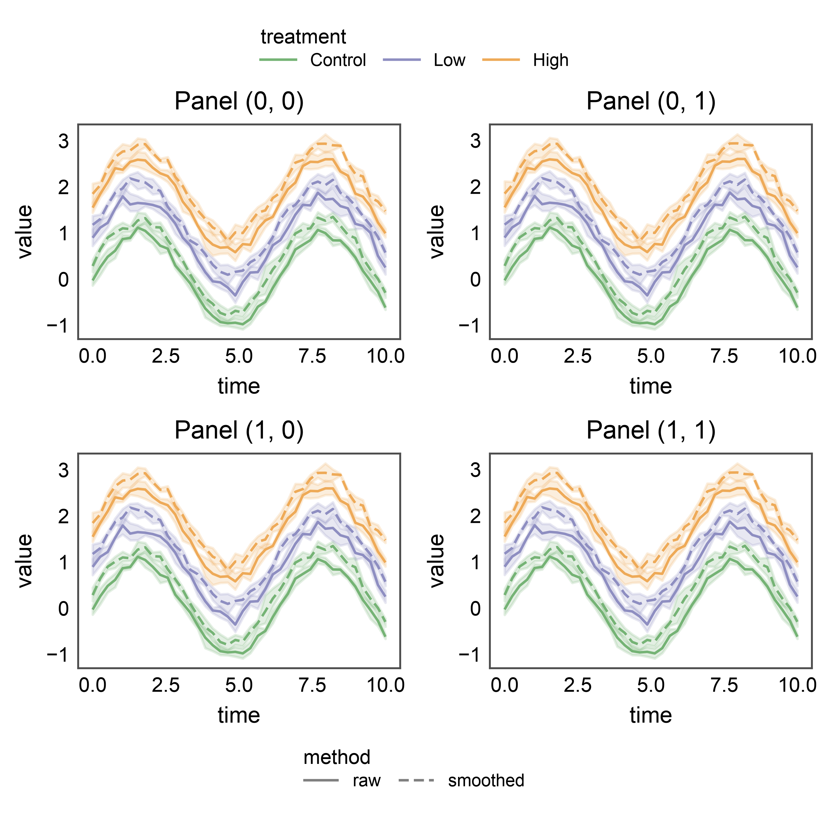
10. Two independent bands on one figure
Multiple pp.legend_group calls can coexist on the same figure.
Each uses collect=[...] (and optionally axes=[...]) to claim a
disjoint slice of the stashed legend entries, and each renders on its
own side. Below, the treatment palette shares a side='top' band
while the method linestyles share a side='bottom' band — two
figure-anchored groups on the same grid.
fig, axes = pp.subplots(2, 2, axes_size=(45, 30))
pp.legend(side="top", collect=["treatment"])
pp.legend(side="bottom", collect=["method"])
for r, row in enumerate(axes):
    for c, ax in enumerate(row):
        pp.lineplot(
            data=line_df, x="time", y="value",
            hue="treatment", style="method", palette=treatment_palette,
            dashes={"raw": (1, 0), "smoothed": (4, 2)},
            title=f"Panel {(r, c)}", ax=ax,
        )
pp.show()
10b. Scoping a group to a subset of axes
axes=[...] restricts which subplots a group collects from and
evicts per-axis legends from. The top-row band below only looks at
the top row of axes; the bottom-row band only at the bottom. Useful
when the subplot grid displays two independent stories that share a
figure.
fig, axes = pp.subplots(2, 2, axes_size=(45, 30))
top_row = list(axes[0])
bottom_row = list(axes[1])
pp.legend(
    anchor=axes[0, -1], side="top", axes=top_row, collect=["treatment"],
)
pp.legend(
    anchor=axes[1, -1], side="bottom", axes=bottom_row, collect=["method"],
)
for r, row in enumerate(axes):
    for c, ax in enumerate(row):
        pp.lineplot(
            data=line_df, x="time", y="value",
            hue="treatment", style="method", palette=treatment_palette,
            dashes={"raw": (1, 0), "smoothed": (4, 2)},
            title=f"Panel {(r, c)}", ax=ax,
        )
pp.show()

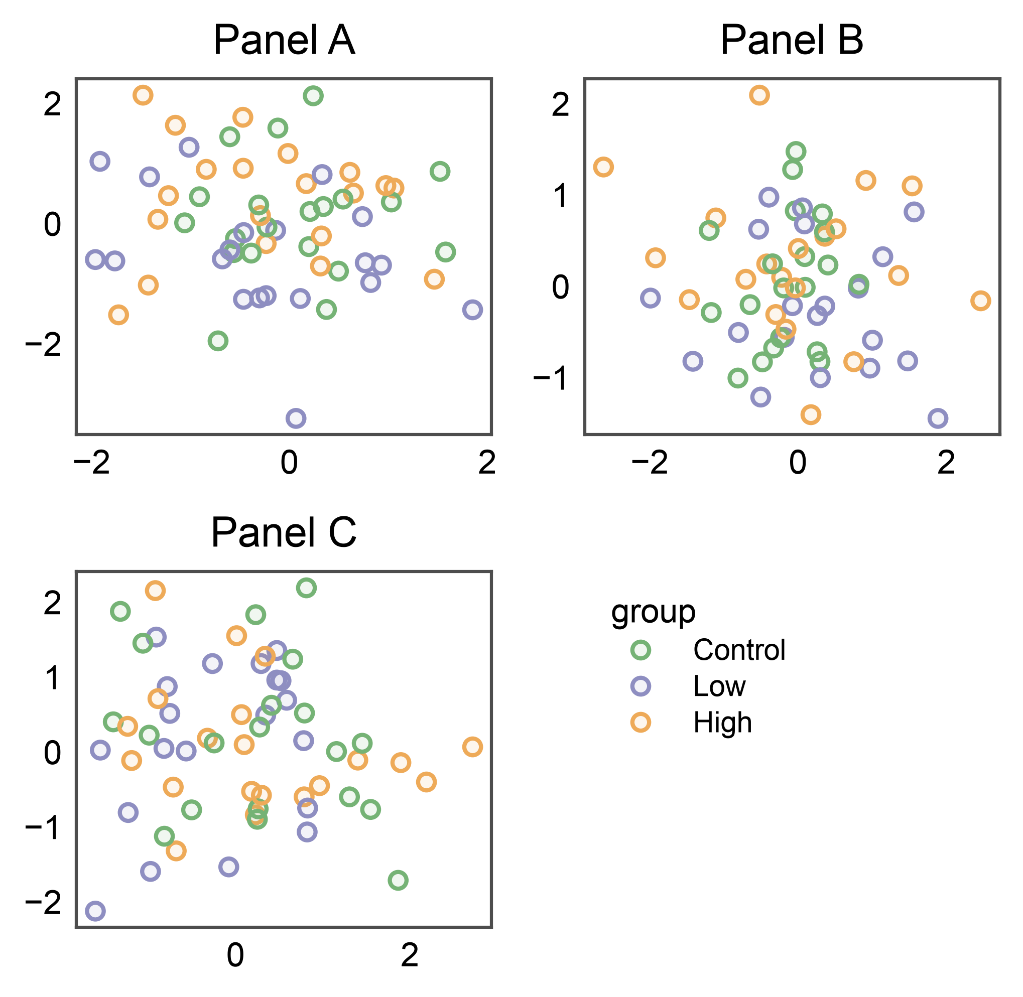
11. Row bands (with inter-row band)
New in 0.10: passing a row of axes as the positional scope creates a band pinned to that row’s top edge, centered on the row’s width only (not the full figure). Ideal for a 2xN grid where each row carries its own hue that deserves its own legend.
Here we place two row bands on the same figure: one above row 0 (at the top of the figure) and one above row 1 (between the two rows). The second band is the interesting case — it exercises the auto-layout’s ability to negotiate per-row reservations so the inter-row band opens enough vertical space without colliding with row 0’s xlabels below.
Contrast with pp.legend(side='top') (section 5, top case): that
variant spans the full grid width as a single band. Here we get two
distinct bands, each scoped to its own row’s width.
Migration note: pre-0.10 this pattern required explicitly passing
anchor= AND axes= (see section 10b). With 0.10 the single
positional arg expresses both — the scope IS the anchor.
fig, axes = pp.subplots(2, 3, axes_size=(35, 25))
pp.legend(axes[0], side="top", collect=["group"])
pp.legend(axes[1], side="top", collect=["group"])
_panel_cycle = ["A", "B", "C", "D", "A", "B"]
for r, row in enumerate(axes):
    for c, ax in enumerate(row):
        panel = _panel_cycle[r * 3 + c]
        pp.scatterplot(
            data=_df[_df["panel"] == panel], x="x", y="y",
            hue="group", palette="pastel",
            title=f"Panel {panel}", ax=ax,
        )
pp.show()
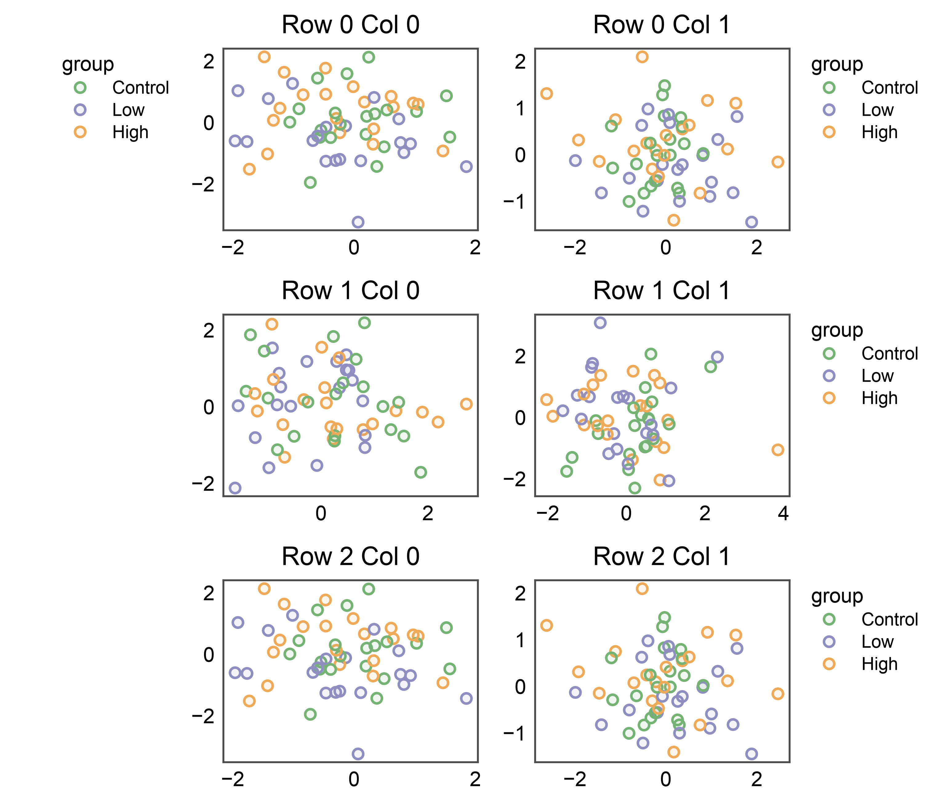
12. Column band — pp.legend(axes[:, 0], side='left')
The same idea, column-oriented. Passing a column slice as the scope creates a band pinned to the left edge of that column, centered on the column’s height. Handy when a left-most column shares a common legend that doesn’t apply to other columns (e.g., a reference-distribution column next to per-condition panels).
Default orientation for side='left' is vertical (entries stack
down the edge) and alignment defaults to 'start' (top of the
column). Override either via orientation= / align= if the
defaults collide with the column’s ylabels.
fig, axes = pp.subplots(3, 2, axes_size=(35, 25))
pp.legend(axes[:, 0], side="left", collect=["group"])
for r, row in enumerate(axes):
    for c, ax in enumerate(row):
        panel = "ABCD"[(r * 2 + c) % 4]
        pp.scatterplot(
            data=_df[_df["panel"] == panel], x="x", y="y",
            hue="group", palette="pastel",
            title=f"Row {r} Col {c}", ax=ax,
        )
pp.show()
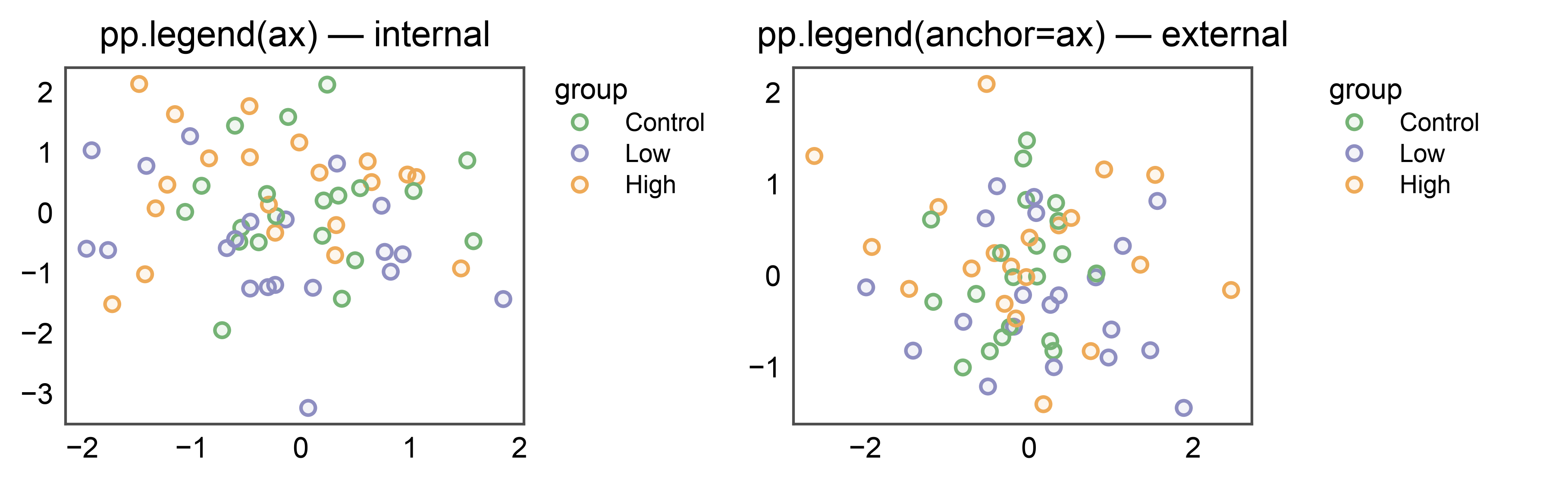
13. Internal vs external per-axes legend
The positional and keyword forms of pp.legend have subtly
different layout semantics when scoping to a single axes:
pp.legend(ax)(positional) — internal per-axes legend. The plot call (pp.scatterplotetc.) already created a per-axes legend group on that axes;pp.legend(ax)adopts that existing group rather than building a second competing one. This makes it the single source of truth — no “scope overlaps with an existing group” warning, no double render, and anyside=you pass is honoured. The legend is measured byax.get_tightbbox(), so it counts as part of the axes’ own decoration and the figure grows to accommodate it just like a tick label or title would.pp.legend(anchor=ax)(kwarg) — external band pinned to that axes’ right edge. The band is measured as an overhang past the axes rectangle and absorbs the per-cellrightreservation (see section 6).
The 1x2 figure below shows both modes side by side, one per panel.
fig, axes = pp.subplots(1, 2, axes_size=(45, 35))
# Left panel: internal legend pinned to axes[0].
pp.legend(axes[0])
# Right panel: external band pinned to axes[1]'s right edge.
pp.legend(anchor=axes[1])
pp.scatterplot(
    data=_df[_df["panel"] == "A"], x="x", y="y",
    hue="group", palette="pastel",
    title="pp.legend(ax) — internal", ax=axes[0],
)
pp.scatterplot(
    data=_df[_df["panel"] == "B"], x="x", y="y",
    hue="group", palette="pastel",
    title="pp.legend(anchor=ax) — external", ax=axes[1],
)
pp.show()
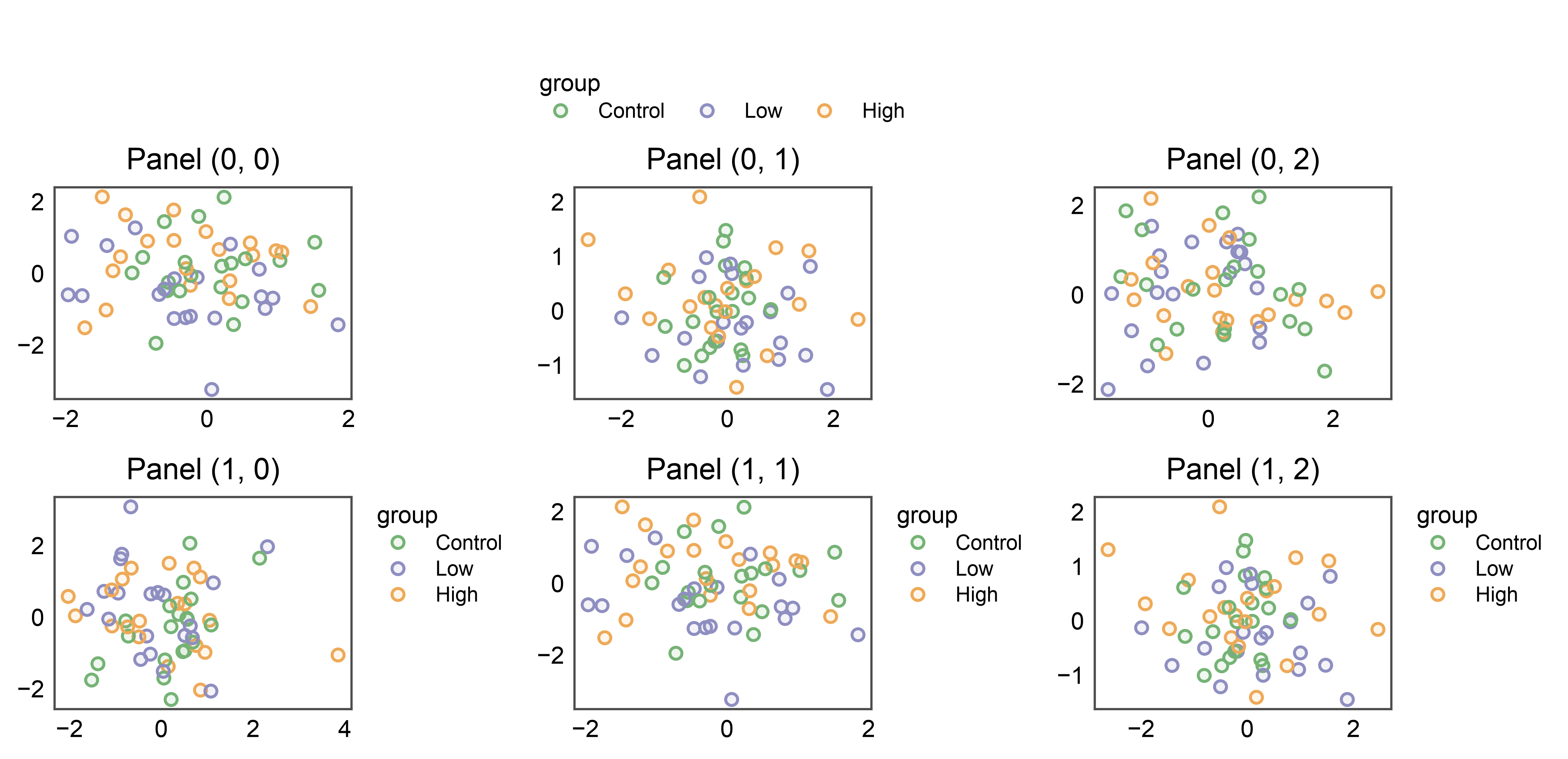
14. Sub-scope with an explicit anchor= override
Advanced use: the axes= kwarg sets the collection scope
(which plots contribute entries) while anchor= independently
sets the geometric pin (where the band physically sits). By
default pp.legend(axes=top_row, side='top') anchors to the
row’s bounding rect and centers the band. Pass anchor= to
override the pin — e.g., collect entries from the whole top row
but pin the band above the top-right corner cell specifically.
Useful when the collection scope is one geometry (a full row) but the aesthetic target is another (a single corner panel, typically because it carries the richest hue stash).
fig, axes = pp.subplots(2, 3, axes_size=(35, 25))
top_row = list(axes[0])
pp.legend(
    axes=top_row, anchor=axes[0, -1], side="top", collect=["group"],
)
for r, row in enumerate(axes):
    for c, ax in enumerate(row):
        panel = "ABCD"[(r * 3 + c) % 4]
        pp.scatterplot(
            data=_df[_df["panel"] == panel], x="x", y="y",
            hue="group", palette="pastel",
            title=f"Panel {(r, c)}", ax=ax,
        )
pp.show()
15. In-cell shared legend — pp.legend(anchor=ax, inside=True)
When a grid has an empty cell (3 plots in a 2x2 layout, or any
asymmetric arrangement), publiplots can fill that cell with the
shared legend instead of overhanging the figure’s edge. The
anchor= is the cell to render INTO; collection scope still
defaults to the full figure (or pass axes=[...] to narrow).
The anchor cell is auto-blanked (no frame, no ticks) so it reads
as a clean legend tile — opt out via clear_anchor=False if
the cell already holds intentional content.
Default placement: side='left', align='start' → upper-left of
the tile. This is the visual continuation of the canonical
pp.legend(side='right', align='start') band recipe: the legend
hugs the inner-left edge of the legend tile, against the divide
between plots and legend. Override side / align for other
layouts (empty cell on the LEFT of plots → side='right';
centered tile → side='center').
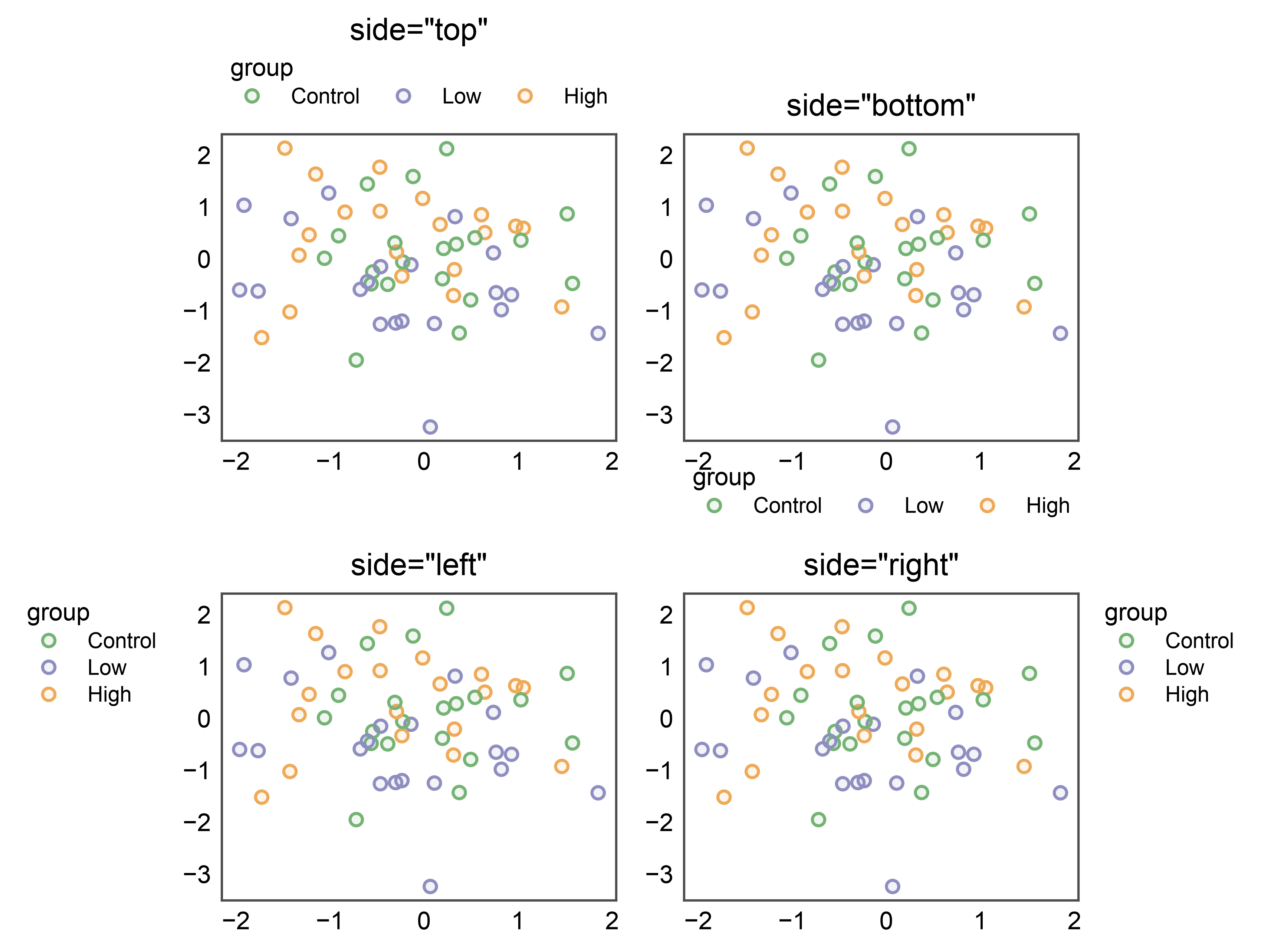
16. Per-axes side= on a single axes (all four sides)
pp.legend(ax, side=...) adopts the per-axes legend group the plot
call already created on that axes and applies the side you ask for —
no second group, no “scope overlaps with an existing group” warning,
and the side= is honoured (previously the auto-created right-side
group could win). All four sides work in axes-anchored mode:
side='right'/'left'→ vertical band beside the axes. An internal left legend clears the y-tick labels.side='top'/'bottom'→ horizontal band above/below. An internal top legend clears the axes title.
The outward offset defaults are larger for the top and left sides in this axes-anchored mode, so the band clears the reclaimed decoration cleanly. The 2x2 figure below shows one side per panel.
fig, axes = pp.subplots(2, 2, axes_size=(45, 35))
for (r, c), side in zip([(0, 0), (0, 1), (1, 0), (1, 1)],
                        ["top", "bottom", "left", "right"]):
    pp.scatterplot(
        data=_df[_df["panel"] == "A"], x="x", y="y",
        hue="group", palette="pastel",
        title=f'side="{side}"', ax=axes[r, c],
    )
    pp.legend(axes[r, c], side=side)
pp.show()
17. One-call placement via legend_kws
Placement keys passed in legend_kws are forwarded straight to the
per-axes legend group, so you can position the legend in a single
pp.scatterplot call — no separate pp.legend(ax) needed. The
forwarded placement keys are side, orientation, align,
x_offset, y_offset, and gap. Here side="left" lands
the legend on the axes’ left edge in one call.
(The inside=True path is independent and ignores these placement
keys — see section 2.)
pp.scatterplot(
    data=_df[_df["panel"] == "A"], x="x", y="y",
    hue="group", palette="pastel",
    legend_kws={"side": "left"},
    title='legend_kws={"side": "left"}',
)
pp.show()
Total running time of the script: (0 minutes 53.999 seconds)