Note
Go to the end to download the full example code.
Hatch Pattern Examples
This example demonstrates hatch pattern functionality in PubliPlots. Hatch patterns are useful for creating black-and-white publication-ready figures that are distinguishable without relying on color.
import publiplots as pp
import pandas as pd
import numpy as np
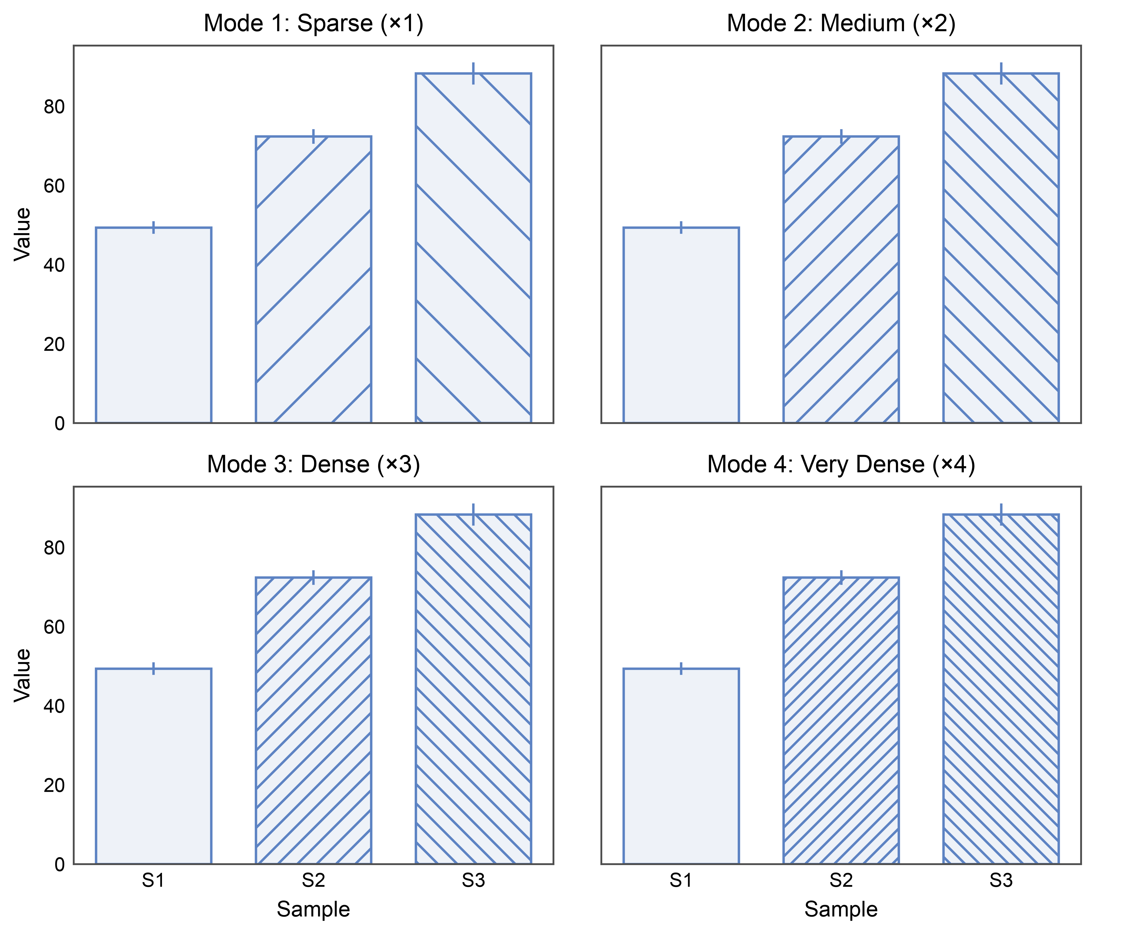
Understanding Hatch Modes
PubliPlots supports multiple hatch pattern density modes: - Mode 1 (default): Sparse patterns (base × 1, e.g., ‘/’) - Mode 2: Medium density (base × 2, e.g., ‘//’) - Mode 3: Dense patterns (base × 3, e.g., ‘///’) - Mode 4: Very dense (base × 4, e.g., ‘////’)
# Create sample data
np.random.seed(333)
hatch_mode_data = pd.DataFrame({
    'sample': np.repeat(['S1', 'S2', 'S3'], 10),
    'value': np.concatenate([
        np.random.normal(50, 5, 10),
        np.random.normal(70, 6, 10),
        np.random.normal(90, 7, 10),
    ])
})

# Create figure comparing different hatch modes
fig, axes = pp.subplots(2, 2, axes_size=(70, 55), sharex=True, sharey=True)
kwargs = dict(
    data=hatch_mode_data,
    x='sample',
    y='value',
    hatch='sample',
    xlabel='Sample',
    ylabel='Value',
    color='#5D83C3',
    errorbar='se',
)

# Mode 1 (sparse)
pp.set_hatch_mode(1)
pp.barplot(
    **kwargs,
    title=f'Mode 1: Sparse (×{pp.get_hatch_mode()})',
    ax=axes[0, 0]
)

# Mode 2 (medium)
pp.set_hatch_mode(2)
pp.barplot(
    **kwargs,
    title=f'Mode 2: Medium (×{pp.get_hatch_mode()})',
    ax=axes[0, 1]
)

# Mode 3 (dense)
pp.set_hatch_mode(3)
pp.barplot(
    **kwargs,
    title=f'Mode 3: Dense (×{pp.get_hatch_mode()})',
    ax=axes[1, 0]
)

# Mode 4 (very dense)
pp.set_hatch_mode(4)
pp.barplot(
    **kwargs,
    title=f'Mode 4: Very Dense (×{pp.get_hatch_mode()})',
    ax=axes[1, 1]
)

pp.show()

# Reset to default
pp.set_hatch_mode()
Available Hatch Patterns
View all available hatch patterns for the current mode.
print("Available hatch patterns for mode 2:")
pp.set_hatch_mode(2)
pp.list_hatch_patterns()

# Reset to default
pp.set_hatch_mode()
Available hatch patterns for mode 2:
Hatch Patterns (Mode 2):
  0: '' (no hatch)
  1: '//'
  2: '\\'
  3: '..'
  4: '||'
  5: '--'
  6: '++'
  7: 'xx'
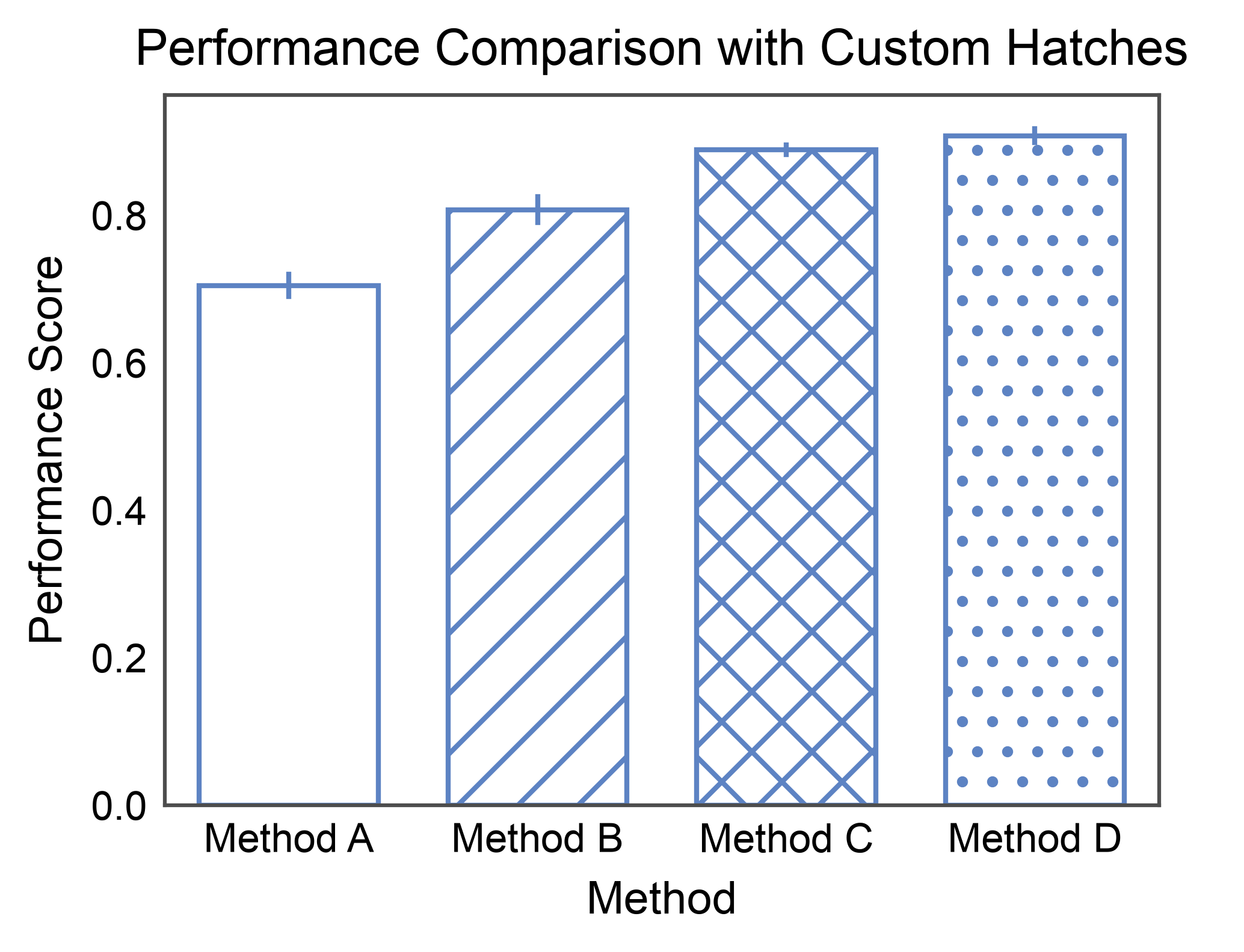
Custom Hatch Mapping
Use custom hatch patterns for specific categories.
# Create comparison data
np.random.seed(444)
method_data = pd.DataFrame({
    'method': np.repeat(['Method A', 'Method B', 'Method C', 'Method D'], 12),
    'performance': np.concatenate([
        np.random.normal(0.70, 0.06, 12),
        np.random.normal(0.82, 0.05, 12),
        np.random.normal(0.88, 0.04, 12),
        np.random.normal(0.91, 0.03, 12),
    ])
})

# Set hatch mode
pp.set_hatch_mode(2)

# Create plot with custom hatch mapping
ax = pp.barplot(
    data=method_data,
    x='method',
    y='performance',
    hatch='method',
    hatch_map={
        'Method A': '',      # No hatch
        'Method B': '//',    # Diagonal lines
        'Method C': 'xx',    # Cross hatch
        'Method D': '..'     # Dots
    },
    title='Performance Comparison with Custom Hatches',
    xlabel='Method',
    ylabel='Performance Score',
    errorbar='se',
    color='#5D83C3',
    alpha=0.0,
)
pp.show()

# Reset mode
pp.set_hatch_mode()
Hatch Patterns for Grouped Data
Combine hatch patterns with grouping for complex visualizations.
# Create grouped time-series data
np.random.seed(555)
timeseries_data = pd.DataFrame({
    'time': np.repeat(['Week 1', 'Week 2', 'Week 3', 'Week 4'], 24),
    'group': np.tile(np.repeat(['Group A', 'Group B'], 12), 4),
    'value': np.concatenate([
        # Week 1
        np.random.normal(40, 6, 12),   # Group A
        np.random.normal(42, 6, 12),   # Group B
        # Week 2
        np.random.normal(48, 7, 12),   # Group A
        np.random.normal(56, 8, 12),   # Group B
        # Week 3
        np.random.normal(52, 7, 12),   # Group A
        np.random.normal(68, 9, 12),   # Group B
        # Week 4
        np.random.normal(55, 8, 12),   # Group A
        np.random.normal(75, 10, 12),  # Group B
    ])
})

# Set medium density
pp.set_hatch_mode(2)

# Create grouped bar plot with hatches
ax = pp.barplot(
    data=timeseries_data,
    x='time',
    y='value',
    hatch='group',
    title='Time Series with Hatch Patterns',
    xlabel='Time Point',
    ylabel='Measurement',
    errorbar='se',
    hatch_map={'Group A': '', 'Group B': '..'},
    color='#5D83C3',
)
pp.show()

# Reset mode
pp.set_hatch_mode()
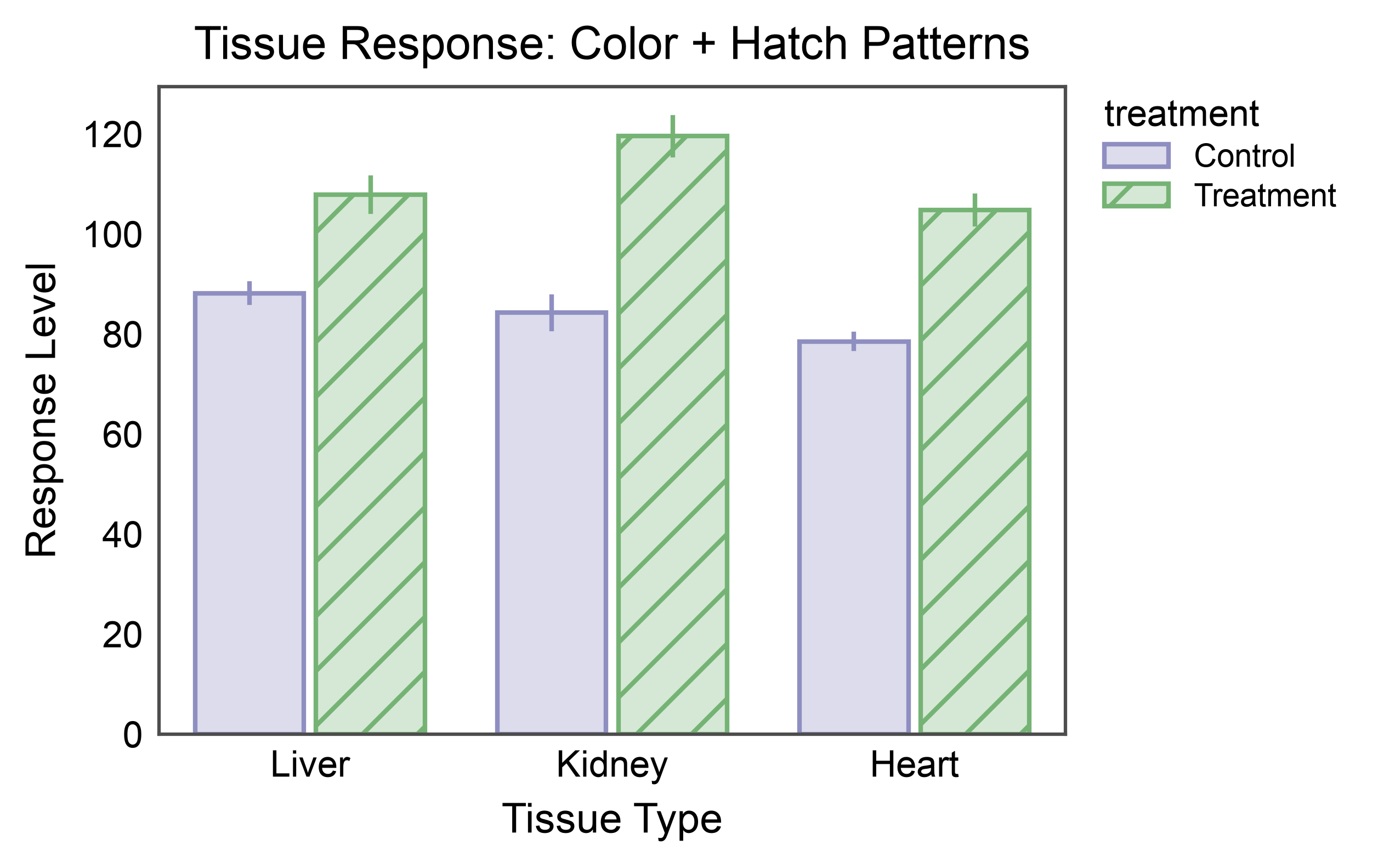
Hatch + Color for Maximum Distinction
Combine hatch patterns with colors for figures that work in both color and black-and-white formats.
# Create treatment data
np.random.seed(666)
treatment_data = pd.DataFrame({
    'tissue': np.repeat(['Liver', 'Kidney', 'Heart'], 15),
    'treatment': np.tile(['Control']*7 + ['Treatment']*8, 3),
    'response': np.concatenate([
        # Liver
        np.random.normal(85, 8, 7),    # Control
        np.random.normal(110, 12, 8),  # Treatment
        # Kidney
        np.random.normal(90, 9, 7),    # Control
        np.random.normal(115, 13, 8),  # Treatment
        # Heart
        np.random.normal(80, 7, 7),    # Control
        np.random.normal(105, 11, 8),  # Treatment
    ])
})

# Set hatch mode
pp.set_hatch_mode(3)

# Create bar plot with both color and hatch
ax = pp.barplot(
    data=treatment_data,
    x='tissue',
    y='response',
    hue='treatment',
    hatch='treatment',
    title='Tissue Response: Color + Hatch Patterns',
    xlabel='Tissue Type',
    ylabel='Response Level',
    errorbar='se',
    palette={'Control': '#8E8EC1', 'Treatment': '#75B375'},
    hatch_map={'Control': '', 'Treatment': '//'},
    alpha=0.3,
)
pp.show()

# Reset mode
pp.set_hatch_mode()
Total running time of the script: (0 minutes 3.580 seconds)