Note
Go to the end to download the full example code.
Value Label Annotations
This example showcases pp.annotate across every plot type that
supports it. Each pp.*plot function takes an annotate kwarg —
pass True for defaults or a dict to override format, anchor, color,
text kwargs, and (for boxplots/violins) which statistics to label.
Anchor vocabularies are strategy-specific:
pp.barplot:outside/inside/base/centerpp.pointplot,pp.boxplot,pp.violinplot:top/bottom/left/right/center
import publiplots as pp
import pandas as pd
import numpy as np

rng = np.random.default_rng(0)
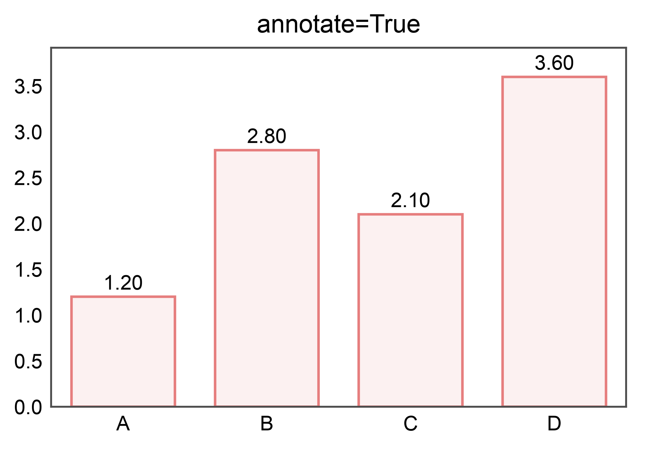
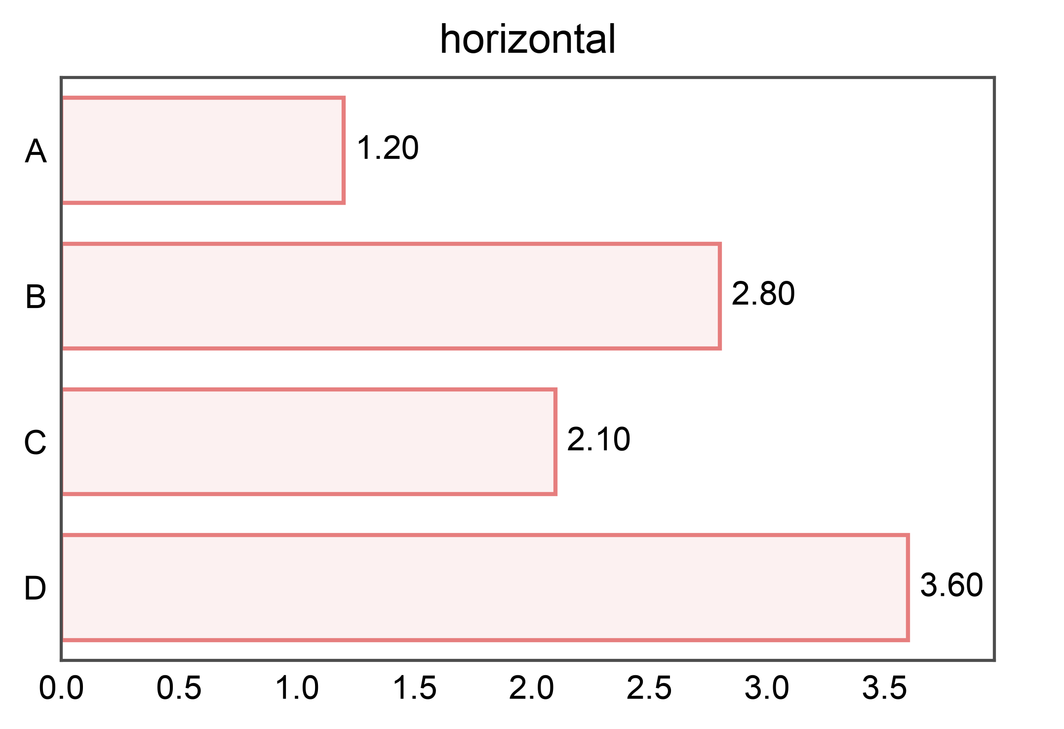
Simple: labels outside the bars (default)
df = pd.DataFrame({
    "category": pd.Categorical(["A", "B", "C", "D"]),
    "value": [1.2, 2.8, 2.1, 3.6],
})

ax = pp.barplot(data=df, x="category", y="value", annotate=True,
                title="annotate=True")
pp.show()
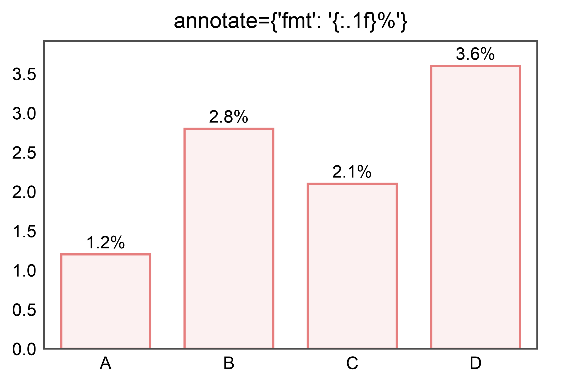
Custom format string
ax = pp.barplot(
    data=df, x="category", y="value",
    annotate={"fmt": "{:.1f}%"},
    title="annotate={'fmt': '{:.1f}%'}",
)
pp.show()
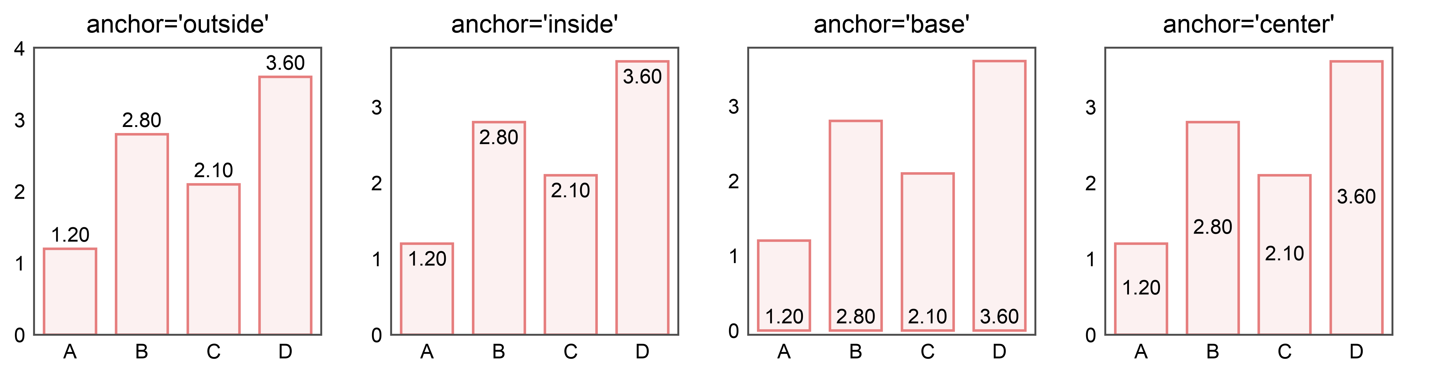
Anchor positions
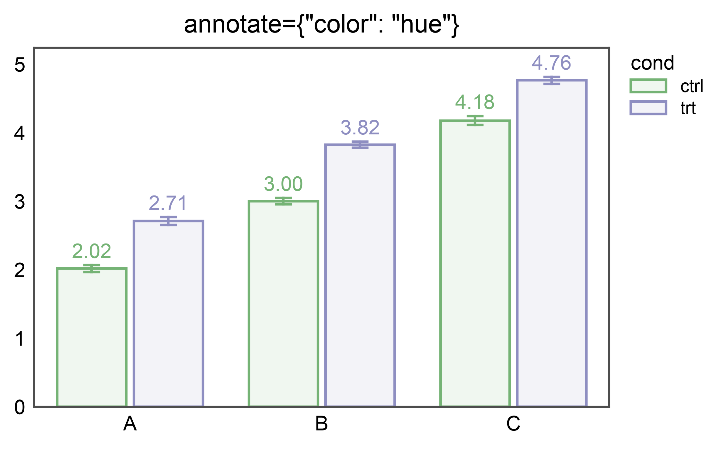
Hue-colored labels
rows = []
for group in ("A", "B", "C"):
    for cond in ("ctrl", "trt"):
        base = 2 if group == "A" else (3 if group == "B" else 4)
        bump = 0 if cond == "ctrl" else 0.8
        for v in rng.normal(loc=base + bump, scale=0.2, size=10):
            rows.append({"group": group, "cond": cond, "y": float(v)})
grouped = pd.DataFrame(rows)
grouped["group"] = grouped["group"].astype("category")
grouped["cond"] = grouped["cond"].astype("category")

ax = pp.barplot(
    data=grouped, x="group", y="y", hue="cond", errorbar="se",
    annotate={"color": "hue"},
    title='annotate={"color": "hue"}',
)
pp.show()
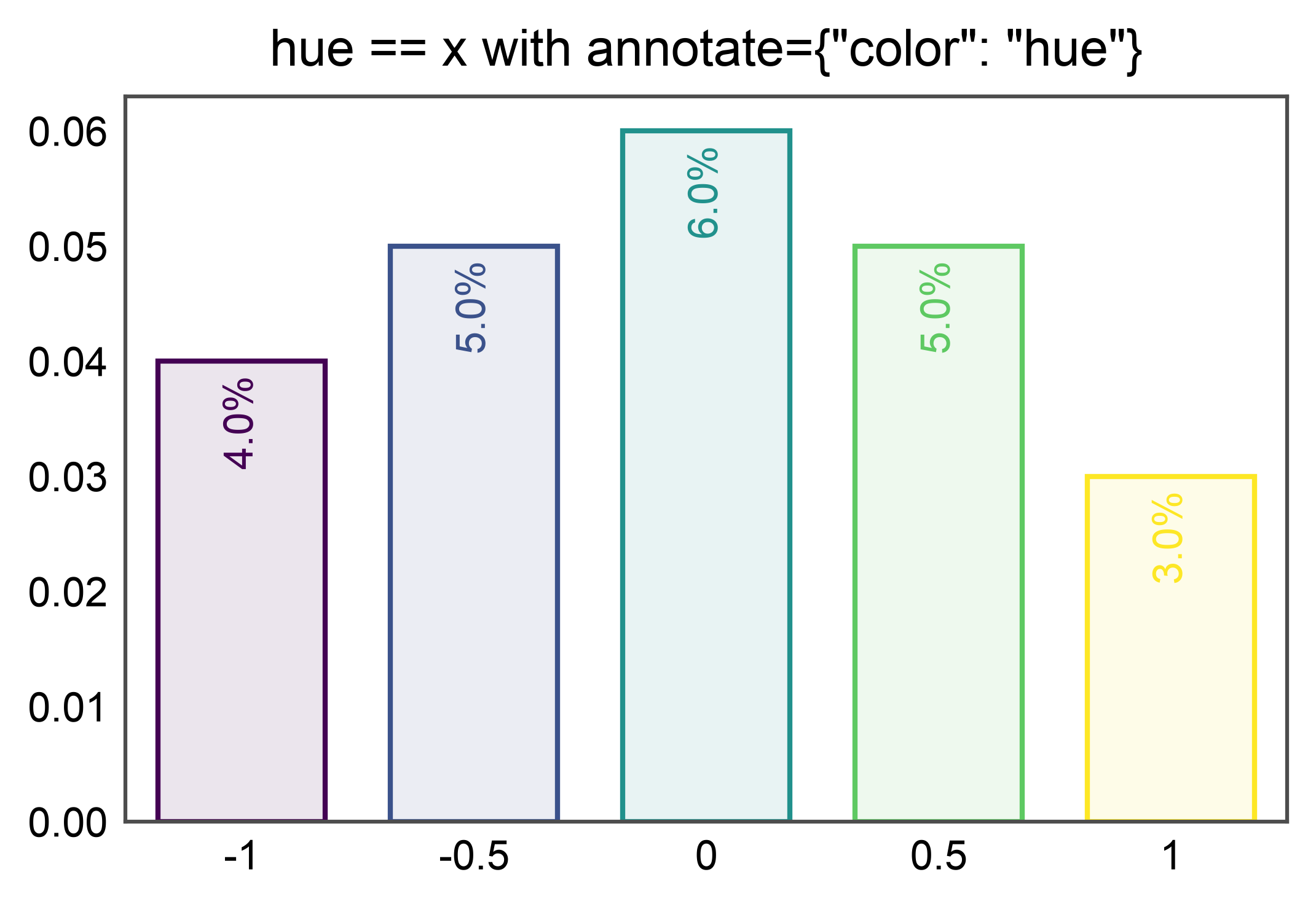
Hue-colored labels when hue == x
A common idiom is hue=x to color each category from a palette
while keeping the categorical axis. annotate={"color": "hue"}
resolves to the saturated palette color per bar — the bar’s
default alpha=0.1 outline fill does not leak into the label.
tau_df = pd.DataFrame({
    "tau": ["-1", "-0.5", "0", "0.5", "1"],
    "value": [0.04, 0.05, 0.06, 0.05, 0.03],
})
tau_palette = {
    "-1": "#440154", "-0.5": "#3b528b", "0": "#21918c",
    "0.5": "#5ec962", "1": "#fde725",
}

ax = pp.barplot(
    data=tau_df, x="tau", y="value", hue="tau",
    order=list(tau_palette), palette=tau_palette, legend=False,
    annotate={"fmt": "{:.1%}", "anchor": "inside",
              "rotation": 90, "color": "hue"},
    title='hue == x with annotate={"color": "hue"}',
)
pp.show()
Horizontal orientation
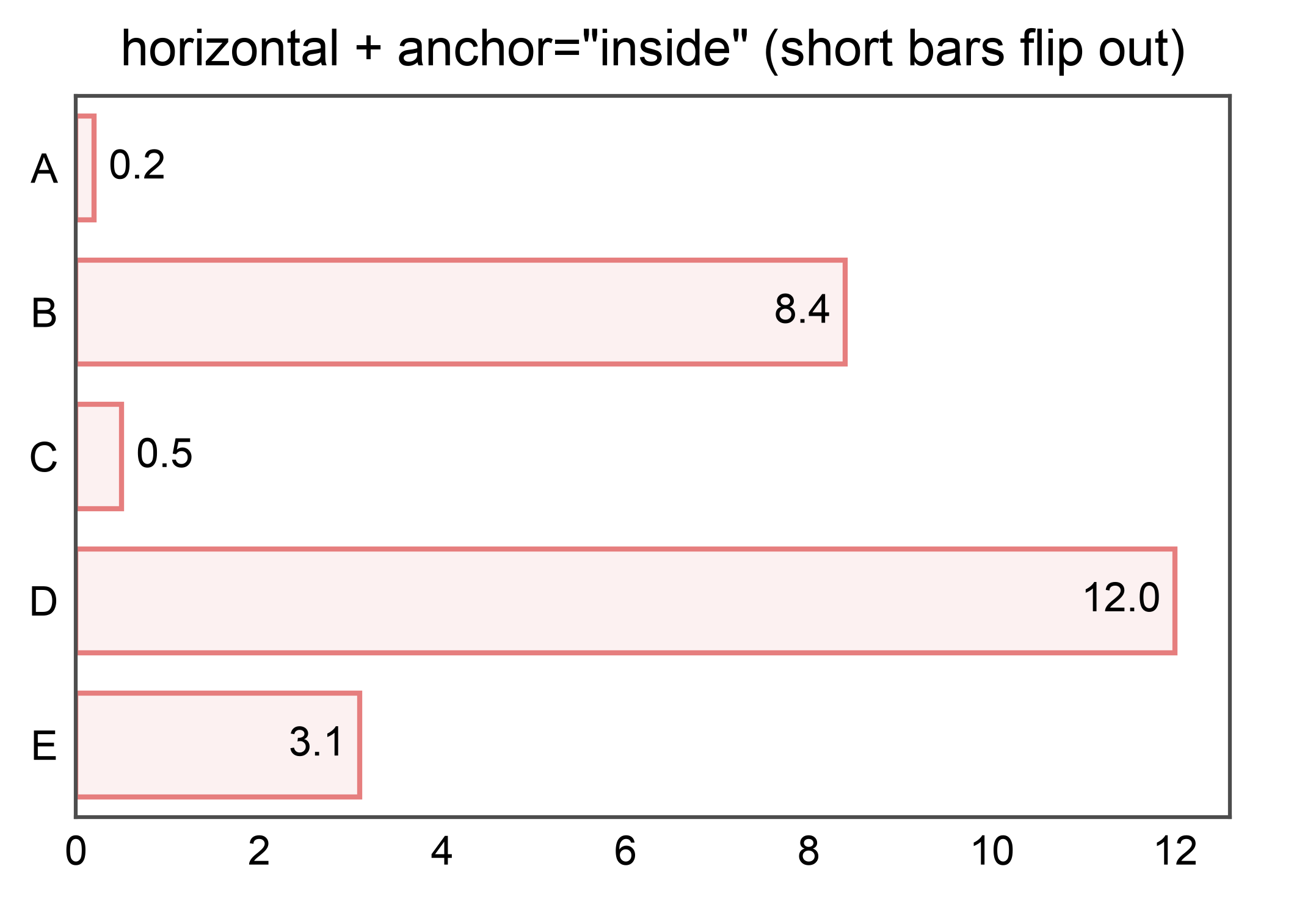
Horizontal + inside with mixed bar sizes
When anchor="inside" is requested but a bar is too short to fit the
label, that single label flips to "outside" automatically. Other bars
keep their inside anchoring.
df_mixed = pd.DataFrame({
    "c": pd.Categorical(["A", "B", "C", "D", "E"]),
    "v": [0.2, 8.4, 0.5, 12.0, 3.1],
})
ax = pp.barplot(
    data=df_mixed, x="v", y="c",
    annotate={"anchor": "inside", "fmt": ".1f"},
    title='horizontal + anchor="inside" (short bars flip out)',
)
pp.show()
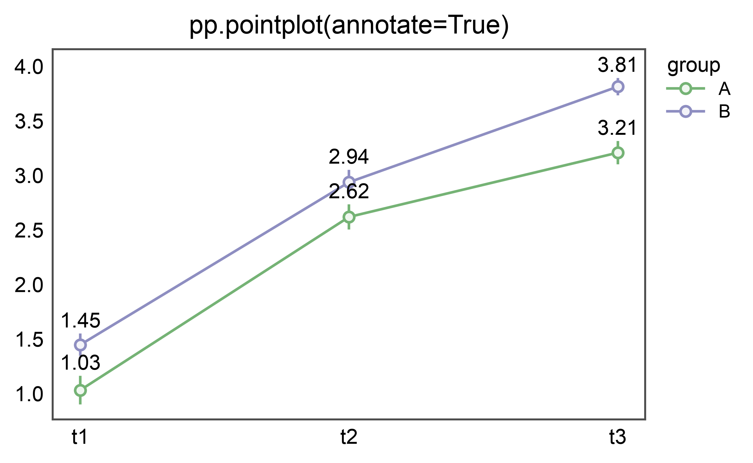
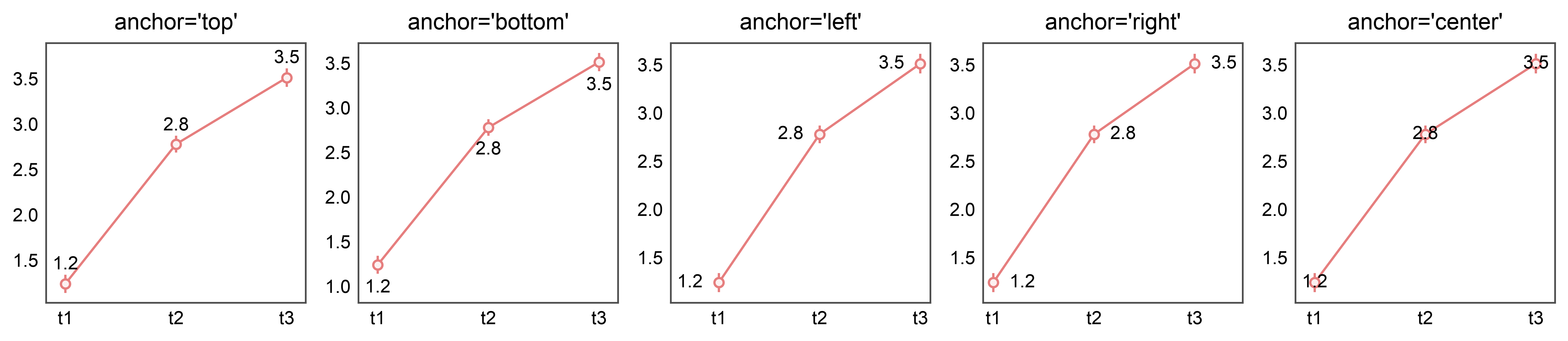
Pointplot: mean ± errorbar labels
pp.pointplot(…, annotate=True) labels each mean at the top of its
errorbar cap. Anchor vocabulary differs from barplots: point labels are
directional — top / bottom / left / right / center.
rows = []
for grp in ("A", "B"):
    for t in ("t1", "t2", "t3"):
        base = {"t1": 1.0, "t2": 2.5, "t3": 3.2}[t] + (0 if grp == "A" else 0.5)
        for v in rng.normal(loc=base, scale=0.3, size=10):
            rows.append({"group": grp, "time": t, "v": float(v)})
point_df = pd.DataFrame(rows)
point_df["time"] = point_df["time"].astype("category")
point_df["group"] = point_df["group"].astype("category")

ax = pp.pointplot(
    data=point_df, x="time", y="v", hue="group",
    errorbar="se", annotate={"fmt": ".2f"},
    title="pp.pointplot(annotate=True)",
)
pp.show()
Point anchor variants
Boxplot: stats labels
pp.boxplot(…, annotate=True) labels the median by default. Pass a
stats=[…] list to label multiple stats per box: any of
median, q1, q3, whisker_low, whisker_high, mean.
box_rows = []
for g, base in zip(("A", "B", "C"), (1.0, 2.0, 3.0)):
    for v in rng.normal(base, 0.5, 40):
        box_rows.append({"g": g, "y": float(v)})
box_df = pd.DataFrame(box_rows)
box_df["g"] = box_df["g"].astype("category")

ax = pp.boxplot(
    data=box_df, x="g", y="y",
    annotate={"stats": ["median", "q1", "q3"], "fmt": ".2f"},
    title="pp.boxplot(annotate={'stats': [...]})",
)
pp.show()
![pp.boxplot(annotate={'stats': [...]})](../_images/sphx_glr_plot_23_annotate_010.png)
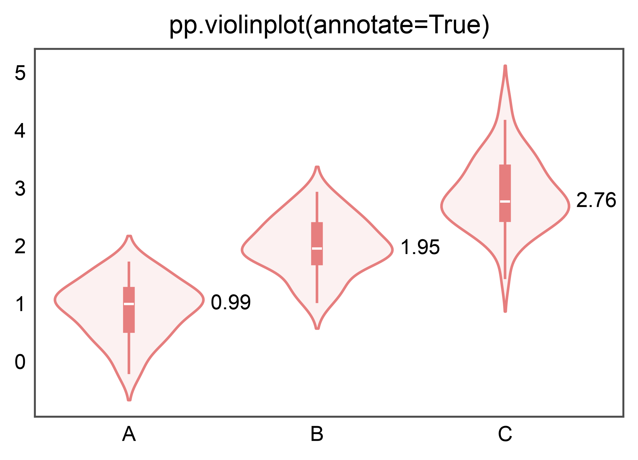
Violinplot: same stats API
pp.violinplot shares the box_stats strategy — violins are a different visual but the same stats (median, quartiles) apply.
ax = pp.violinplot(
    data=box_df, x="g", y="y",
    annotate={"stats": ["median"], "fmt": ".2f"},
    title="pp.violinplot(annotate=True)",
)
pp.show()
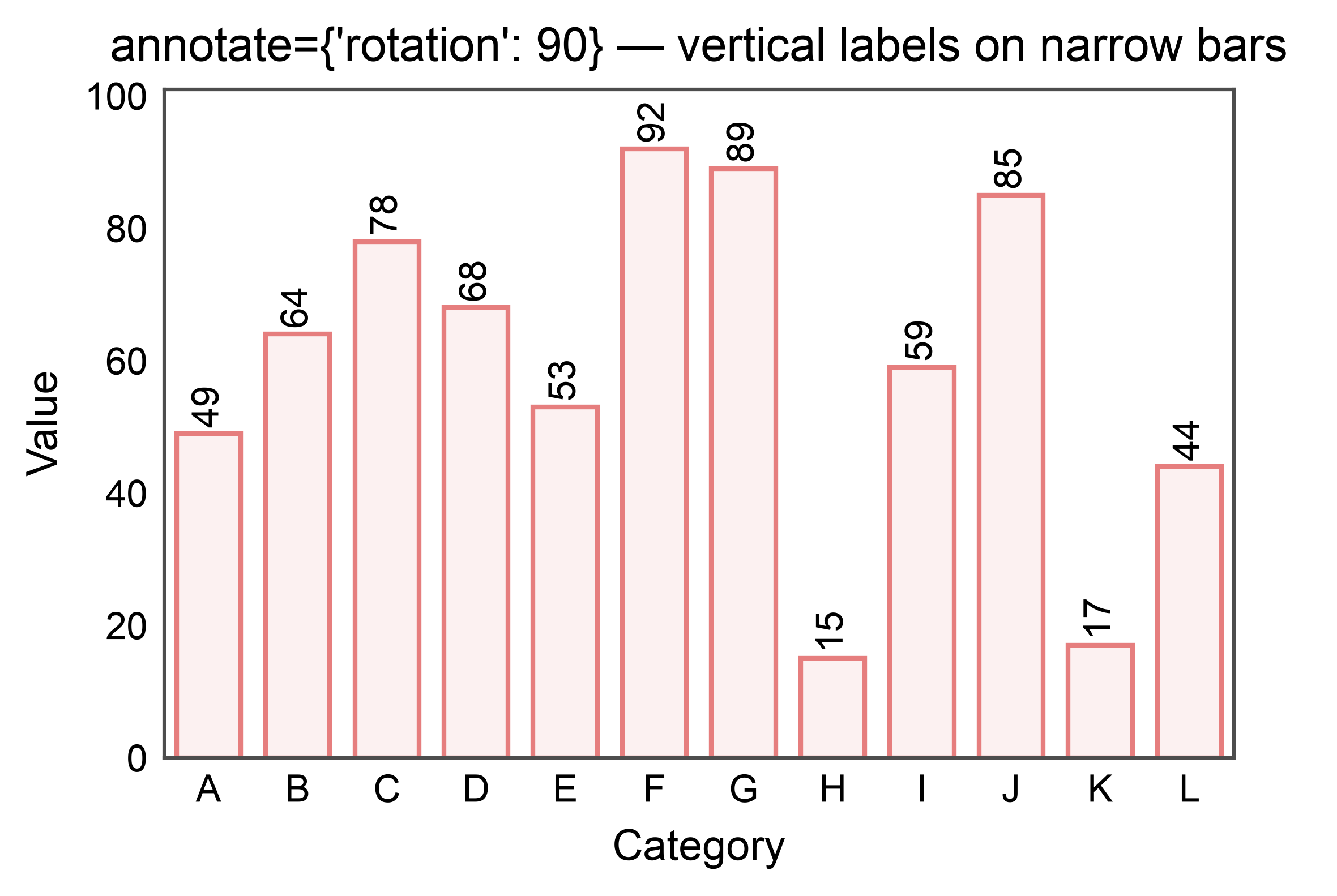
Vertical labels for narrow bars
annotate={"rotation": 90} rotates each label 90° counter-clockwise.
matplotlib applies (ha, va) to the post-rotation bbox, so the
default anchor="outside" alignment (ha="center", va="bottom")
still anchors the label just above the bar top at any rotation — no
alignment remap needed. publiplots expands the categorical axis so
rotated labels don’t clip their neighbors.
narrow_df = pd.DataFrame({
    "category": list("ABCDEFGHIJKL"),
    "value": rng.integers(10, 100, 12),
})

ax = pp.barplot(
    data=narrow_df, x="category", y="value",
    annotate={"rotation": 90, "fmt": ".0f"},
    title="annotate={'rotation': 90} — vertical labels on narrow bars",
    xlabel="Category", ylabel="Value",
)
pp.show()
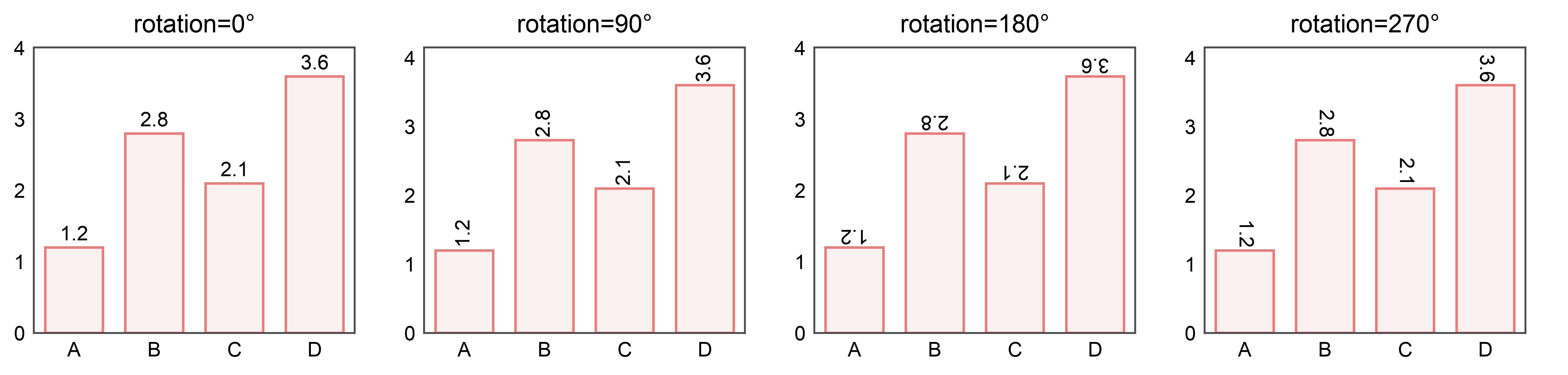
Rotation tour: 0° / 90° / 180° / 270°
Because matplotlib applies (ha, va) to the post-rotation bbox,
the default anchor="outside" alignment keeps the label above the
bar top at every rotation — the text just rotates in place.
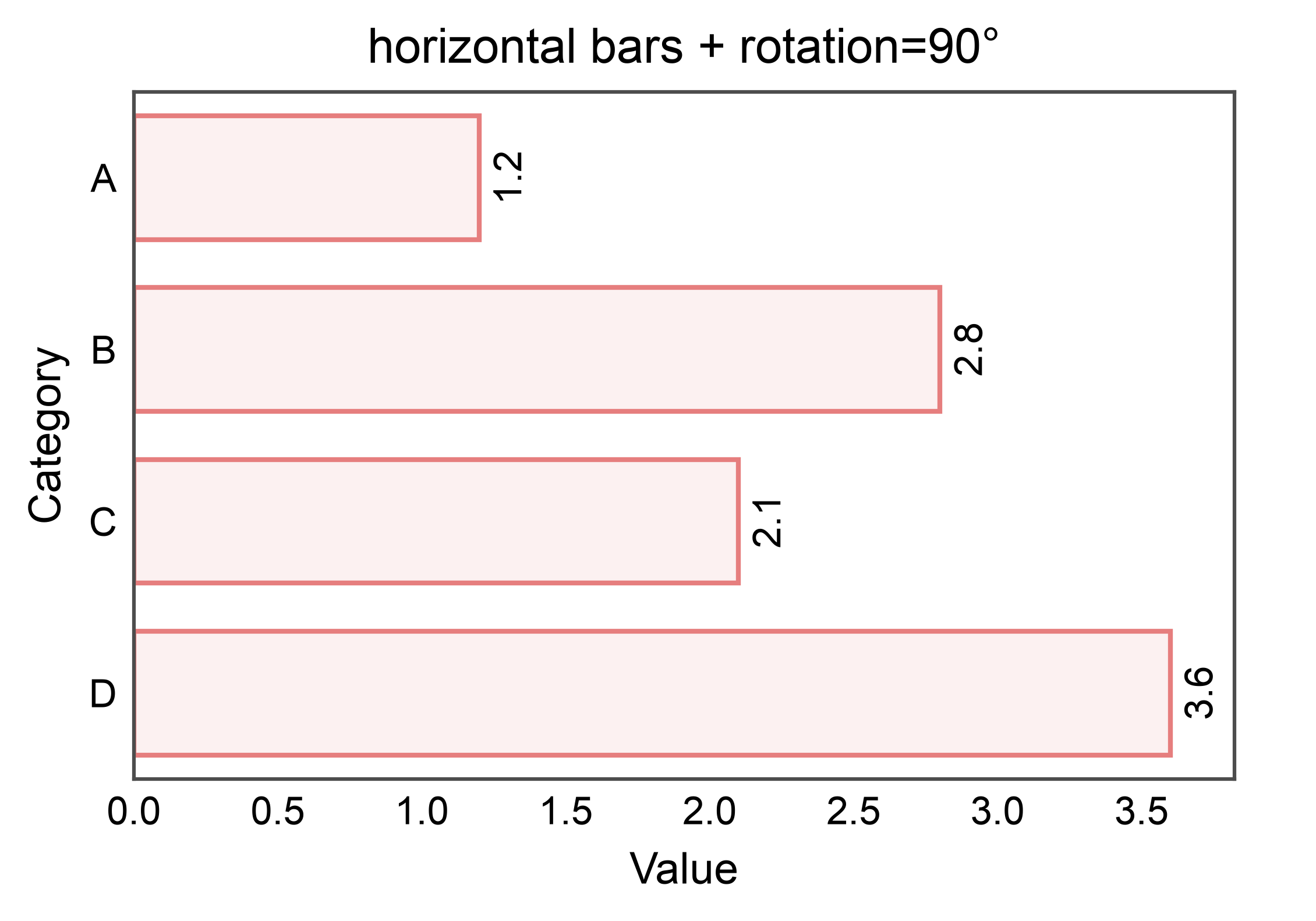
Rotation on horizontal bars
For horizontal bars the default anchor is still “outside” — to the
right of the bar, with (ha="left", va="center"). Because
matplotlib aligns the post-rotation bbox, the rotated label still
sits just outside the bar end without any alignment remap.
ax = pp.barplot(
    data=df, y="category", x="value",
    annotate={"rotation": 90, "fmt": ".1f"},
    title="horizontal bars + rotation=90°",
    xlabel="Value", ylabel="Category",
)
pp.show()
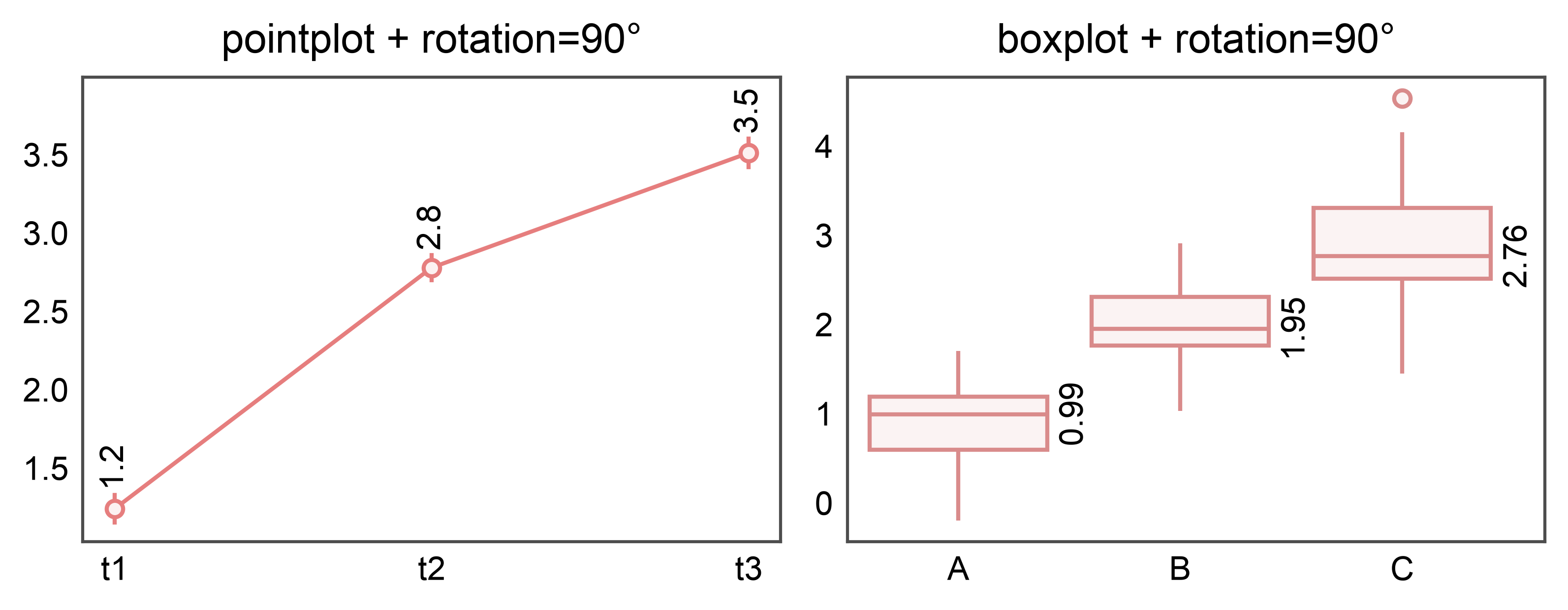
Rotation on point and box plots
All three annotate strategies (bar_values, point_values, box_stats)
accept the rotation kwarg and inherit the same post-rotation-bbox
alignment behavior from matplotlib.
fig, axes = pp.subplots(1, 2, axes_size=(60, 40))
pp.pointplot(
    data=point_df, x="time", y="v", ax=axes[0],
    errorbar="se",
    annotate={"rotation": 90, "fmt": ".1f"},
    title="pointplot + rotation=90°",
)
pp.boxplot(
    data=box_df, x="g", y="y", ax=axes[1],
    annotate={"stats": ["median"], "rotation": 90, "fmt": ".2f"},
    title="boxplot + rotation=90°",
)
pp.show()
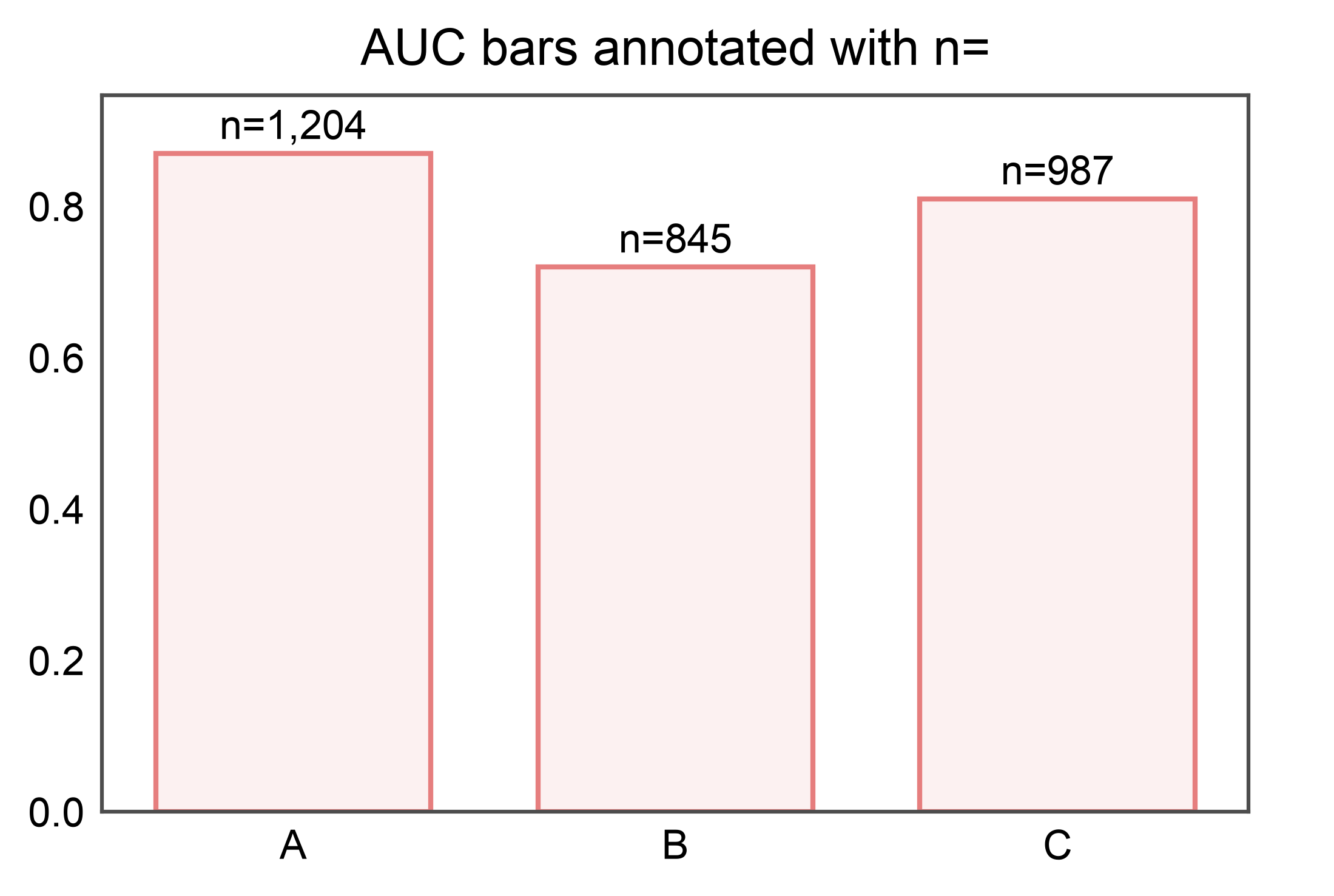
Custom labels: kind="bar_custom"
The bar_custom strategy labels each bar with a user-supplied string
rather than the bar’s own value. Use it to annotate an AUC bar with its
sample count, stamp pathway names on an enrichment bar plot, or render
any per-bar string derived from the source DataFrame.
Labels come from either a DataFrame column name (aligned by the same
(x, hue, hatch) group keys pp.barplot used) or a callable that
receives each BarRecord and returns a string.
Column source: AUC with per-bar n
A classic “AUC + sample count” pattern. labels="n" picks up the
n column from the DataFrame that was plotted; fmt="n={:,}"
formats each value with a thousands separator.
auc_df = pd.DataFrame({
    "group": pd.Categorical(
        ["A", "B", "C"],
        categories=["A", "B", "C"],
    ),
    "auc": [0.87, 0.72, 0.81],
    "n":   [1204, 845, 987],
})
ax = pp.barplot(data=auc_df, x="group", y="auc",
                title="AUC bars annotated with n=")
pp.annotate(ax, kind="bar_custom", labels="n", fmt="n={:,}")
pp.show()
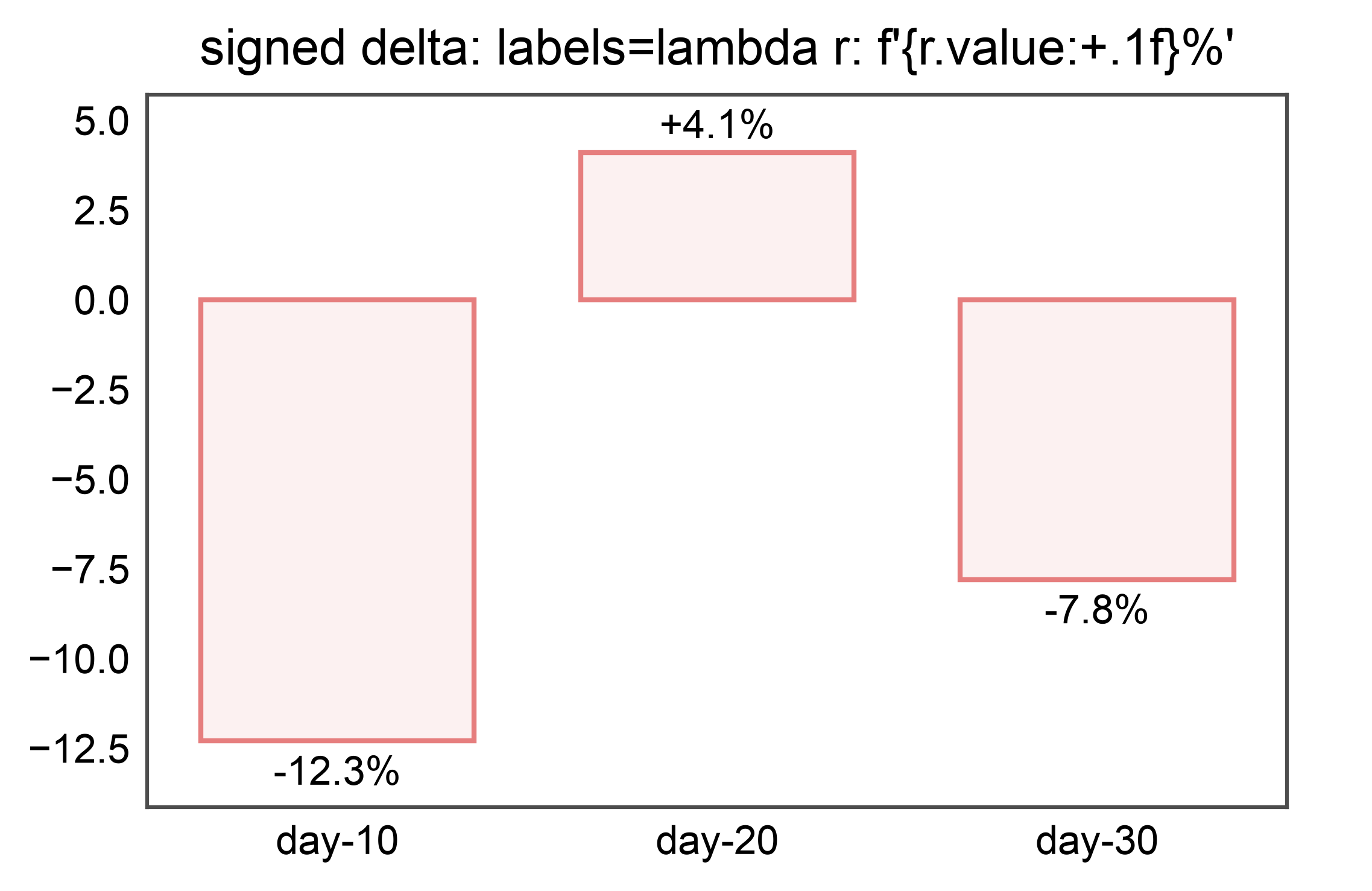
Callable source: signed percent delta
A labels= callable receives each BarRecord and returns the
label string. Use it when the label is a function of the bar’s own
value (or anything else you can compute per-bar).
delta_df = pd.DataFrame({
    "cohort": pd.Categorical(
        ["day-10", "day-20", "day-30"],
        categories=["day-10", "day-20", "day-30"],
    ),
    "pct_change": [-12.3, 4.1, -7.8],
})
ax = pp.barplot(
    data=delta_df, x="cohort", y="pct_change",
    title="signed delta: labels=lambda r: f'{r.value:+.1f}%'",
)
pp.annotate(ax, kind="bar_custom",
            labels=lambda r: f"{r.value:+.1f}%")
pp.show()
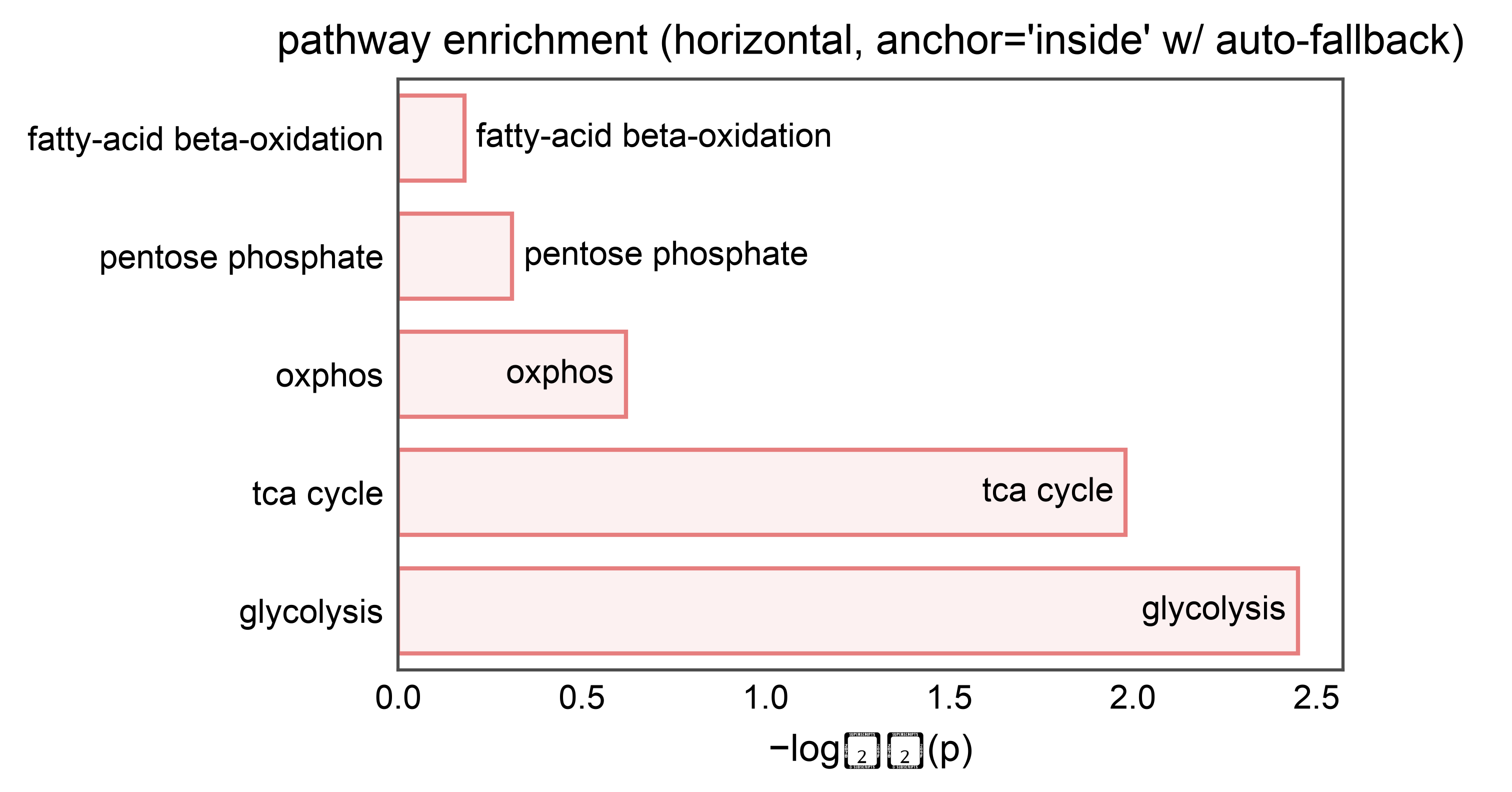
Callable source: per-bar categorical string with fit-aware placement
The callable has access to r.frame_row_index (the position in the
source DataFrame of the first row matching this bar’s group), so you
can look up arbitrary sibling columns — here, pathway names for an
enrichment plot.
anchor="inside" places each label inside its bar. When a bar is
too short to fit its label, bar_custom falls back to
anchor="outside" for that bar only (same fit_check machinery
that bar_values uses). This means enrichment bars with a wide
score range get labels placed in whichever edge reads cleanly.
pathway_df = pd.DataFrame({
    "pathway": pd.Categorical(
        [
            "glycolysis",
            "tca cycle",
            "oxphos",
            "pentose phosphate",
            "fatty-acid beta-oxidation",
        ],
        categories=[
            "fatty-acid beta-oxidation",
            "pentose phosphate",
            "oxphos",
            "tca cycle",
            "glycolysis",
        ],
    ),
    # Wide score range: top bars easily fit the label inside;
    # the bottom bars are too short, so fit_check re-anchors them outside.
    "score": [2.45, 1.98, 0.62, 0.31, 0.18],
})
ax = pp.barplot(
    data=pathway_df, x="score", y="pathway",
    title="pathway enrichment (horizontal, anchor='inside' w/ auto-fallback)",
    xlabel="−log₁₀(p)", ylabel="",
)
pp.annotate(
    ax, kind="bar_custom",
    labels=lambda r: str(r.category),
    anchor="inside",
)
pp.show()
/home/runner/work/publiplots/publiplots/src/publiplots/annotate/_shared.py:127: UserWarning: Glyph 8321 (\N{SUBSCRIPT ONE}) missing from font(s) Arial.
  ax.figure.canvas.draw()
/home/runner/work/publiplots/publiplots/src/publiplots/annotate/_shared.py:127: UserWarning: Glyph 8320 (\N{SUBSCRIPT ZERO}) missing from font(s) Arial.
  ax.figure.canvas.draw()
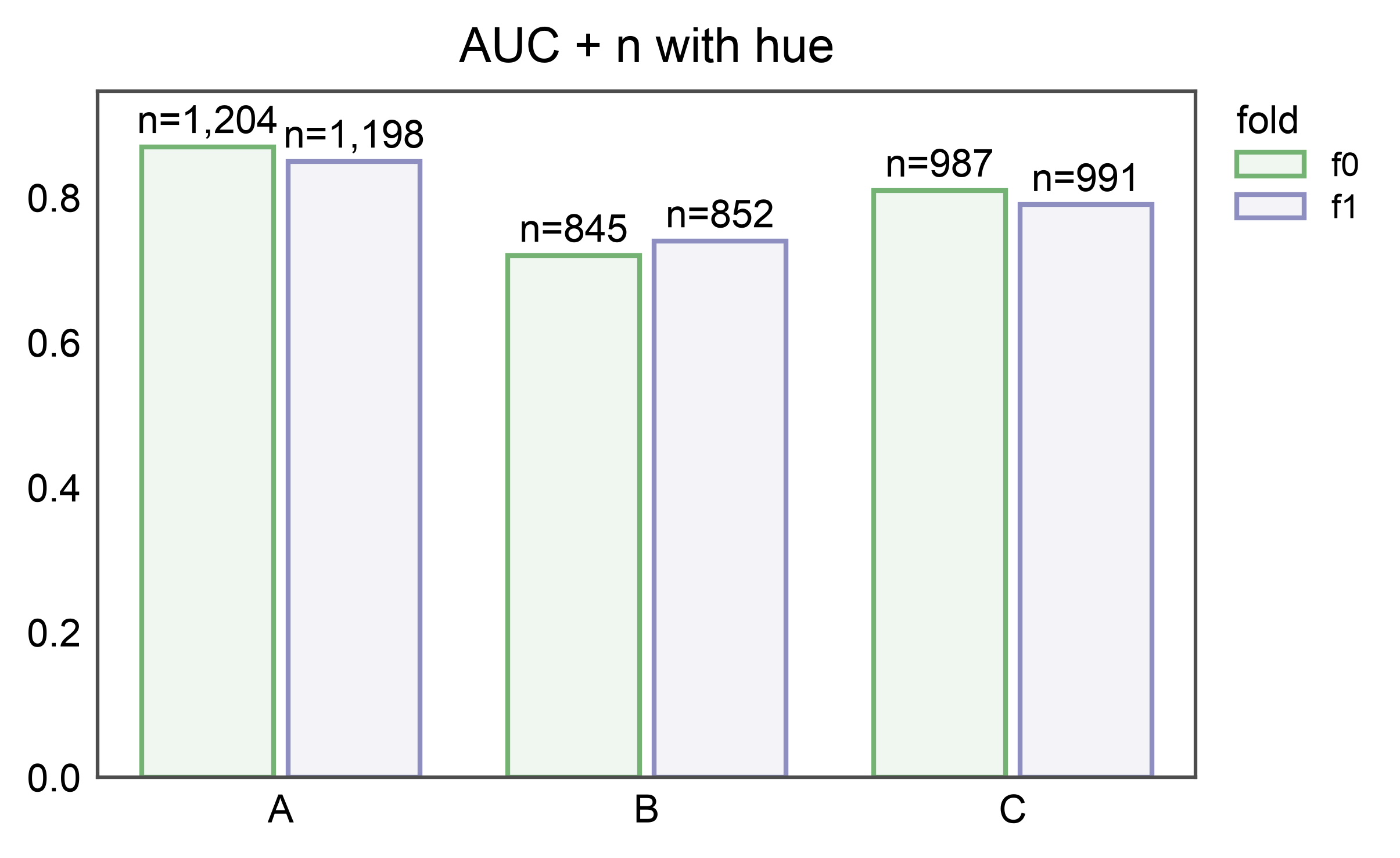
Column source with hue
Label alignment follows the same dodge rules as pp.barplot: columns
are looked up by the (category, hue, hatch) group key, so labels
are paired with the correct bar even when hue is active.
hue_df = pd.DataFrame({
    "group": pd.Categorical(
        ["A", "A", "B", "B", "C", "C"],
        categories=["A", "B", "C"],
    ),
    "fold":  pd.Categorical(
        ["f0", "f1", "f0", "f1", "f0", "f1"],
        categories=["f0", "f1"],
    ),
    "auc":   [0.87, 0.85, 0.72, 0.74, 0.81, 0.79],
    "n":     [1204, 1198, 845, 852, 987, 991],
})
ax = pp.barplot(
    data=hue_df, x="group", y="auc", hue="fold",
    title="AUC + n with hue",
)
pp.annotate(ax, kind="bar_custom", labels="n", fmt="n={:,}")
pp.show()
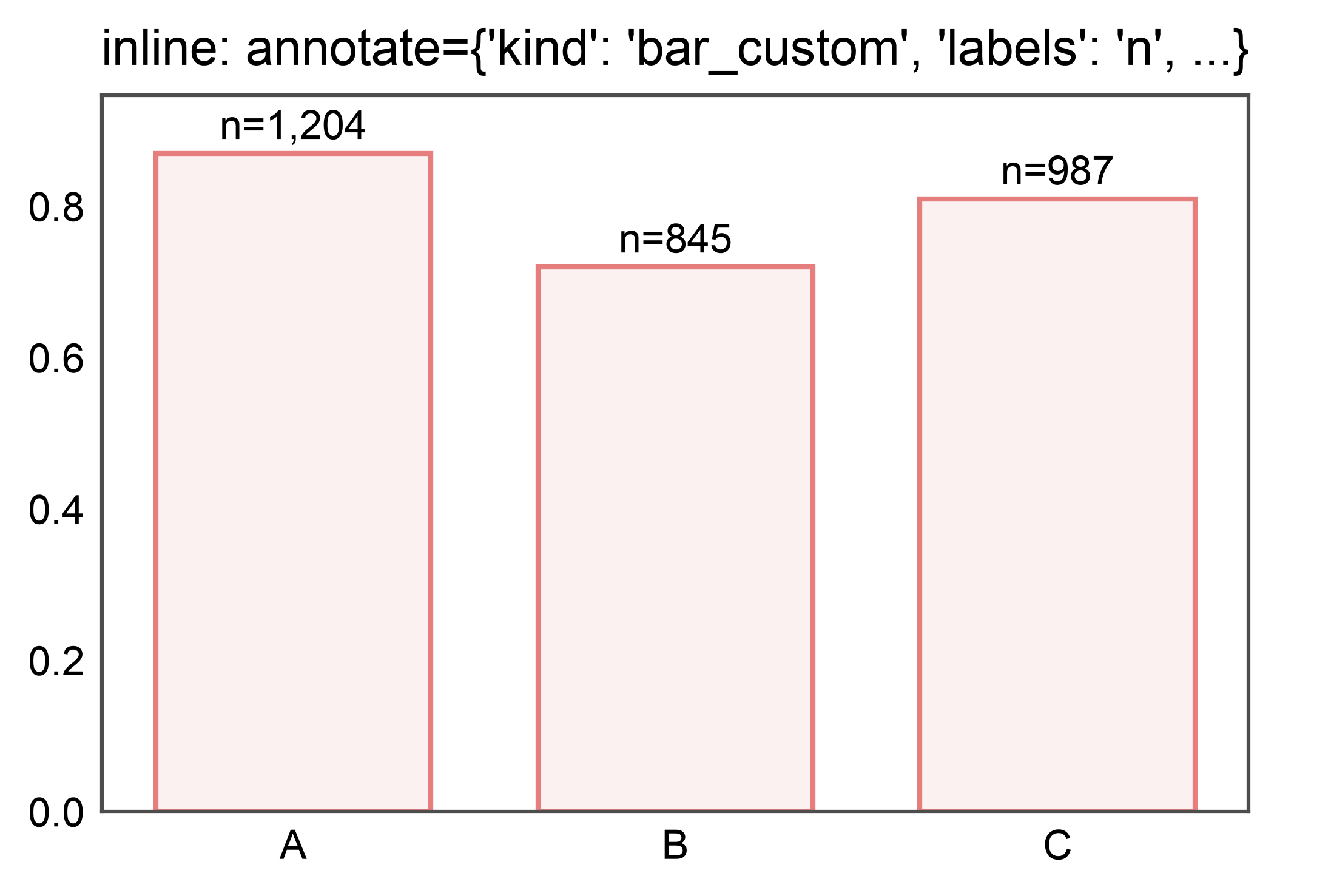
Inline via pp.barplot(annotate={"kind": "bar_custom", ...})
For brevity, pass the strategy and its options directly to
pp.barplot via the annotate= kwarg — the plotter dispatches
to bar_custom internally.
ax = pp.barplot(
    data=auc_df, x="group", y="auc",
    annotate={"kind": "bar_custom", "labels": "n", "fmt": "n={:,}"},
    title="inline: annotate={'kind': 'bar_custom', 'labels': 'n', ...}",
)
pp.show()
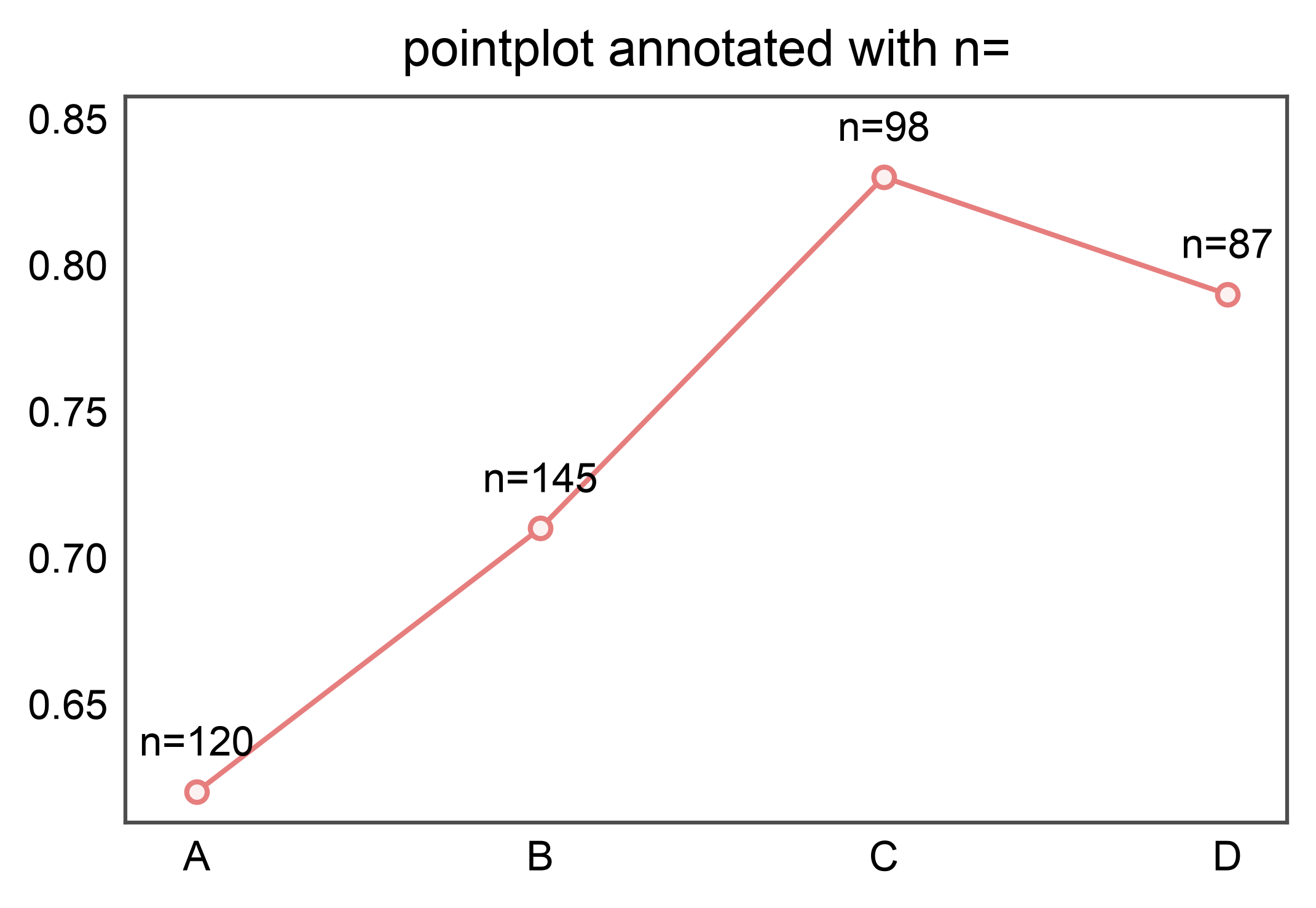
kind="point_custom": per-point column labels
Same labels=(column|callable) contract as bar_custom, but for
pp.pointplot. Label each point with a sibling column (here,
sample count) aligned by the same (x, hue) group keys that
pp.pointplot used.
point_df = pd.DataFrame({
    "group": pd.Categorical(
        ["A", "B", "C", "D"], categories=["A", "B", "C", "D"],
    ),
    "auc": [0.62, 0.71, 0.83, 0.79],
    "n":   [120, 145, 98, 87],
})
ax = pp.pointplot(data=point_df, x="group", y="auc",
                   title="pointplot annotated with n=")
pp.annotate(ax, kind="point_custom", labels="n", fmt="n={:,}",
            anchor="top")
pp.show()
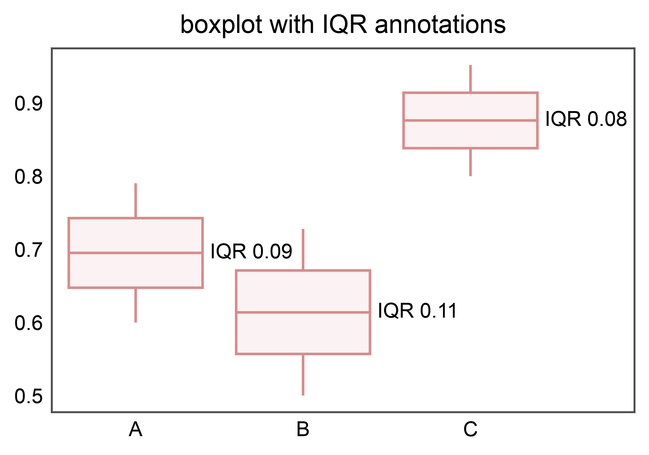
kind="box_custom": per-box callable labels
labels= accepts a callable (BoxStatsRecord) -> str. Use
record.stats to read any of the six statistics on the fly
(median, q1, q3, whisker_low, whisker_high, mean) — here, the
IQR alongside the group position.
box_df = pd.DataFrame({
    "group": pd.Categorical(
        (["A"] * 20 + ["B"] * 20 + ["C"] * 20),
        categories=["A", "B", "C"],
    ),
    "score": (
        list(0.6 + 0.01 * i for i in range(20))
        + list(0.5 + 0.012 * i for i in range(20))
        + list(0.8 + 0.008 * i for i in range(20))
    ),
})
ax = pp.boxplot(data=box_df, x="group", y="score",
                 title="boxplot with IQR annotations")
pp.annotate(
    ax, kind="box_custom",
    labels=lambda r: f"IQR {r.stats['q3'] - r.stats['q1']:.2f}",
    anchor="right",
)
pp.show()
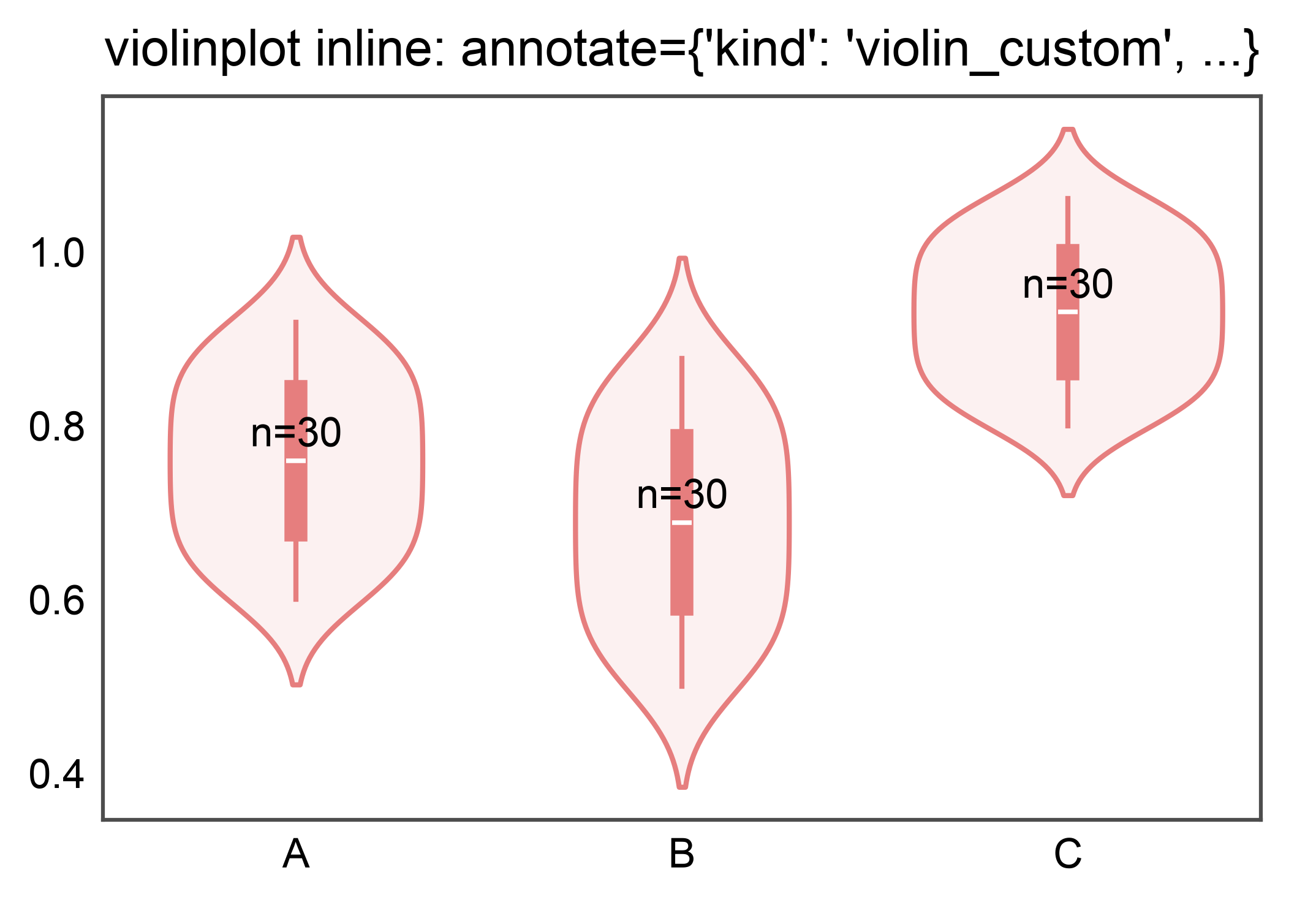
kind="violin_custom": per-violin inline annotation
pp.violinplot(annotate={"kind": "violin_custom", ...}) dispatches
to violin_custom without a follow-up pp.annotate call. Use
the inline form for one-shot figures; reach for the two-call form
when you want to compose multiple annotation layers.
violin_df = pd.DataFrame({
    "group": pd.Categorical(
        (["A"] * 30 + ["B"] * 30 + ["C"] * 30),
        categories=["A", "B", "C"],
    ),
    "score": (
        list(0.6 + 0.011 * i for i in range(30))
        + list(0.5 + 0.013 * i for i in range(30))
        + list(0.8 + 0.009 * i for i in range(30))
    ),
    "n": [30] * 30 + [30] * 30 + [30] * 30,
})
ax = pp.violinplot(
    data=violin_df, x="group", y="score",
    annotate={"kind": "violin_custom", "labels": "n", "fmt": "n={}"},
    title="violinplot inline: annotate={'kind': 'violin_custom', ...}",
)
pp.show()
Total running time of the script: (0 minutes 29.815 seconds)