Note
Go to the end to download the full example code.
JointGrid & Jointplot Examples
publiplots.JointGrid is a three-axes composition — one large
bivariate panel with 1D marginal distributions on top and on the right —
built directly on top of publiplots.subplots()’s asymmetric-grid
support. The convenience wrapper publiplots.jointplot() builds a
JointGrid and plots both panels in a single call, returning the
grid so you can still tweak individual axes afterwards. Five canonical
kind= aliases compose the bivariate primitives shipped by
publiplots: "scatter", "hex", "kde", "reg", "resid".
import publiplots as pp
import pandas as pd
import numpy as np
Basic Jointplot
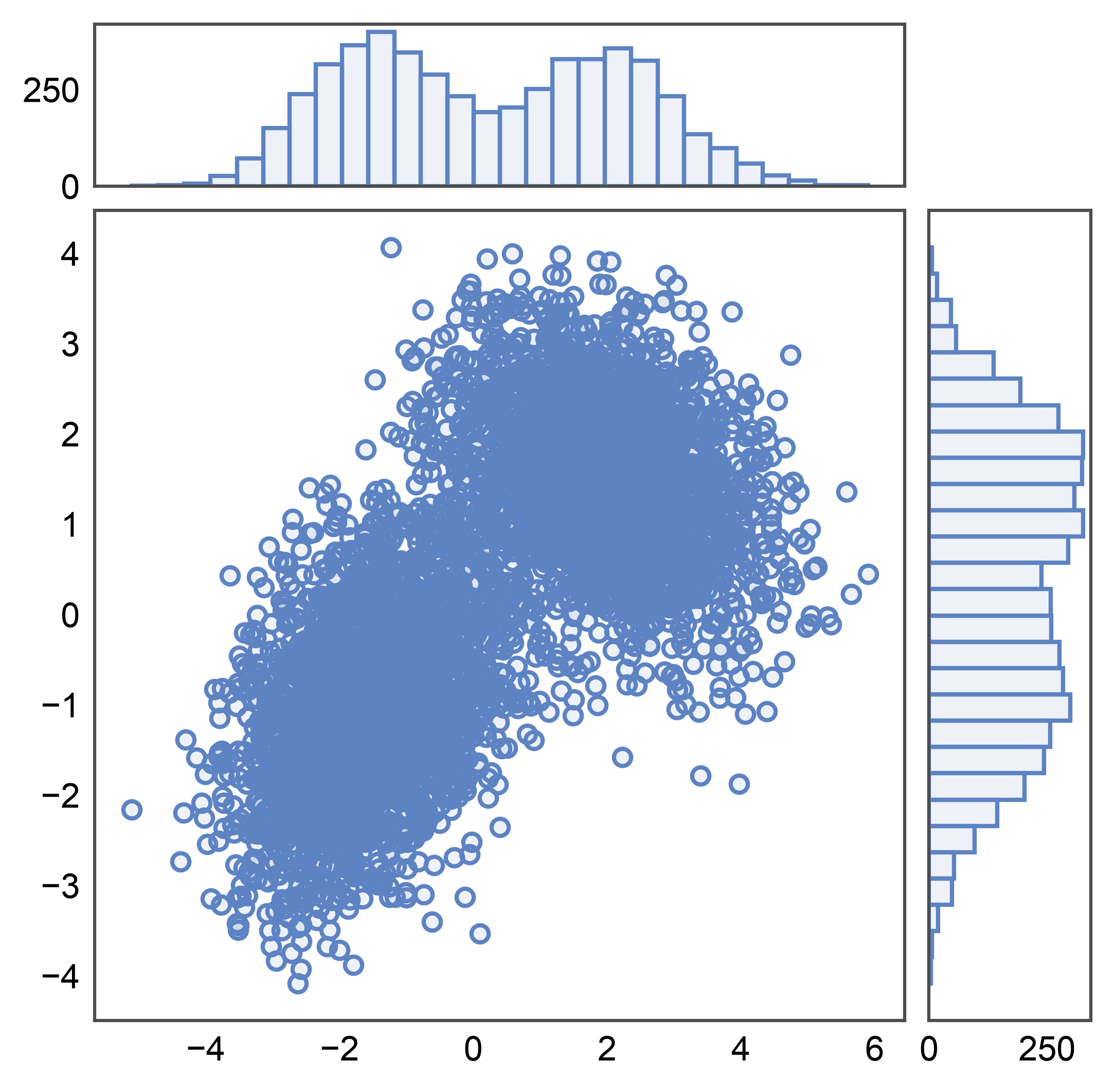
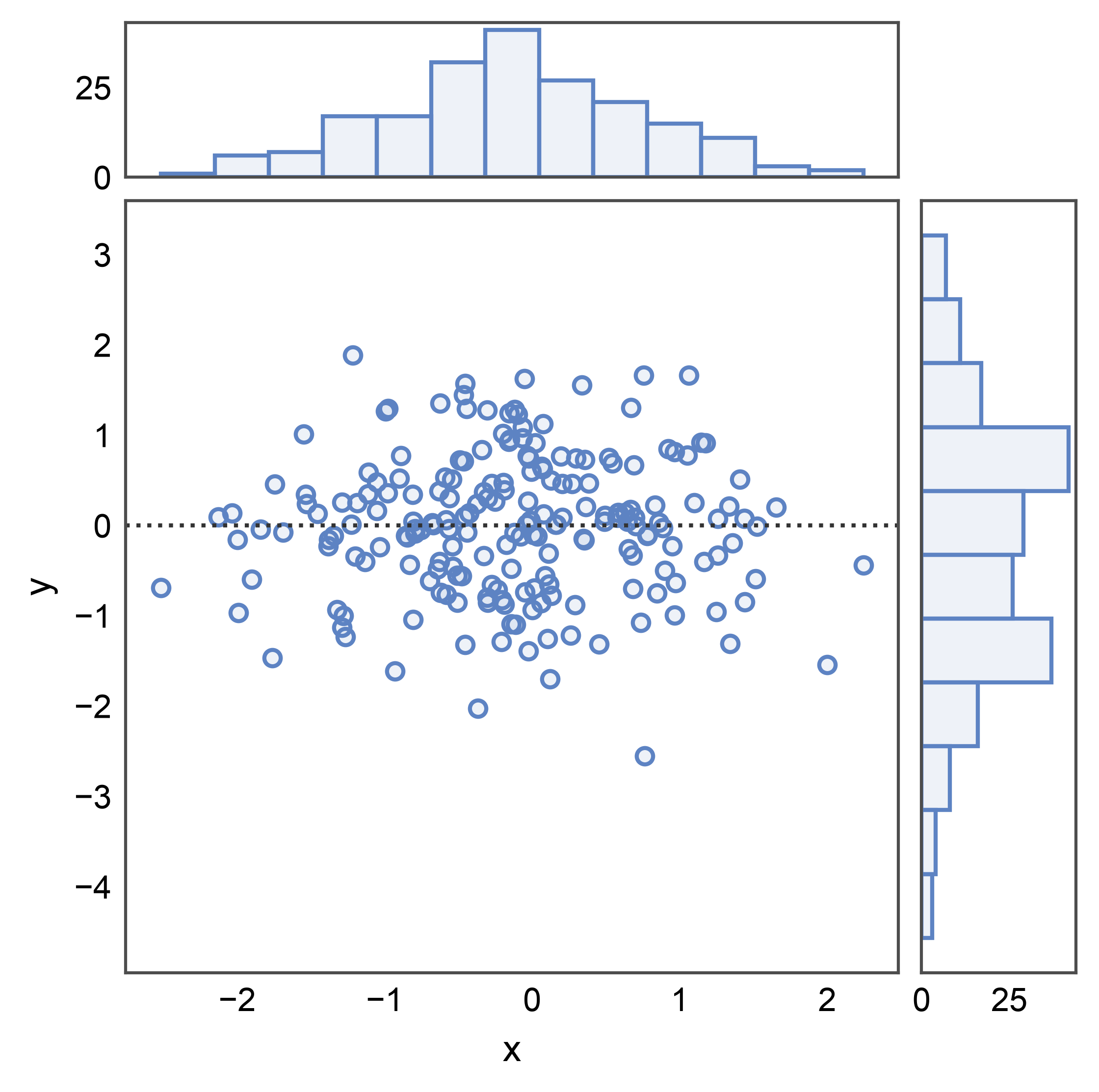
Simplest case: pass a long-form frame to pp.jointplot() with
kind="scatter". The main panel gets a scatter; both marginals get
histograms. The synthetic data here is a 2D Gaussian mixture — two
clusters with mild correlation structure that we’ll reuse across
sections.
rng = np.random.default_rng(0)
n = 5_000
cluster_a = rng.multivariate_normal([-1.5, -1.0], [[1.0, 0.4], [0.4, 1.0]], n // 2)
cluster_b = rng.multivariate_normal([2.0, 1.5], [[1.2, -0.3], [-0.3, 0.8]], n // 2)
mixture = pd.DataFrame(np.vstack([cluster_a, cluster_b]), columns=["x", "y"])

g = pp.jointplot(data=mixture, x="x", y="y", kind="scatter")
pp.show()
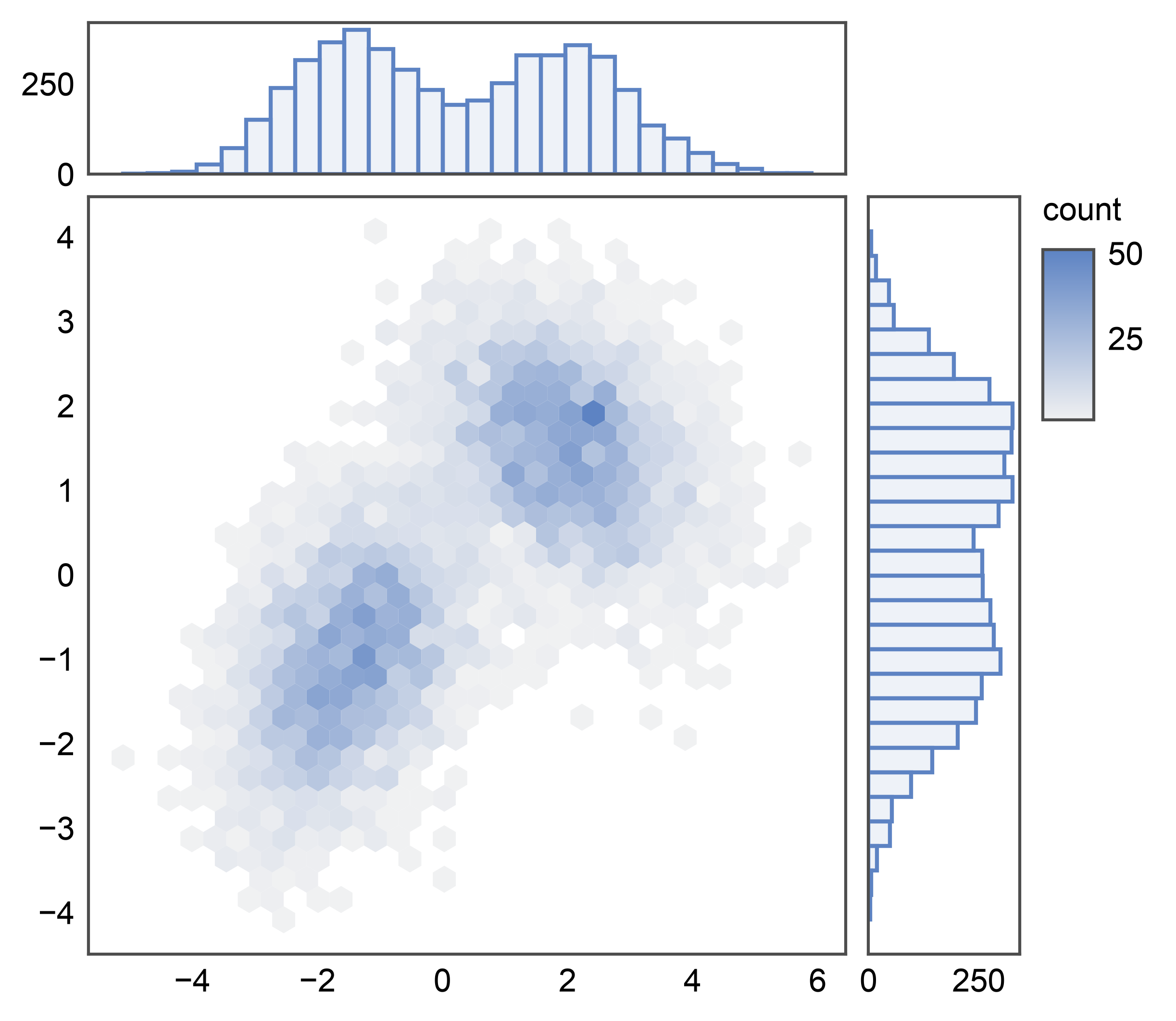
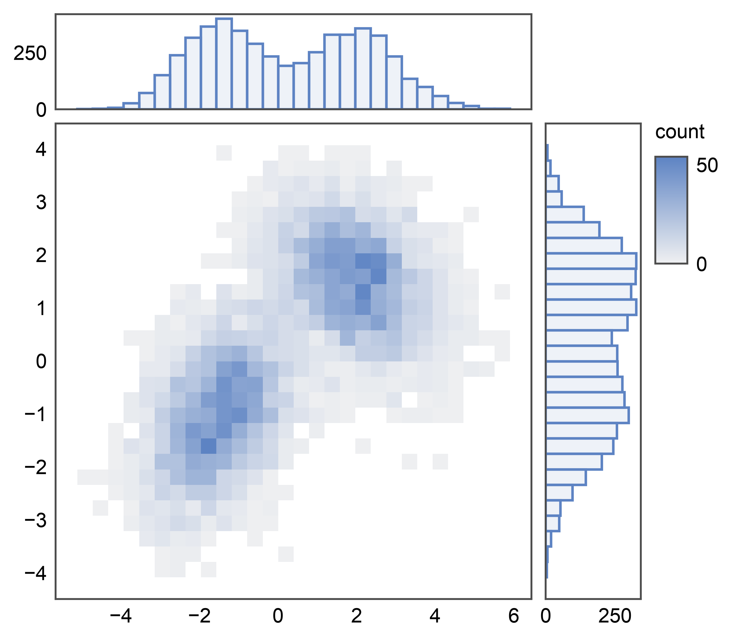
Hexbin Jointplot
With 5k points the scatter above is already dense enough that clusters
start to overplot. Switch kind="hex" for the same grid but with a
publiplots.hexbinplot() on the main panel: a 2D density readout
that scales to millions of points without losing structure. The
colorbar is auto-routed to a figure-level band on the right so it
doesn’t disturb the joint↔marginal gap. Marginals stay as histograms.
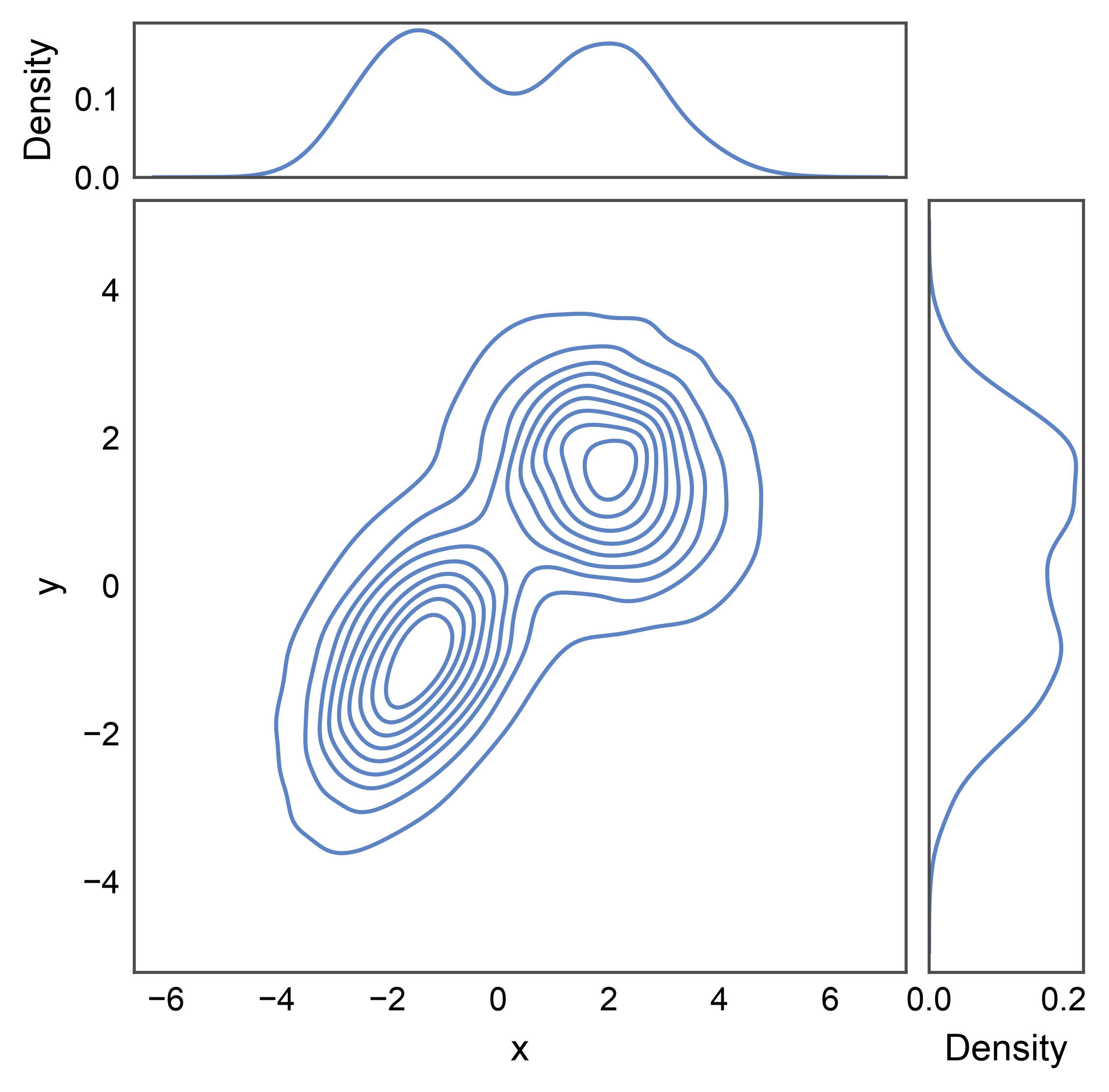
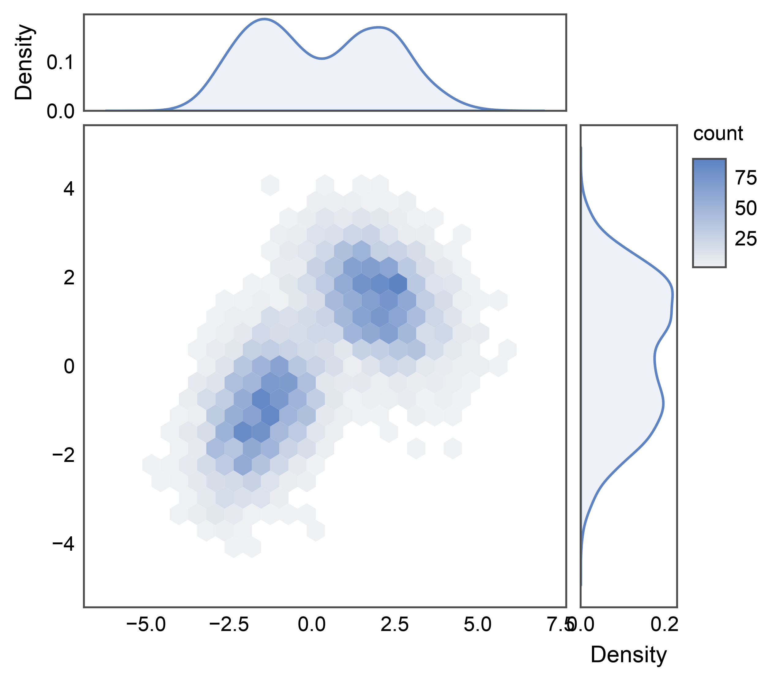
KDE Jointplot
kind="kde" puts a publiplots.kdeplot() 2D contour plot on
the joint and 1D KDE curves on each marginal. Smooths the discrete
point cloud into continuous density estimates — useful when scatter
points are too sparse to read structure but you don’t want hex bins.
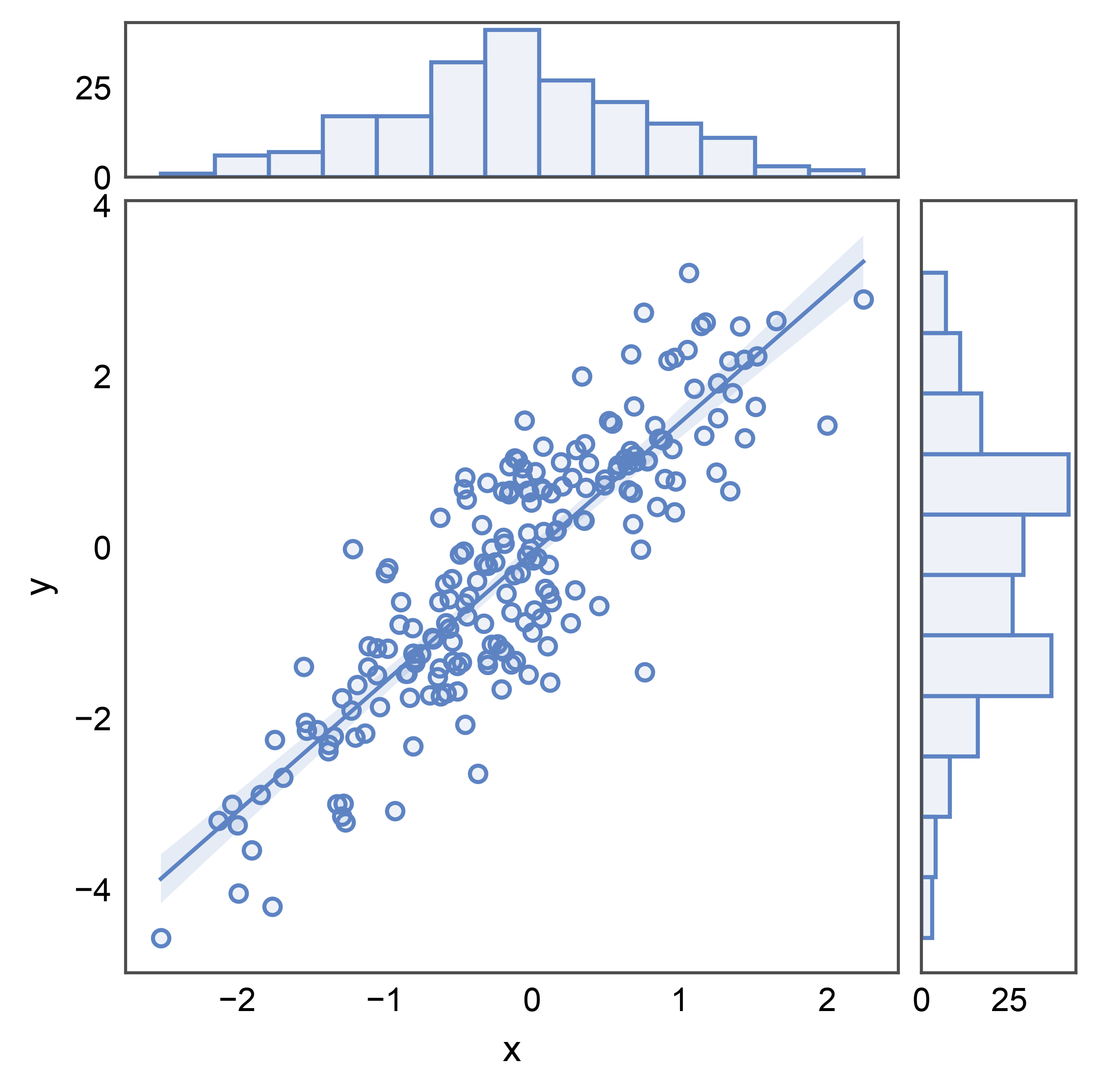
Regression Jointplot
kind="reg" overlays a linear regression with confidence band on
the joint scatter via publiplots.regplot(), with histogram
marginals. Use it when you care about the trend AND the marginal
distributions of the predictor / response.
# Synthetic linear-with-noise dataset for a clearer regression example.
rng = np.random.default_rng(7)
n = 200
x = rng.normal(0, 1, n)
linear = pd.DataFrame({"x": x, "y": 1.5 * x + rng.normal(0, 0.8, n)})

g = pp.jointplot(data=linear, x="x", y="y", kind="reg")
pp.show()
Residual Jointplot
kind="resid" plots the residuals from a linear fit instead of the
raw response, via publiplots.residplot(). A good residual plot
shows no systematic structure — the residuals should look like white
noise around zero. Marginals stay histograms.
Histogram Jointplot
kind="hist" puts a 2D histogram on the joint panel via
pp.histplot()’s 2D mode and 1D histograms on each marginal.
A discretized alternative to kind="hex" — useful when you want
explicit rectangular bins instead of hexagonal ones.
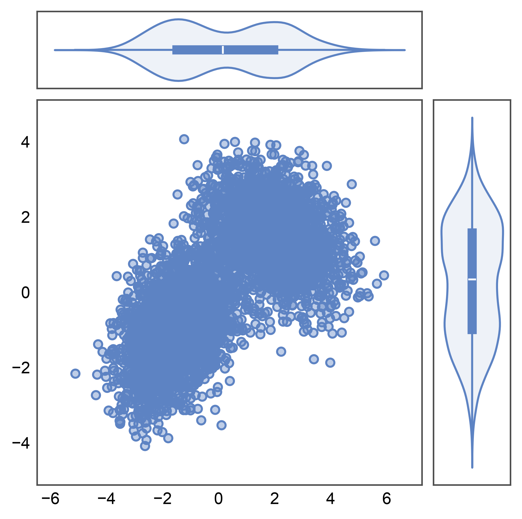
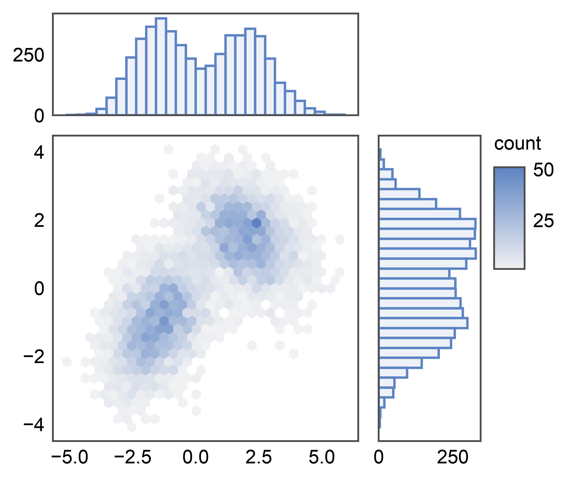
Custom Composition via pp.JointGrid
pp.jointplot is a thin convenience wrapper; when you want
different plot functions or per-slot kwargs, construct the grid
yourself and call plot_joint / plot_marginals. Any publiplots
plot function that accepts data=, x=, y=, ax= works in the joint
slot; for marginals, use 1D-capable pp.* plots — currently
pp.histplot(), pp.kdeplot(), pp.stripplot(),
pp.boxplot(), and pp.violinplot(). Here we mix a hexbin
joint with KDE marginals.
g = pp.JointGrid(data=mixture, x="x", y="y")
g.plot_joint(pp.hexbinplot, gridsize=20)
g.plot_marginals(pp.kdeplot, fill=True)
pp.show()
Violin Marginals
pp.violinplot accepts univariate calls (only x= or only
y=), which makes it a drop-in marginal function for
pp.JointGrid. Each marginal becomes a single violin
summarizing that axis’s distribution — useful when you want
distribution-shape readouts on both axes alongside the joint.
g = pp.JointGrid(data=mixture, x="x", y="y")
g.plot_joint(pp.scatterplot, alpha=0.4)
g.plot_marginals(pp.violinplot)
pp.show()
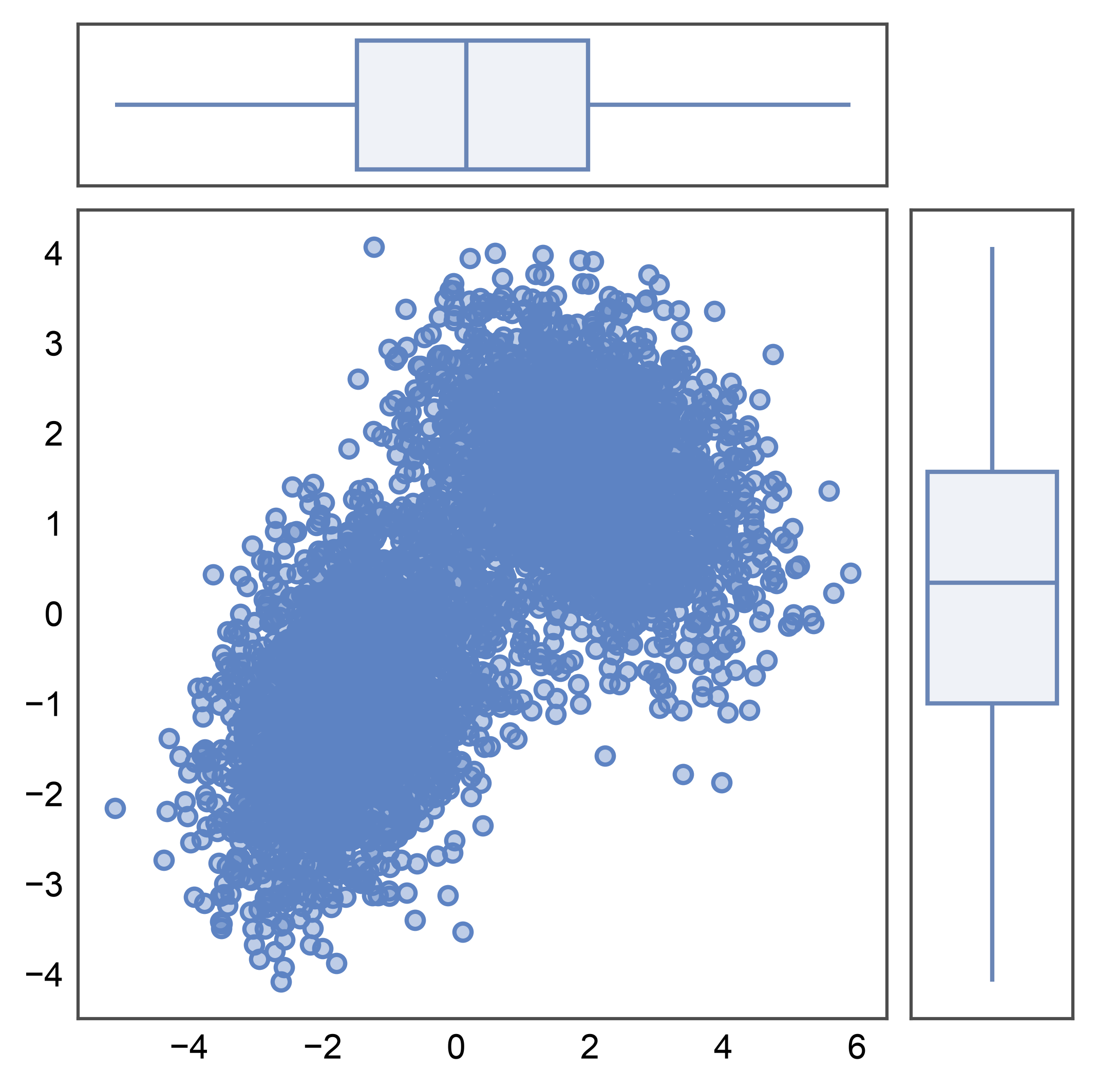
Box Marginals
pp.boxplot works the same way as a univariate marginal. Each
marginal collapses to a single box (median, IQR, whiskers, fliers)
— a compact summary that scales to large joint panels without
crowding.
g = pp.JointGrid(data=mixture, x="x", y="y")
g.plot_joint(pp.scatterplot, alpha=0.4)
g.plot_marginals(pp.boxplot)
pp.show()
Sizing and Spacing
Three layout knobs control the grid geometry, all matching seaborn’s
JointGrid semantics modulo units:
height— total grid budget in millimeters, as a square.ratio— marginal-to-main split (default5: main panel is 5/6 of the grid in each direction, marginals are 1/6).space— gap between panels in mm.None(default) auto-scales withheight(height * 0.025); pass an explicit value to lock the gap in mm for cross-figure consistency.
Here we use a smaller grid, a thicker-marginal ratio, and an explicit 3 mm gap.
Total running time of the script: (0 minutes 7.328 seconds)