Note
Go to the end to download the full example code.
Histogram Examples
This example walks through publiplots.histplot(), built on top of
seaborn’s histplot. Histograms are ideal for inspecting the shape of
a univariate distribution — single or grouped — with optional stacking,
dodging, KDE overlays, and rich stats.
import publiplots as pp
import pandas as pd
import numpy as np
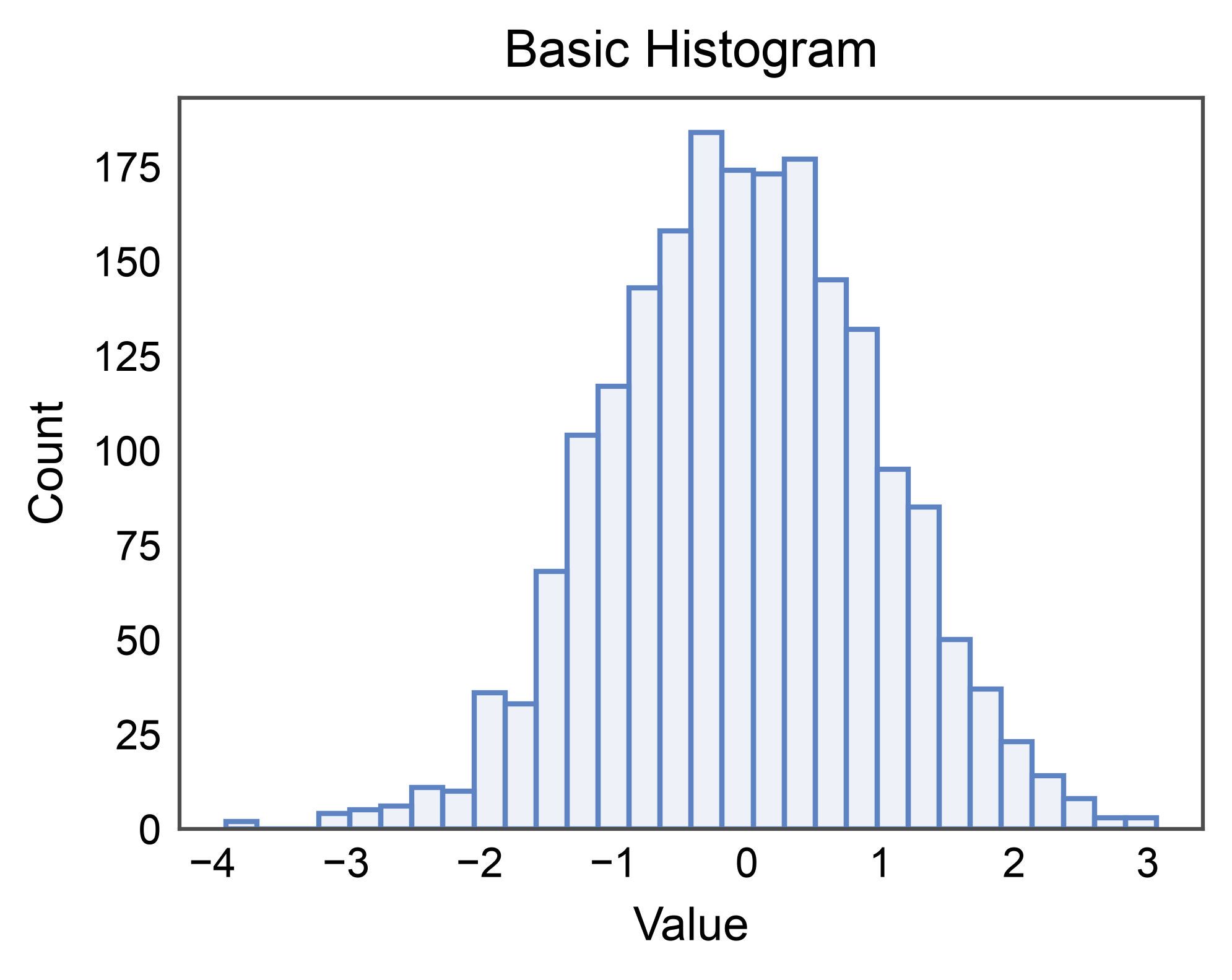
Basic Histogram
Simplest case: one numeric column, default stat="count".
rng = np.random.default_rng(0)
values = pd.DataFrame({"value": rng.normal(0, 1, 2000)})

ax = pp.histplot(
    data=values,
    x="value",
    bins=30,
    title="Basic Histogram",
    xlabel="Value",
    ylabel="Count",
)
pp.show()
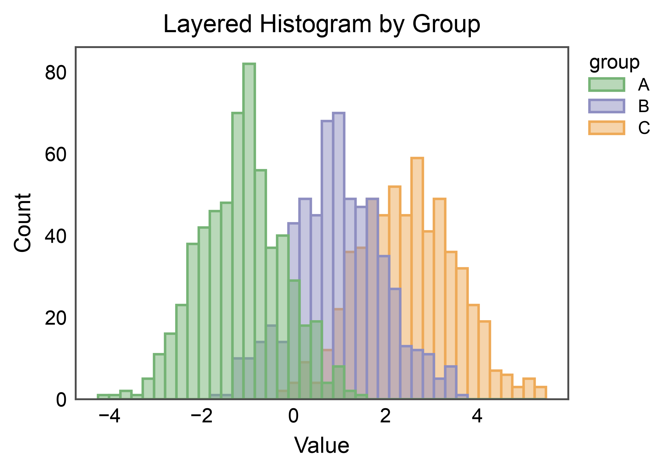
Grouped Histogram (layered)
With hue, each level gets its own color from the palette. The
default multiple="layer" overlays distributions with translucent
fills so overlap regions are visible.
rng = np.random.default_rng(7)
mix = pd.DataFrame({
    "value": np.r_[rng.normal(-1.0, 1, 600),
                   rng.normal( 1.0, 1, 600),
                   rng.normal( 2.5, 1, 600)],
    "group": ["A"] * 600 + ["B"] * 600 + ["C"] * 600,
})

ax = pp.histplot(
    data=mix,
    x="value",
    hue="group",
    bins=40,
    palette="pastel",
    alpha=0.5,
    title="Layered Histogram by Group",
    xlabel="Value",
    ylabel="Count",
)
pp.show()
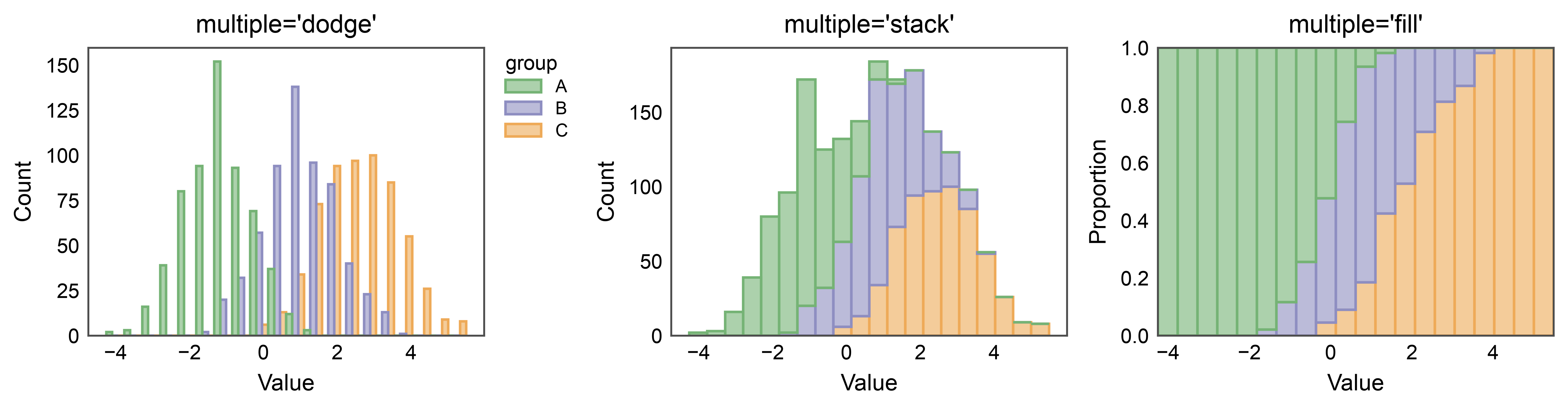
Dodge, Stack, and Fill
multiple= changes how hue levels are combined per bin.
"dodge" places them side-by-side; "stack" piles them; "fill"
normalizes per-bin totals to 1 so the plot shows proportions.
fig, axes = pp.subplots(nrows=1, ncols=3, axes_size=(55, 40))
for ax_, mode in zip(axes.flat, ["dodge", "stack", "fill"]):
    pp.histplot(
        data=mix, x="value", hue="group", bins=20,
        multiple=mode, palette="pastel", alpha=0.6,
        ax=ax_, title=f"multiple={mode!r}",
        xlabel="Value", ylabel="Count" if mode != "fill" else "Proportion",
        legend=(mode == "dodge"),
    )
pp.show()
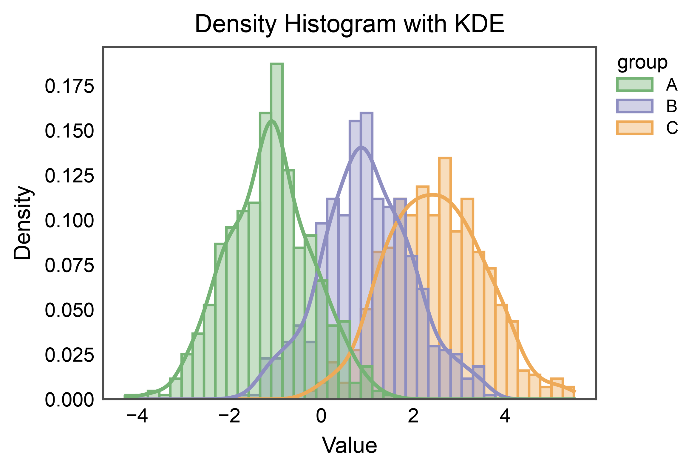
Density + KDE Overlay
Switch to stat="density" so the histogram integrates to 1, then
enable kde=True to overlay a kernel density estimate per group.
ax = pp.histplot(
    data=mix,
    x="value",
    hue="group",
    stat="density",
    kde=True,
    palette="pastel",
    alpha=0.4,
    bins=40,
    title="Density Histogram with KDE",
    xlabel="Value",
    ylabel="Density",
)
pp.show()
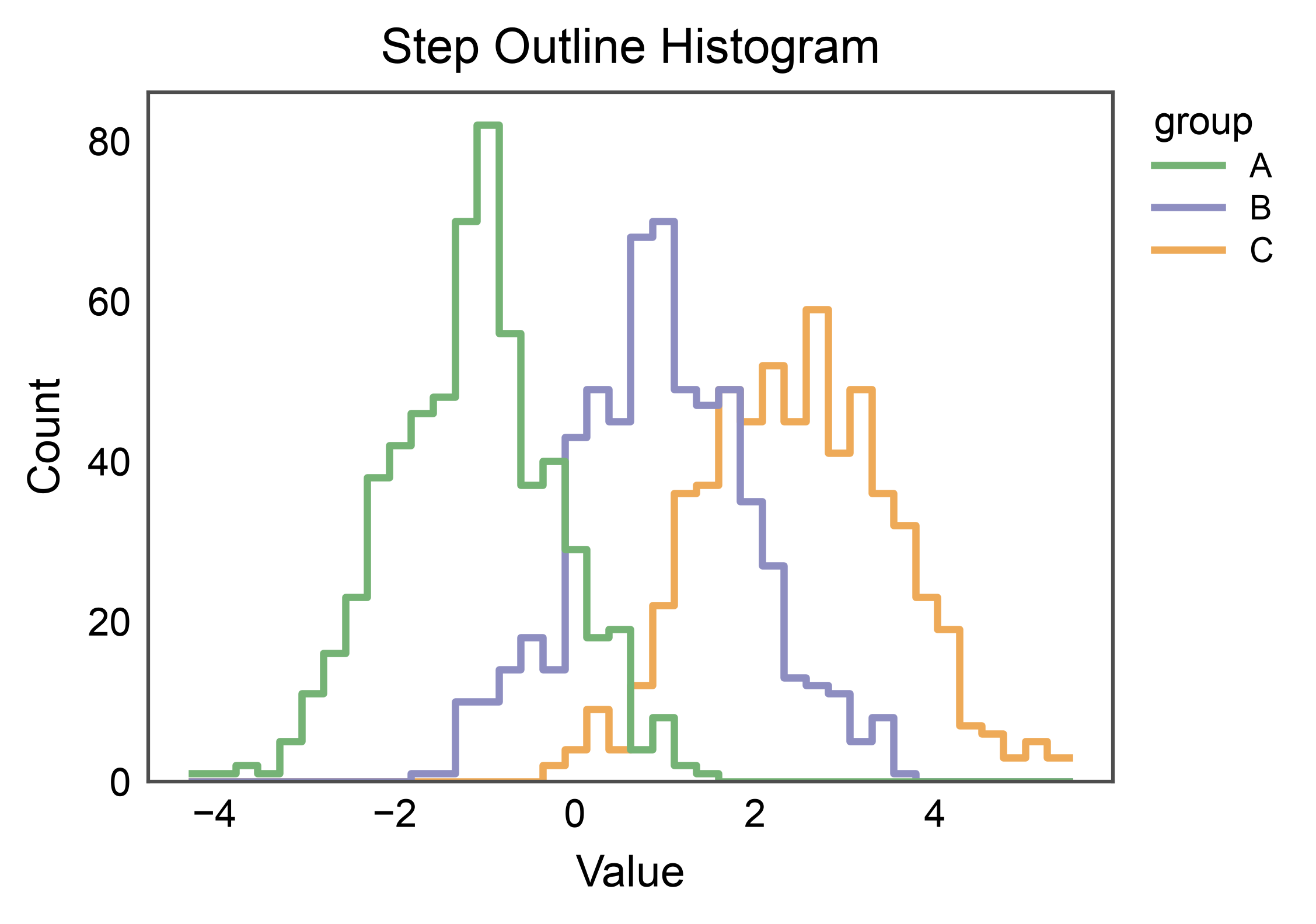
Step Outline (Unfilled)
element="step" draws a piecewise-constant outline. With
fill=False the bars are replaced by clean contours — useful for
comparing many groups without visual clutter.
ax = pp.histplot(
    data=mix,
    x="value",
    hue="group",
    element="step",
    fill=False,
    bins=40,
    palette="pastel",
    linewidth=1.5,
    title="Step Outline Histogram",
    xlabel="Value",
    ylabel="Count",
)
pp.show()
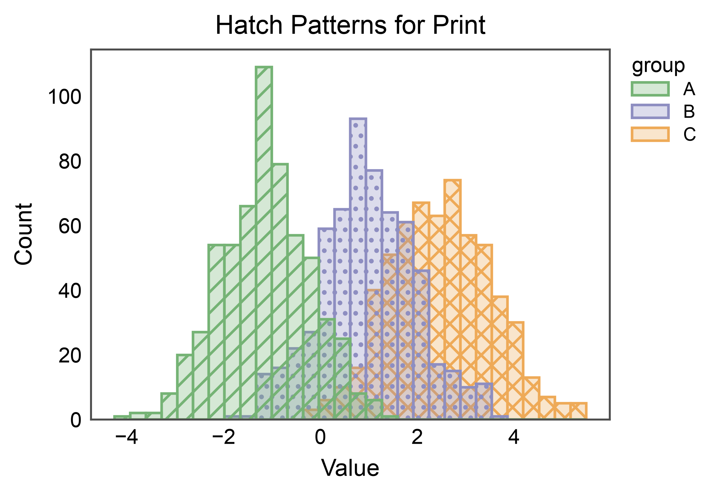
Hatch Patterns
For B&W-friendly figures, assign a hatch pattern per group alongside
color. In v1, hatch= is supported with multiple="layer" and
with hue=None. Override per-level patterns with hatch_map=.
ax = pp.histplot(
    data=mix,
    x="value",
    hue="group",
    hatch="group",
    hatch_map={"A": "///", "B": "...", "C": "xxx"},
    palette="pastel",
    bins=30,
    alpha=0.3,
    title="Hatch Patterns for Print",
    xlabel="Value",
    ylabel="Count",
)
pp.show()
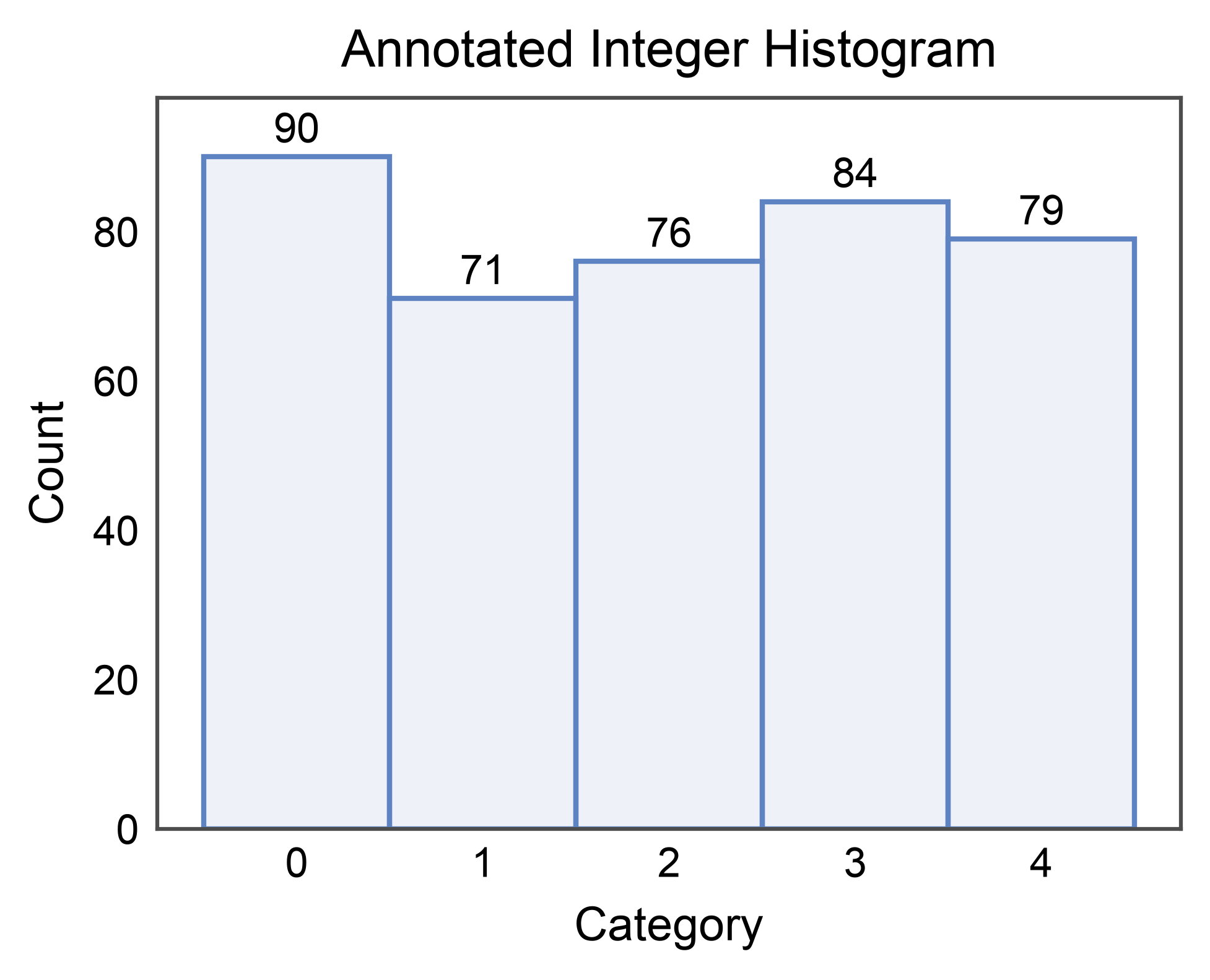
Annotated Bar Counts
annotate=True labels each bar with its value (only supported for
element="bars"). Pass a dict to forward options to
publiplots.annotate() (format strings, offsets, anchors, …).
rng = np.random.default_rng(11)
discrete = pd.DataFrame({"category": rng.integers(0, 5, 400)})

ax = pp.histplot(
    data=discrete,
    x="category",
    bins=5,
    discrete=True,
    annotate={"fmt": ".0f"},
    title="Annotated Integer Histogram",
    xlabel="Category",
    ylabel="Count",
)
pp.show()
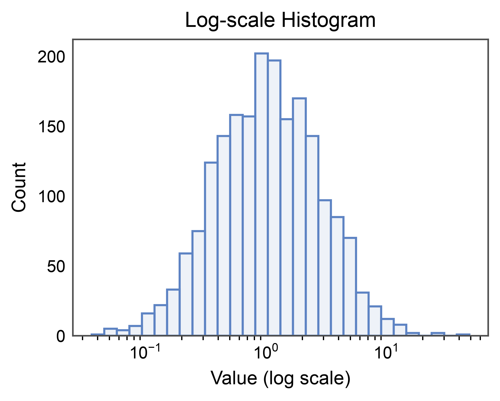
Log Scale
Long-tailed data is easier to read on a log axis. log_scale=True
switches the value axis to log and rebins appropriately.
rng = np.random.default_rng(3)
heavy_tail = pd.DataFrame({"x": rng.lognormal(0, 1, 2000)})

ax = pp.histplot(
    data=heavy_tail,
    x="x",
    bins=30,
    log_scale=True,
    title="Log-scale Histogram",
    xlabel="Value (log scale)",
    ylabel="Count",
)
pp.show()
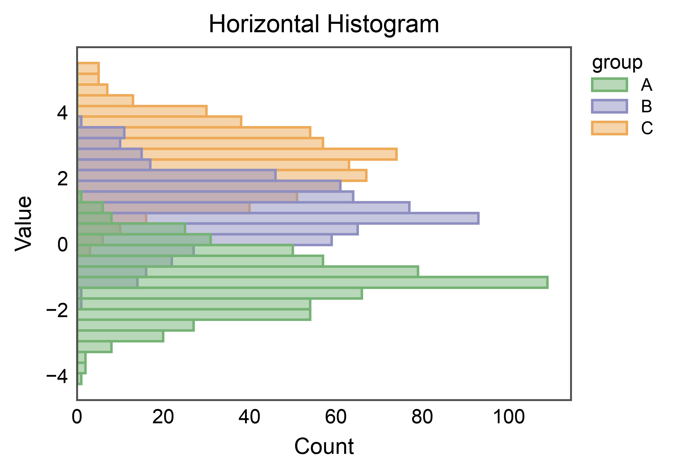
Horizontal Histogram
Pass y= instead of x= to rotate the histogram 90 degrees.
Useful for stacking next to categorical axes in multipanel figures.
ax = pp.histplot(
    data=mix,
    y="value",
    hue="group",
    bins=30,
    palette="pastel",
    alpha=0.5,
    title="Horizontal Histogram",
    xlabel="Count",
    ylabel="Value",
)
pp.show()
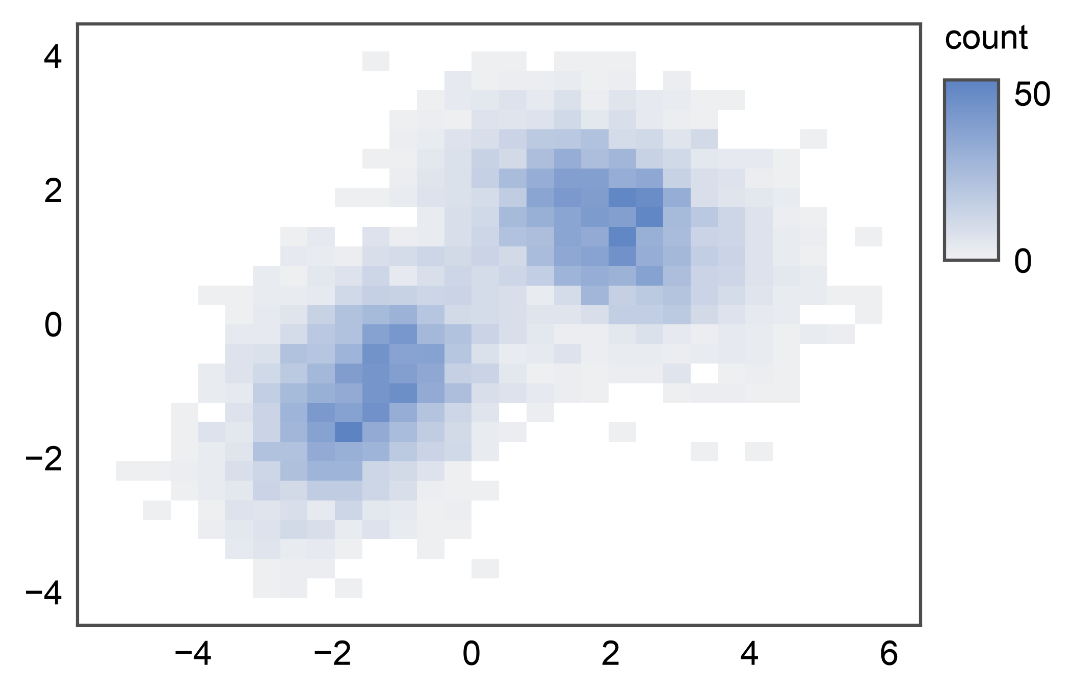
2D Histogram (Bivariate)
Pass both x= and y= to render a 2D histogram — a heatmap-
like bivariate density readout where each cell colors by the count
(or whatever stat= resolves to). The colorbar lands on the
figure-level legend band on the right. With many points, this is a
useful alternative to pp.hexbinplot() when you want explicit
rectangular bins.
rng = np.random.default_rng(0)
n = 5_000
cluster_a = rng.multivariate_normal([-1.5, -1.0], [[1.0, 0.4], [0.4, 1.0]], n // 2)
cluster_b = rng.multivariate_normal([2.0, 1.5], [[1.2, -0.3], [-0.3, 0.8]], n // 2)
mixture = pd.DataFrame(np.vstack([cluster_a, cluster_b]), columns=["x", "y"])

ax = pp.histplot(data=mixture, x="x", y="y")
pp.show()
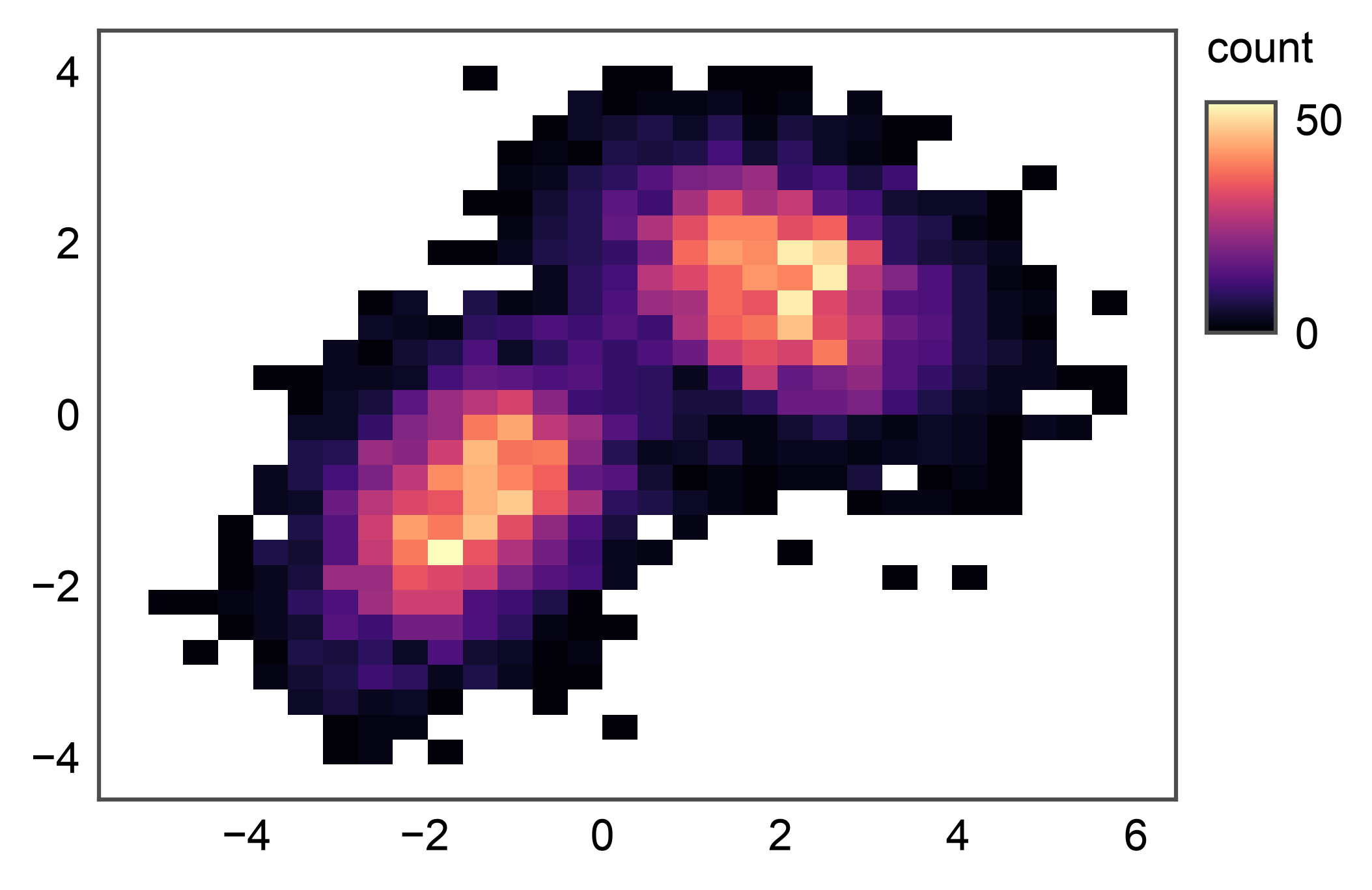
2D Histogram with Custom Colormap
By default the cmap is a light sequential gradient built from
pp.rcParams["color"] so 2D primitives match the rest of
publiplots’ theme. Pass cmap= to override with any matplotlib
or seaborn cmap name. Pair with vmin=/vmax= to clip the
color scale.
ax = pp.histplot(data=mixture, x="x", y="y", cmap="magma")
pp.show()
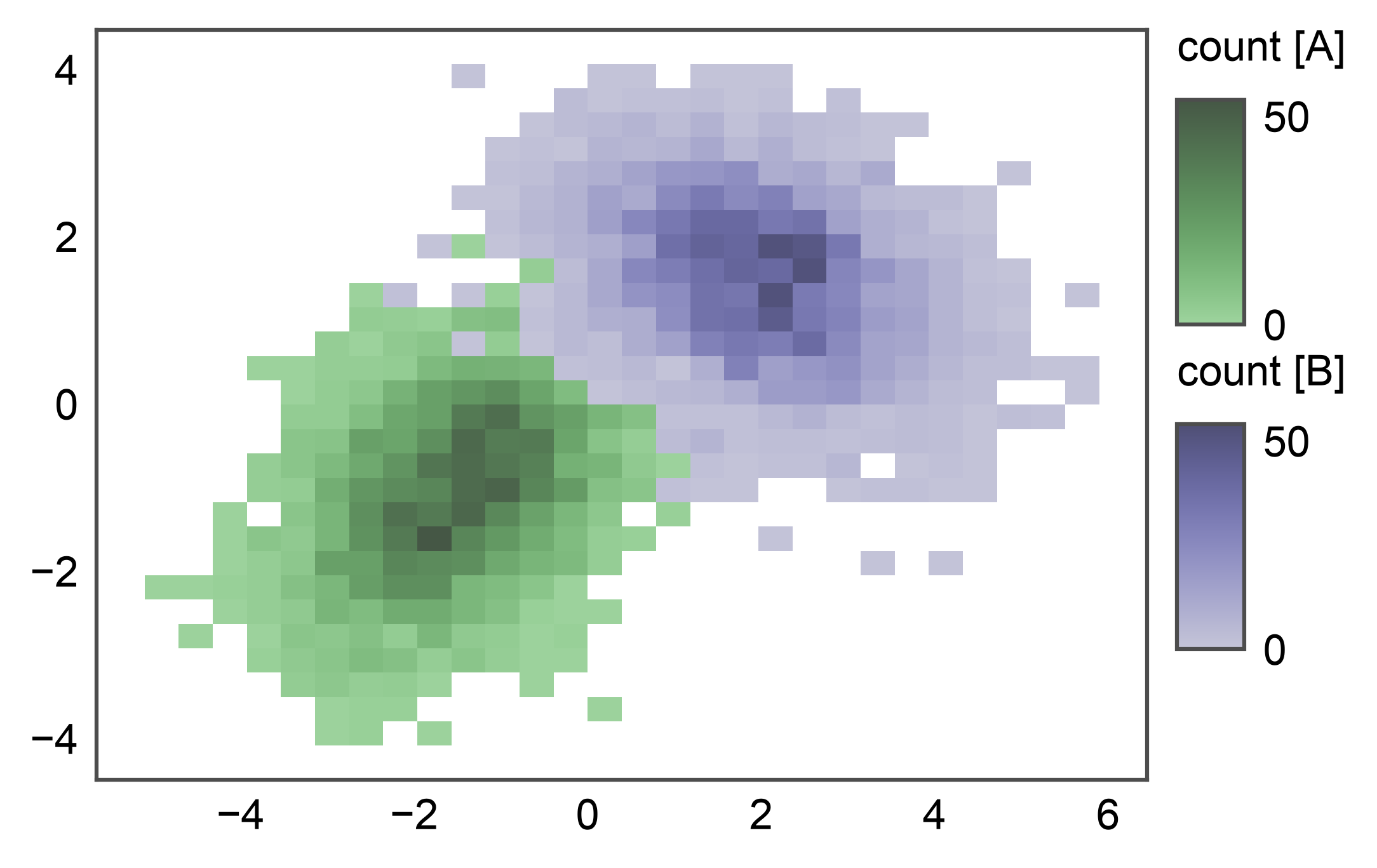
2D Histogram with Hue
Pass hue= to overlay one heatmap per hue level. Each level
draws its own QuadMesh tinted by the palette, and the legend
stacks one colorbar per level (e.g. count [A] / count [B])
so per-subgroup count magnitudes stay readable. Useful for two or
three labeled subgroups in 2D — for more than three levels, prefer
faceting via pp.subplots().
Total running time of the script: (0 minutes 10.157 seconds)