Note
Go to the end to download the full example code.
Kdeplot Examples
publiplots.kdeplot() renders kernel density estimates in both
univariate (1D curve / filled density) and bivariate (2D contour) modes.
Reach for it when the distribution itself is the story — either to
compare smooth marginals across groups (1D + hue) or to show the shape
of a 2D point cloud without the clutter of individual markers.
Dispatch mirrors seaborn.kdeplot(): supply one of x or y
for a 1D density; supply both for a 2D contour plot. In the 2D case,
cbar=True routes the colorbar through the publiplots legend reactor
(so pp.legend(side=...) etc. work identically to
publiplots.hexbinplot()).
import numpy as np
import pandas as pd

import publiplots as pp

kdeplot = pp.kdeplot

rng = np.random.default_rng(0)
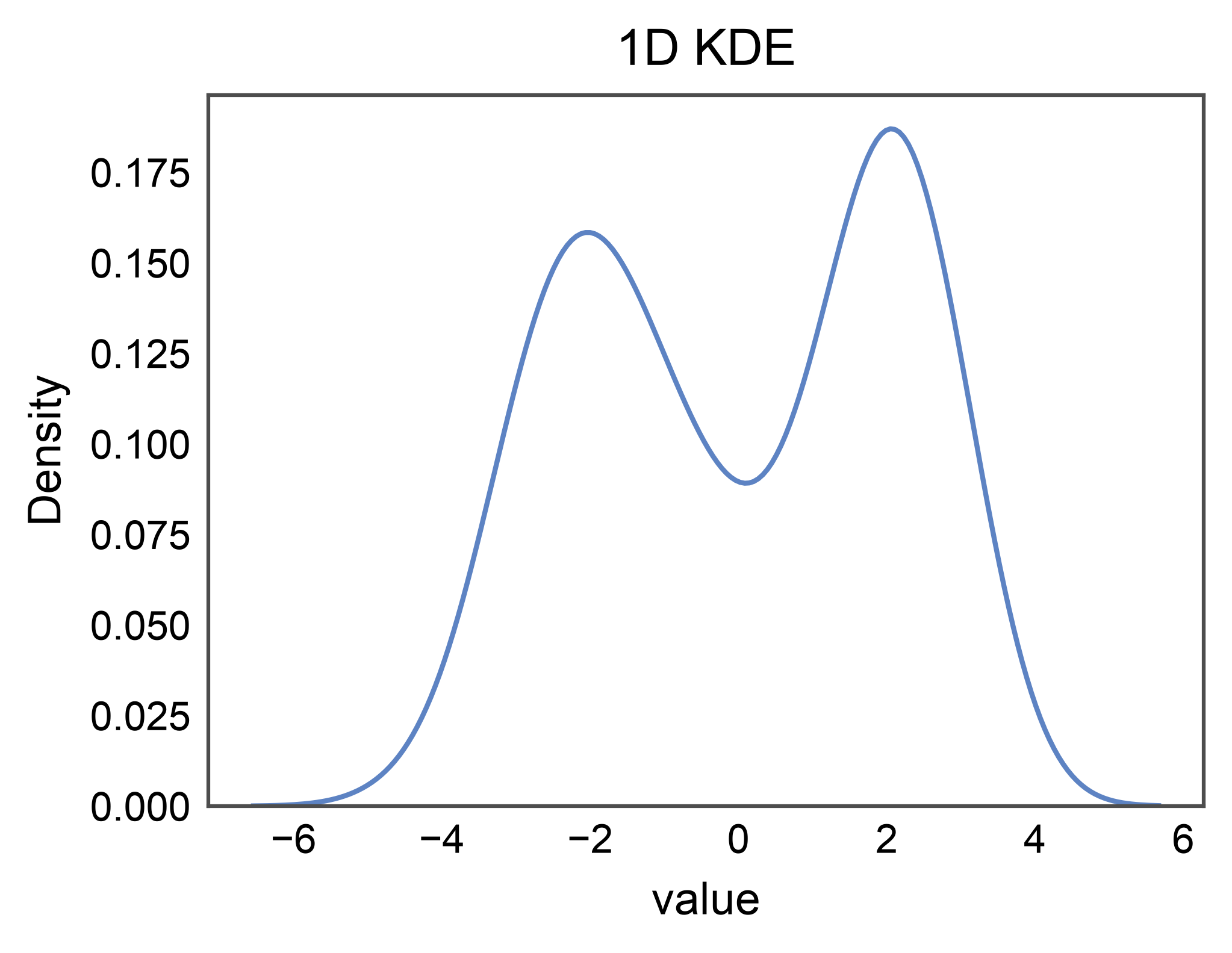
Basic 1D Univariate Density
The simplest case: pass a single x column and you get a smooth
density curve. No hue, no legend entry is stashed.
univariate = pd.DataFrame({
    "value": np.concatenate([
        rng.normal(-2.0, 1.0, 100),
        rng.normal(2.0, 0.8, 100),
    ]),
})

ax = kdeplot(
    data=univariate,
    x="value",
    title="1D KDE",
    xlabel="value",
)
pp.show()
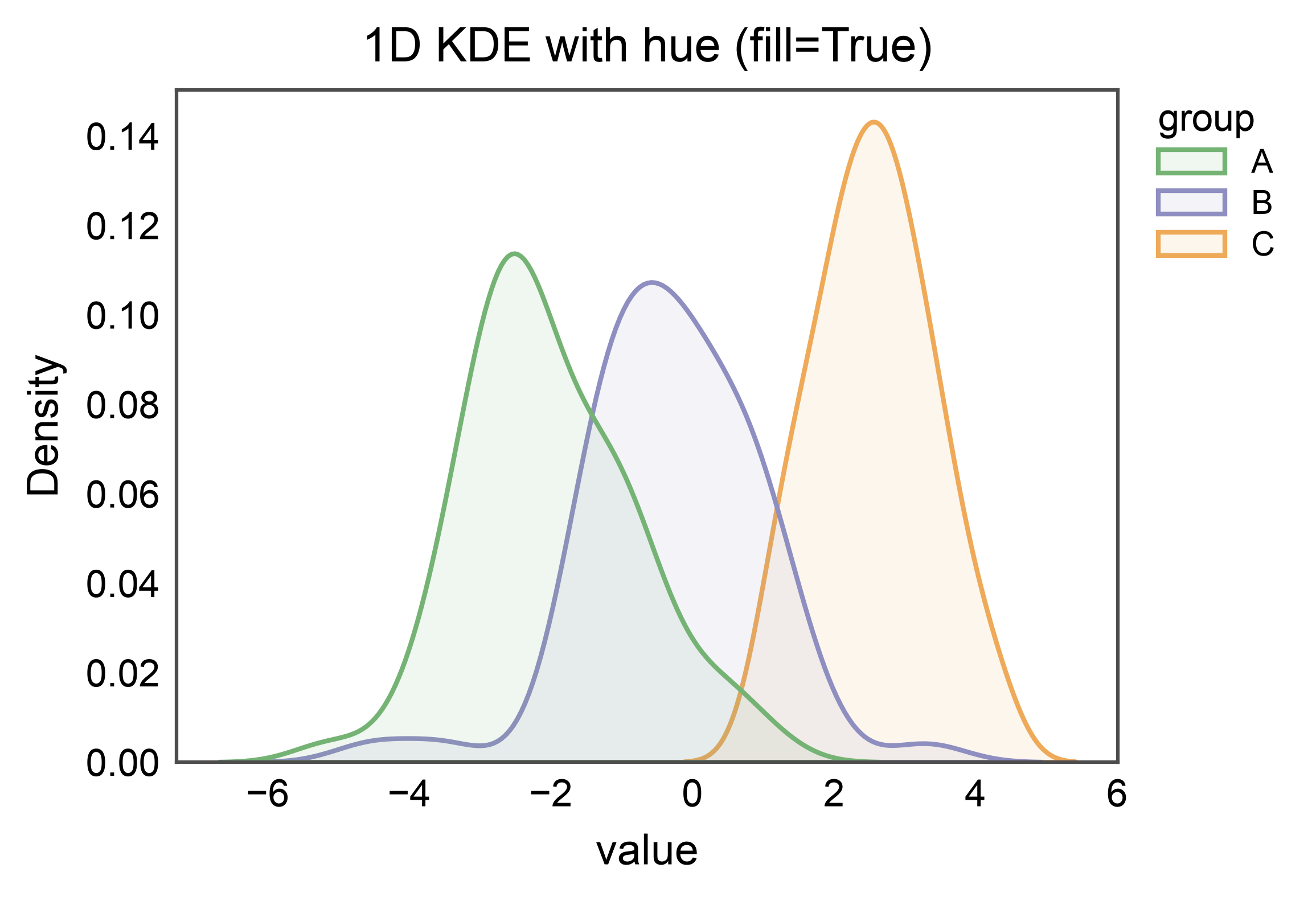
1D with Hue + Filled Regions
Add a hue= column to overlay per-group densities. fill=True
produces filled-area curves with the publiplots transparent-fill /
opaque-edge styling, and the legend entry carries rectangle swatches.
groups = pd.DataFrame({
    "value": np.concatenate([
        rng.normal(-2.0, 1.0, 60),
        rng.normal(0.0, 1.2, 60),
        rng.normal(2.5, 0.9, 60),
    ]),
    "group": ["A"] * 60 + ["B"] * 60 + ["C"] * 60,
})

ax = kdeplot(
    data=groups,
    x="value",
    hue="group",
    fill=True,
    palette="pastel",
    title="1D KDE with hue (fill=True)",
    xlabel="value",
)
pp.show()
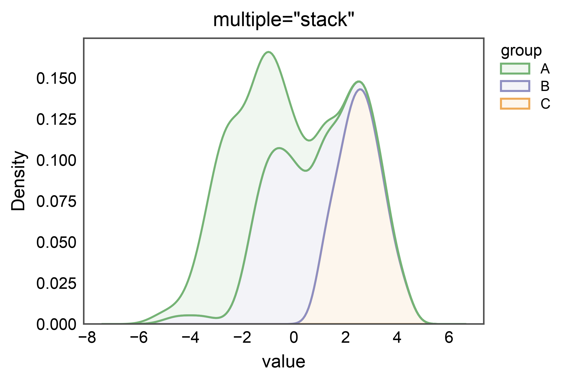
Stacked 1D Densities
multiple="stack" stacks per-group densities so the total
integrates to the unnormalized-count density — useful when the
relative contribution of each group at a given x matters more than
each group’s own shape.
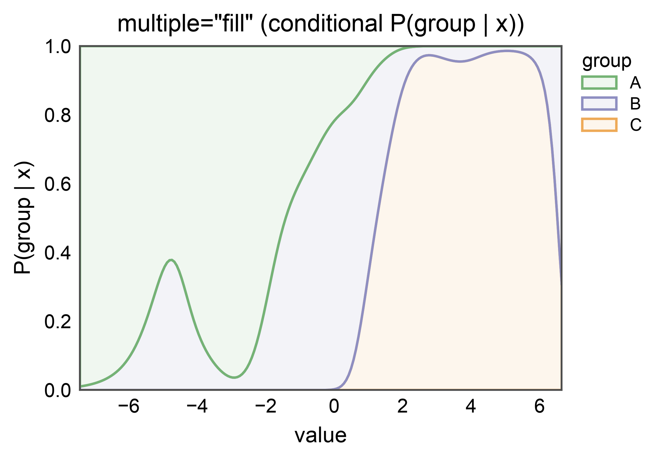
100%-Stacked Densities (Conditional Probability)
multiple="fill" re-normalizes the stack to a constant total of 1,
so each band reads as the conditional probability of belonging to
that hue level given x. Use this when “which group dominates
here?” is the question the plot should answer.
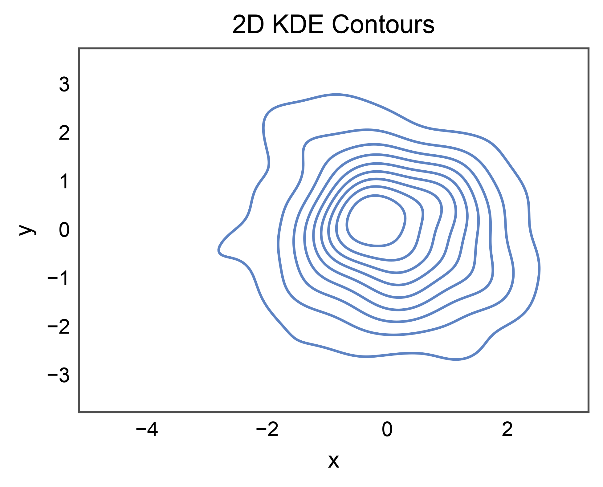
2D Bivariate Contours
Provide both x and y for an iso-density contour plot. With no
hue and no colorbar, nothing is stashed — the plot reads as a single
cloud of contours.
bivariate = pd.DataFrame({
    "x": rng.normal(0.0, 1.0, 200),
    "y": rng.normal(0.0, 1.0, 200),
})

ax = kdeplot(
    data=bivariate,
    x="x",
    y="y",
    title="2D KDE Contours",
    xlabel="x",
    ylabel="y",
)
pp.show()
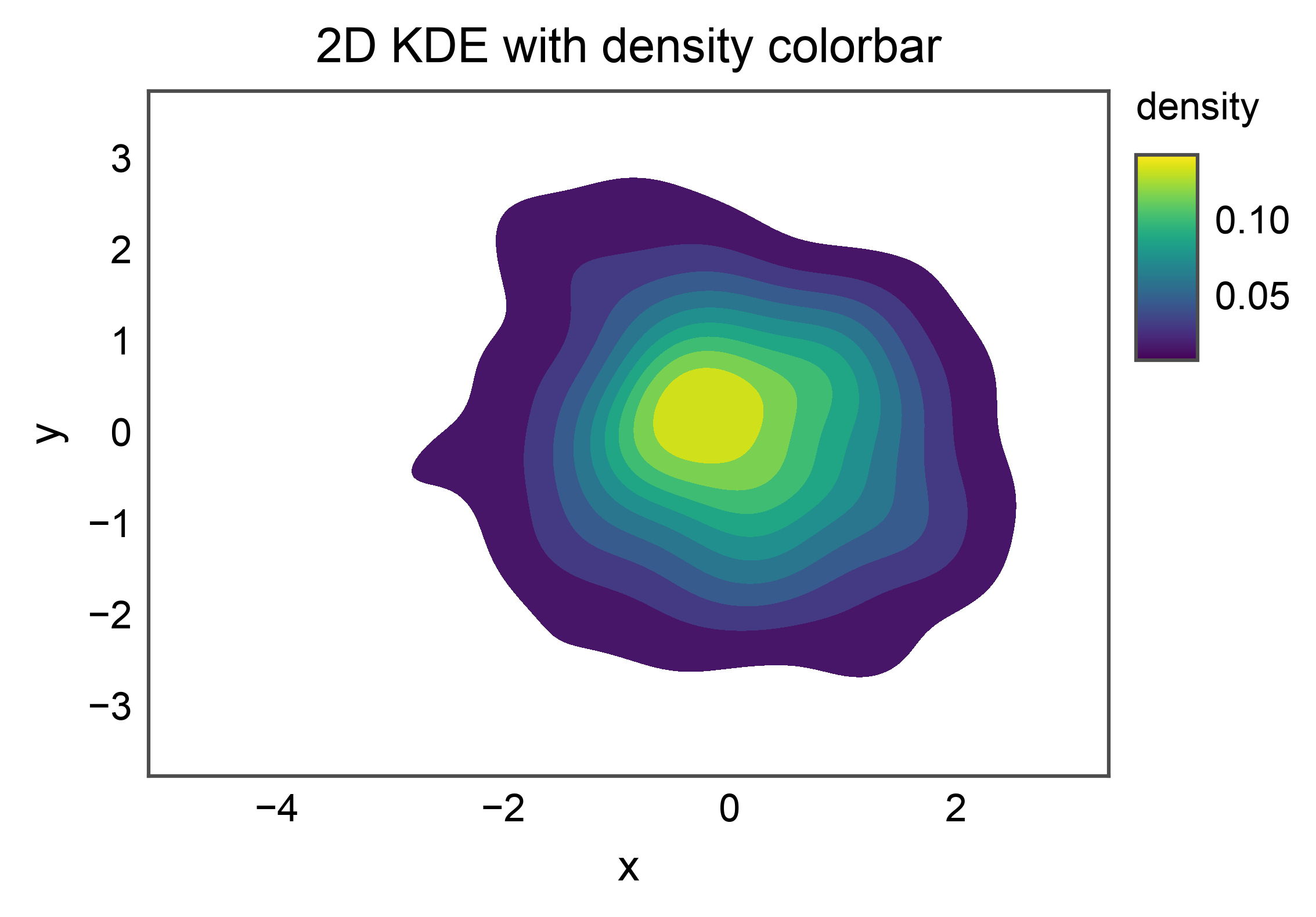
2D with Continuous Colorbar
Pass cbar=True to route a continuous-hue colorbar through the
publiplots legend reactor. publiplots auto-fills the contour bands
with the resolved cmap (defaulting to
matplotlib.rcParams["image.cmap"]) so the gradient the colorbar
advertises is the gradient the contours actually encode. Pass
cmap= to override (any matplotlib colormap name is accepted).
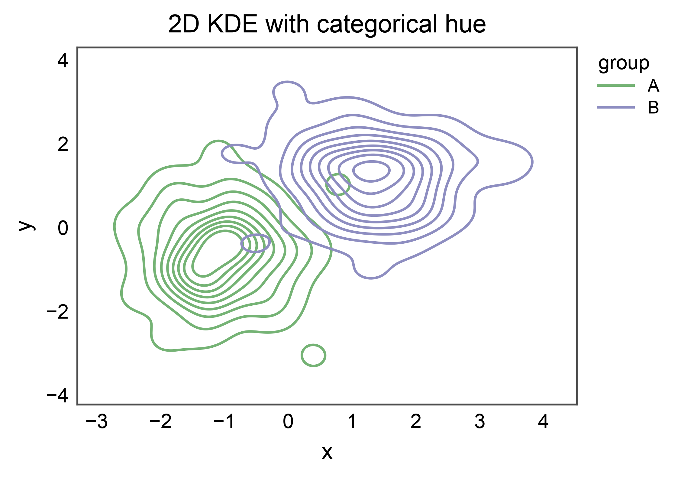
2D with Categorical Hue
hue= on a 2D plot emits one contour set per group, colored from
the resolved palette. The legend entry carries line handles (one per
group).
bivariate_grouped = pd.DataFrame({
    "x": np.concatenate([
        rng.normal(-1.0, 0.8, 100),
        rng.normal(1.5, 0.8, 100),
    ]),
    "y": np.concatenate([
        rng.normal(-0.5, 0.8, 100),
        rng.normal(1.0, 0.8, 100),
    ]),
    "group": ["A"] * 100 + ["B"] * 100,
})

ax = kdeplot(
    data=bivariate_grouped,
    x="x",
    y="y",
    hue="group",
    palette="pastel",
    title="2D KDE with categorical hue",
    xlabel="x",
    ylabel="y",
)
pp.show()
Total running time of the script: (0 minutes 4.862 seconds)