Note
Go to the end to download the full example code.
UpSet Plot Examples
This example demonstrates UpSet plot functionality in PubliPlots. UpSet plots are an alternative to Venn diagrams for visualizing set intersections, especially useful when dealing with many sets (4 or more) where Venn diagrams become hard to read.
import publiplots as pp
import pandas as pd
import numpy as np
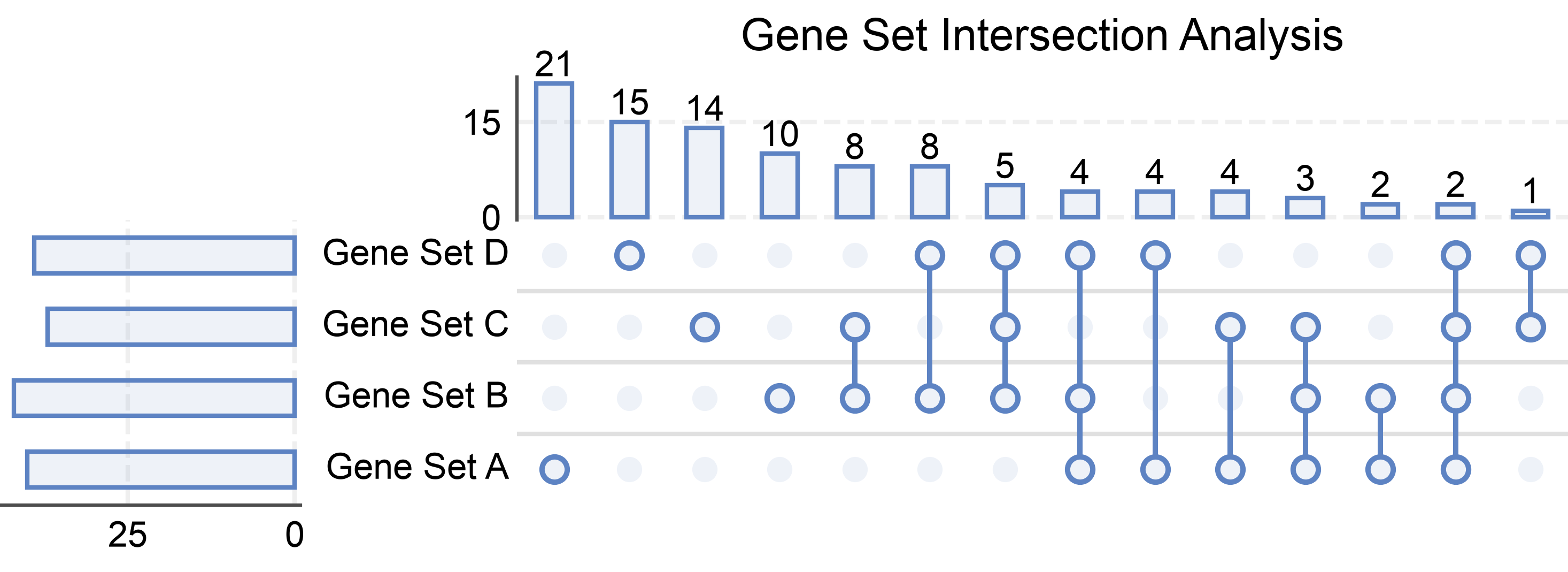
Basic UpSet Plot
Create a basic UpSet plot from a dictionary of sets.
# Create sample sets with meaningful overlaps
np.random.seed(100)
upset_sets = {
    'Gene Set A': set(np.random.randint(1, 100, 50)),
    'Gene Set B': set(np.random.randint(30, 130, 55)),
    'Gene Set C': set(np.random.randint(60, 140, 45)),
    'Gene Set D': set(np.random.randint(20, 110, 48))
}

# Create basic UpSet plot
axes = pp.upsetplot(
    data=upset_sets,
    title='Gene Set Intersection Analysis',
    show_counts=15,
)
pp.show()
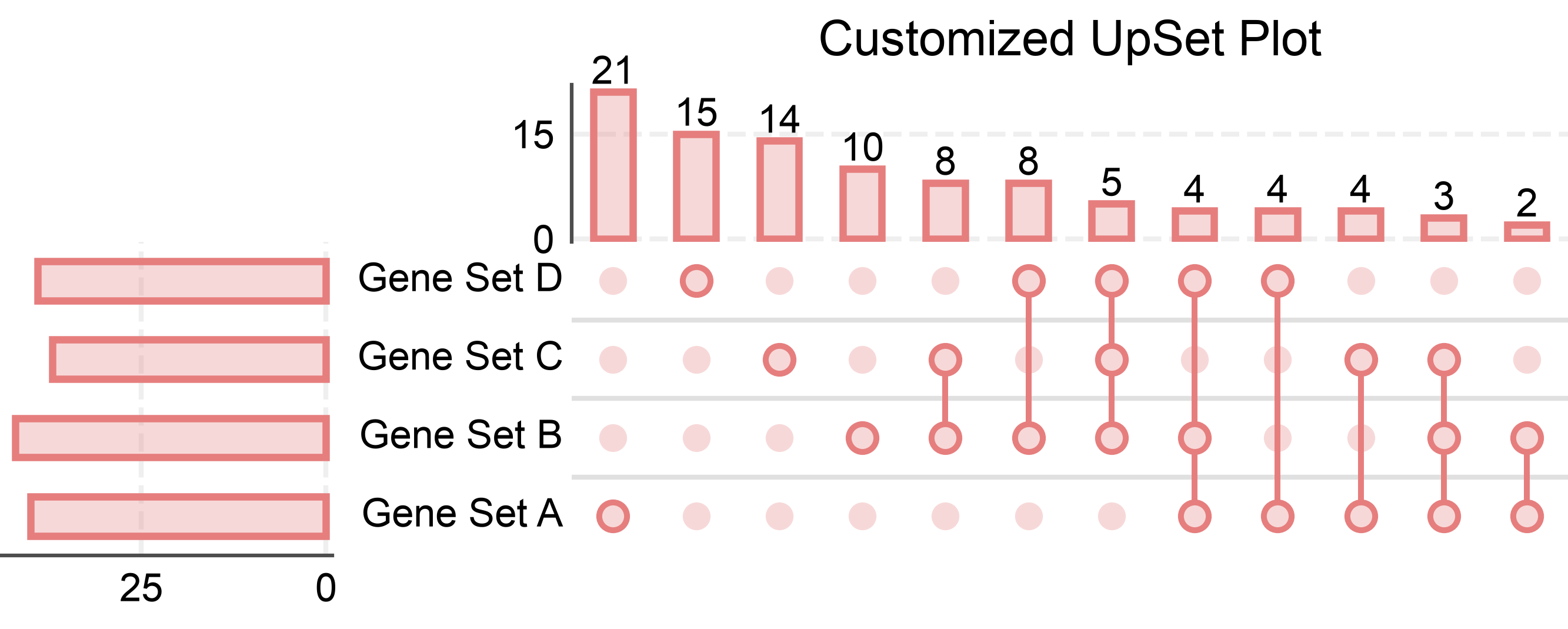
UpSet Plot with Custom Colors
Customize the color and transparency of bars.
# Create UpSet plot with custom styling
axes = pp.upsetplot(
    data=upset_sets,
    sort_by='size',  # Sort by intersection size
    title='Customized UpSet Plot',
    color='#E67E7E',
    alpha=0.3,
    bar_linewidth=1.5,
    show_counts=12,
)
pp.show()
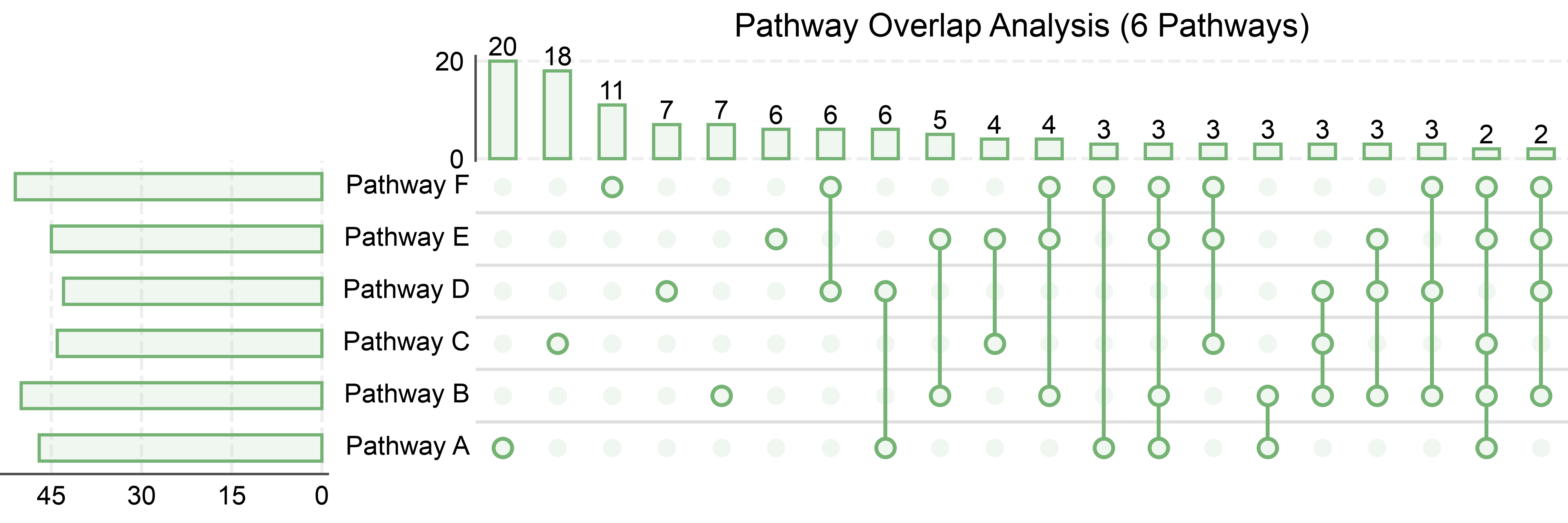
UpSet Plot with Many Sets
UpSet plots excel at showing intersections between many sets, where Venn diagrams become impractical.
# Create 6 sets with various overlaps
np.random.seed(200)
many_sets = {
    'Pathway A': set(np.random.randint(1, 120, 60)),
    'Pathway B': set(np.random.randint(40, 160, 65)),
    'Pathway C': set(np.random.randint(80, 180, 55)),
    'Pathway D': set(np.random.randint(20, 140, 58)),
    'Pathway E': set(np.random.randint(60, 160, 62)),
    'Pathway F': set(np.random.randint(30, 150, 60))
}

# Create UpSet plot with many sets
axes = pp.upsetplot(
    data=many_sets,
    sort_by='size',
    title='Pathway Overlap Analysis (6 Pathways)',
    color='#75B375',
    show_counts=20,
)
pp.show()
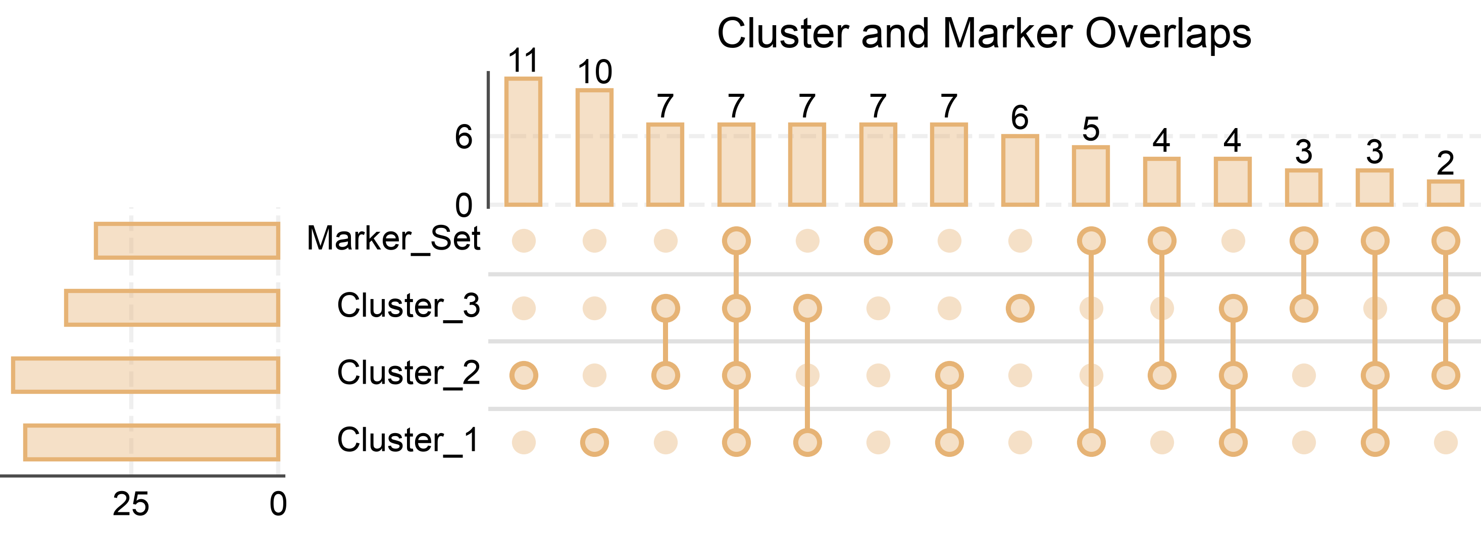
UpSet Plot from DataFrame
Create an UpSet plot from a binary membership DataFrame. This is useful when working with tabular data.
# Create binary membership DataFrame
# Rows are elements, columns are sets, values are 0/1 indicating membership
np.random.seed(300)
n_elements = 100
upset_df = pd.DataFrame({
    'Cluster_1': np.random.choice([0, 1], n_elements, p=[0.6, 0.4]),
    'Cluster_2': np.random.choice([0, 1], n_elements, p=[0.5, 0.5]),
    'Cluster_3': np.random.choice([0, 1], n_elements, p=[0.7, 0.3]),
    'Marker_Set': np.random.choice([0, 1], n_elements, p=[0.65, 0.35]),
})

# Create UpSet plot from DataFrame
axes = pp.upsetplot(
    data=upset_df,
    sort_by='size',
    title='Cluster and Marker Overlaps',
    color='#E6B375',
    alpha=0.4,
    show_counts=15,
)
pp.show()
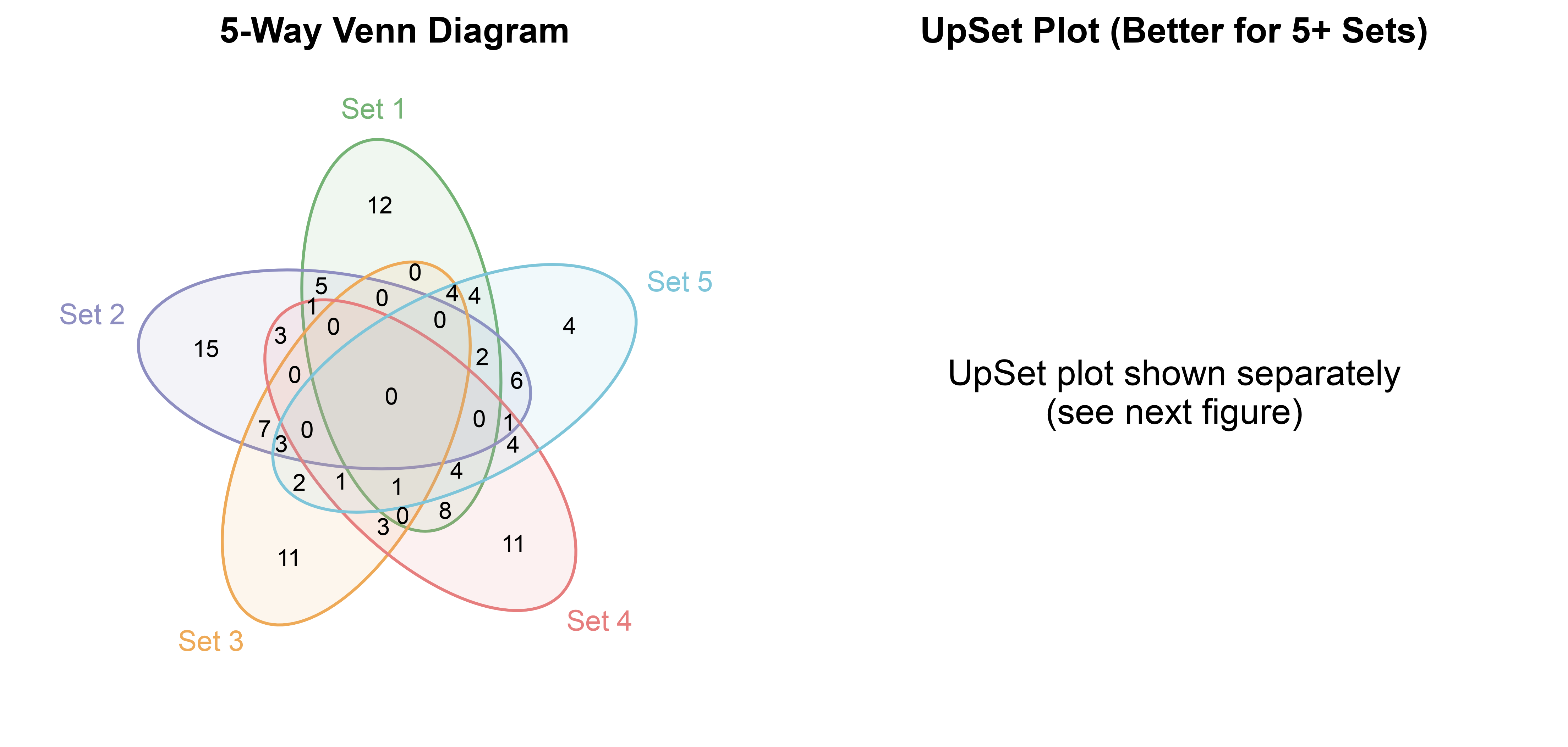
Comparing UpSet vs Venn for 4+ Sets
Demonstrate why UpSet plots are preferred for many sets.
# Create 5 sets
np.random.seed(400)
five_sets = {
'Set 1': set(np.random.randint(1, 100, 50)),
'Set 2': set(np.random.randint(30, 130, 55)),
'Set 3': set(np.random.randint(60, 140, 45)),
'Set 4': set(np.random.randint(20, 110, 48)),
'Set 5': set(np.random.randint(40, 120, 52))
}
# Create side-by-side comparison
fig, (ax1, ax2) = pp.subplots(1, 2, axes_size=(90, 80))
# Venn diagram (left)
pp.venn(
sets=list(five_sets.values()),
labels=list(five_sets.keys()),
colors=pp.color_palette('pastel', n_colors=5),
ax=ax1,
)
ax1.set_title('5-Way Venn Diagram', fontsize=12, fontweight='bold')
# UpSet plot (right) - shown separately in the next figure
ax2.text(0.5, 0.5, 'UpSet plot shown separately\n(see next figure)',
ha='center', va='center', fontsize=12)
ax2.axis('off')
ax2.set_title('UpSet Plot (Better for 5+ Sets)', fontsize=12, fontweight='bold')
pp.show()
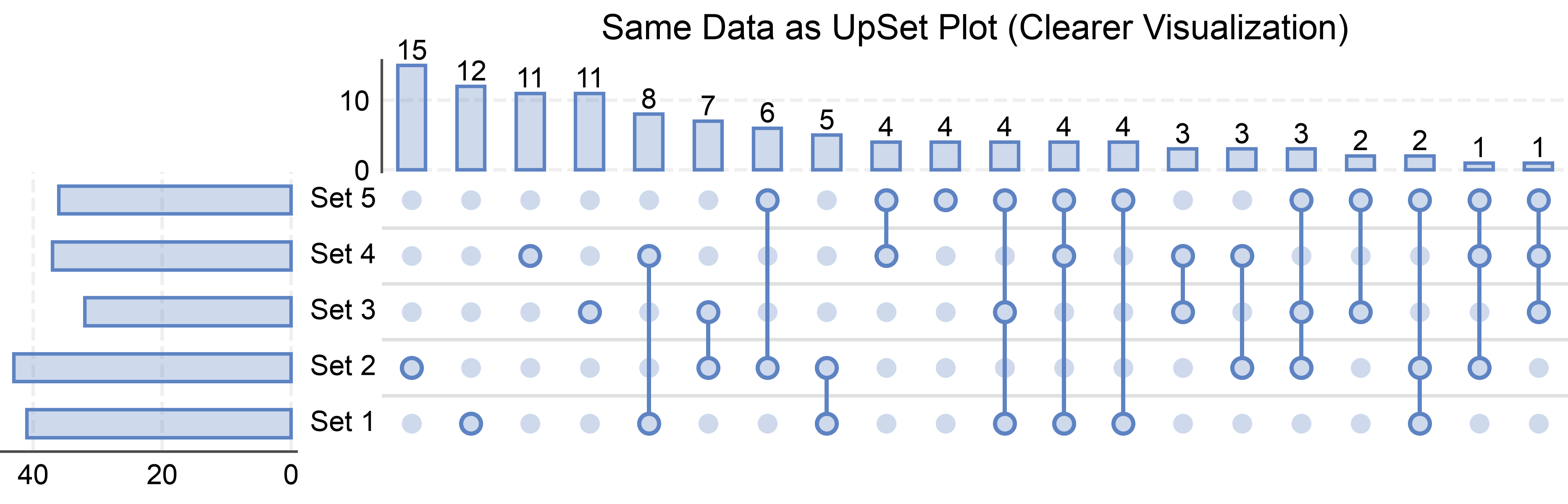
# Show the UpSet plot
axes = pp.upsetplot(
data=five_sets,
sort_by='size',
title='Same Data as UpSet Plot (Clearer Visualization)',
color='#5D83C3',
alpha=0.3,
show_counts=20,
)
pp.show()
Total running time of the script: (0 minutes 3.645 seconds)