Note
Go to the end to download the full example code.
Configuration and Styling
This example demonstrates how to configure PubliPlots using rcParams, set global styles, and customize various plotting parameters.
import publiplots as pp
import pandas as pd
import numpy as np
Understanding rcParams
PubliPlots uses an rcParams system similar to matplotlib and seaborn. You can access both matplotlib parameters and PubliPlots-specific parameters through the same unified interface.
# View some default PubliPlots parameters
print("PubliPlots Custom Parameters:")
print(f"  Default color: {pp.rcParams['color']}")
print(f"  Default alpha: {pp.rcParams['alpha']}")
print(f"  Default edgecolor: {pp.rcParams['edgecolor']}")
print(f"  Default capsize: {pp.rcParams['capsize']}")
print(f"  Hatch mode: {pp.rcParams['hatch_mode']}")

print("\nMatplotlib Parameters (via pp.rcParams):")
print(f"  Axes size (mm): {pp.rcParams['subplots.axes_size']}")
print(f"  Line width: {pp.rcParams['lines.linewidth']}")
print(f"  Font size: {pp.rcParams['font.size']}")
print(f"  DPI: {pp.rcParams['savefig.dpi']}")
PubliPlots Custom Parameters:
  Default color: #5d83c3
  Default alpha: 0.1
  Default edgecolor: None
  Default capsize: 0.0
  Hatch mode: 1

Matplotlib Parameters (via pp.rcParams):
  Axes size (mm): (70.0, 50.0)
  Line width: 1.0
  Font size: 8.0
  DPI: 600.0
Publication-Grade Defaults
PubliPlots applies publication-grade styling automatically on import. No style function calls are needed — you get print-ready figures by default.
# Create sample data for demonstration
np.random.seed(100)
sample_data = pd.DataFrame({
    'category': np.repeat(['A', 'B', 'C'], 10),
    'value': np.concatenate([
        np.random.normal(50, 8, 10),
        np.random.normal(70, 10, 10),
        np.random.normal(85, 12, 10),
    ])
})

print("\nDefault PubliPlots Style (applied on import):")
print(f"  Axes size (mm): {pp.rcParams['subplots.axes_size']}")
print(f"  Font size: {pp.rcParams['font.size']}")
print(f"  DPI: {pp.rcParams['savefig.dpi']}")

ax = pp.barplot(
    data=sample_data,
    x='category',
    y='value',
    title='Default Publication-Grade Style',
    errorbar='se',
    palette='pastel'
)
pp.show()
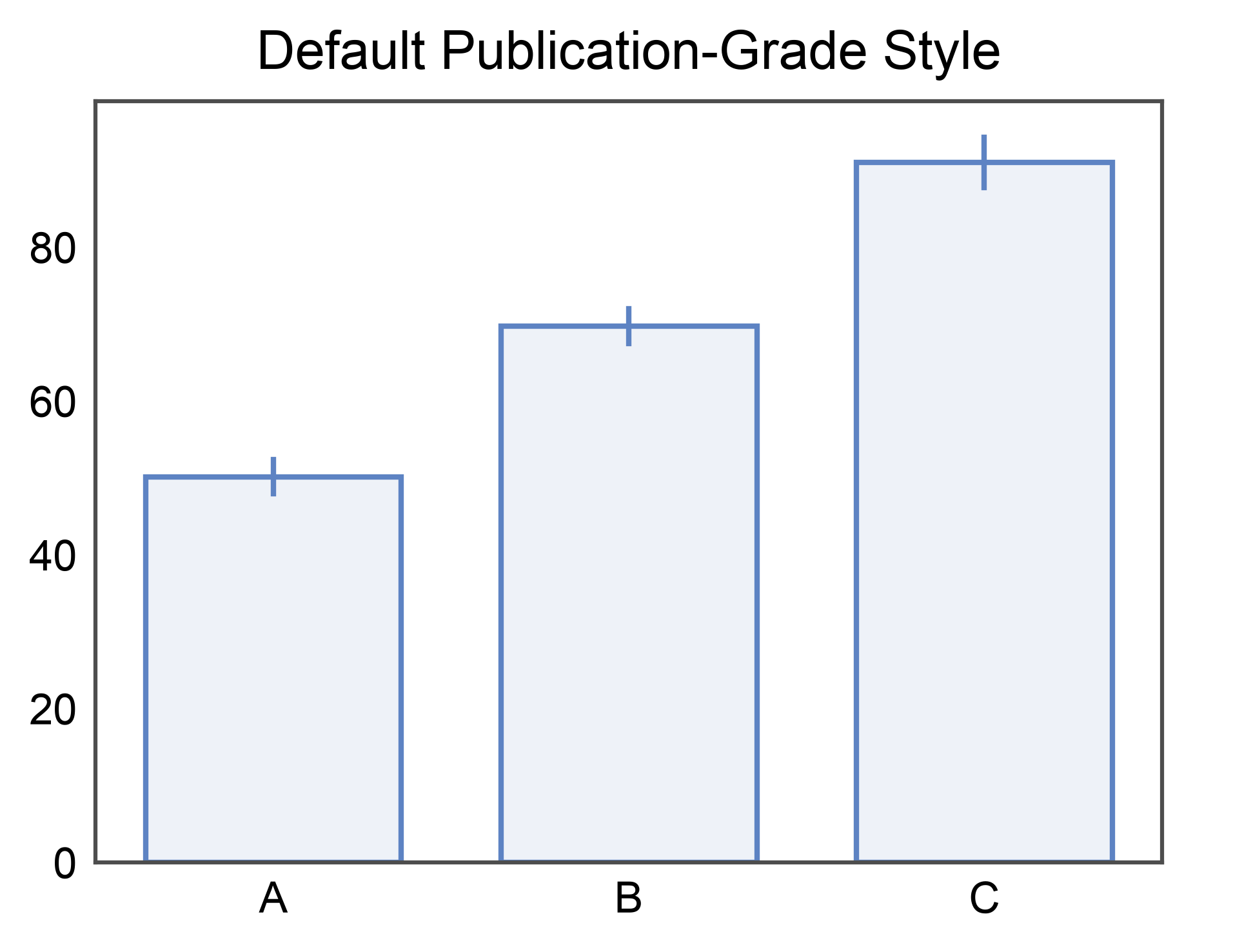
Default PubliPlots Style (applied on import):
  Axes size (mm): (70.0, 50.0)
  Font size: 8.0
  DPI: 600.0
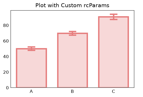
Customizing Individual Parameters
You can customize any parameter by setting it through pp.rcParams.
# Set custom defaults
pp.rcParams['color'] = '#E67E7E'  # Change default color to red
pp.rcParams['alpha'] = 0.3        # Increase default transparency
pp.rcParams['capsize'] = 0.15     # Larger error bar caps
pp.rcParams['hatch_mode'] = 2     # Medium density hatch patterns

# Also customize matplotlib parameters
pp.rcParams['subplots.axes_size'] = (80, 50)  # Wider axes (mm)
pp.rcParams['lines.linewidth'] = 2.5           # Thicker lines
pp.rcParams['font.size'] = 11                  # Slightly larger font

# Create plot with custom defaults
ax = pp.barplot(
    data=sample_data,
    x='category',
    y='value',
    title='Plot with Custom rcParams',
    errorbar='se',
)
pp.show()

# Reset to default (reverts to matplotlib defaults)
pp.reset_style()
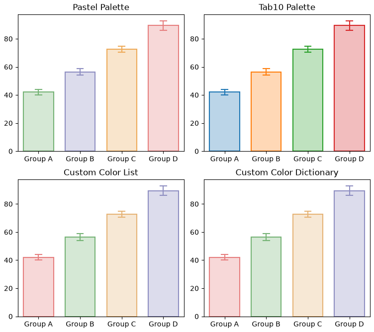
Using Color Palettes
PubliPlots provides easy access to color palettes.
# Create data for palette demonstration
palette_data = pd.DataFrame({
    'group': np.repeat(['Group A', 'Group B', 'Group C', 'Group D'], 12),
    'measurement': np.concatenate([
        np.random.normal(45, 7, 12),
        np.random.normal(60, 8, 12),
        np.random.normal(75, 9, 12),
        np.random.normal(90, 10, 12),
    ])
})

# Using built-in palettes
fig, axes = pp.subplots(2, 2, axes_size=(85, 70))

# Pastel palette
pp.barplot(
    data=palette_data,
    x='group',
    y='measurement',
    hue='group',
    palette='pastel',
    errorbar='se',
    title='Pastel Palette',
    ax=axes[0, 0]
)

# Tab10 palette
pp.barplot(
    data=palette_data,
    x='group',
    y='measurement',
    hue='group',
    palette='tab10',
    errorbar='se',
    title='Tab10 Palette',
    ax=axes[0, 1]
)

# Custom color list
custom_colors = ['#E67E7E', '#75B375', '#E6B375', '#8E8EC1']
pp.barplot(
    data=palette_data,
    x='group',
    y='measurement',
    hue='group',
    palette=custom_colors,
    errorbar='se',
    title='Custom Color List',
    ax=axes[1, 0]
)

# Custom color dictionary
custom_dict = {
    'Group A': '#E67E7E',
    'Group B': '#75B375',
    'Group C': '#E6B375',
    'Group D': '#8E8EC1'
}
pp.barplot(
    data=palette_data,
    x='group',
    y='measurement',
    hue='group',
    palette=custom_dict,
    errorbar='se',
    title='Custom Color Dictionary',
    ax=axes[1, 1]
)

pp.show()
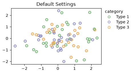
Context-Based Styling
Temporarily override parameters for specific plots without changing global settings.
# Create sample scatter data
np.random.seed(200)
scatter_data = pd.DataFrame({
'x': np.random.randn(80),
'y': np.random.randn(80),
'category': np.random.choice(['Type 1', 'Type 2', 'Type 3'], 80)
})
# Plot 1: Default settings
ax = pp.scatterplot(
data=scatter_data,
x='x',
y='y',
hue='category',
title='Default Settings',
palette='pastel',
alpha=0.2,
)
pp.show()
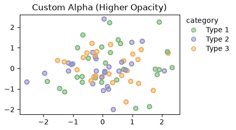
# Plot 2: Override alpha and color for this plot only
ax = pp.scatterplot(
data=scatter_data,
x='x',
y='y',
hue='category',
title='Custom Alpha (Higher Opacity)',
palette='pastel',
alpha=0.5, # Override default alpha just for this plot
)
pp.show()
Saving Figures with Custom Settings
Control output quality and format when saving figures.
# Create a sample figure
ax = pp.barplot(
    data=sample_data,
    x='category',
    y='value',
    title='Sample Figure for Saving',
    errorbar='se',
    palette='pastel'
)

# Save with different settings (uncomment to actually save)
# pp.savefig('figure_low_res.png', dpi=150)      # Lower resolution
# pp.savefig('figure_high_res.png', dpi=300)     # High resolution
# pp.savefig('figure_vector.pdf')                # Vector format (PDF)
# pp.savefig('figure_vector.svg')                # Vector format (SVG)

print("Figure saving examples (commented out to prevent file creation)")
print("  - PNG at 150 DPI (web/presentations)")
print("  - PNG at 300 DPI (publications)")
print("  - PDF (vector, editable)")
print("  - SVG (vector, web-friendly)")

pp.show()
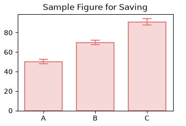
Figure saving examples (commented out to prevent file creation)
  - PNG at 150 DPI (web/presentations)
  - PNG at 300 DPI (publications)
  - PDF (vector, editable)
  - SVG (vector, web-friendly)
Best Practices Summary
Publication-grade defaults are applied automatically on import
Customize global defaults with pp.rcParams for consistency
Override parameters per-plot when needed using function arguments
Use pp.reset_style() to revert to matplotlib defaults if needed
Use color palettes for consistent coloring across figures
Save in vector formats (PDF/SVG) for publications
Use hatch patterns for black-and-white publications
print("\nConfiguration complete!")
Configuration complete!
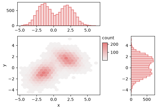
Asymmetric Grids
pp.subplots accepts width_ratios= and height_ratios= to build
asymmetric grids. axes_size remains the per-cell budget: total grid
width is axes_size[0] * ncols and the ratios split that budget across
columns proportionally (rows analogous). Equal ratios recover the uniform
case. The canonical use is a seaborn-style JointGrid: a large main panel
flanked by thin marginal strips.
rng = np.random.default_rng(42)
n = 10_000
cluster_a = rng.multivariate_normal([-1.5, -1.0], [[1.0, 0.4], [0.4, 1.0]], n // 2)
cluster_b = rng.multivariate_normal([2.0, 1.5], [[1.2, -0.3], [-0.3, 0.8]], n // 2)
joint = pd.DataFrame(np.vstack([cluster_a, cluster_b]), columns=["x", "y"])

fig, axes = pp.subplots(
    2, 2,
    axes_size=(45, 35),
    width_ratios=[7, 2],
    height_ratios=[2, 5],
)
axes[0, 1].set_visible(False)

pp.hexbinplot(
    data=joint, x="x", y="y",
    gridsize=20,
    xlabel="x", ylabel="y",
    ax=axes[1, 0],
)
pp.histplot(
    data=joint, x="x", bins=30,
    xlabel="", ylabel="",
    ax=axes[0, 0],
)
pp.histplot(
    data=joint, y="y", bins=30,
    xlabel="", ylabel="",
    ax=axes[1, 1],
)
pp.show()
Total running time of the script: (0 minutes 3.798 seconds)