Note
Go to the end to download the full example code.
Errorbar Examples
publiplots.errorbarplot() is a publication-ready scatter plot
that draws x and/or y uncertainty bars at each point. Unlike
publiplots.pointplot() (which is categorical-x only and
y-error only), pp.errorbarplot accepts continuous x, two-axis
errors, and asymmetric bounds via tuple-of-columns. Marker rendering
is delegated to publiplots.scatterplot(), so categorical and
continuous hue=, palette=, the publiplots double-layer alpha
convention, and the opaque background-marker for occlusion all work
out of the box. Stems match their marker color: categorical hue=
groups stems by level, continuous numeric hue= colors each stem
from the cmap, and no hue= falls back to the neutral
rcParams['edgecolor'].
import numpy as np
import pandas as pd

import publiplots as pp
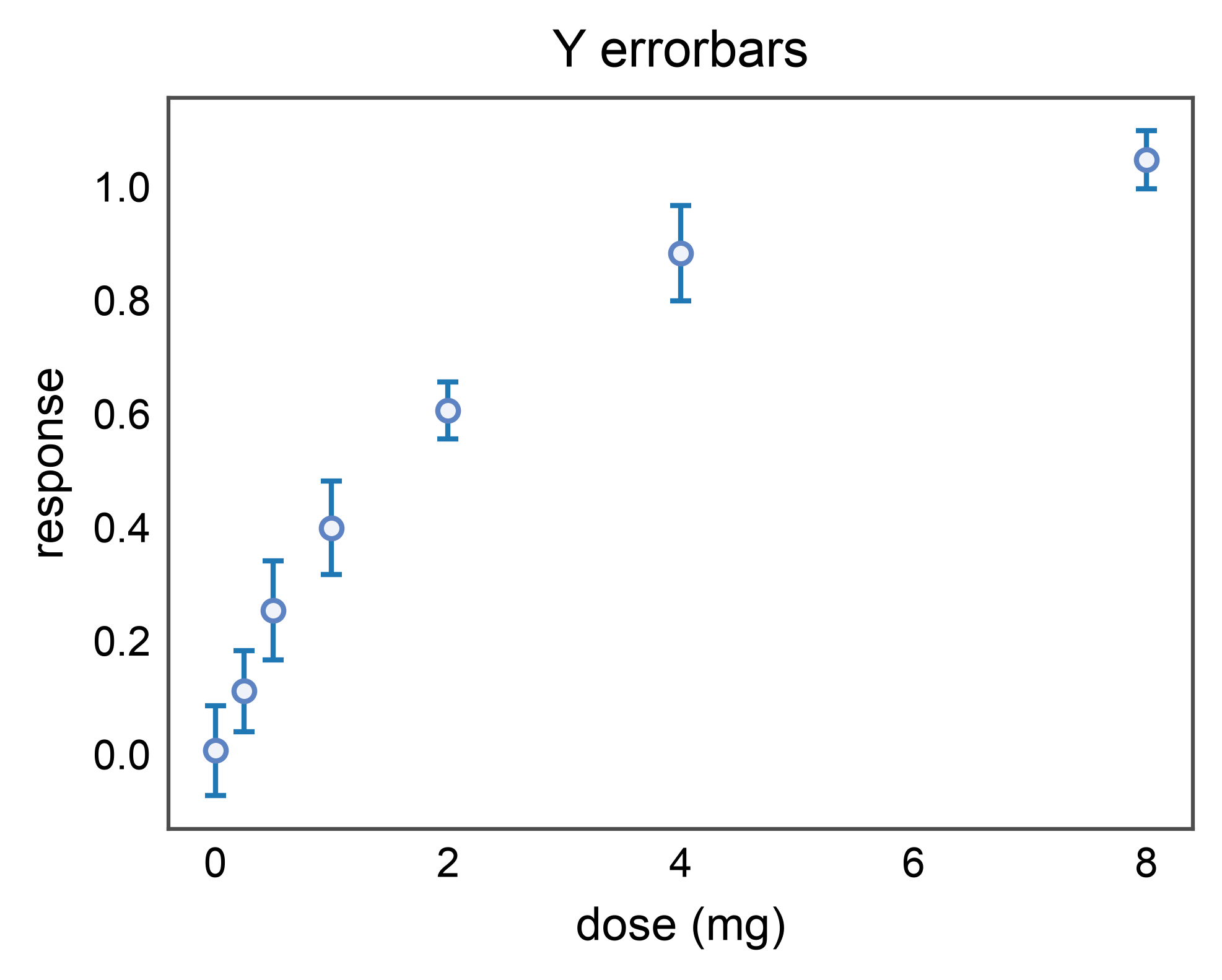
Basic Y-Errorbars
The most common case: a measurement with a standard error of the mean
(or any symmetric uncertainty) on the y-axis. Pass the column name as
yerr=.
rng = np.random.default_rng(0)
doses = np.array([0.0, 0.25, 0.5, 1.0, 2.0, 4.0, 8.0])
n = len(doses)
basic_df = pd.DataFrame({
    "dose": doses,
    "response": 1.0 - np.exp(-doses / 2.0) + 0.05 * rng.normal(size=n),
    "sem": 0.05 + 0.04 * rng.uniform(size=n),
})

pp.errorbarplot(
    data=basic_df,
    x="dose",
    y="response",
    yerr="sem",
    capsize=2,
    title="Y errorbars",
    xlabel="dose (mg)",
    ylabel="response",
)
pp.show()
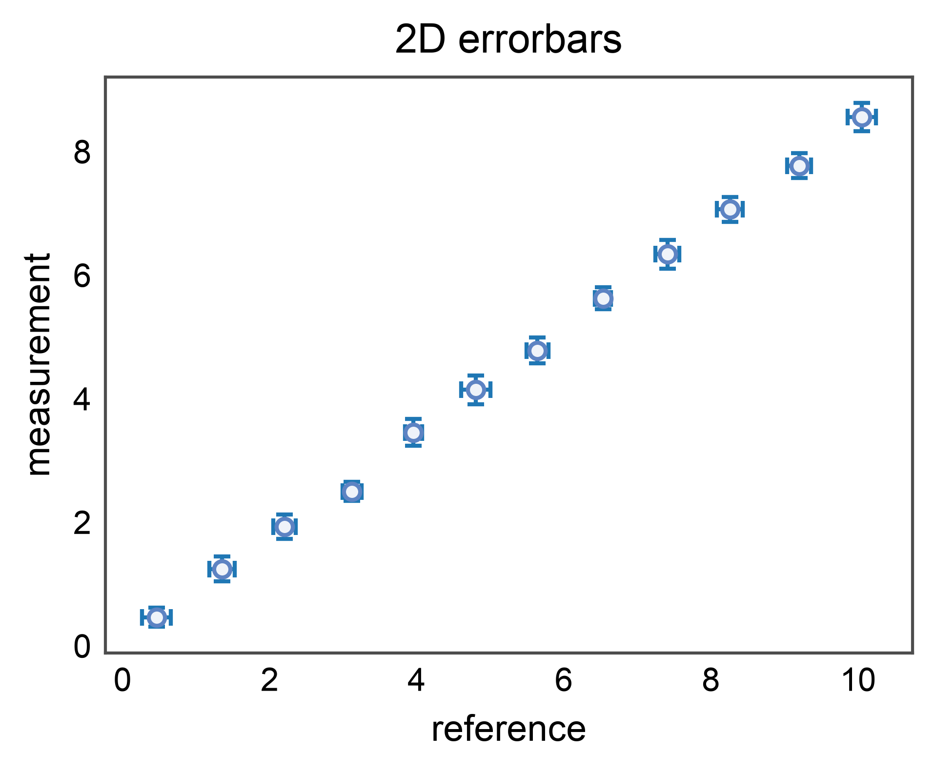
2D Errorbars (X and Y)
When both axes carry uncertainty (e.g. a calibration curve where the
reference value is itself measured), pass xerr= and yerr=
together. The two error directions render in a single
ax.errorbar call below the markers.
rng = np.random.default_rng(1)
n = 12
xx = np.linspace(0.5, 10.0, n)
yy = 0.85 * xx + 0.1 * rng.normal(size=n)
calib_df = pd.DataFrame({
    "x_meas": xx + 0.05 * rng.normal(size=n),
    "y_meas": yy,
    "x_err": 0.1 + 0.1 * rng.uniform(size=n),
    "y_err": 0.15 + 0.1 * rng.uniform(size=n),
})

pp.errorbarplot(
    data=calib_df,
    x="x_meas",
    y="y_meas",
    xerr="x_err",
    yerr="y_err",
    capsize=2,
    title="2D errorbars",
    xlabel="reference",
    ylabel="measurement",
)
pp.show()
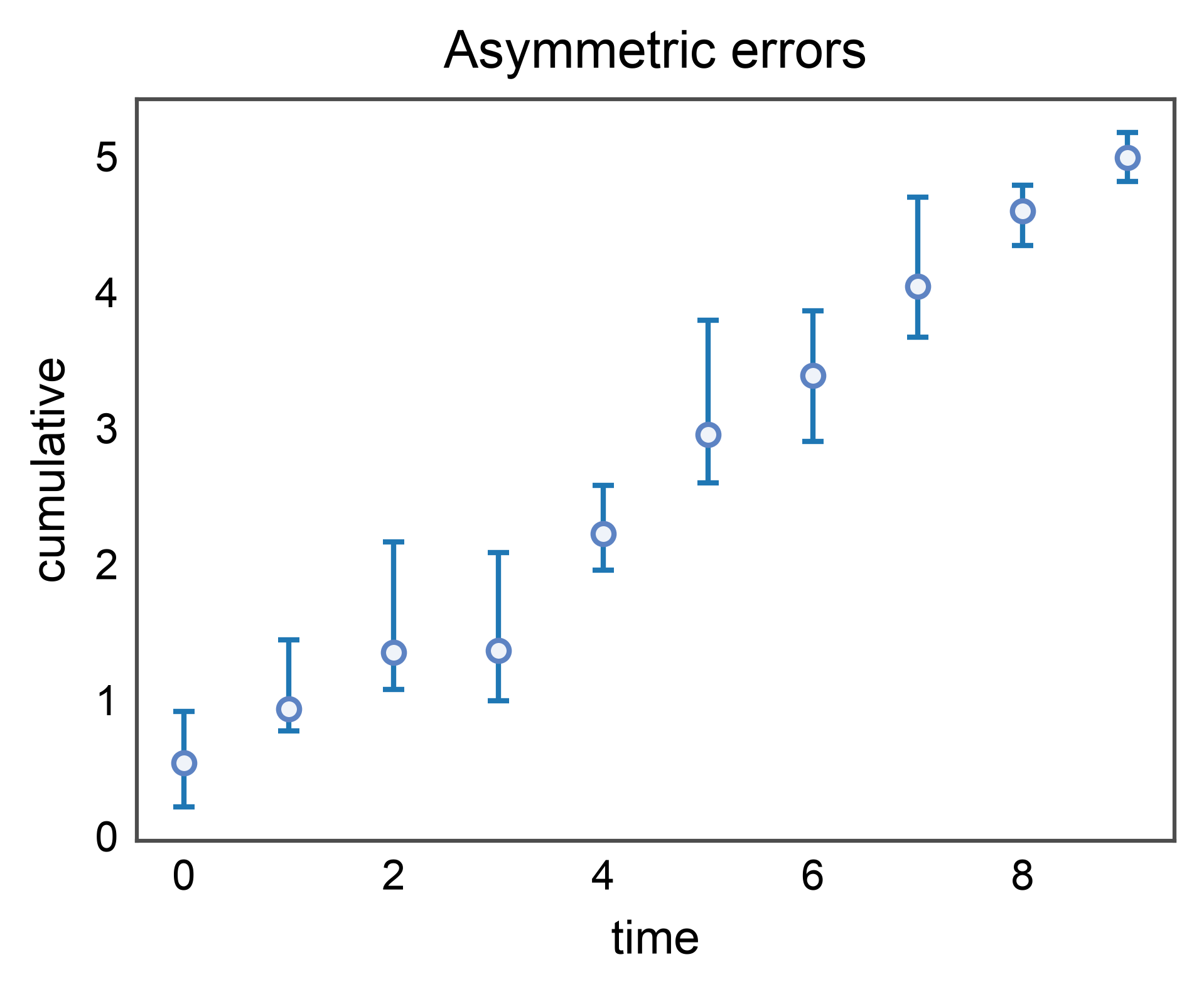
Asymmetric Errors via Tuple-of-Columns
When the lower and upper bounds differ (e.g. bootstrap CIs on a skewed
statistic), pass a 2-tuple of column names (lo_col, hi_col). The
values in each column are the distances below and above the point
(matplotlib’s yerr convention).
rng = np.random.default_rng(2)
n = 10
x = np.arange(n)
y = np.cumsum(rng.normal(0.5, 0.2, n))
asym_df = pd.DataFrame({
    "x": x,
    "y": y,
    "y_lo": 0.1 + 0.4 * rng.uniform(size=n),
    "y_hi": 0.1 + 0.8 * rng.uniform(size=n),
})

pp.errorbarplot(
    data=asym_df,
    x="x",
    y="y",
    yerr=("y_lo", "y_hi"),
    capsize=2,
    title="Asymmetric errors",
    xlabel="time",
    ylabel="cumulative",
)
pp.show()
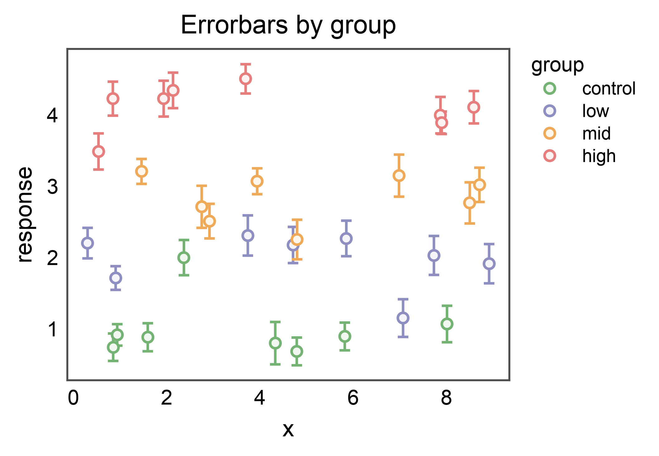
Categorical Hue
Pass hue= to color the markers by group. With a categorical hue,
errorbar stems are issued per-group with ecolor set from the
resolved palette so each measurement’s uncertainty inherits its
group’s color. (Continuous numeric hue= keeps stems neutral —
see the next section.)
rng = np.random.default_rng(3)
groups = ["control", "low", "mid", "high"]
n_per = 8
hue_df = pd.concat([
    pd.DataFrame({
        "x": rng.uniform(0, 10, n_per),
        "y": (i + 1) + 0.3 * rng.normal(size=n_per),
        "yerr": 0.15 + 0.15 * rng.uniform(size=n_per),
        "group": g,
    })
    for i, g in enumerate(groups)
], ignore_index=True)

fig, ax = pp.subplots(axes_size=(60, 45))
pp.errorbarplot(
    data=hue_df,
    x="x",
    y="y",
    yerr="yerr",
    hue="group",
    palette="pastel",
    capsize=2,
    ax=ax,
    title="Errorbars by group",
    xlabel="x",
    ylabel="response",
)
pp.show()
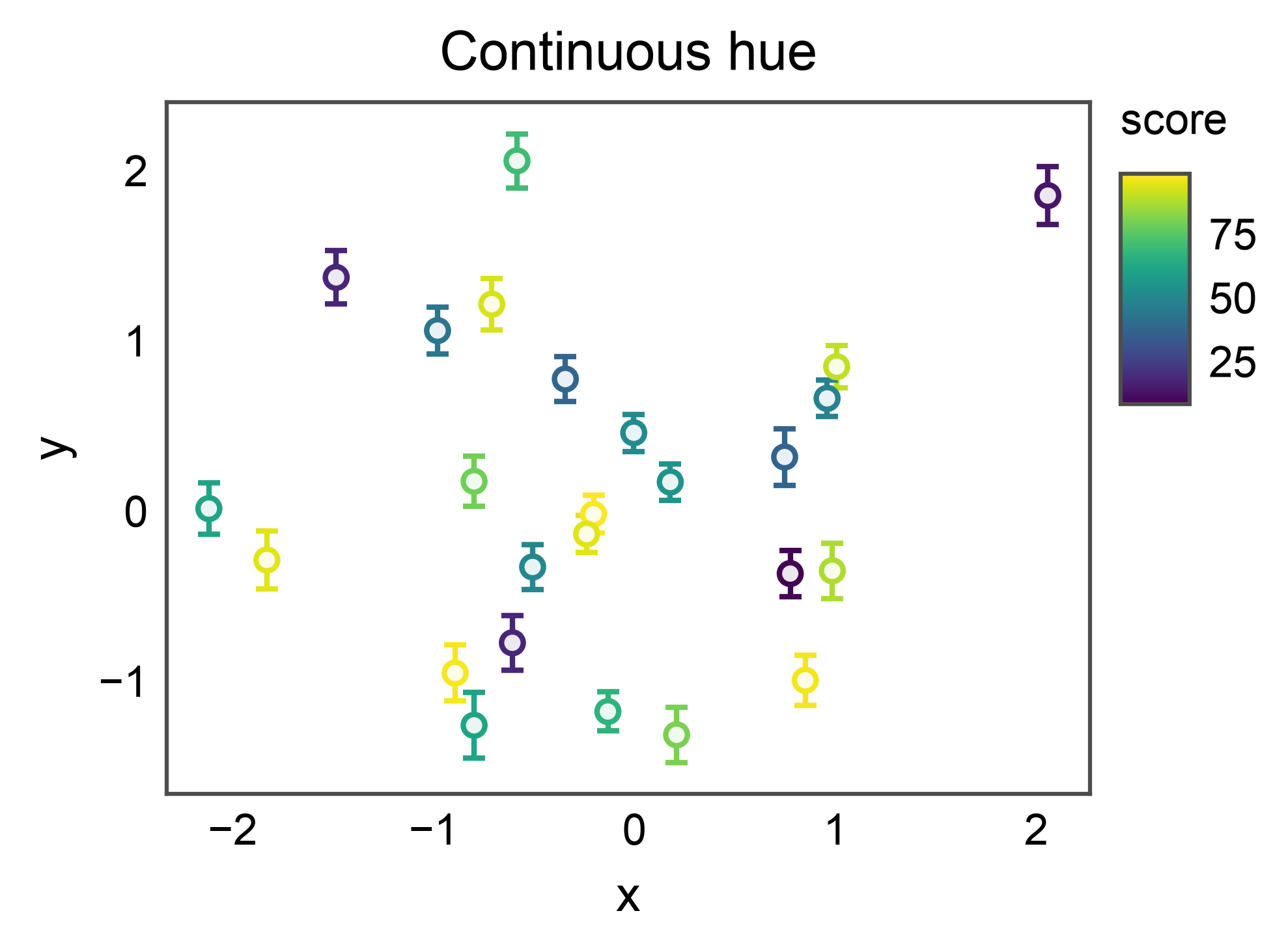
Continuous Hue with Colorbar
Pass a numeric column as hue= to color markers along a continuous
scale. pp.scatterplot (delegated to internally) registers a
colorbar via the publiplots layout reactor, so the colorbar reserves
space without colliding with the axes. Each stem inherits its
marker’s cmap color (one ax.errorbar call per point) so the
uncertainty visually attaches to the measurement.
rng = np.random.default_rng(4)
n = 25
score = rng.uniform(0, 100, n)
cont_df = pd.DataFrame({
    "x": rng.normal(size=n),
    "y": rng.normal(size=n),
    "yerr": 0.1 + 0.1 * rng.uniform(size=n),
    "score": score,
})

fig, ax = pp.subplots(axes_size=(60, 45))
pp.errorbarplot(
    data=cont_df,
    x="x",
    y="y",
    yerr="yerr",
    hue="score",
    palette="viridis",
    capsize=2,
    ax=ax,
    title="Continuous hue",
    xlabel="x",
    ylabel="y",
)
pp.show()
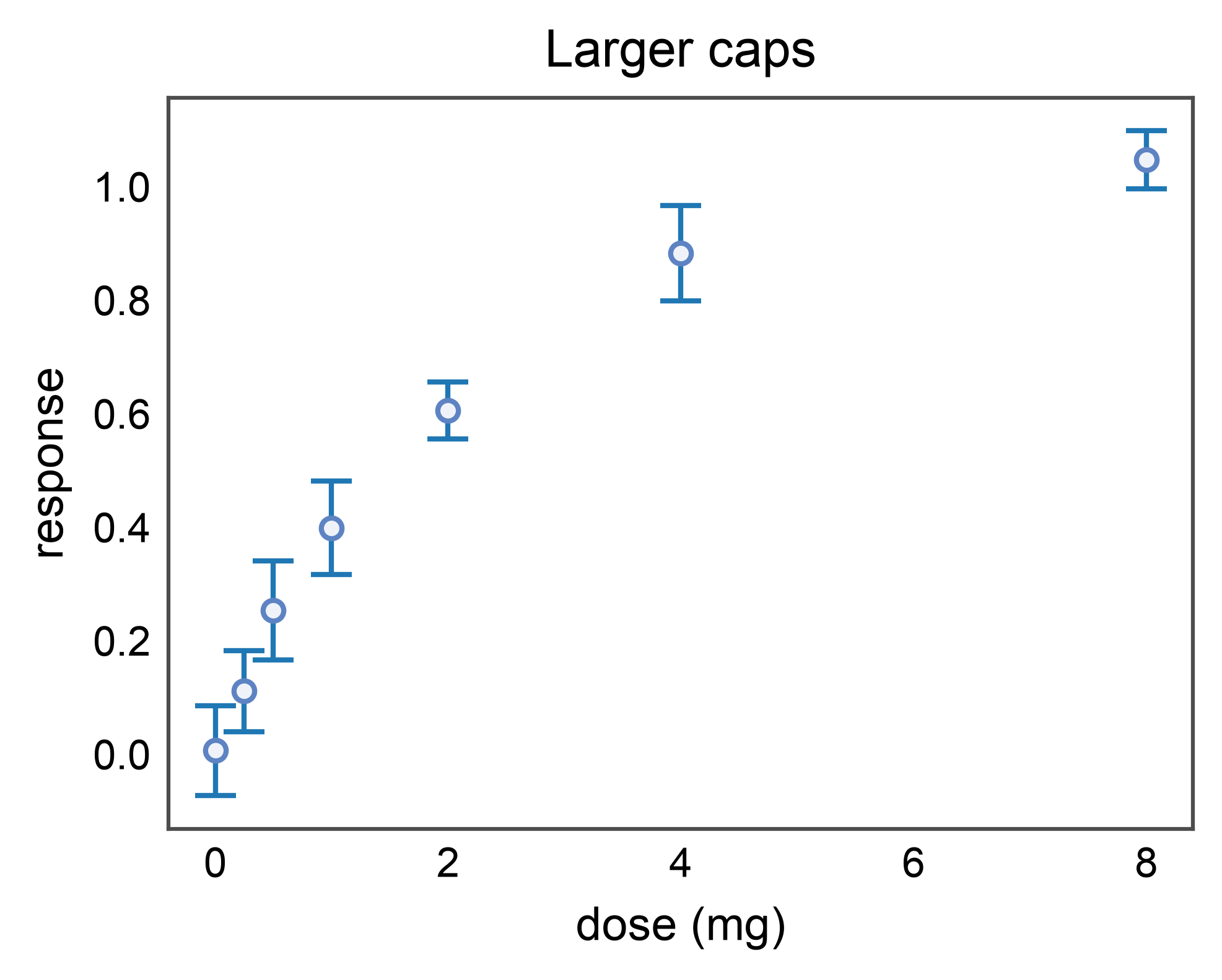
Custom Capsize
capsize defaults to rcParams['capsize'] (currently 0 — no
caps). Pass capsize=2 (or any positive value) for the
publication look. capthick defaults to the stem linewidth.
pp.errorbarplot(
    data=basic_df,
    x="dose",
    y="response",
    yerr="sem",
    capsize=4,
    capthick=1.0,
    title="Larger caps",
    xlabel="dose (mg)",
    ylabel="response",
)
pp.show()
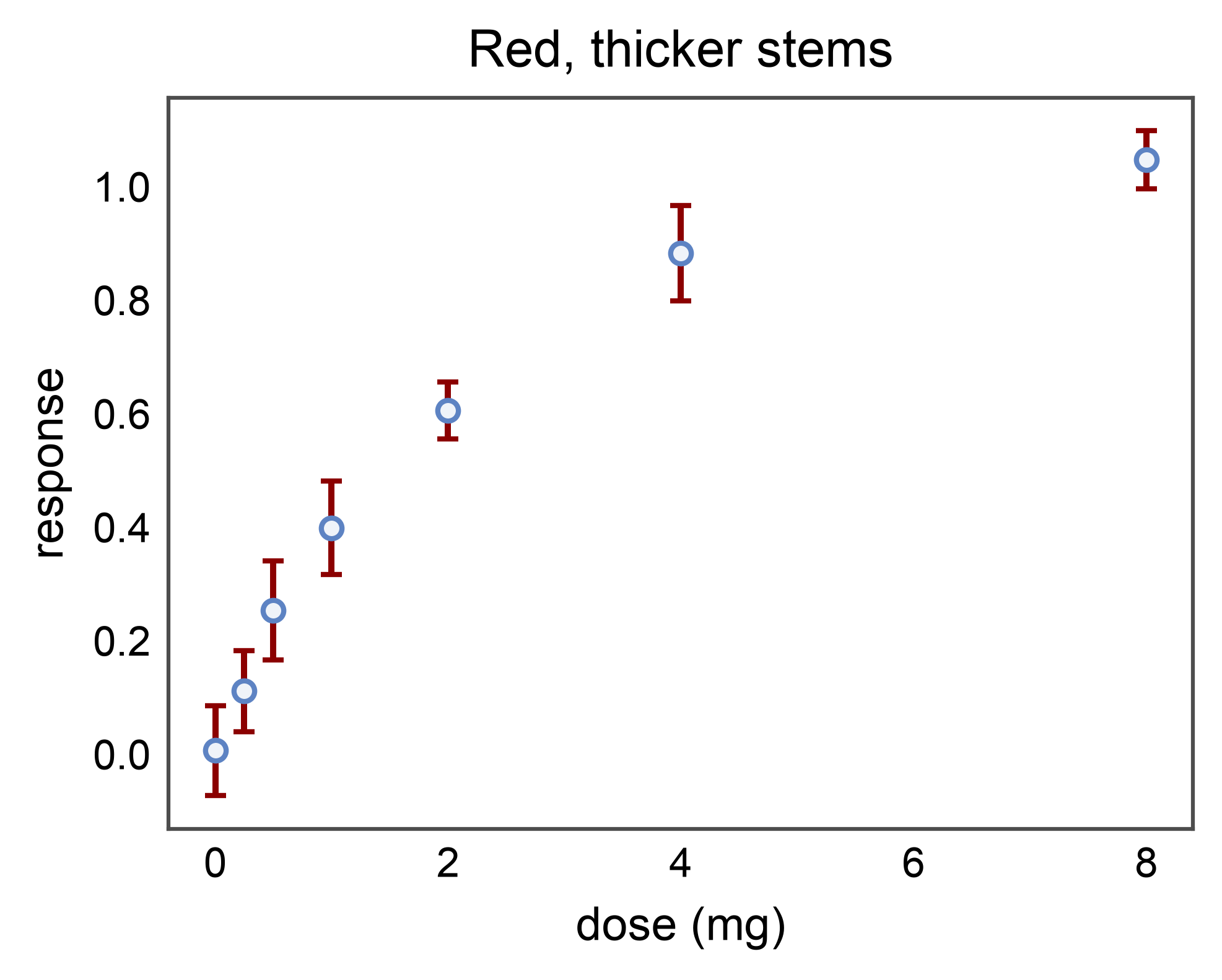
Custom Errorbar Styling via errorbar_kws
All extra kwargs accepted by matplotlib.axes.Axes.errorbar()
pass through errorbar_kws=. The most useful overrides are
ecolor= (force a non-edgecolor stem color) and elinewidth=
(thicker or thinner stems than the default).
pp.errorbarplot(
    data=basic_df,
    x="dose",
    y="response",
    yerr="sem",
    capsize=2,
    errorbar_kws=dict(ecolor="#8b0000", elinewidth=1.2),
    title="Red, thicker stems",
    xlabel="dose (mg)",
    ylabel="response",
)
pp.show()
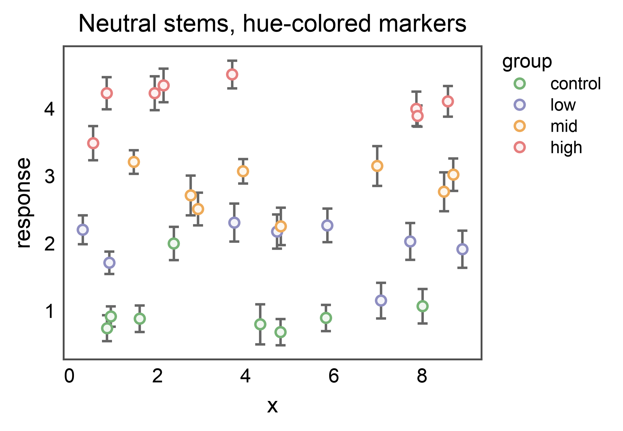
Forcing Neutral Stems on a Hue Plot
Caller-supplied errorbar_kws['ecolor'] wins over the per-hue
coloring. Pass it when you want hue-colored markers on top of a
uniform, neutral set of stems — e.g. when groups overlap heavily or
you want the marker fill alone to carry the hue.
fig, ax = pp.subplots(axes_size=(60, 45))
pp.errorbarplot(
    data=hue_df,
    x="x",
    y="y",
    yerr="yerr",
    hue="group",
    palette="pastel",
    capsize=2,
    errorbar_kws=dict(ecolor="0.4"),
    ax=ax,
    title="Neutral stems, hue-colored markers",
    xlabel="x",
    ylabel="response",
)
pp.show()
Total running time of the script: (0 minutes 3.541 seconds)