Note
Go to the end to download the full example code.
Line Plot Examples
This example demonstrates line plot functionality in PubliPlots, built on top of seaborn’s lineplot. Line plots are ideal for visualizing trends over a continuous independent variable (time series, dose-response, learning curves) with optional aggregation, error bands, and multi-group comparisons.
import publiplots as pp
import pandas as pd
import numpy as np
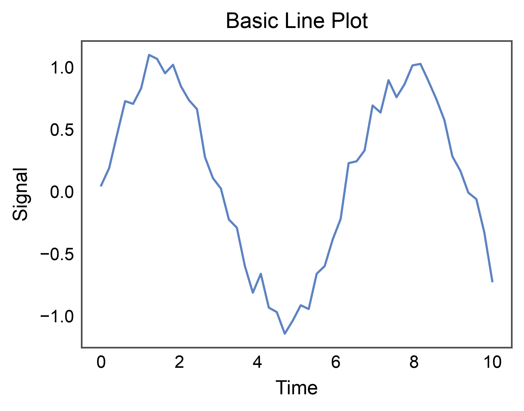
Basic Line Plot
Simplest case: one series, continuous x.
np.random.seed(42)
t = np.linspace(0, 10, 50)
signal = pd.DataFrame({
    "time": t,
    "value": np.sin(t) + np.random.normal(0, 0.1, len(t)),
})

ax = pp.lineplot(
    data=signal,
    x="time",
    y="value",
    title="Basic Line Plot",
    xlabel="Time",
    ylabel="Signal",
)
pp.show()
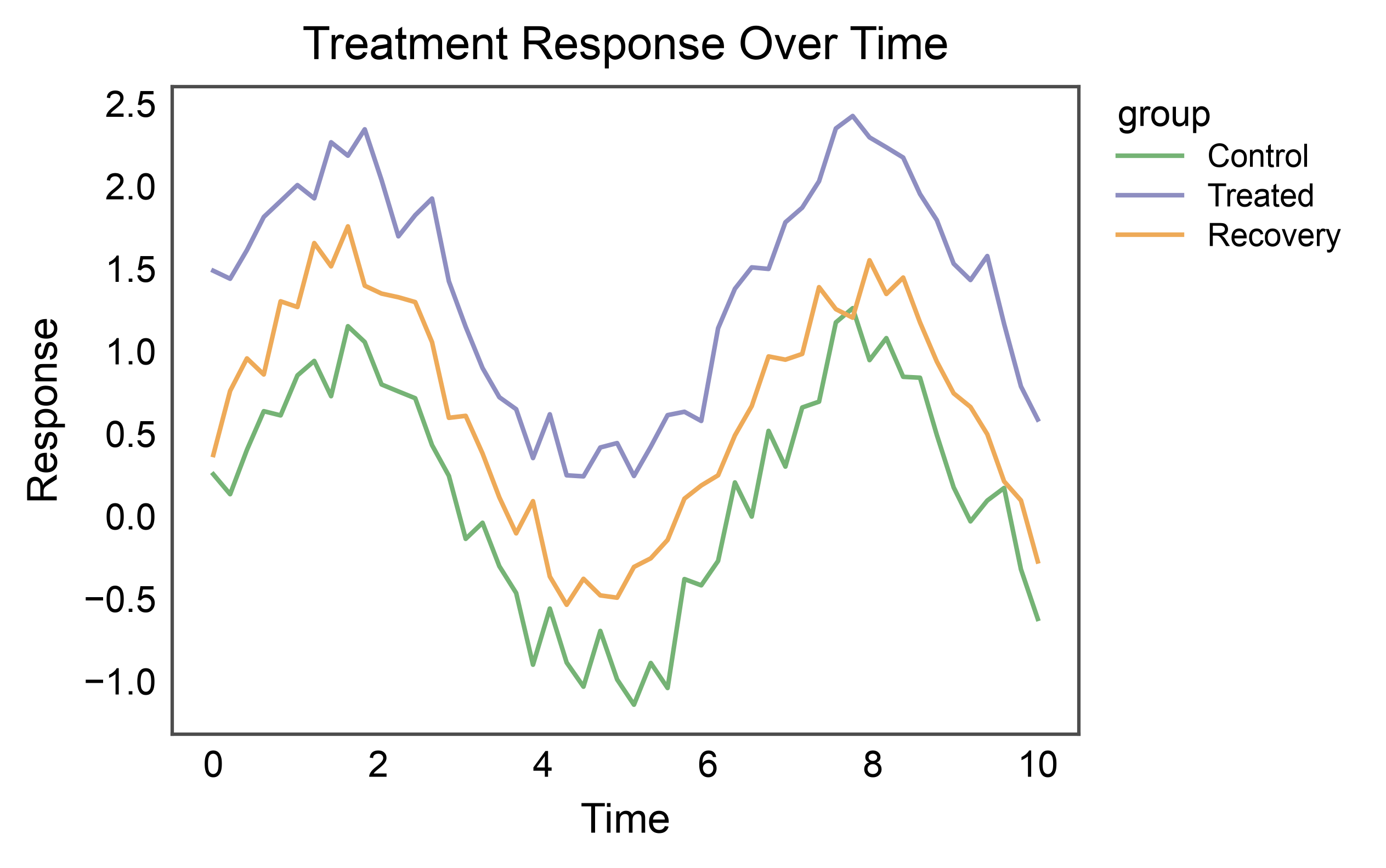
Line Plot with Hue (multi-series)
Group by a categorical variable to draw one line per group.
np.random.seed(7)
rows = []
for group, offset in [("Control", 0.0), ("Treated", 1.2), ("Recovery", 0.5)]:
    for tt in t:
        rows.append({"time": tt, "value": np.sin(tt) + offset +
                     np.random.normal(0, 0.15), "group": group})
multi = pd.DataFrame(rows)

ax = pp.lineplot(
    data=multi,
    x="time",
    y="value",
    hue="group",
    palette="pastel",
    title="Treatment Response Over Time",
    xlabel="Time",
    ylabel="Response",
)
pp.show()
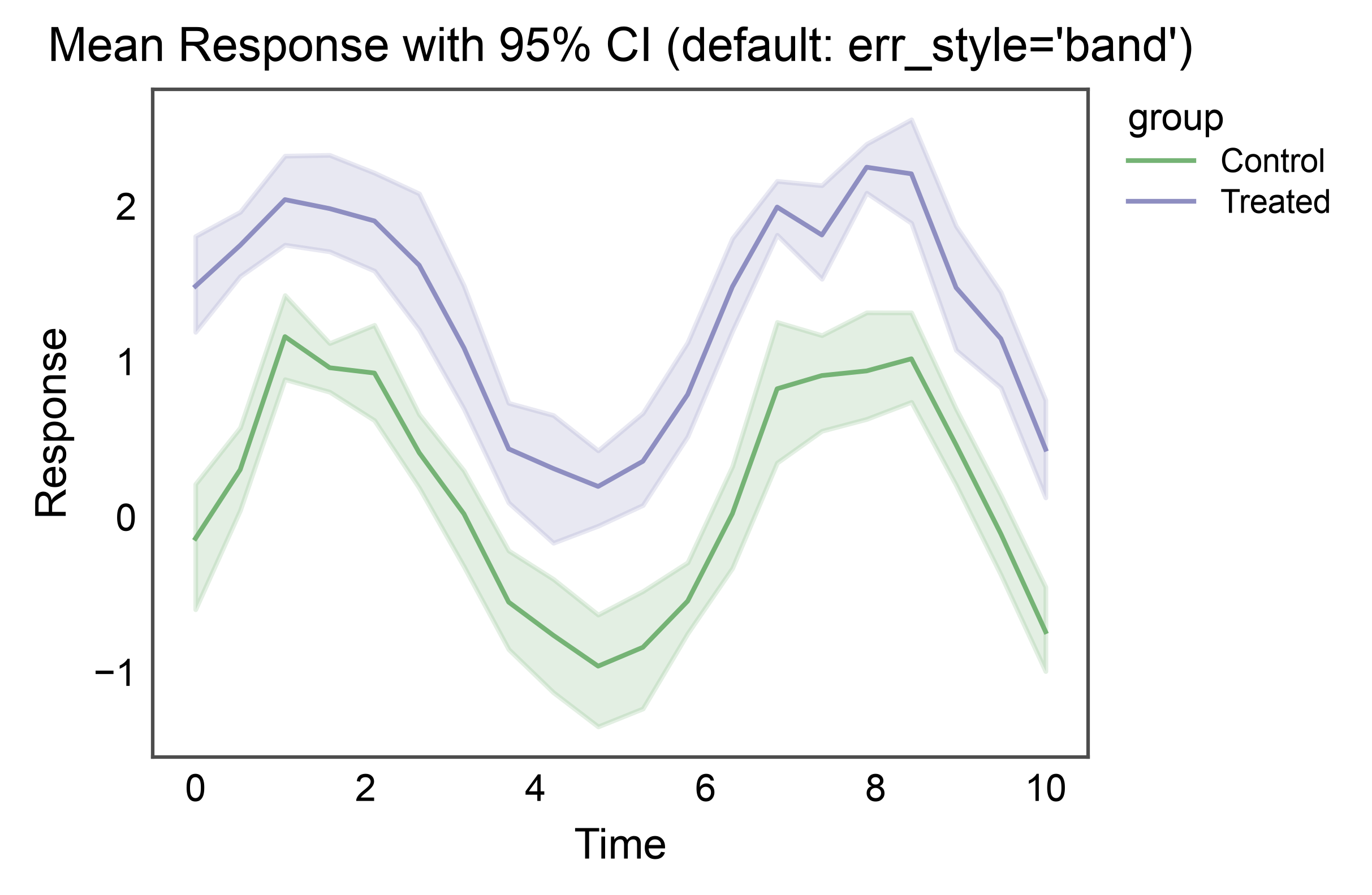
Aggregation with Error Band
When multiple y observations exist per x, lineplot aggregates (mean by default) and draws a shaded confidence interval band.
np.random.seed(11)
rows = []
for group, offset in [("Control", 0.0), ("Treated", 1.2)]:
    for tt in np.linspace(0, 10, 20):
        for _ in range(8):  # 8 replicates per time point
            rows.append({"time": tt, "value": np.sin(tt) + offset +
                         np.random.normal(0, 0.5), "group": group})
replicates = pd.DataFrame(rows)

ax = pp.lineplot(
    data=replicates,
    x="time",
    y="value",
    hue="group",
    palette="pastel",
    errorbar=("ci", 95),
    title="Mean Response with 95% CI (default: err_style='band')",
    xlabel="Time",
    ylabel="Response",
)
pp.show()
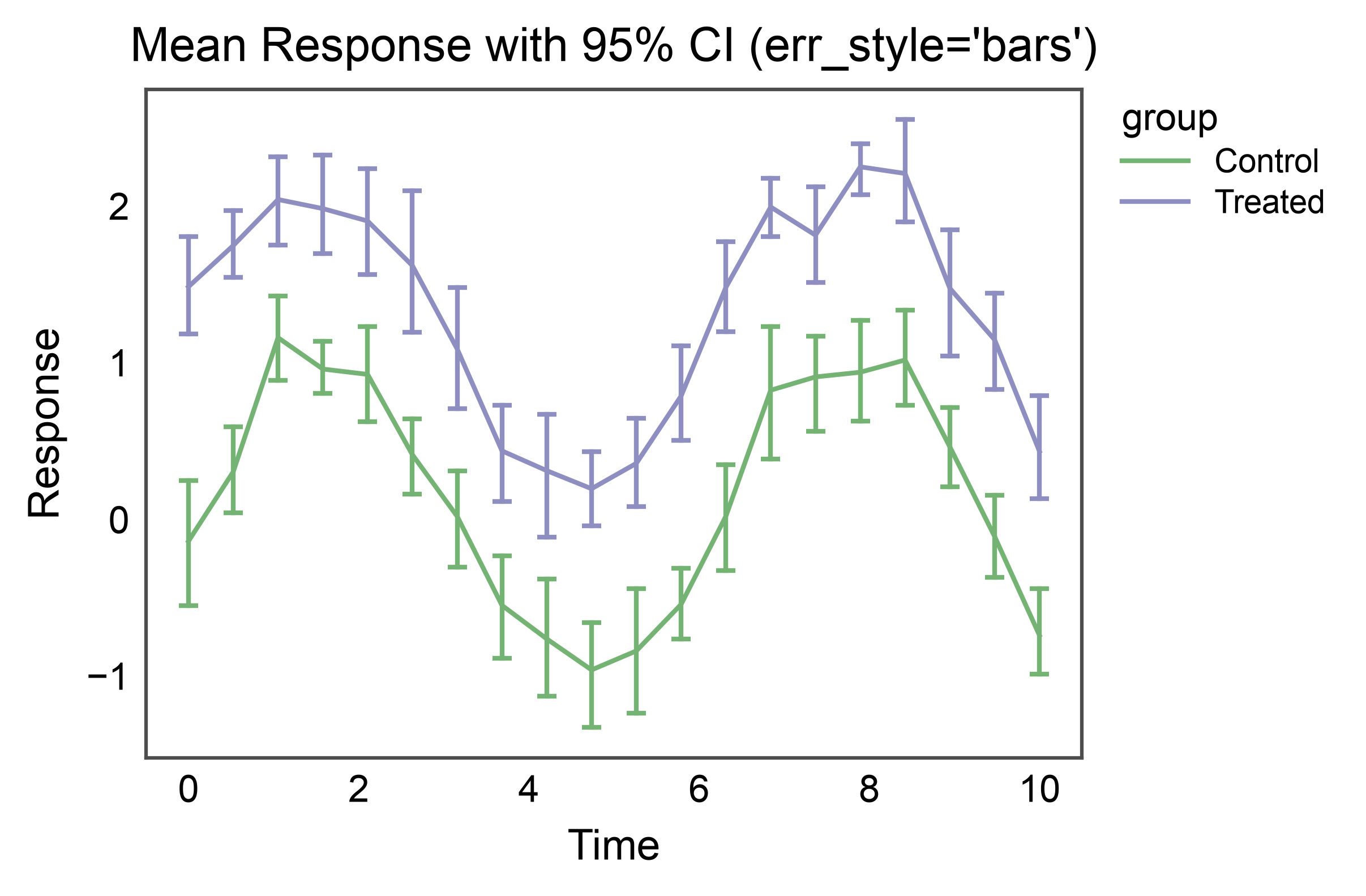
Error Bars Instead of Band
Switch to discrete error bars at each aggregated point with
err_style="bars".
ax = pp.lineplot(
    data=replicates,
    x="time",
    y="value",
    hue="group",
    palette="pastel",
    errorbar=("ci", 95),
    err_style="bars",
    err_kws={"capsize": 3},
    title="Mean Response with 95% CI (err_style='bars')",
    xlabel="Time",
    ylabel="Response",
)
pp.show()
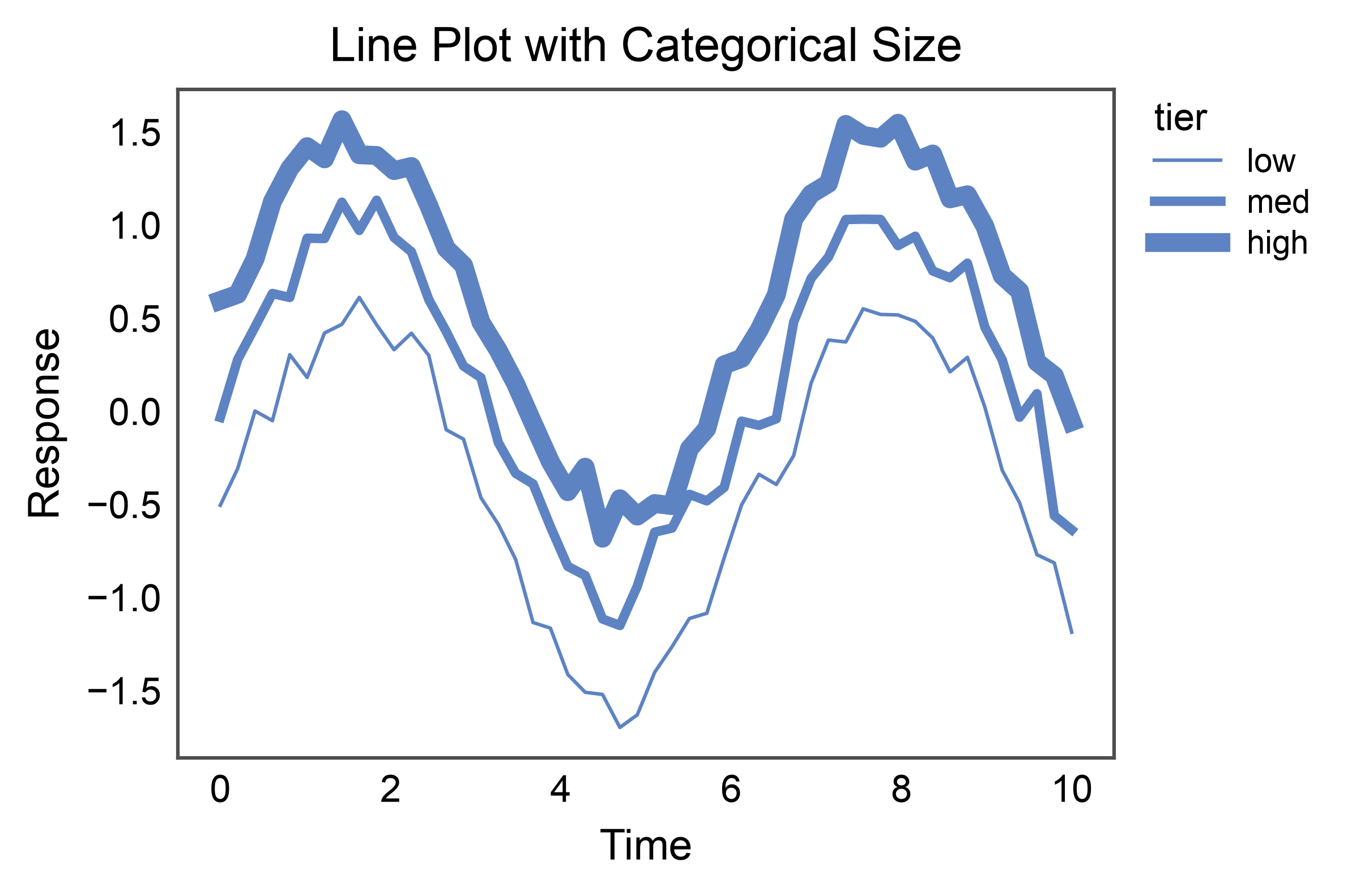
Categorical Size (line width per group)
size= accepts a categorical column too. Pass an explicit
sizes={category: linewidth} to control the width per category, or
let publiplots interpolate between the default (1.0, 4.0). The
legend shows one line swatch per category at its assigned width.
np.random.seed(21)
rows = []
for tier, offset in [("low", -0.5), ("med", 0.0), ("high", 0.5)]:
    for tt in t:
        rows.append({"time": tt, "value": np.sin(tt) + offset +
                     np.random.normal(0, 0.1), "tier": tier})
tiered = pd.DataFrame(rows)

ax = pp.lineplot(
    data=tiered,
    x="time",
    y="value",
    size="tier",
    sizes={"low": 0.75, "med": 2.0, "high": 4.0},
    title="Line Plot with Categorical Size",
    xlabel="Time",
    ylabel="Response",
)
pp.show()
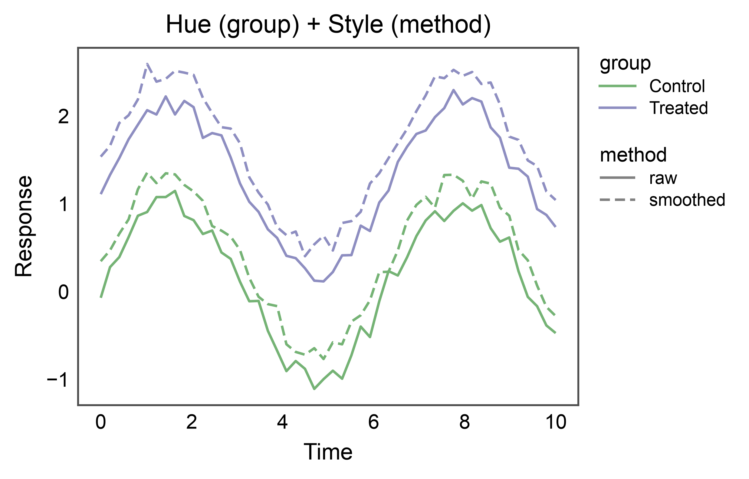
Hue + Style on Different Variables
hue= and style= become especially useful when they map to
different columns — e.g., color encodes the treatment group, dash
pattern encodes the measurement modality. Two legends rendered
side-by-side: one for color, one for pattern.
np.random.seed(13)
rows = []
for group, offset in [("Control", 0.0), ("Treated", 1.2)]:
    for method, jitter in [("raw", 0.0), ("smoothed", 0.3)]:
        for tt in t:
            rows.append({"time": tt, "value": np.sin(tt) + offset + jitter +
                         np.random.normal(0, 0.1), "group": group,
                         "method": method})
two_vars = pd.DataFrame(rows)

ax = pp.lineplot(
    data=two_vars,
    x="time",
    y="value",
    hue="group",
    style="method",
    palette="pastel",
    dashes={"raw": (1, 0), "smoothed": (4, 2)},
    title="Hue (group) + Style (method)",
    xlabel="Time",
    ylabel="Response",
)
pp.show()
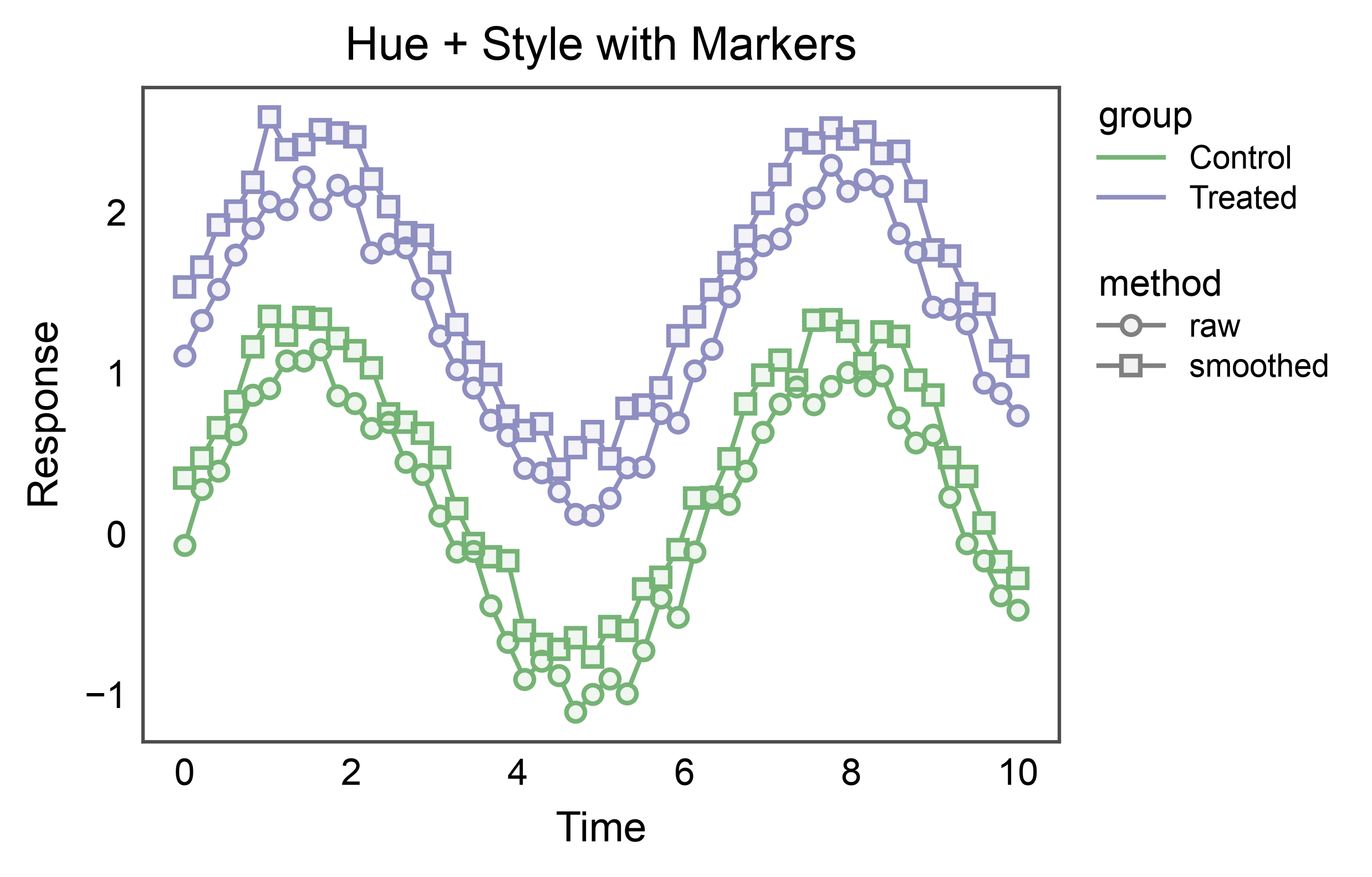
Markers on Aggregated Points
markers=True draws a marker at each aggregated x position —
useful to emphasise discrete observations on top of the trend line.
publiplots styles markers with the same double-layer convention as
pp.pointplot: a semi-transparent fill over a solid colored ring,
so the fill reads the group color without hiding the connecting
line. edgecolor= overrides the ring color if you want a neutral
outline for high-density plots.
ax = pp.lineplot(
    data=two_vars,
    x="time",
    y="value",
    hue="group",
    style="method",
    palette="pastel",
    markers=True,
    dashes=False,
    title="Hue + Style with Markers",
    xlabel="Time",
    ylabel="Response",
)
pp.show()
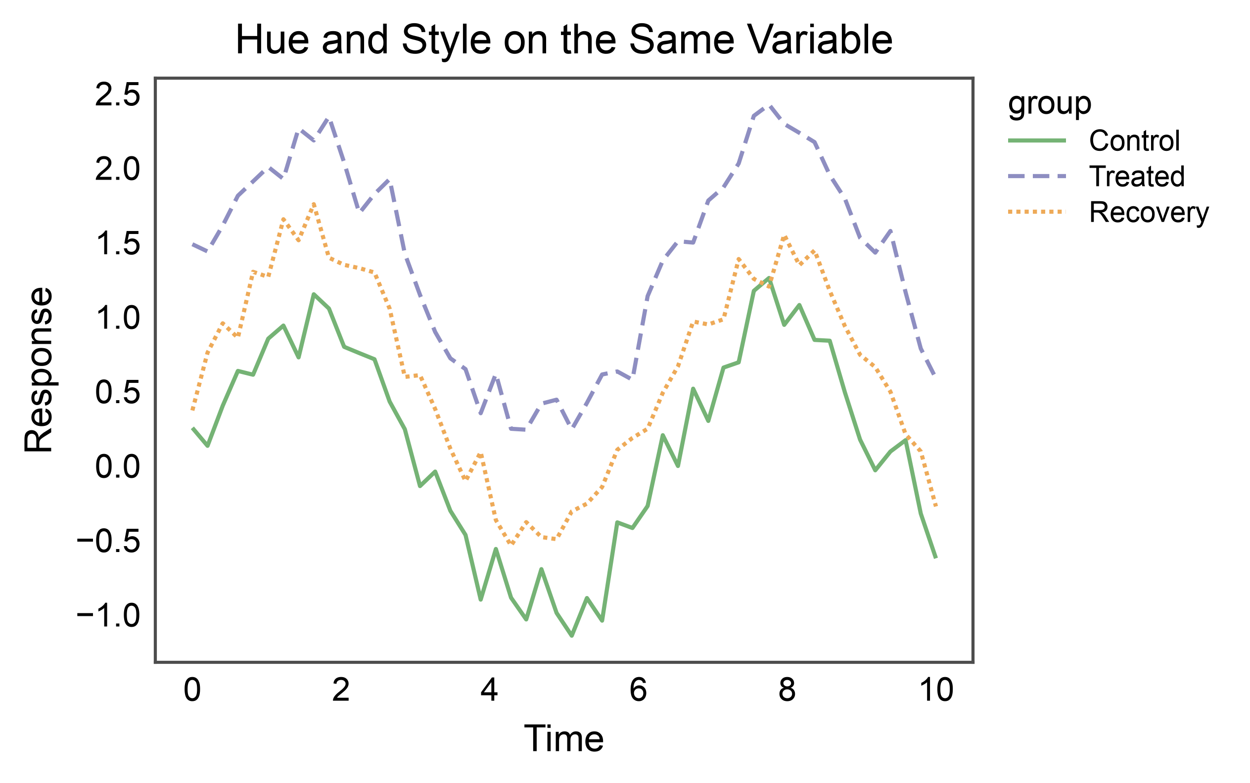
Hue and Style on the Same Variable
When hue= and style= map to the same column, publiplots
merges them into a single legend whose swatches encode both
dimensions at once — the colored, dashed line matches how the series
actually appears on the plot. Handy when a single categorical
variable is the organising axis of the figure.
ax = pp.lineplot(
    data=multi,
    x="time",
    y="value",
    hue="group",
    style="group",
    palette="pastel",
    dashes={"Control": (1, 0), "Treated": (4, 2), "Recovery": (1, 1)},
    title="Hue and Style on the Same Variable",
    xlabel="Time",
    ylabel="Response",
)
pp.show()
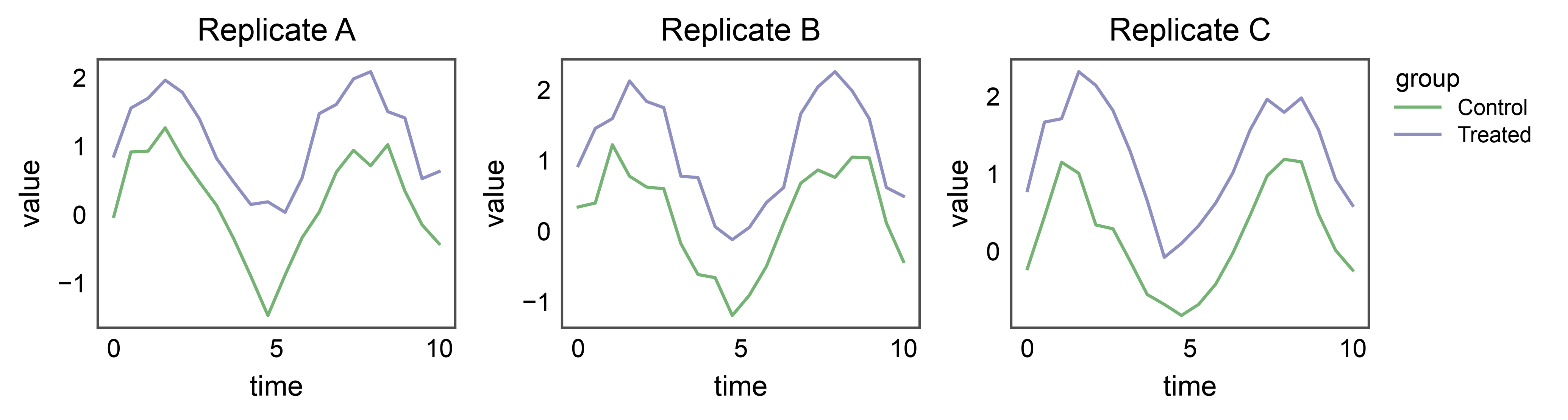
Shared Legend Across Subplots
When several line plots share the same hue variable, attach
pp.legend(anchor=...) before drawing. Each lineplot
stashes its hue entry on the corresponding axes; the group collects
them and renders one unified legend on the right.
np.random.seed(99)
rows = []
for panel in ["Replicate A", "Replicate B", "Replicate C"]:
    for group, offset in [("Control", 0.0), ("Treated", 1.0)]:
        for tt in np.linspace(0, 10, 20):
            rows.append({"panel": panel, "time": tt,
                         "value": np.sin(tt) + offset + np.random.normal(0, 0.2),
                         "group": group})
shared = pd.DataFrame(rows)

fig, axes = pp.subplots(1, 3, axes_size=(40, 30))
pp.legend(anchor=axes[-1])
for ax, panel in zip(axes, ["Replicate A", "Replicate B", "Replicate C"]):
    pp.lineplot(
        data=shared[shared["panel"] == panel],
        x="time",
        y="value",
        hue="group",
        palette="pastel",
        title=panel,
        ax=ax,
    )
pp.show()
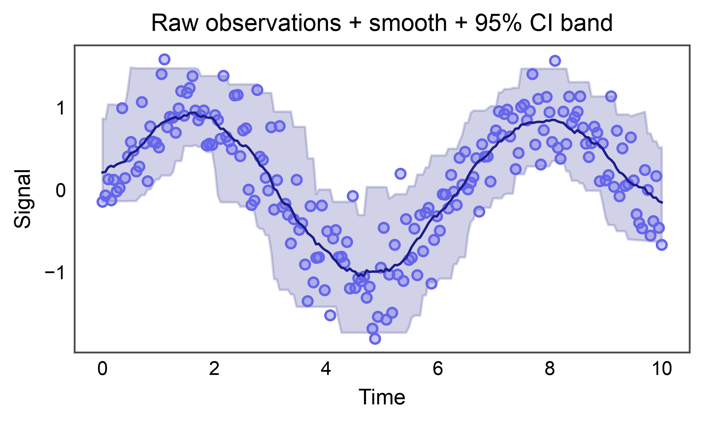
Smooth Line with Precomputed CI Band
errorbar=('custom', (lo_col, hi_col)) accepts precomputed lower
and upper bounds — e.g. from a LOESS bootstrap, a GAM fit, or a
Bayesian posterior — and renders them as a shaded band. No manual
ax.fill_between call per group needed. A full “raw scatter +
smooth line + CI band” panel now composes as two native pp.*
calls.
Here we synthesize a noisy sine wave, fit a rolling-mean smoother, and take a rolling 2.5%/97.5% percentile envelope as a stand-in for a bootstrap CI (keeping the example dependency-free — numpy only).
np.random.seed(31)
x = np.linspace(0, 10, 200)
y_raw = np.sin(x) + np.random.normal(0, 0.35, size=x.size)
raw_df = pd.DataFrame({"time": x, "value": y_raw})

window = 25
rolled = raw_df["value"].rolling(window, center=True, min_periods=1)
smooth_df = pd.DataFrame({
    "time": x,
    "value": rolled.mean().to_numpy(),
    "lo": rolled.quantile(0.025).to_numpy(),
    "hi": rolled.quantile(0.975).to_numpy(),
})

fig, ax = pp.subplots(axes_size=(90, 45))
pp.scatterplot(
    data=raw_df, x="time", y="value",
    color="#6565eb", alpha=0.35, ax=ax,
)
pp.lineplot(
    data=smooth_df, x="time", y="value",
    errorbar=("custom", ("lo", "hi")),
    err_style="band", color="#1d1d8a",
    title="Raw observations + smooth + 95% CI band",
    xlabel="Time",
    ylabel="Signal",
    ax=ax,
)
pp.show()
Total running time of the script: (0 minutes 7.692 seconds)