Note
Go to the end to download the full example code.
Hexbin Examples
publiplots.hexbinplot() is the 2D sibling of publiplots.histplot():
it aggregates a point cloud into a hexagonal grid and colors each cell by
count or by a user-supplied reduction of a third variable. Reach for it
when a scatter is so dense that individual points stop being readable.
The color legend is a continuous-hue colorbar routed through the standard
publiplots legend reactor — pp.legend(side=...), legend_kws={'inside':
True}, and figure-level bands all work without any plot-specific legend
code.
import publiplots as pp
import pandas as pd
import numpy as np
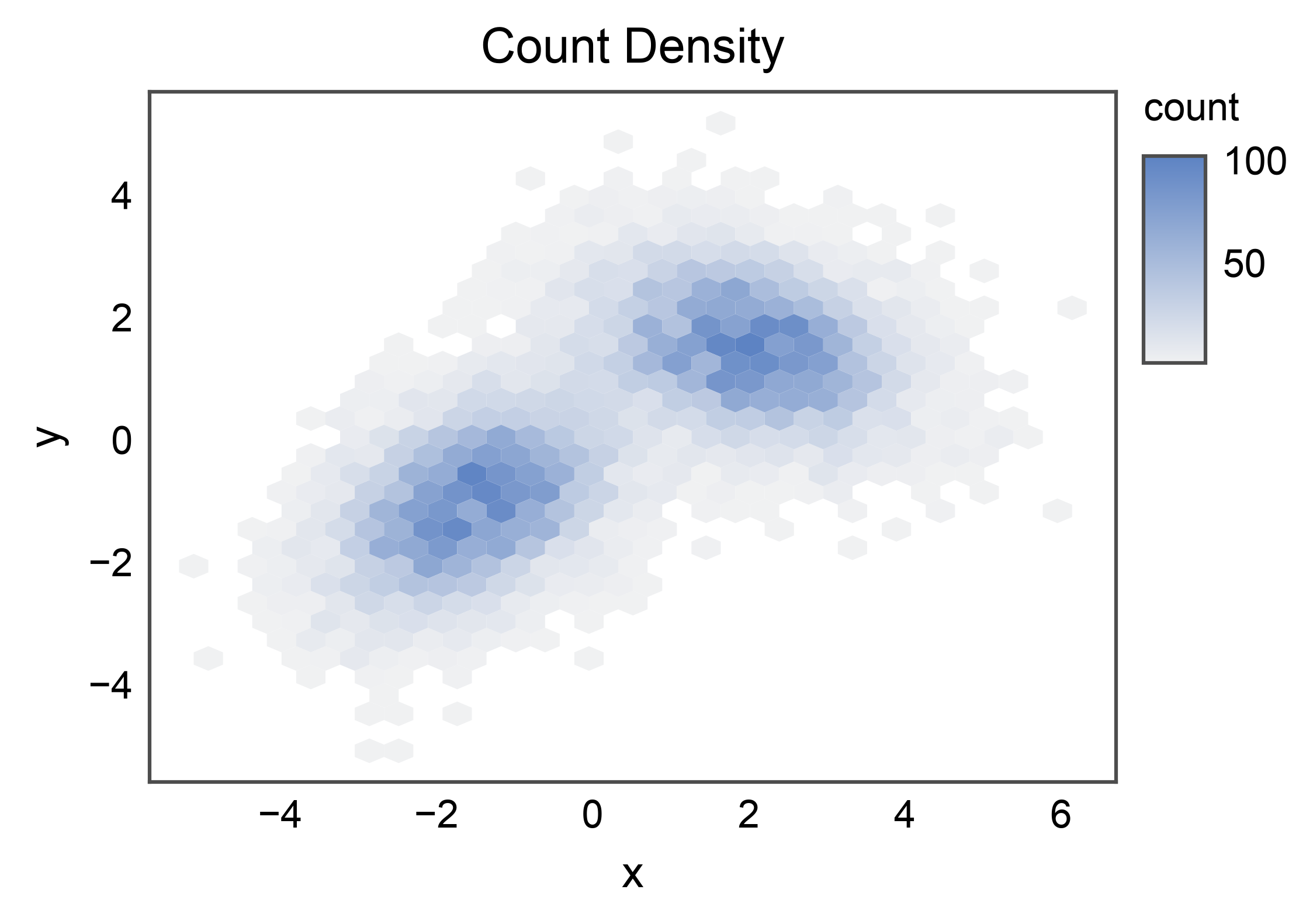
Basic Count Density
Simplest case: color each hex by the number of points falling in it. The colorbar on the right of the axes is auto-rendered from the stashed continuous-hue entry.
rng = np.random.default_rng(0)
n = 10_000
cluster_a = rng.multivariate_normal([-1.5, -1.0], [[1.0, 0.4], [0.4, 1.0]], n // 2)
cluster_b = rng.multivariate_normal([2.0, 1.5], [[1.2, -0.3], [-0.3, 0.8]], n // 2)
mixture = pd.DataFrame(np.vstack([cluster_a, cluster_b]), columns=["x", "y"])

ax = pp.hexbinplot(
    data=mixture,
    x="x",
    y="y",
    title="Count Density",
    xlabel="x",
    ylabel="y",
)
pp.show()
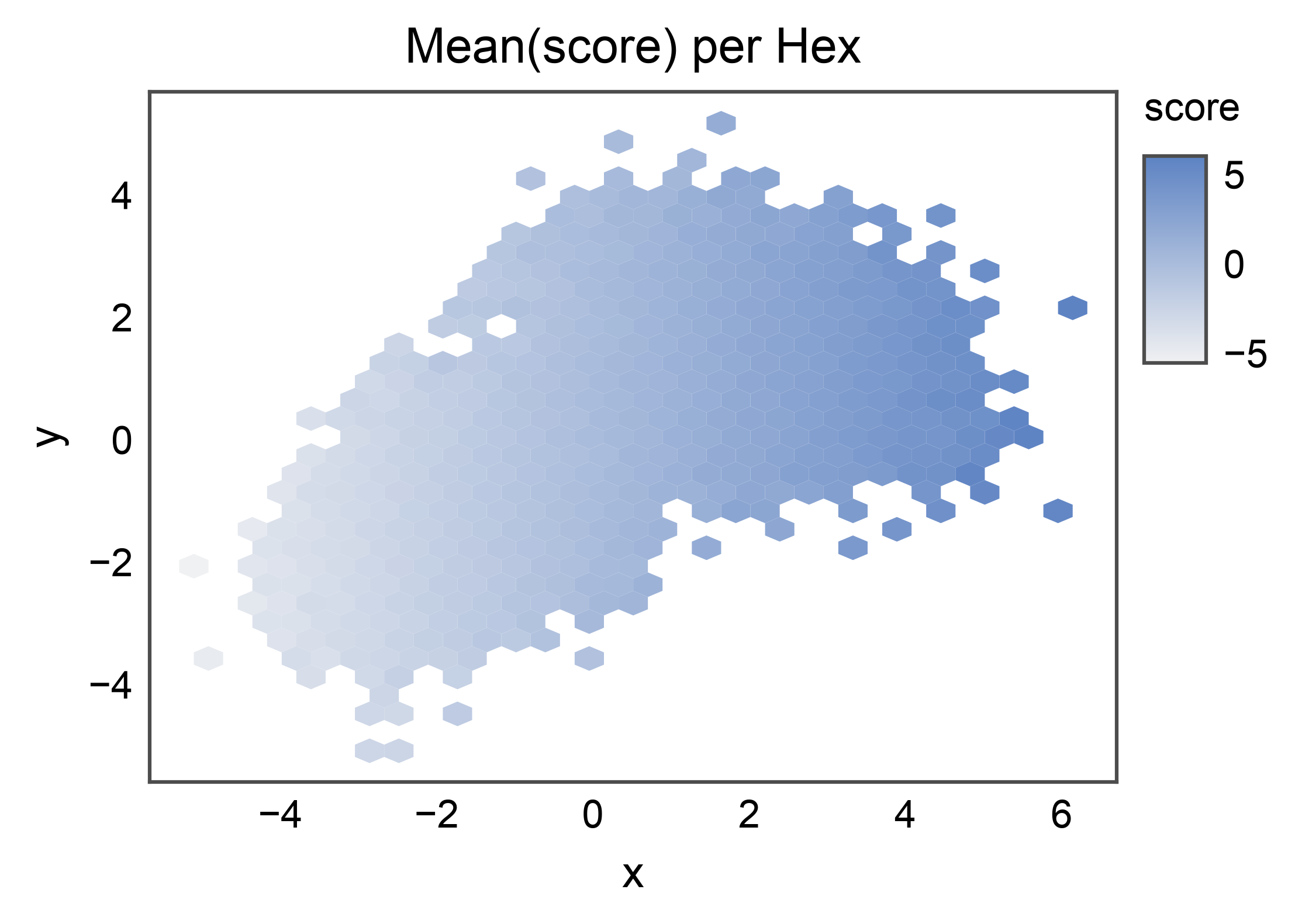
Reduced Third Variable
Pass C= to color each hex by a reduction of a third column
(reduce_C_function=np.mean by default). Here the score trends
with x — the gradient should read left-to-right across the cloud.
scored = mixture.copy()
scored["score"] = scored["x"] + rng.normal(scale=0.3, size=len(scored))

ax = pp.hexbinplot(
    data=scored,
    x="x",
    y="y",
    C="score",
    reduce_C_function=np.mean,
    title="Mean(score) per Hex",
    xlabel="x",
    ylabel="y",
)
pp.show()
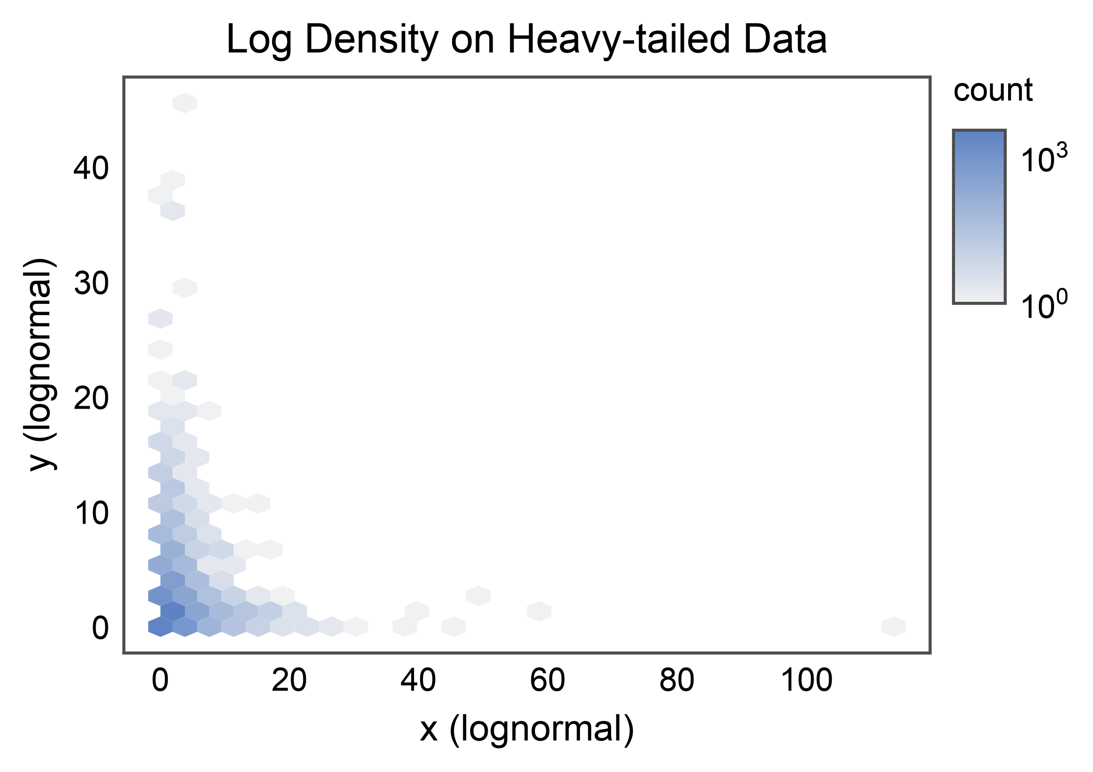
Log-scaled Density
For heavy-tailed distributions, pass bins="log" to log-normalize
the color scale. The legend automatically detects the
LogNorm and renders log-spaced colorbar
ticks.
heavy = pd.DataFrame({
    "x": rng.lognormal(mean=0.0, sigma=1.0, size=n),
    "y": rng.lognormal(mean=0.0, sigma=1.0, size=n),
})

ax = pp.hexbinplot(
    data=heavy,
    x="x",
    y="y",
    bins="log",
    title="Log Density on Heavy-tailed Data",
    xlabel="x (lognormal)",
    ylabel="y (lognormal)",
)
pp.show()
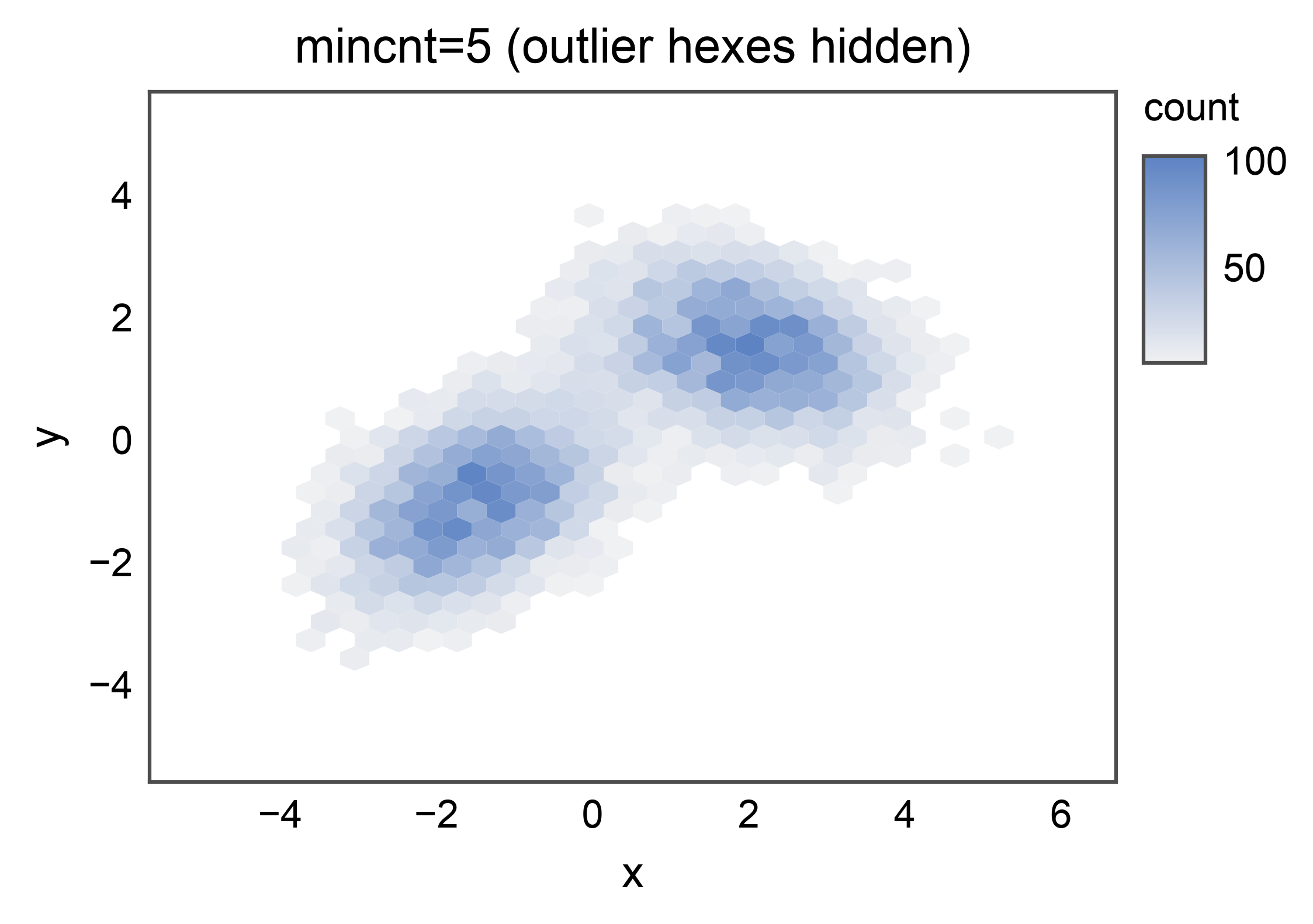
mincnt: Hide Sparse Cells
mincnt= hides hexes that contain fewer than the given number of
points, so empty regions render as transparent background rather than
the lowest color. Use a higher value to clean up isolated outlier
cells.
ax = pp.hexbinplot(
    data=mixture,
    x="x",
    y="y",
    mincnt=5,
    title="mincnt=5 (outlier hexes hidden)",
    xlabel="x",
    ylabel="y",
)
pp.show()
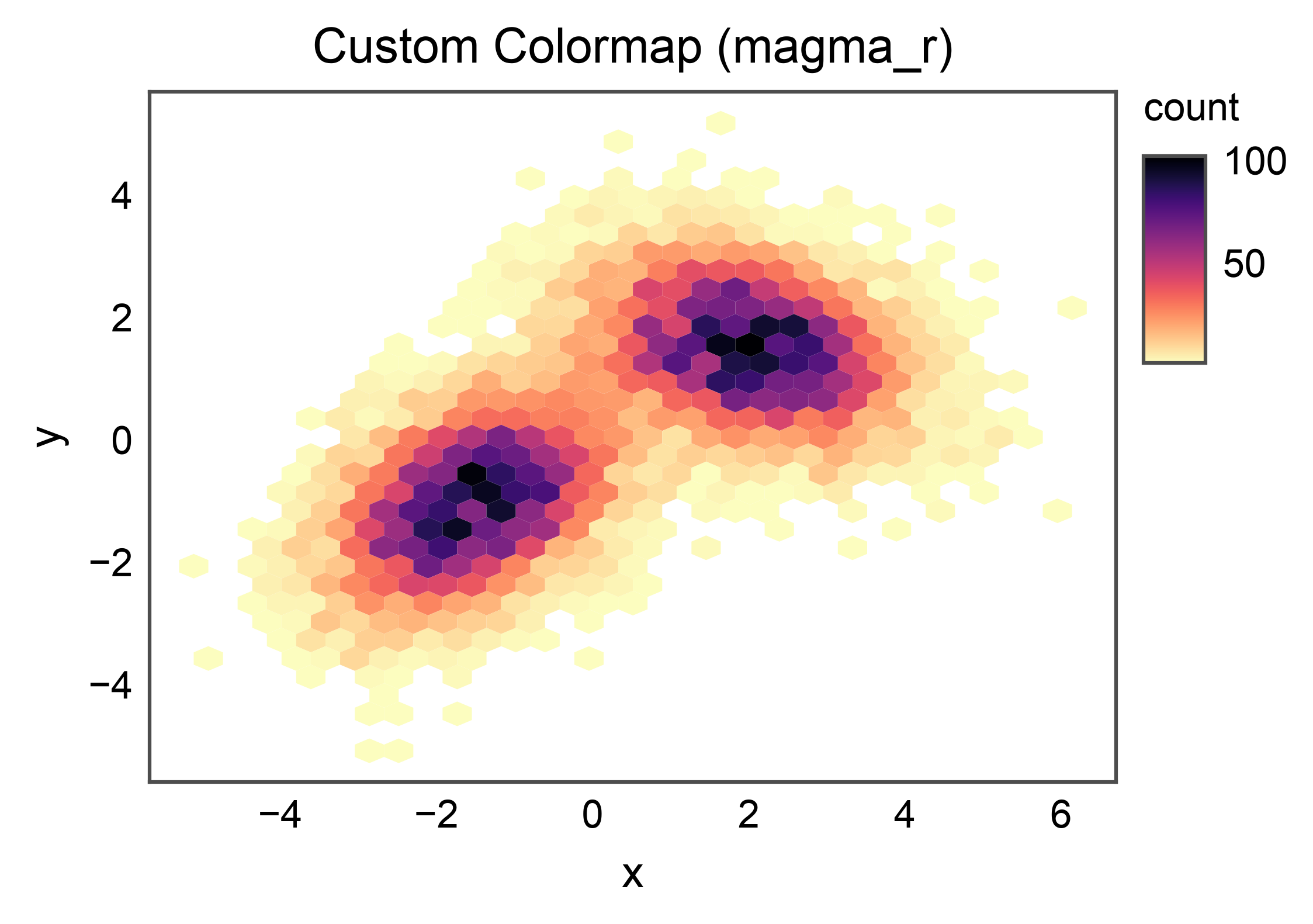
Custom Colormap
cmap= accepts any matplotlib colormap name. When omitted,
publiplots falls back to matplotlib.rcParams["image.cmap"] so a
figure-level cmap override works as expected.
ax = pp.hexbinplot(
    data=mixture,
    x="x",
    y="y",
    cmap="magma_r",
    title="Custom Colormap (magma_r)",
    xlabel="x",
    ylabel="y",
)
pp.show()
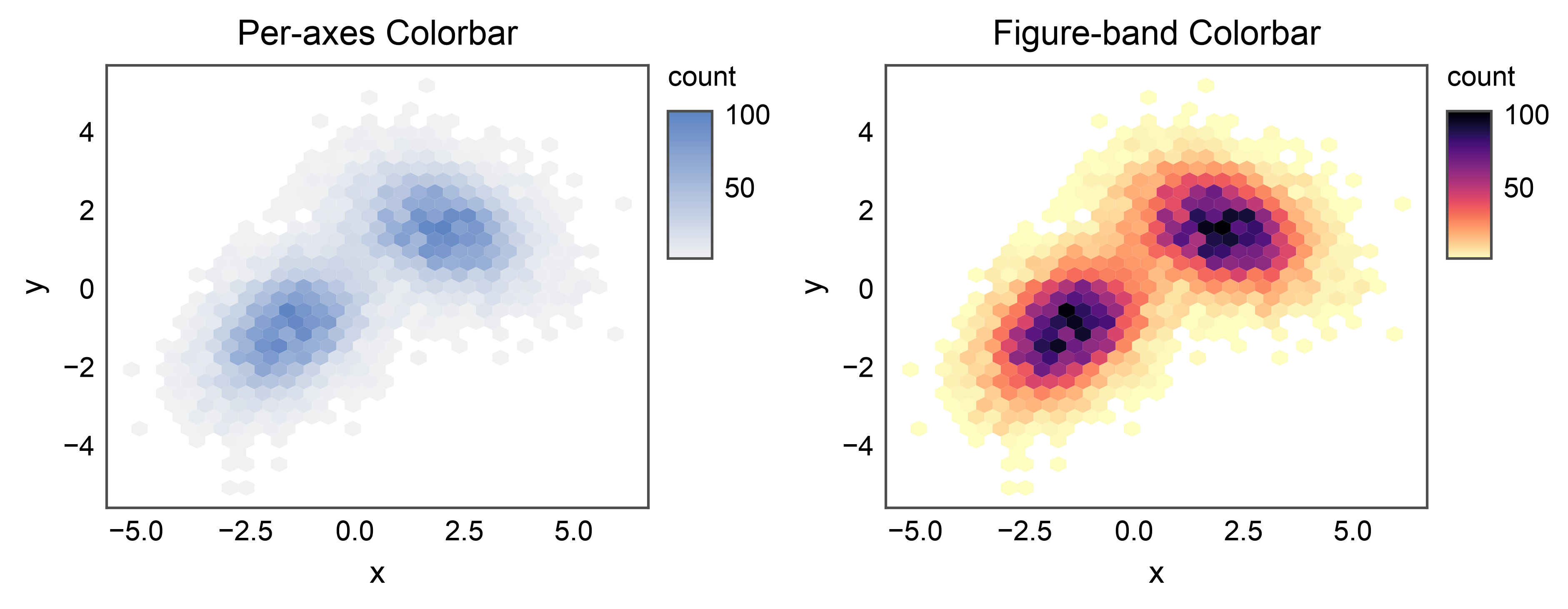
Grid of Hexbins with a Shared Legend
Hexbin colorbars integrate with the shared legend reactor. Scoping
pp.legend(axes[1], side="right") to a single panel means the band
claims only that panel’s stashed entry; the other panel continues to
auto-render its own per-axes colorbar.
fig, axes = pp.subplots(nrows=1, ncols=2, axes_size=(55, 45))
pp.hexbinplot(
    data=mixture, x="x", y="y",
    title="Per-axes Colorbar",
    xlabel="x", ylabel="y",
    ax=axes[0],
)
pp.legend(axes[1], side="right")
pp.hexbinplot(
    data=mixture, x="x", y="y",
    cmap="magma_r",
    title="Figure-band Colorbar",
    xlabel="x", ylabel="y",
    ax=axes[1],
)
pp.show()
Total running time of the script: (0 minutes 5.002 seconds)