Note
Go to the end to download the full example code.
Bar Plot Examples
This example demonstrates the various bar plot capabilities in PubliPlots, including simple bars, grouped bars, error bars, and hatch patterns.
import publiplots as pp
import pandas as pd
import numpy as np
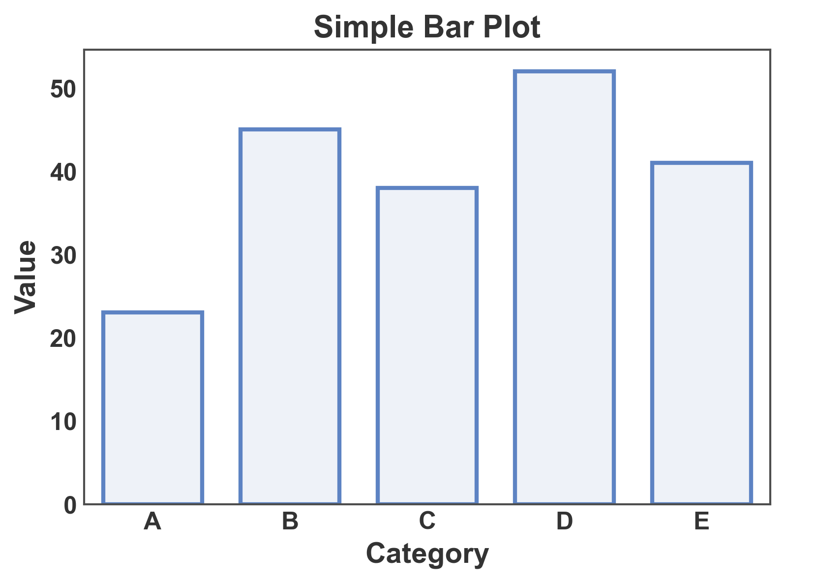
Simple Bar Plot
Create a basic bar plot with categorical data.
# Create sample data
simple_data = pd.DataFrame({
    'category': ['A', 'B', 'C', 'D', 'E'],
    'value': [23, 45, 38, 52, 41]
})

# Create simple bar plot
ax = pp.barplot(
    data=simple_data,
    x='category',
    y='value',
    title='Simple Bar Plot',
    xlabel='Category',
    ylabel='Value',
    palette='pastel',
)
pp.show()
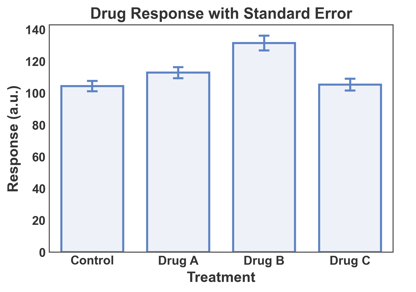
Bar Plot with Error Bars
Show mean ± standard error with multiple measurements per category.
# Create data with multiple measurements per category
np.random.seed(42)
error_data = pd.DataFrame({
    'treatment': np.repeat(['Control', 'Drug A', 'Drug B', 'Drug C'], 12),
    'response': np.concatenate([
        np.random.normal(100, 15, 12),  # Control
        np.random.normal(120, 12, 12),  # Drug A
        np.random.normal(135, 18, 12),  # Drug B
        np.random.normal(110, 14, 12),  # Drug C
    ])
})

# Create bar plot with error bars
ax = pp.barplot(
    data=error_data,
    x='treatment',
    y='response',
    title='Drug Response with Standard Error',
    xlabel='Treatment',
    ylabel='Response (a.u.)',
    errorbar='se',  # standard error
    capsize=0.1,
    palette='pastel',
)
pp.show()
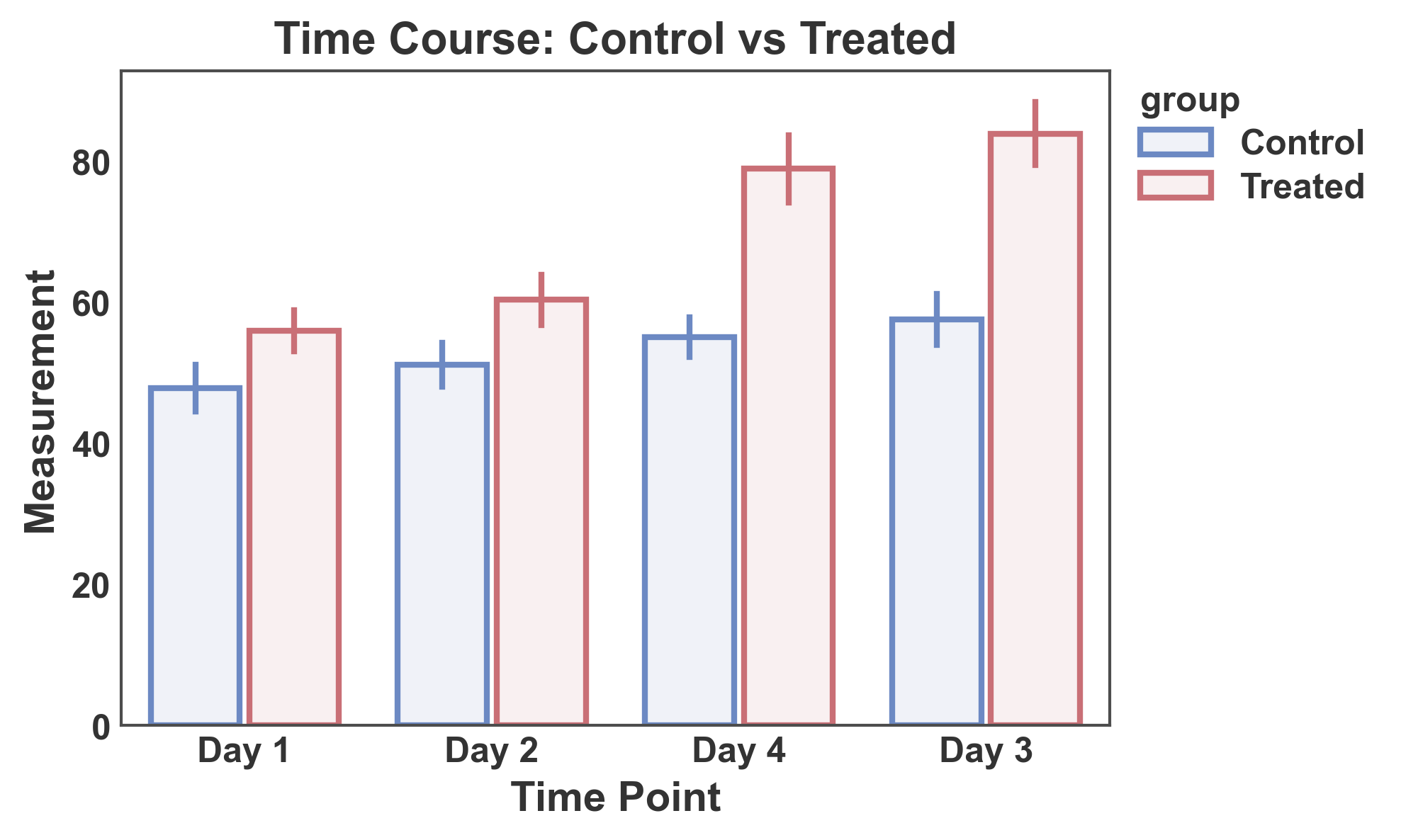
Grouped Bar Plot with Hue
Use the hue parameter to create grouped bars split by a categorical variable.
# Create grouped data
np.random.seed(123)
hue_data = pd.DataFrame({
    'time': np.repeat(['Day 1', 'Day 2', 'Day 3', 'Day 4'], 20),
    'group': np.tile(np.repeat(['Control', 'Treated'], 10), 4),
    'measurement': np.concatenate([
        # Day 1
        np.random.normal(50, 8, 10),   # Control
        np.random.normal(52, 8, 10),   # Treated
        # Day 2
        np.random.normal(52, 9, 10),   # Control
        np.random.normal(65, 10, 10),  # Treated
        # Day 3
        np.random.normal(54, 9, 10),   # Control
        np.random.normal(78, 12, 10),  # Treated
        # Day 4
        np.random.normal(55, 10, 10),  # Control
        np.random.normal(85, 14, 10),  # Treated
    ])
})

# Create grouped bar plot
ax = pp.barplot(
    data=hue_data,
    x='time',
    y='measurement',
    hue='group',
    title='Time Course: Control vs Treated',
    xlabel='Time Point',
    ylabel='Measurement',
    errorbar='se',
    palette="RdGyBu_r",
)
pp.show()
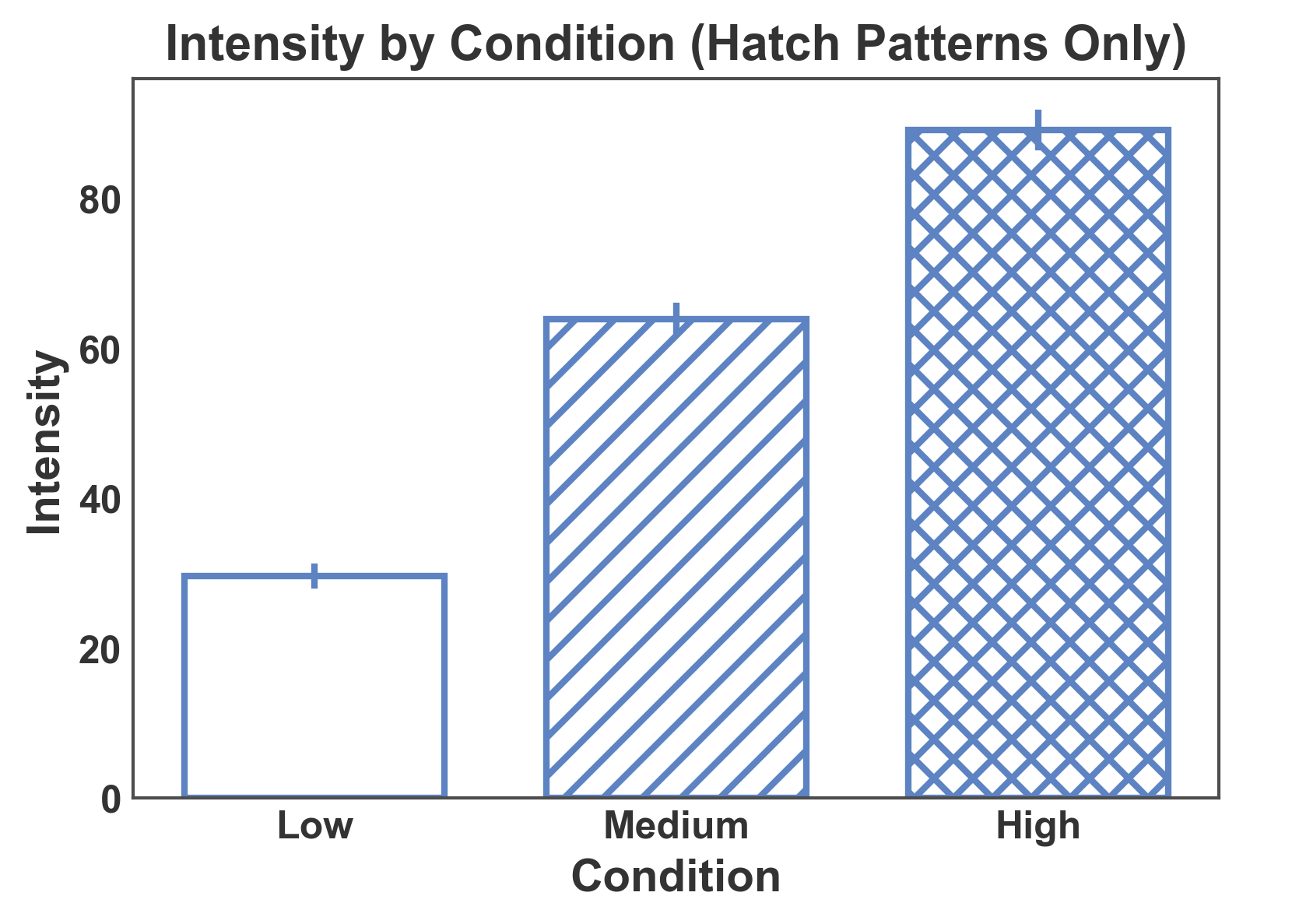
Bar Plot with Hatch Patterns Only
Use hatch patterns without color grouping for black-and-white publications.
# Create data for hatch-only plot
np.random.seed(456)
hatch_only_data = pd.DataFrame({
    'condition': np.repeat(['Low', 'Medium', 'High'], 15),
    'intensity': np.concatenate([
        np.random.normal(30, 5, 15),
        np.random.normal(60, 8, 15),
        np.random.normal(90, 10, 15),
    ])
})

# Create bar plot with hatch patterns (no hue)
ax = pp.barplot(
    data=hatch_only_data,
    x='condition',
    y='intensity',
    hatch='condition',
    title='Intensity by Condition (Hatch Patterns Only)',
    xlabel='Condition',
    ylabel='Intensity',
    errorbar='se',
    color='#5D83C3',
    hatch_map={'Low': '', 'Medium': '//', 'High': 'xx'},
    alpha=0.0,
)
pp.show()
Single Color + Hatch on a Separate Column
When a single fixed color represents the family of bars and a second
categorical column differentiates bars by pattern only, pass color=
together with hatch= pointing at that other column. All bars get
the same face color; the hatch encodes the sub-category.
np.random.seed(2024)
encoder_data = pd.DataFrame({
    "model": np.repeat(["Baseline", "Proposed"], 24),
    "encoder": np.tile(np.repeat(["1D CNN", "2D CNN"], 12), 2),
    "score": np.concatenate([
        np.random.normal(0.70, 0.04, 12), np.random.normal(0.73, 0.04, 12),
        np.random.normal(0.78, 0.03, 12), np.random.normal(0.82, 0.03, 12),
    ]),
})

ax = pp.barplot(
    data=encoder_data,
    x="model",
    y="score",
    color="#43adaa",
    hatch="encoder",
    hatch_map={"1D CNN": "", "2D CNN": "///"},
    errorbar="se",
    title="Fixed color + hatch differentiates encoder",
    xlabel="Model family",
    ylabel="Score",
)
pp.show()
Hue and Hatch on the Same Column
When hue= and hatch= point at the same column, publiplots
merges them into a single legend whose swatches encode both color and
pattern — useful when a single categorical variable is the organizing
axis of the figure.
ax = pp.barplot(
    data=encoder_data,
    x="model",
    y="score",
    hue="encoder",
    hatch="encoder",
    palette={"1D CNN": "#8E8EC1", "2D CNN": "#60a8a8"},
    hatch_map={"1D CNN": "", "2D CNN": "///"},
    errorbar="se",
    title="hue == hatch → combined legend",
    xlabel="Model family",
    ylabel="Score",
)
pp.show()
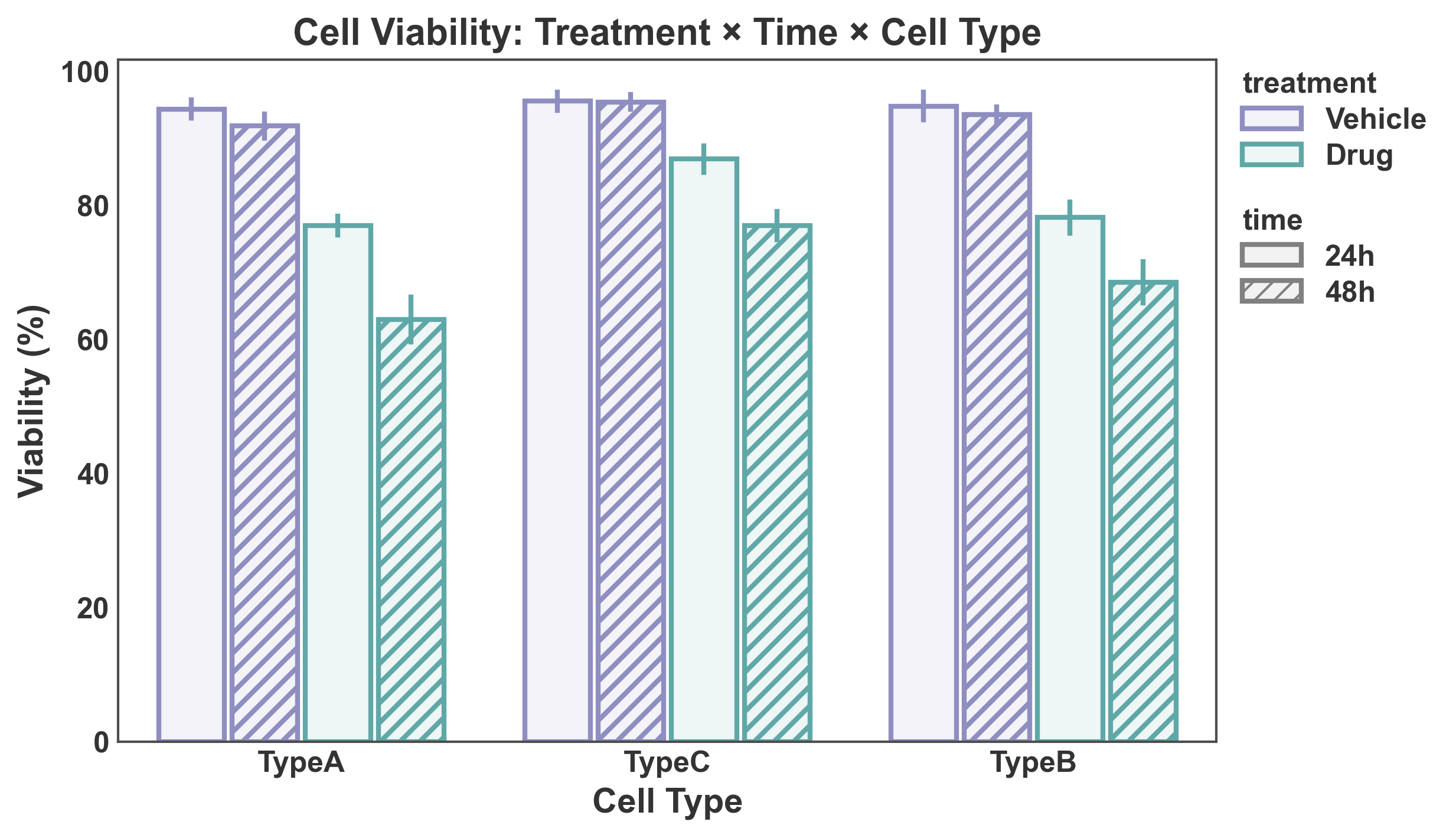
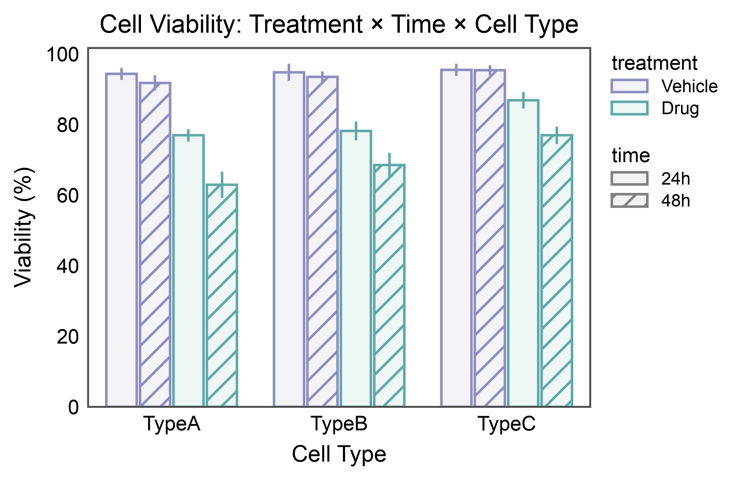
Bar Plot with Hue and Hatch (Double Split)
Combine color grouping (hue) and pattern differentiation (hatch) for visualizing data with two categorical grouping variables.
# Create data with both hue and hatch
np.random.seed(789)
double_split_data = pd.DataFrame({
    "cell_type": np.repeat(["TypeA", "TypeB", "TypeC"], 40),
    "treatment": np.tile(np.repeat(["Vehicle", "Drug"], 20), 3),
    "time": np.tile(np.repeat(["24h", "48h"], 10), 6),
    "viability": np.concatenate([
        # TypeA
        np.random.normal(95, 5, 10),   # Vehicle, 24h
        np.random.normal(93, 5, 10),   # Vehicle, 48h
        np.random.normal(75, 8, 10),   # Drug, 24h
        np.random.normal(60, 10, 10),  # Drug, 48h
        # TypeB
        np.random.normal(94, 5, 10),   # Vehicle, 24h
        np.random.normal(92, 5, 10),   # Vehicle, 48h
        np.random.normal(80, 8, 10),   # Drug, 24h
        np.random.normal(70, 9, 10),   # Drug, 48h
        # TypeC
        np.random.normal(96, 4, 10),   # Vehicle, 24h
        np.random.normal(95, 4, 10),   # Vehicle, 48h
        np.random.normal(85, 7, 10),   # Drug, 24h
        np.random.normal(78, 8, 10),   # Drug, 48h
    ])
})

# Create bar plot with both hue and hatch
ax = pp.barplot(
    data=double_split_data,
    x="cell_type",
    y="viability",
    hue="treatment",
    hatch="time",
    title="Cell Viability: Treatment × Time × Cell Type",
    xlabel="Cell Type",
    ylabel="Viability (%)",
    errorbar="se",
    palette={"Vehicle": "#8E8EC1", "Drug": "#60a8a8"},
    hatch_map={"24h": "", "48h": "///"},
)
pp.show()
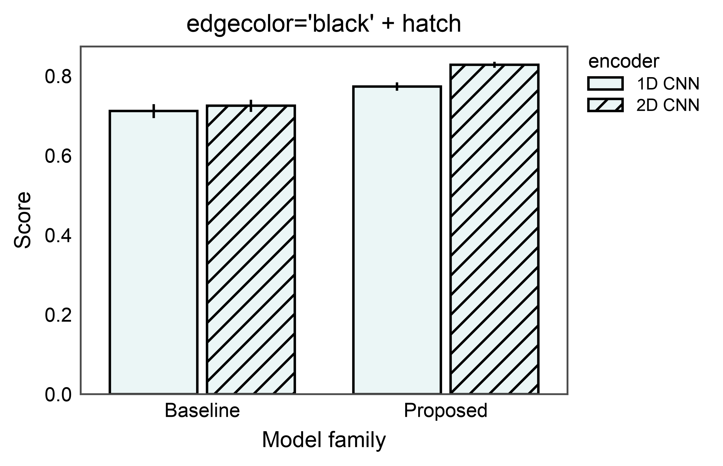
Explicit Edge Color with Hatch
The edgecolor= argument overrides the automatic face-derived edges
on every bar, independently of whether a hatch is active. Pair it
with hatch= to produce classic print-style bars: colored fill,
consistent black outline, pattern fill on the hatched subset.
ax = pp.barplot(
    data=encoder_data,
    x="model",
    y="score",
    color="#43adaa",
    edgecolor="black",
    hatch="encoder",
    hatch_map={"1D CNN": "", "2D CNN": "///"},
    errorbar="se",
    title="edgecolor='black' + hatch",
    xlabel="Model family",
    ylabel="Score",
)
pp.show()
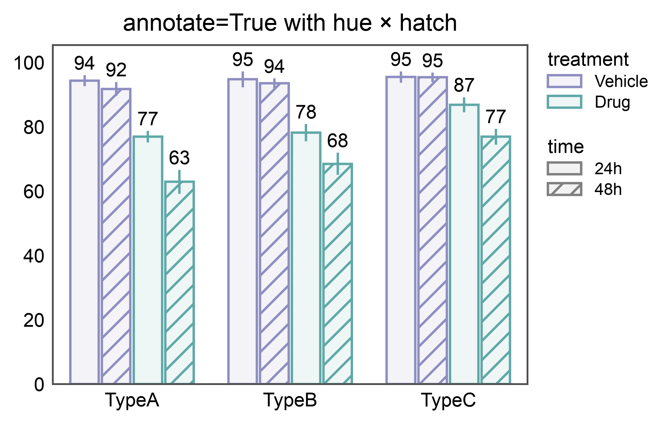
Annotated hue + hatch bars
annotate=True pairs each bar with its aggregated value correctly
even when bars are dodged across both a hue and a hatch dimension —
12 bars here (3 cell types × 2 treatments × 2 time points), 12 labels.
ax = pp.barplot(
    data=double_split_data,
    x="cell_type",
    y="viability",
    hue="treatment",
    hatch="time",
    errorbar="se",
    palette={"Vehicle": "#8E8EC1", "Drug": "#60a8a8"},
    hatch_map={"24h": "", "48h": "///"},
    annotate={"fmt": ".0f"},
    title="annotate=True with hue × hatch",
)
pp.show()
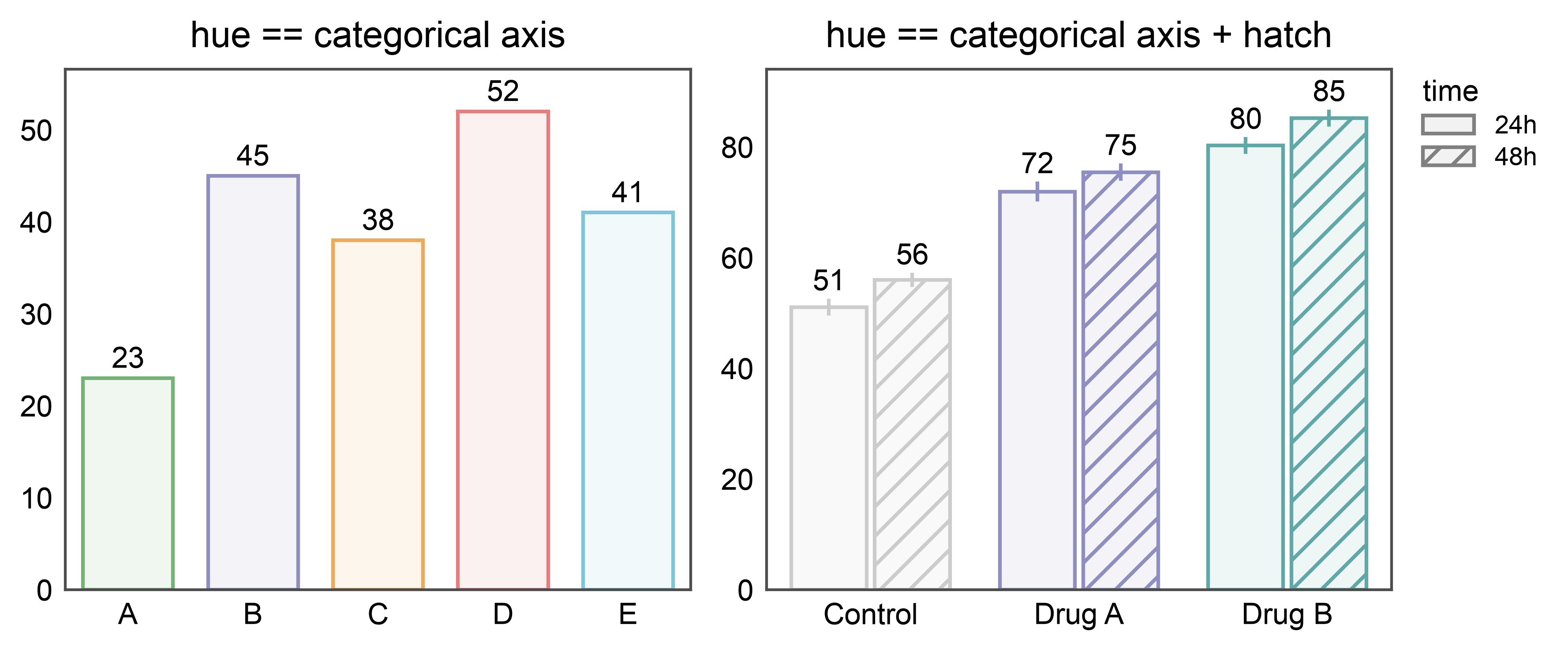
Annotated bars when hue or hatch matches the categorical axis
Setting hue (or hatch) to the categorical axis doesn’t cause
dodging — each category just gets its own color (or pattern). If the
other split is a separate column, it still causes dodging as usual.
annotate follows suit: one label per drawn bar, correctly paired.
# Shared dataset: response per treatment at two time points.
np.random.seed(101)
time_data = pd.DataFrame({
"treatment": np.tile(np.repeat(["Control", "Drug A", "Drug B"], 10), 2),
"time": np.repeat(["24h", "48h"], 30),
"response": np.concatenate([
np.random.normal(50, 3, 10), np.random.normal(70, 4, 10),
np.random.normal(80, 4, 10), np.random.normal(55, 3, 10),
np.random.normal(75, 4, 10), np.random.normal(85, 4, 10),
]),
})
hue_palette = {"Control": "#cccccc", "Drug A": "#8E8EC1", "Drug B": "#60a8a8"}
# hue == categorical axis (vs. hue == cat + hatch on a separate column)
fig, axes = pp.subplots(1, 2, axes_size=(60, 50))
pp.barplot(
data=simple_data, x="category", y="value", hue="category", ax=axes[0],
palette="pastel", errorbar=None,
annotate={"fmt": ".0f"},
title="hue == categorical axis",
)
pp.barplot(
data=time_data, x="treatment", y="response",
hue="treatment", hatch="time", ax=axes[1],
palette=hue_palette,
hatch_map={"24h": "", "48h": "///"},
errorbar="se",
annotate={"fmt": ".0f"},
title="hue == categorical axis + hatch",
)
pp.show()
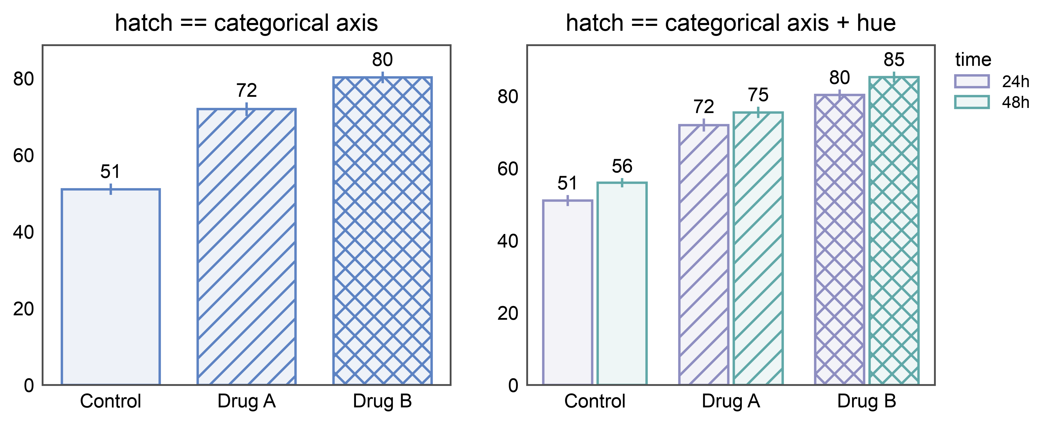
# hatch == categorical axis (vs. hatch == cat + hue on a separate column)
hatch_by_cat = {"Control": "", "Drug A": "///", "Drug B": "xxx"}
fig, axes = pp.subplots(1, 2, axes_size=(60, 50))
pp.barplot(
data=time_data[time_data["time"] == "24h"],
x="treatment", y="response", hatch="treatment", ax=axes[0],
palette="pastel",
hatch_map=hatch_by_cat,
errorbar="se",
annotate={"fmt": ".0f"},
title="hatch == categorical axis",
)
pp.barplot(
data=time_data, x="treatment", y="response",
hue="time", hatch="treatment", ax=axes[1],
palette={"24h": "#8E8EC1", "48h": "#60a8a8"},
hatch_map=hatch_by_cat,
errorbar="se",
annotate={"fmt": ".0f"},
title="hatch == categorical axis + hue",
)
pp.show()
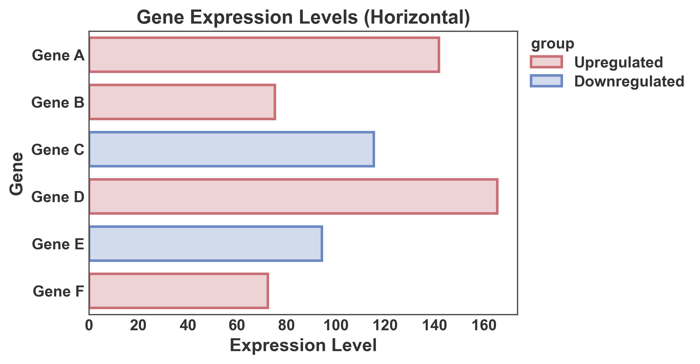
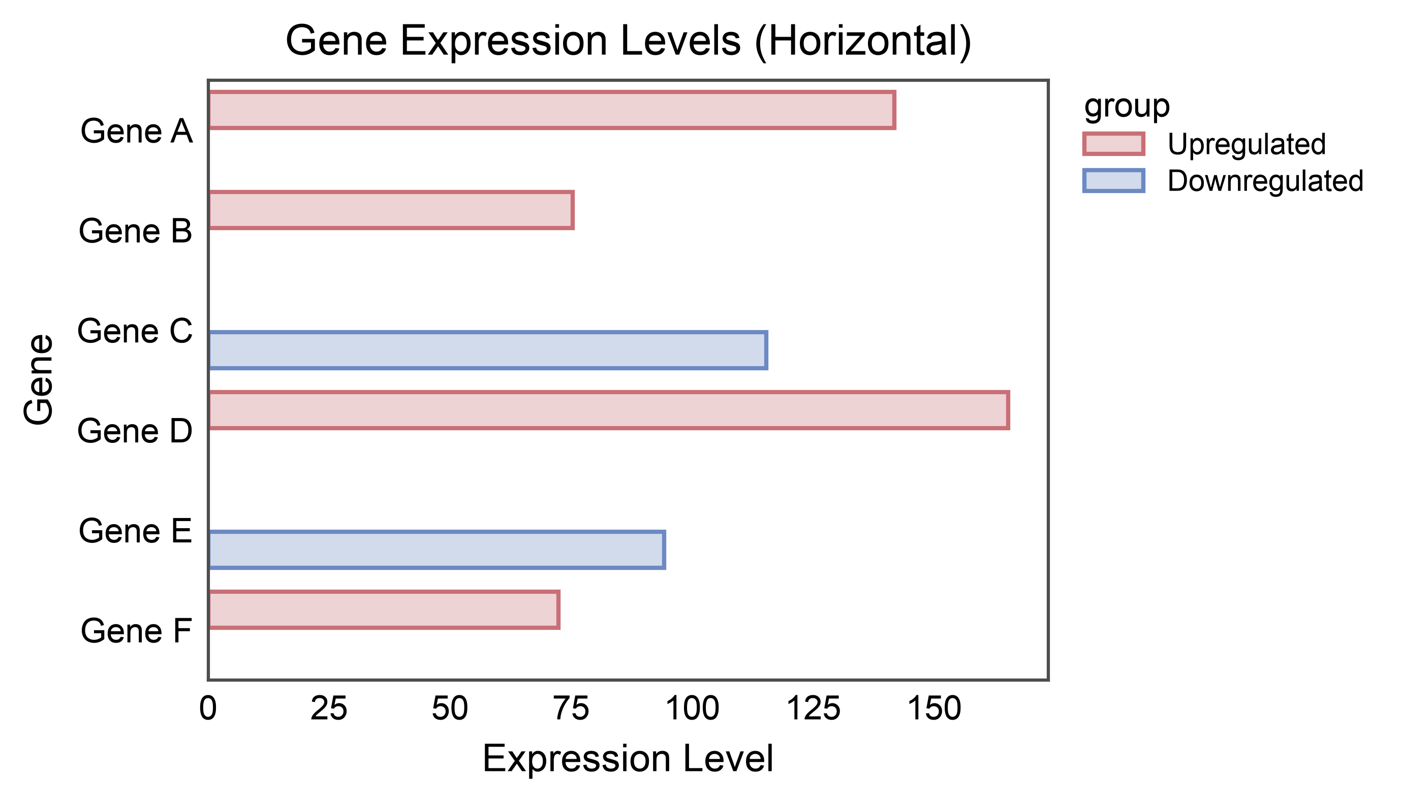
Horizontal Bar Plot
Create horizontal bars by swapping x and y axes.
# Create data for horizontal bar plot
np.random.seed(111)
horizontal_data = pd.DataFrame({
    'gene': ['Gene A', 'Gene B', 'Gene C', 'Gene D', 'Gene E', 'Gene F'],
    'expression': np.random.uniform(50, 200, 6),
    'group': ['Upregulated', 'Upregulated', 'Downregulated',
              'Upregulated', 'Downregulated', 'Upregulated']
})

# Create horizontal bar plot
ax = pp.barplot(
    data=horizontal_data,
    x='expression',
    y='gene',
    hue='group',
    title='Gene Expression Levels (Horizontal)',
    xlabel='Expression Level',
    ylabel='Gene',
    palette="RdGyBu",
    errorbar=None,
    alpha=0.3,
    order=horizontal_data['gene'].tolist()
)
pp.show()
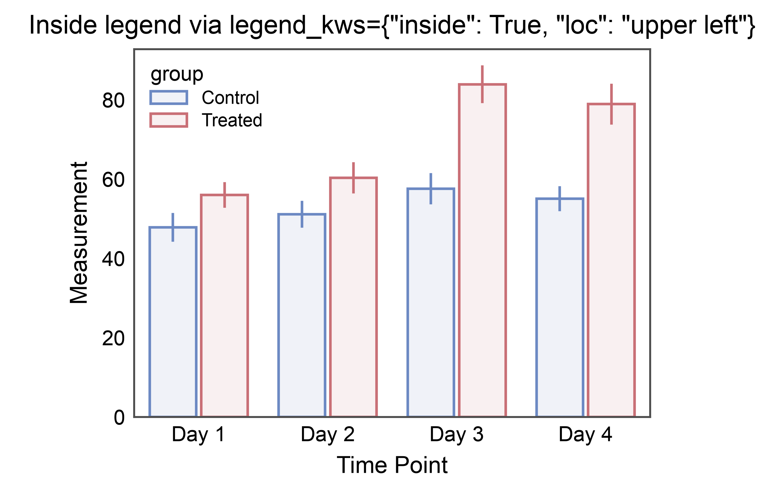
Legend Inside the Axes
By default publiplots parks the legend just past the right edge of the
axes so plots can line up cleanly. For compact figures or when the data
leaves a natural empty corner, pass legend_kws={"inside": True,
"loc": "upper right"} to place the legend inside the axes frame
using matplotlib’s native corner-based placement. inside=True
works with any loc string that matplotlib.axes.Axes.legend()
accepts ("upper right", "lower left", "best", etc.); omit
loc and matplotlib picks the emptiest corner.
ax = pp.barplot(
    data=hue_data,
    x="time",
    y="measurement",
    hue="group",
    palette="RdGyBu_r",
    errorbar="se",
    title='Inside legend via legend_kws={"inside": True, "loc": "upper left"}',
    xlabel="Time Point",
    ylabel="Measurement",
    legend_kws={"inside": True, "loc": "upper left"},
)
pp.show()
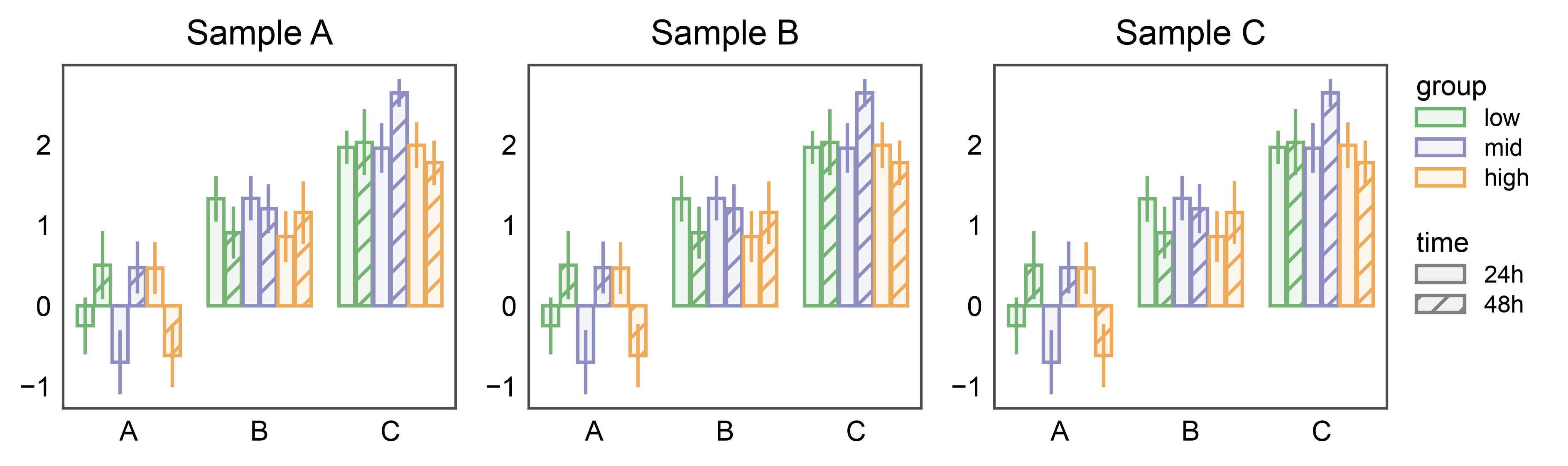
Shared Legend Across Subplots
When several bar subplots share the same hue and hatch variables,
attach pp.legend(anchor=...) before drawing. Each barplot
stashes its hue + hatch entries on the corresponding axes; the group
collects them (deduped by name across subplots) and renders a single
legend on the right of the rightmost subplot — with both the hue swatches
and the hatch patterns.
np.random.seed(99)
shared_df = pd.DataFrame({
    "cat": np.tile(["A", "B", "C"], 60),
    "val": np.random.randn(180) + np.tile([0, 1, 2], 60),
    "group": np.repeat(["low", "mid", "high"], 60),
    "time": np.tile(np.repeat(["24h", "48h"], 30), 3),
})

fig, axes = pp.subplots(1, 3, axes_size=(40, 35))
pp.legend(anchor=axes[-1])
for ax, title in zip(axes, ["Sample A", "Sample B", "Sample C"]):
    pp.barplot(
        data=shared_df, x="cat", y="val",
        hue="group", hatch="time",
        palette="pastel",
        hatch_map={"24h": "", "48h": "///"},
        title=title, ax=ax,
        errorbar="se",
    )
pp.show()
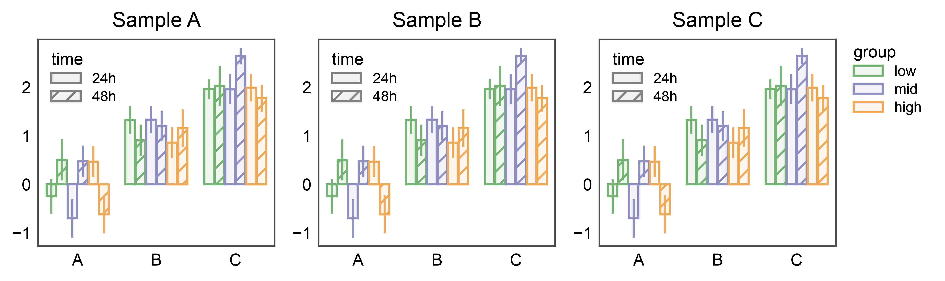
Split Legends: Shared Group, Panel-Local Hatch
The two placement modes compose. When a genuine double-split bar
(hue and hatch both distinct from the categorical axis) has
one dimension repeated across panels and another that’s panel-local
information, pp.legend(collect=[...]) lifts the shared
entry into a single figure-level legend while legend_kws={"inside":
True, ...} keeps the non-collected entry inside each axes. Here the
group color palette is shared across the three samples (collected
once on the right) and the time hatch is local per panel (tucked
into each axes’ upper-left corner).
fig, axes = pp.subplots(1, 3, axes_size=(40, 35))
pp.legend(anchor=axes[-1], collect=["group"])
for ax, title in zip(axes, ["Sample A", "Sample B", "Sample C"]):
    pp.barplot(
        data=shared_df, x="cat", y="val",
        hue="group", hatch="time",
        palette="pastel",
        hatch_map={"24h": "", "48h": "///"},
        title=title, ax=ax,
        errorbar="se",
        legend_kws={"inside": True, "loc": "upper left"},
    )
pp.show()
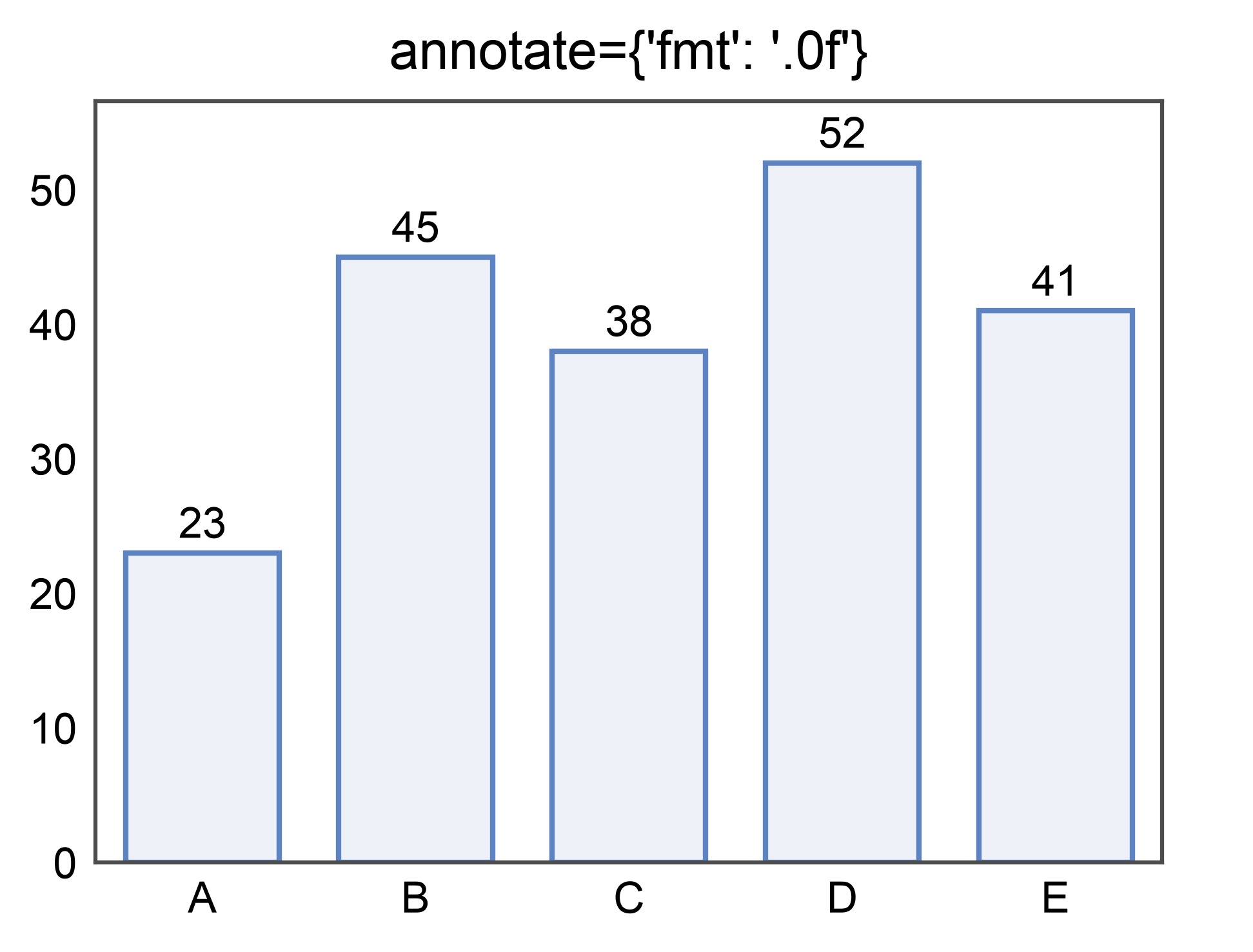
Annotated bars
Label each bar with its aggregated value by passing annotate=True.
Pass a dict to control format, anchor, color, and text kwargs. See the
dedicated annotations gallery for the full
option set shared across barplot, pointplot, boxplot, and violinplot.
ax = pp.barplot(
    data=simple_data,
    x='category', y='value',
    palette='pastel',
    annotate={"fmt": ".0f"},
    title="annotate={'fmt': '.0f'}",
)
pp.show()
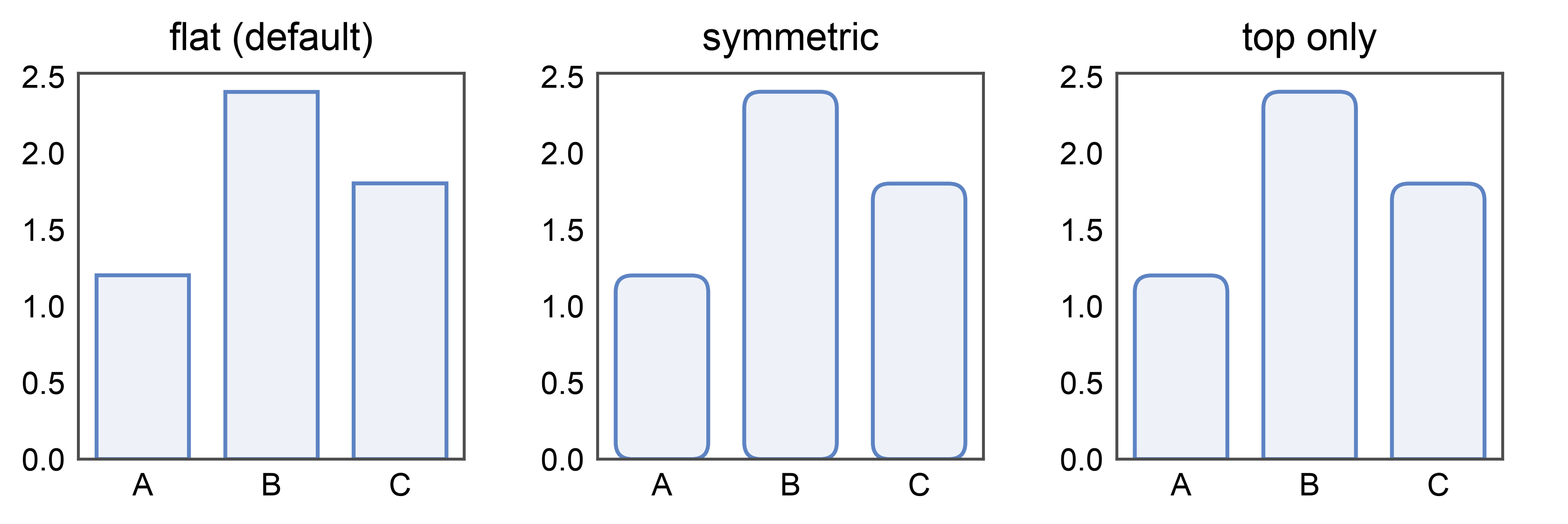
Rounded bars — border_radius
New in 0.10.4: pp.barplot(..., border_radius=1.5) rounds all four
corners. Units are millimeters (print-consistent, independent of
the y-axis scale). Pass a (top_mm, bottom_mm) tuple for
asymmetric rounding — border_radius=(1.5, 0) rounds only the top
and keeps the baseline square, a common infographic look. Set
globally with pp.rcParams['bar.border_radius'] = 1.5.
rounded_df = pd.DataFrame({'x': ['A', 'B', 'C'], 'y': [1.2, 2.4, 1.8]})

fig, axes = pp.subplots(1, 3, axes_size=(35, 35))
pp.barplot(data=rounded_df, x='x', y='y', ax=axes[0], title='flat (default)')
pp.barplot(
    data=rounded_df, x='x', y='y', ax=axes[1],
    border_radius=1.5, title='symmetric',
)
pp.barplot(
    data=rounded_df, x='x', y='y', ax=axes[2],
    border_radius=(1.5, 0), title='top only',
)
pp.show()
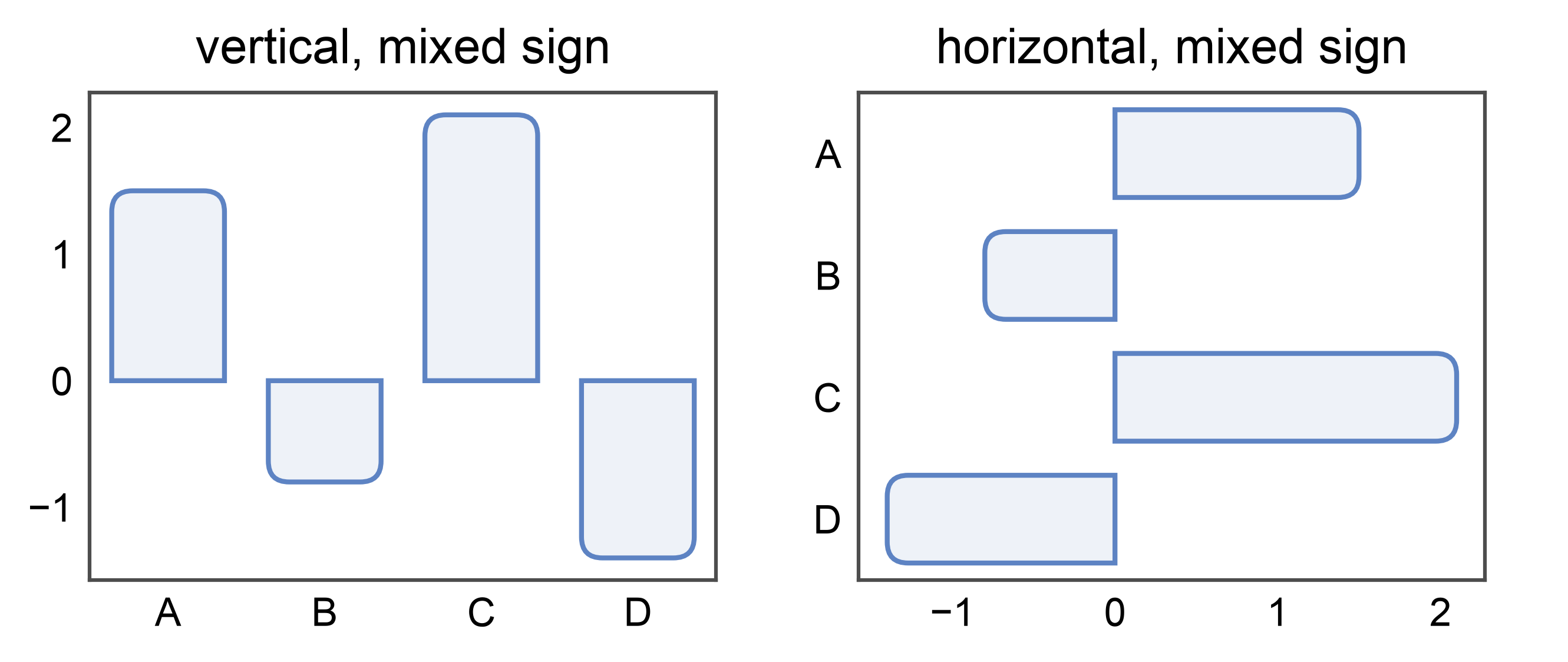
Rounded horizontal bars — orientation- and sign-aware
border_radius=(top_mm, bottom_mm) is interpreted as
(free-end, base-end): the “top” radius lands on the end opposite
the baseline / zero line. For a horizontal barplot (categorical on
y, numeric on x), that’s the right end for positive
values and the left end for negative values. The baseline end
stays square. This means the same border_radius=(1.5, 0) recipe
produces visually consistent “rounded tip, flat base” bars whether
the layout is vertical or horizontal — and whether values are
positive or negative.
signed_df = pd.DataFrame({
    'x': ['A', 'B', 'C', 'D'],
    'y': [1.5, -0.8, 2.1, -1.4],
})
fig, axes = pp.subplots(1, 2, axes_size=(45, 35))
pp.barplot(
    data=signed_df, x='x', y='y', ax=axes[0],
    border_radius=(1.5, 0), title='vertical, mixed sign',
)
pp.barplot(
    data=signed_df, x='y', y='x', ax=axes[1],
    border_radius=(1.5, 0), title='horizontal, mixed sign',
)
pp.show()
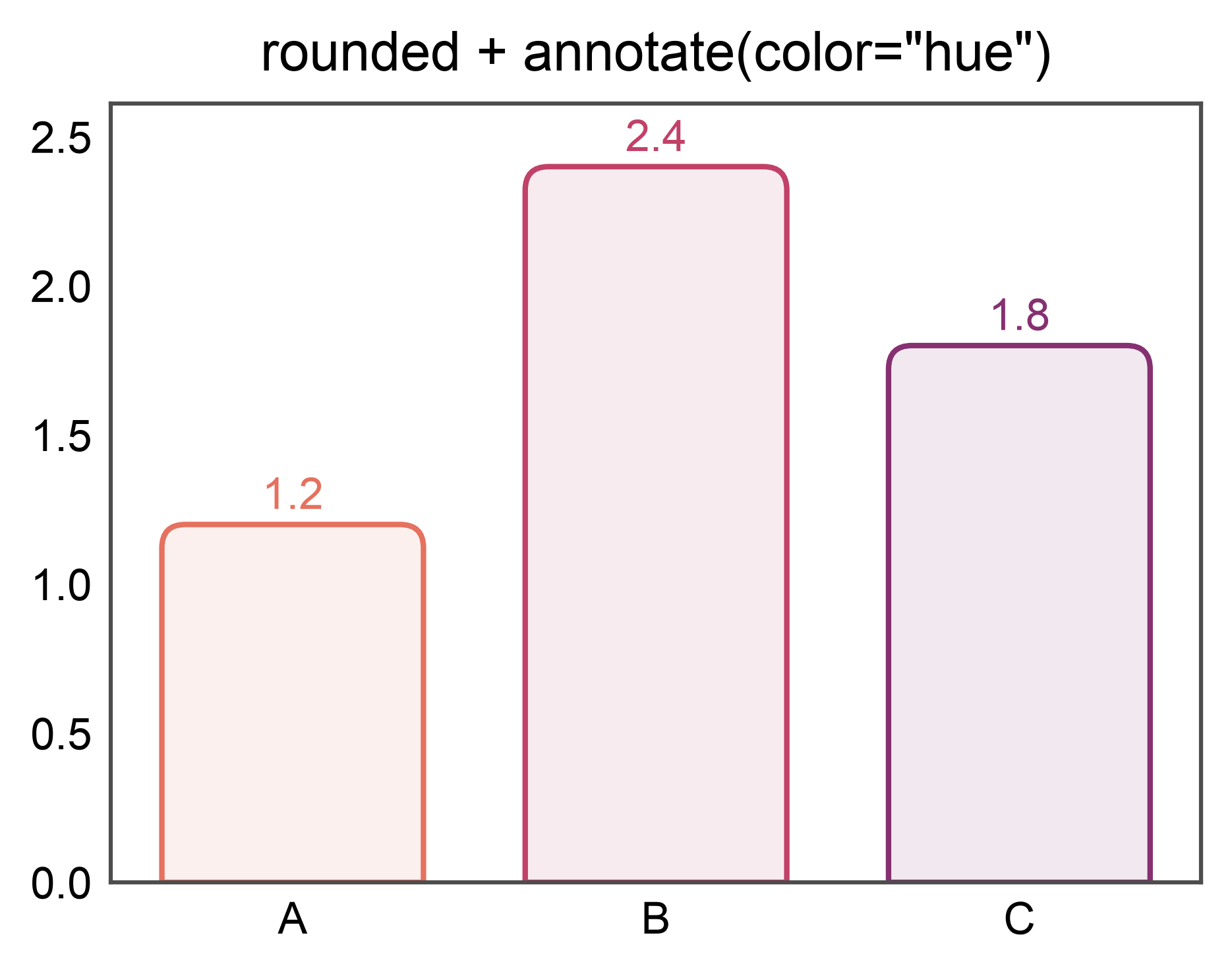
Rounded bars + annotations
annotate= works on rounded bars exactly as it does on flat ones —
border_radius swaps each Rectangle artist for a rounded
patch, and the annotate subsystem walks both kinds. Combines well
with hue=x + annotate={"color": "hue"} for a label per
saturated category color.
ax = pp.barplot(
    data=rounded_df, x='x', y='y', hue='x',
    palette='flare', legend=False,
    border_radius=(1.5, 0),
    annotate={"fmt": ".1f", "color": "hue"},
    title='rounded + annotate(color="hue")',
)
pp.show()
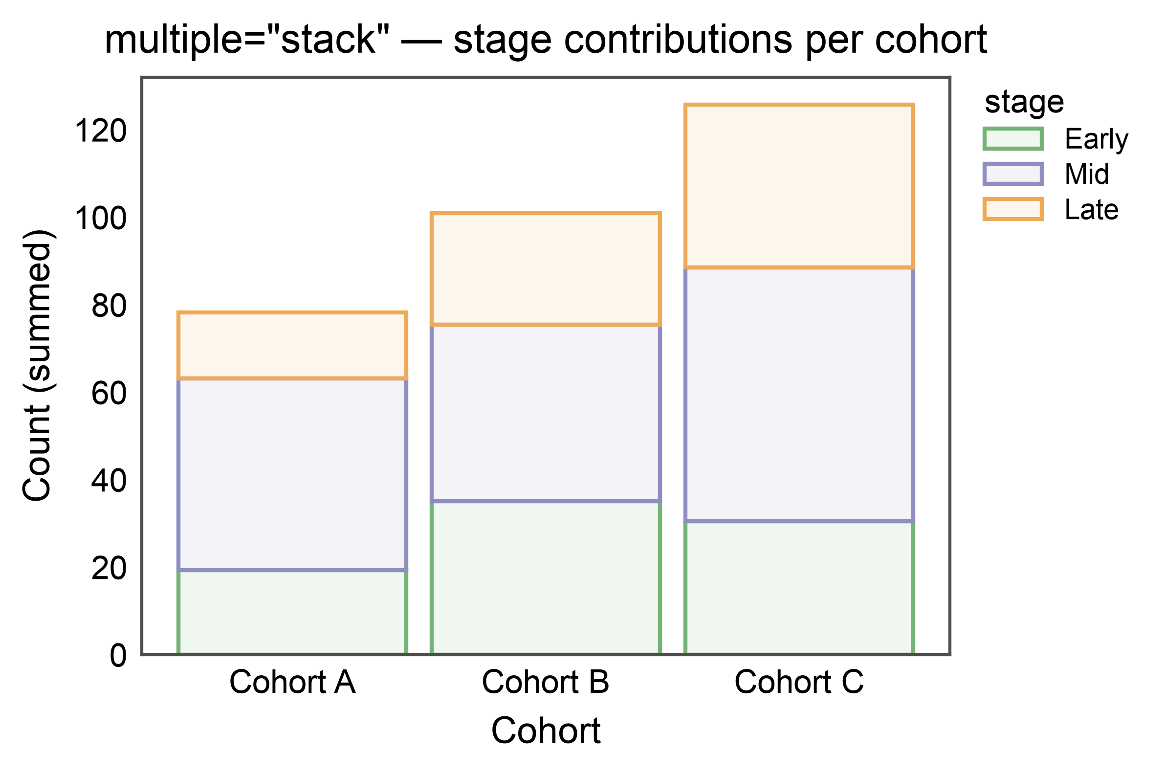
Stacked Bars — multiple="stack"
pp.barplot(multiple="stack") draws each hue level on top of the
previous one rather than side-by-side. The stacking column is whichever
of hue or hatch is distinct from the categorical axis; segment
order (bottom-to-top) follows hue_order / hatch_order or the
palette / hatch_map key order. Stacked bars use the same palette
and legend pipeline as dodged bars, so pp.legend_group and
legend_kws={"inside": True} work unchanged.
Errorbars are dropped on stacked bars — per-segment errors are not
additive without covariance info. Pass errorbar=None to silence
the warning when you explicitly don’t want them.
np.random.seed(2026)
stack_df = pd.DataFrame({
    "cohort": np.tile(np.repeat(["Cohort A", "Cohort B", "Cohort C"], 15), 3),
    "stage": np.repeat(["Early", "Mid", "Late"], 45),
    "count": np.concatenate([
        np.random.normal(20, 3, 15), np.random.normal(35, 5, 15), np.random.normal(30, 4, 15),
        np.random.normal(45, 5, 15), np.random.normal(40, 6, 15), np.random.normal(55, 7, 15),
        np.random.normal(15, 3, 15), np.random.normal(25, 4, 15), np.random.normal(35, 5, 15),
    ]),
})

ax = pp.barplot(
    data=stack_df,
    x="cohort",
    y="count",
    hue="stage",
    multiple="stack",
    errorbar=None,
    palette="pastel",
    hue_order=["Early", "Mid", "Late"],
    title='multiple="stack" — stage contributions per cohort',
    xlabel="Cohort",
    ylabel="Count (summed)",
)
pp.show()
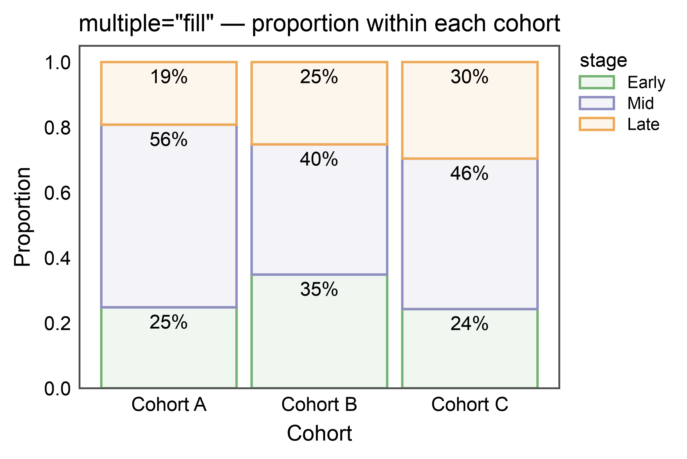
100%-Stacked Bars — multiple="fill"
multiple="fill" normalizes every stack to 1.0, making proportions
comparable across categories with different totals. Combine with
annotate={"fmt": ".0%"} for per-segment percentage labels.
ax = pp.barplot(
    data=stack_df,
    x="cohort",
    y="count",
    hue="stage",
    multiple="fill",
    errorbar=None,
    palette="pastel",
    hue_order=["Early", "Mid", "Late"],
    annotate={"fmt": ".0%"},
    title='multiple="fill" — proportion within each cohort',
    xlabel="Cohort",
    ylabel="Proportion",
)
pp.show()
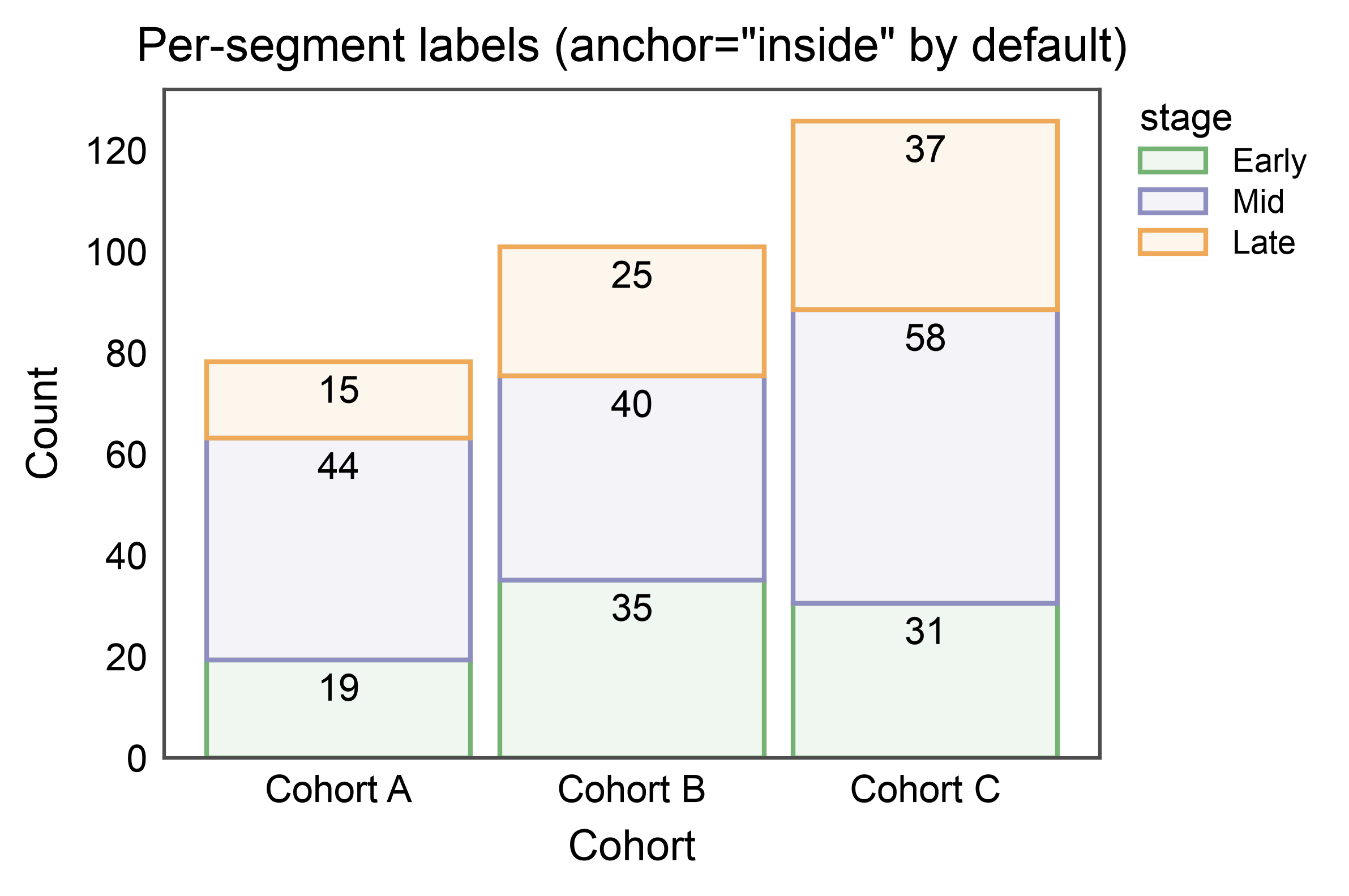
Stacked Bars with Per-Segment Annotations
annotate=True on stacked bars defaults to anchor="inside":
one label per drawn segment, centered within it. Override via
annotate={"anchor": "outside"} to place labels on each segment’s
top edge instead.
ax = pp.barplot(
    data=stack_df,
    x="cohort",
    y="count",
    hue="stage",
    multiple="stack",
    errorbar=None,
    palette="pastel",
    hue_order=["Early", "Mid", "Late"],
    annotate={"fmt": ".0f"},
    title='Per-segment labels (anchor="inside" by default)',
    xlabel="Cohort",
    ylabel="Count",
)
pp.show()
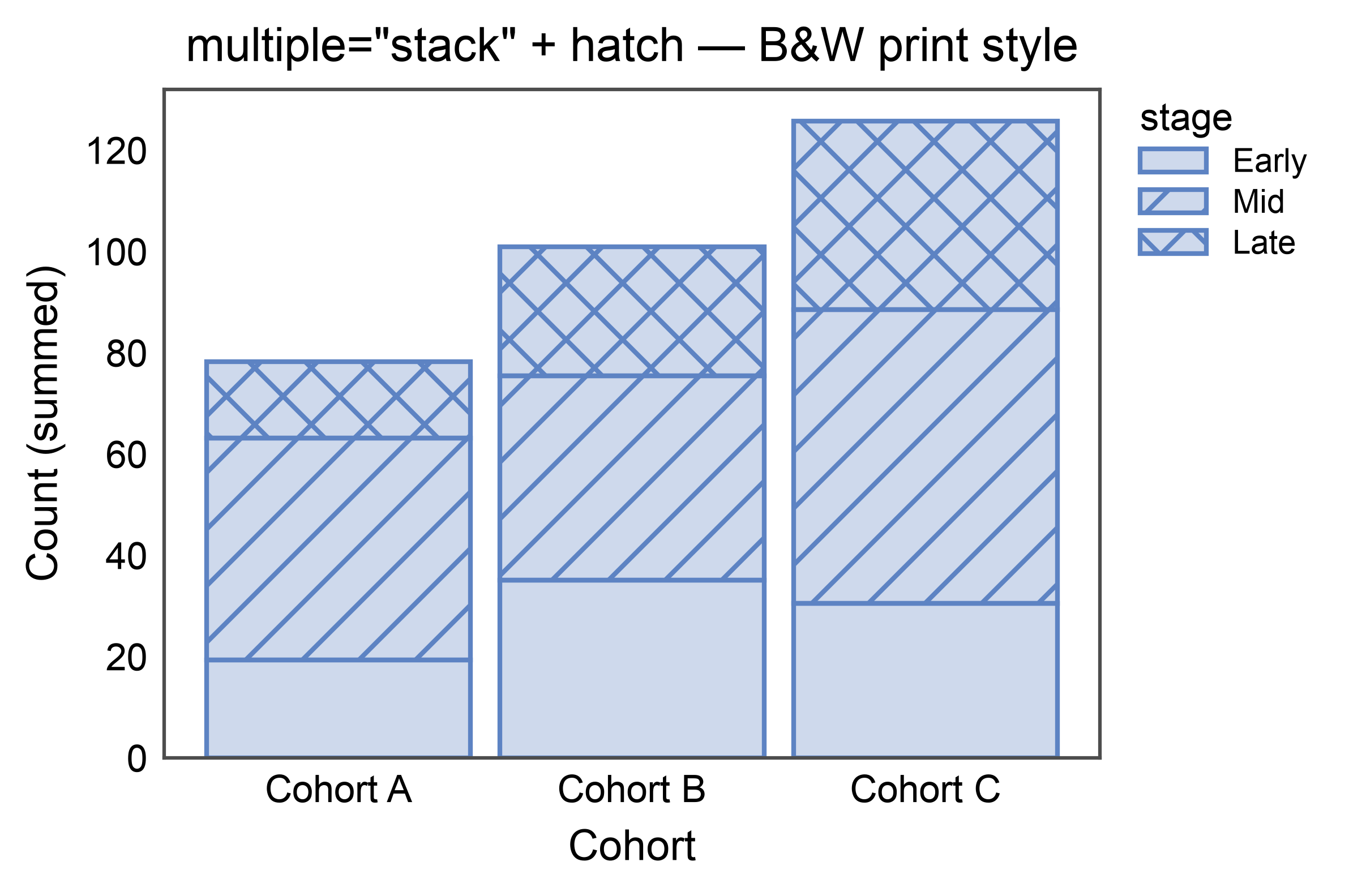
Stacked Bars with Hatch (B&W-friendly)
Hatch patterns can drive the stack dimension on their own, keeping the
figure legible in black-and-white print. Use hatch= (leave hue
unset) and supply a hatch_map if you want specific patterns per
level.
ax = pp.barplot(
    data=stack_df,
    x="cohort",
    y="count",
    hatch="stage",
    multiple="stack",
    errorbar=None,
    color="#5D83C3",
    hatch_map={"Early": "", "Mid": "//", "Late": "xx"},
    hatch_order=["Early", "Mid", "Late"],
    title='multiple="stack" + hatch — B&W print style',
    xlabel="Cohort",
    ylabel="Count (summed)",
    alpha=0.3,
)
pp.show()
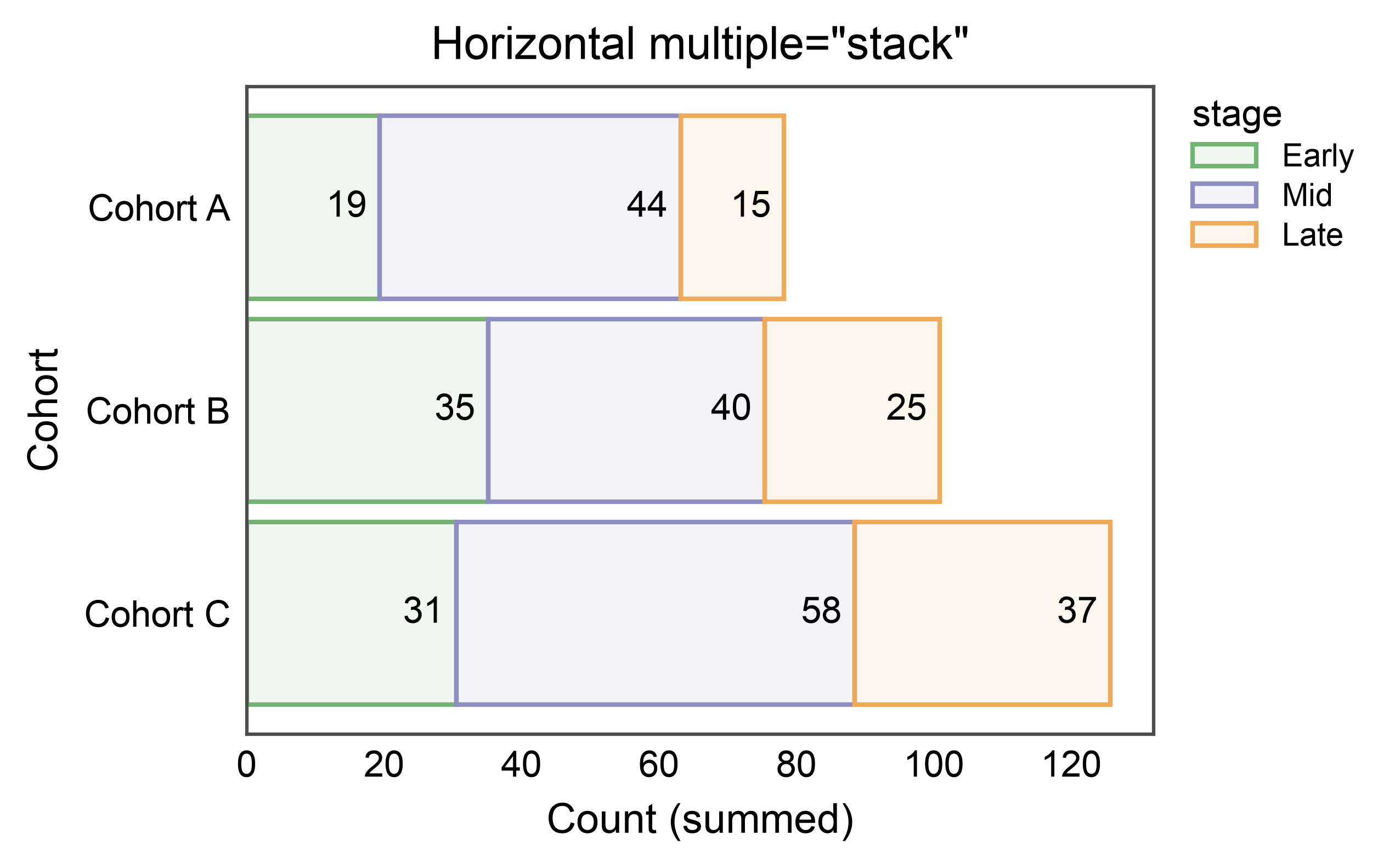
Horizontal Stacked Bars
Swap x and y to stack horizontally — widths accumulate along
the value axis and the categorical axis is inverted (category 0 at
top), matching publiplots’ convention for horizontal dodged bars.
ax = pp.barplot(
    data=stack_df,
    x="count",
    y="cohort",
    hue="stage",
    multiple="stack",
    errorbar=None,
    palette="pastel",
    hue_order=["Early", "Mid", "Late"],
    annotate={"fmt": ".0f"},
    title='Horizontal multiple="stack"',
    xlabel="Count (summed)",
    ylabel="Cohort",
)
pp.show()
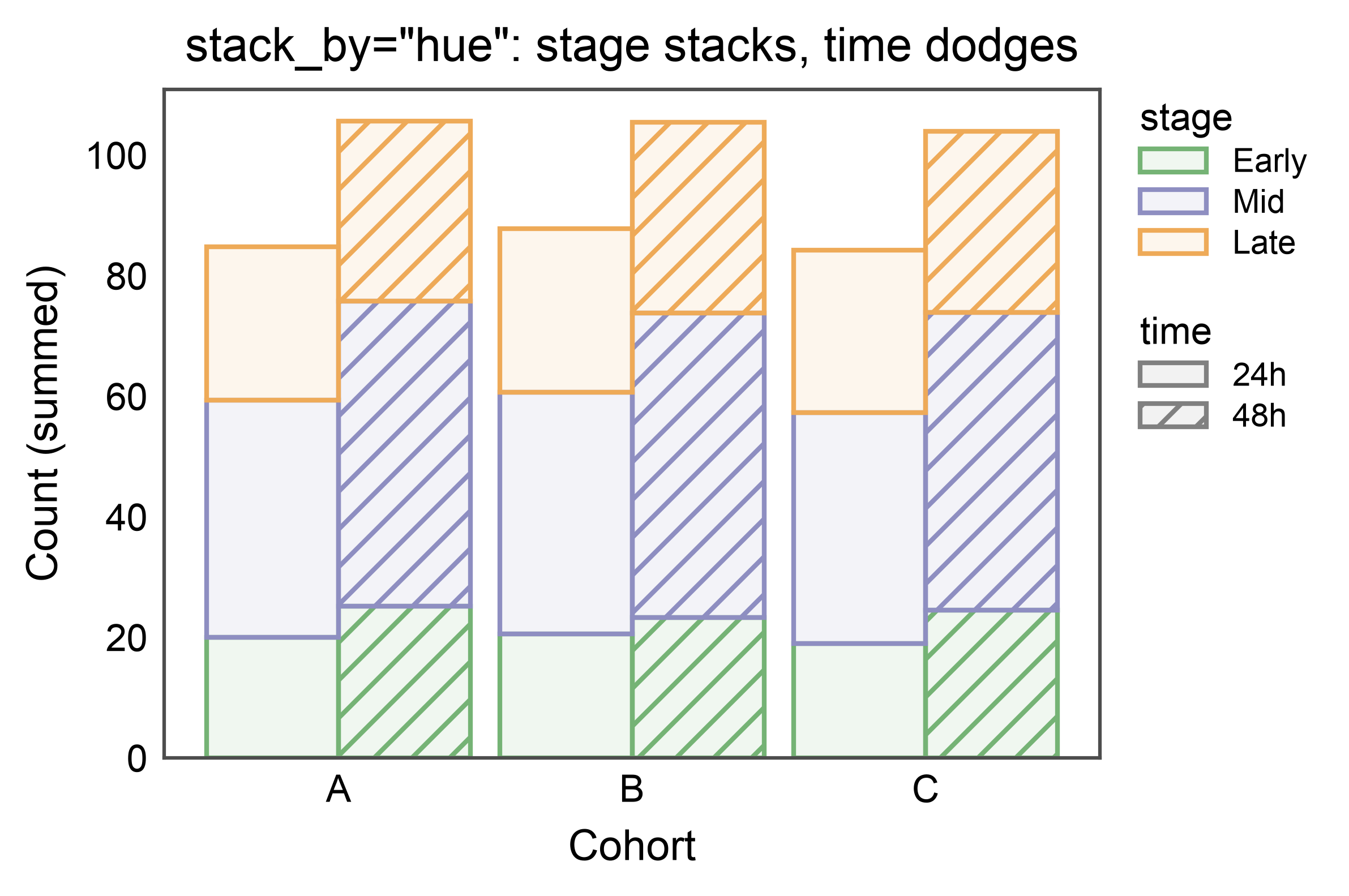
Two Categoricals: Stack One, Dodge the Other — stack_by
When both hue and hatch point at different non-categorical
columns, stacking is ambiguous: either dimension could define the
segments summed along the value axis. stack_by="hue" (or
"hatch") picks one — the chosen dimension stacks; the other is
dodged side-by-side within each category. So each cohort below gets
two dodged stacks (one per time level), each composed of three
stacked stage segments. The legend carries both a color entry
(stage) and a hatch entry (time), matching the double-split
dodge legend.
np.random.seed(2027)
dual_df = pd.DataFrame({
    "cohort": np.tile(np.repeat(["A", "B", "C"], 10), 6),
    "stage": np.tile(np.repeat(["Early", "Mid", "Late"], 30), 2),
    "time": np.repeat(["24h", "48h"], 90),
    "count": np.concatenate([
        np.random.normal(20, 3, 30), np.random.normal(40, 5, 30), np.random.normal(25, 4, 30),
        np.random.normal(25, 3, 30), np.random.normal(50, 5, 30), np.random.normal(30, 4, 30),
    ]),
})

ax = pp.barplot(
    data=dual_df,
    x="cohort",
    y="count",
    hue="stage",
    hatch="time",
    multiple="stack",
    stack_by="hue",
    errorbar=None,
    palette="pastel",
    hatch_map={"24h": "", "48h": "///"},
    hue_order=["Early", "Mid", "Late"],
    title='stack_by="hue": stage stacks, time dodges',
    xlabel="Cohort",
    ylabel="Count (summed)",
)
pp.show()
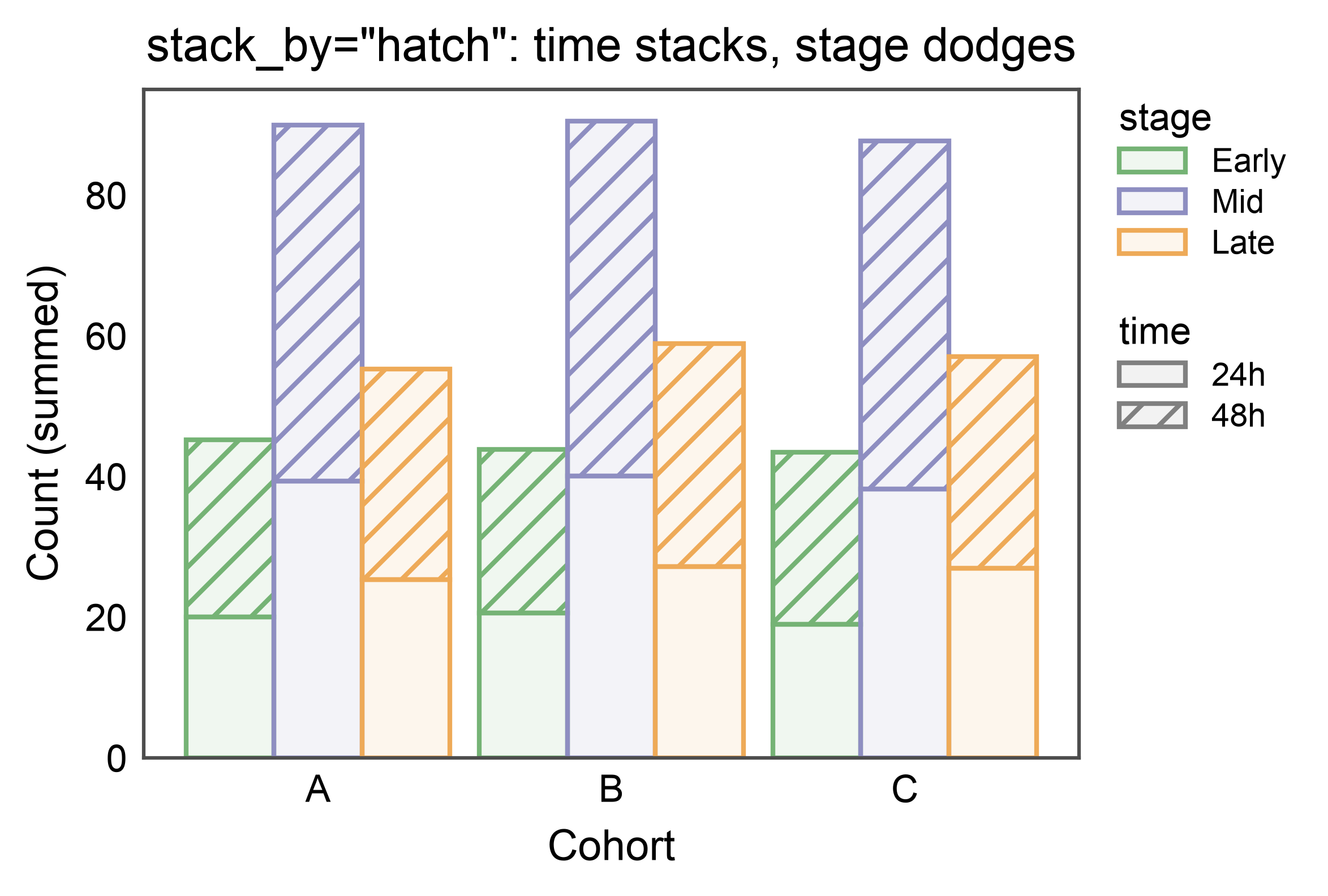
Flip the Stack Dimension
Same data, stack_by="hatch" instead — now time stacks (24h on
the bottom, 48h on top) while stage dodges (three sub-stacks per
cohort). Useful when your primary contrast is along the dimension
you want the eye to sum naturally.
ax = pp.barplot(
    data=dual_df,
    x="cohort",
    y="count",
    hue="stage",
    hatch="time",
    multiple="stack",
    stack_by="hatch",
    errorbar=None,
    palette="pastel",
    hatch_map={"24h": "", "48h": "///"},
    hue_order=["Early", "Mid", "Late"],
    title='stack_by="hatch": time stacks, stage dodges',
    xlabel="Cohort",
    ylabel="Count (summed)",
)
pp.show()
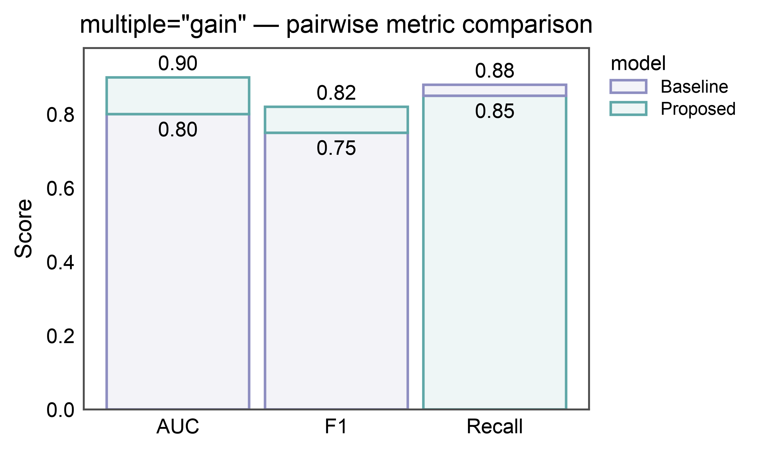
Gain / Improvement Bars — multiple="gain"
For comparing exactly two conditions whose values don’t compose by
sum (AUC, accuracy, F1, expression ceiling). Per category: bottom
segment = min of the two values (loser color), top segment =
max - min (winner color). Bar top = max. Who wins can flip
across categories — the base color flips accordingly.
In the figure below, Proposed wins on AUC and F1 (teal top); Baseline wins on Recall (purple top). Annotate shows absolute values (loser total on the base, winner total on the top) — not the delta.
metric_df = pd.DataFrame({
    "metric": pd.Categorical(
        ["AUC", "F1", "Recall"] * 2,
        categories=["AUC", "F1", "Recall"],
    ),
    "model": pd.Categorical(
        ["Baseline"] * 3 + ["Proposed"] * 3,
        categories=["Baseline", "Proposed"],
    ),
    "score": [0.80, 0.75, 0.88, 0.90, 0.82, 0.85],
})

ax = pp.barplot(
    data=metric_df,
    x="metric", y="score", hue="model",
    multiple="gain", errorbar=None,
    palette={"Baseline": "#8E8EC1", "Proposed": "#60a8a8"},
    annotate={"fmt": ".2f"},
    title='multiple="gain" — pairwise metric comparison',
    ylabel="Score",
)
pp.show()
Total running time of the script: (0 minutes 22.650 seconds)