Note
Go to the end to download the full example code.
Violin Plot Examples
This example demonstrates violin plot functionality in PubliPlots, including simple violin plots, grouped violin plots, split violins, and combined violin+swarm plots.
Examples
import publiplots as pp
import pandas as pd
import numpy as np
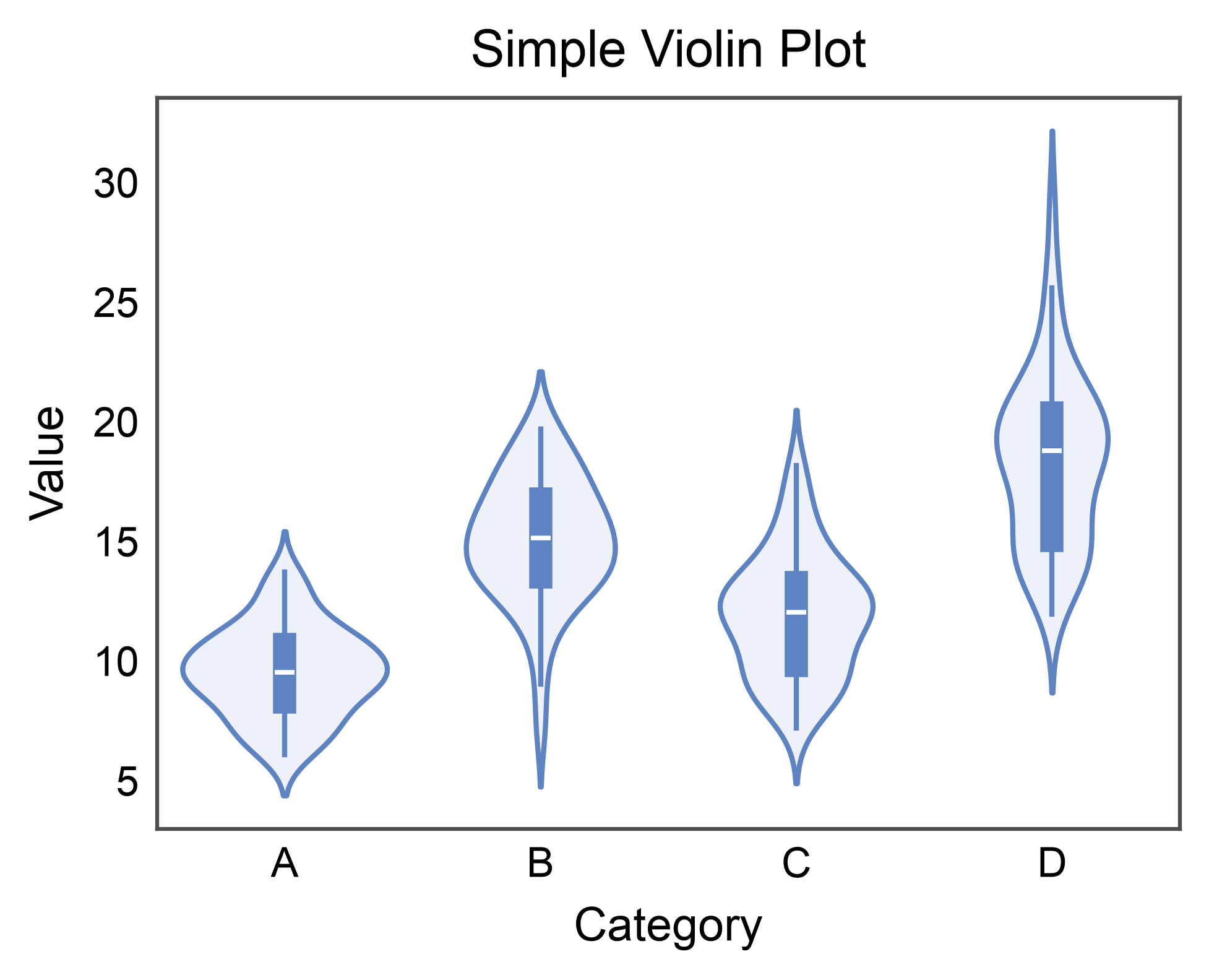
Simple Violin Plot
Basic violin plot showing distribution by category.
# Create sample data
np.random.seed(42)
n = 200
violin_data = pd.DataFrame({
    'category': np.repeat(['A', 'B', 'C', 'D'], n // 4),
    'value': np.concatenate([
        np.random.normal(10, 2, n // 4),
        np.random.normal(15, 3, n // 4),
        np.random.normal(12, 2.5, n // 4),
        np.random.normal(18, 4, n // 4)
    ])
})

# Create simple violin plot
ax = pp.violinplot(
    data=violin_data,
    x='category',
    y='value',
    title='Simple Violin Plot',
    xlabel='Category',
    ylabel='Value',
)
pp.show()
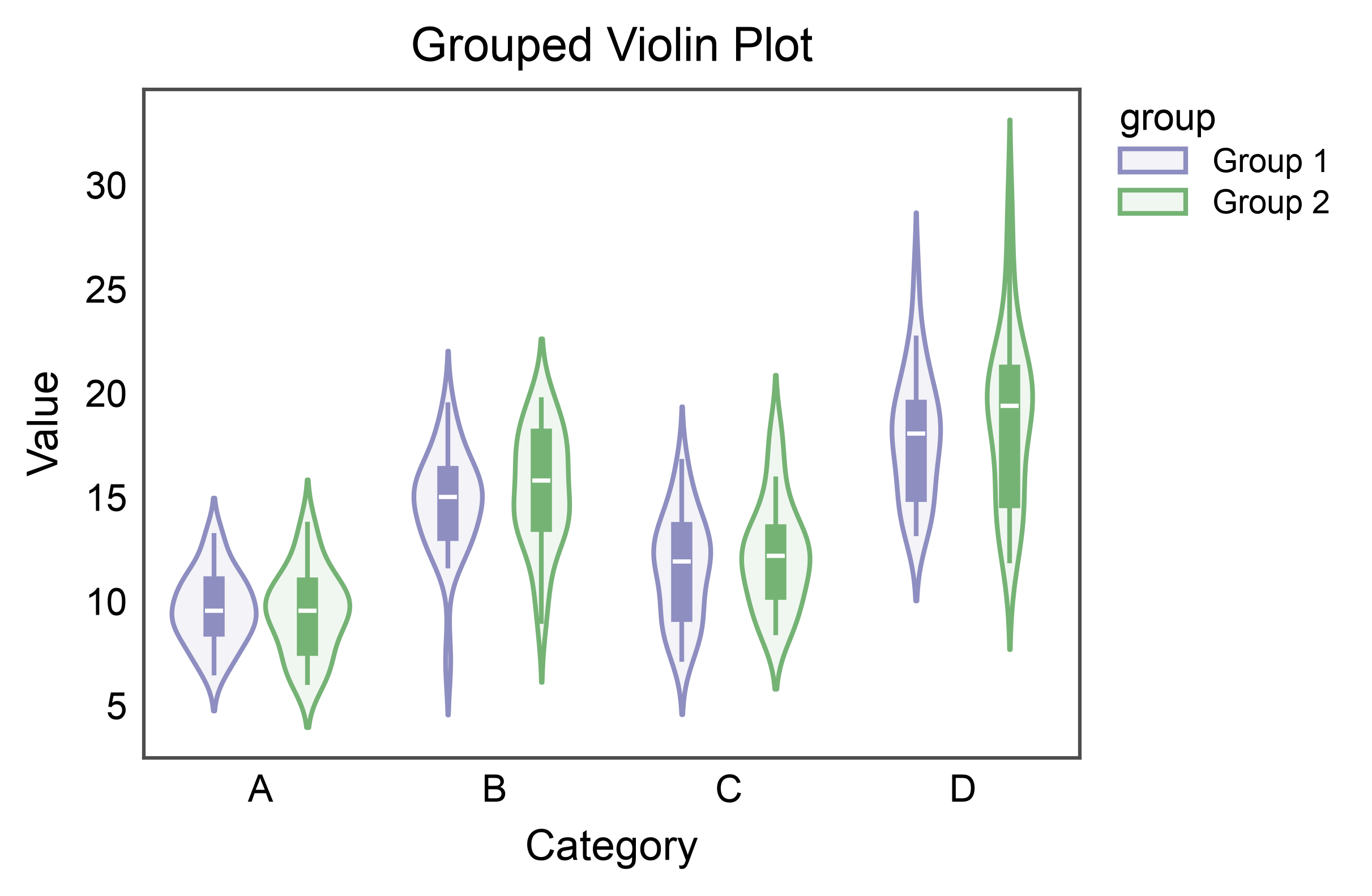
Violin Plot with Hue Grouping
Use the hue parameter to create grouped violin plots.
# Add group variable
violin_data['group'] = np.tile(['Group 1', 'Group 2'], n // 2)

# Create grouped violin plot
ax = pp.violinplot(
    data=violin_data,
    x='category',
    y='value',
    hue='group',
    gap=0.1,
    title='Grouped Violin Plot',
    xlabel='Category',
    ylabel='Value',
    palette={'Group 1': '#8E8EC1', 'Group 2': '#75B375'},
)
pp.show()
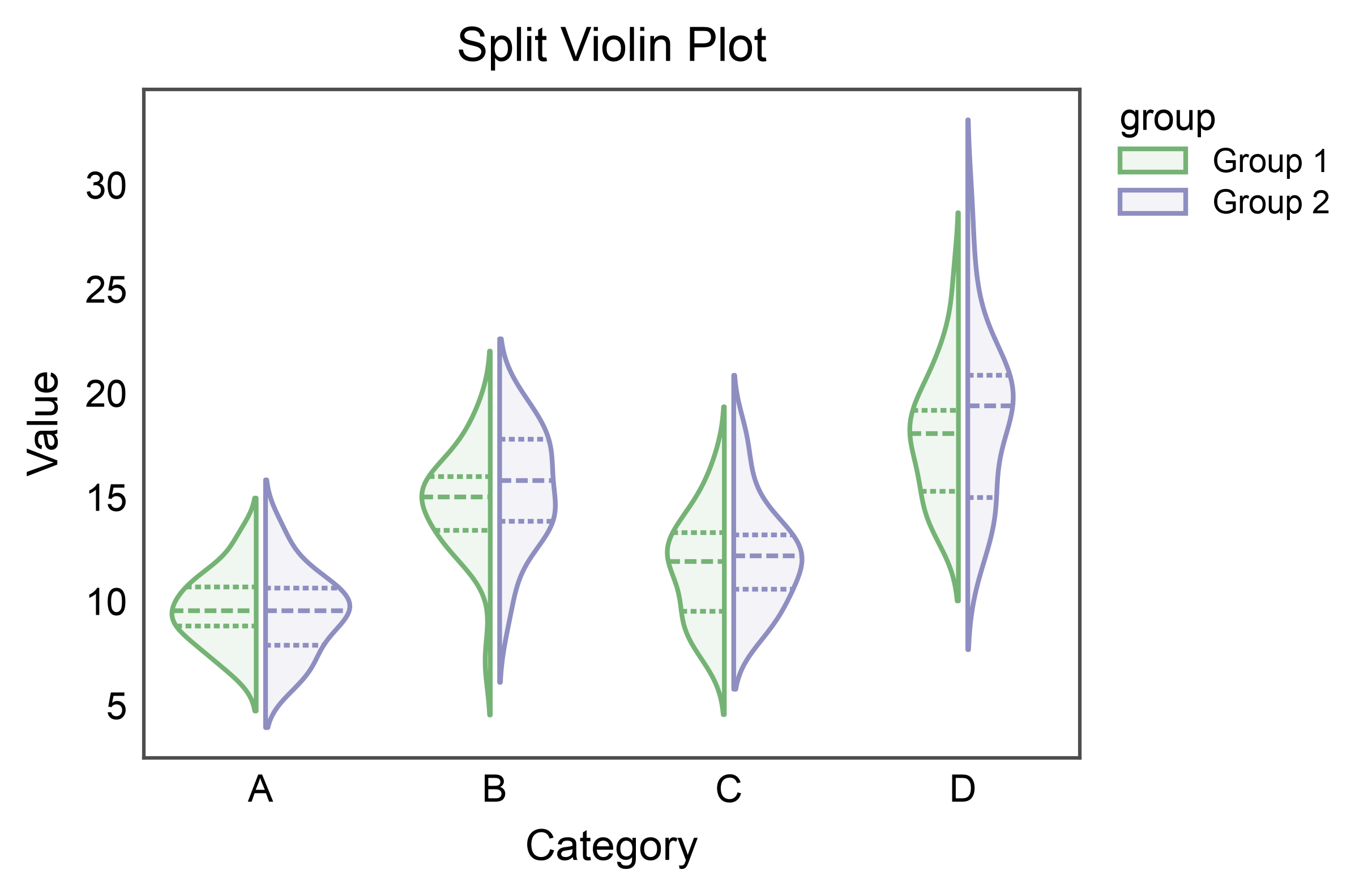
Split Violin Plot
Split violins to compare two groups side by side.
ax = pp.violinplot(
    data=violin_data,
    x='category',
    y='value',
    hue='group',
    split=True,
    inner='quart',
    gap=0.1,
    title='Split Violin Plot',
    xlabel='Category',
    ylabel='Value',
)
pp.show()
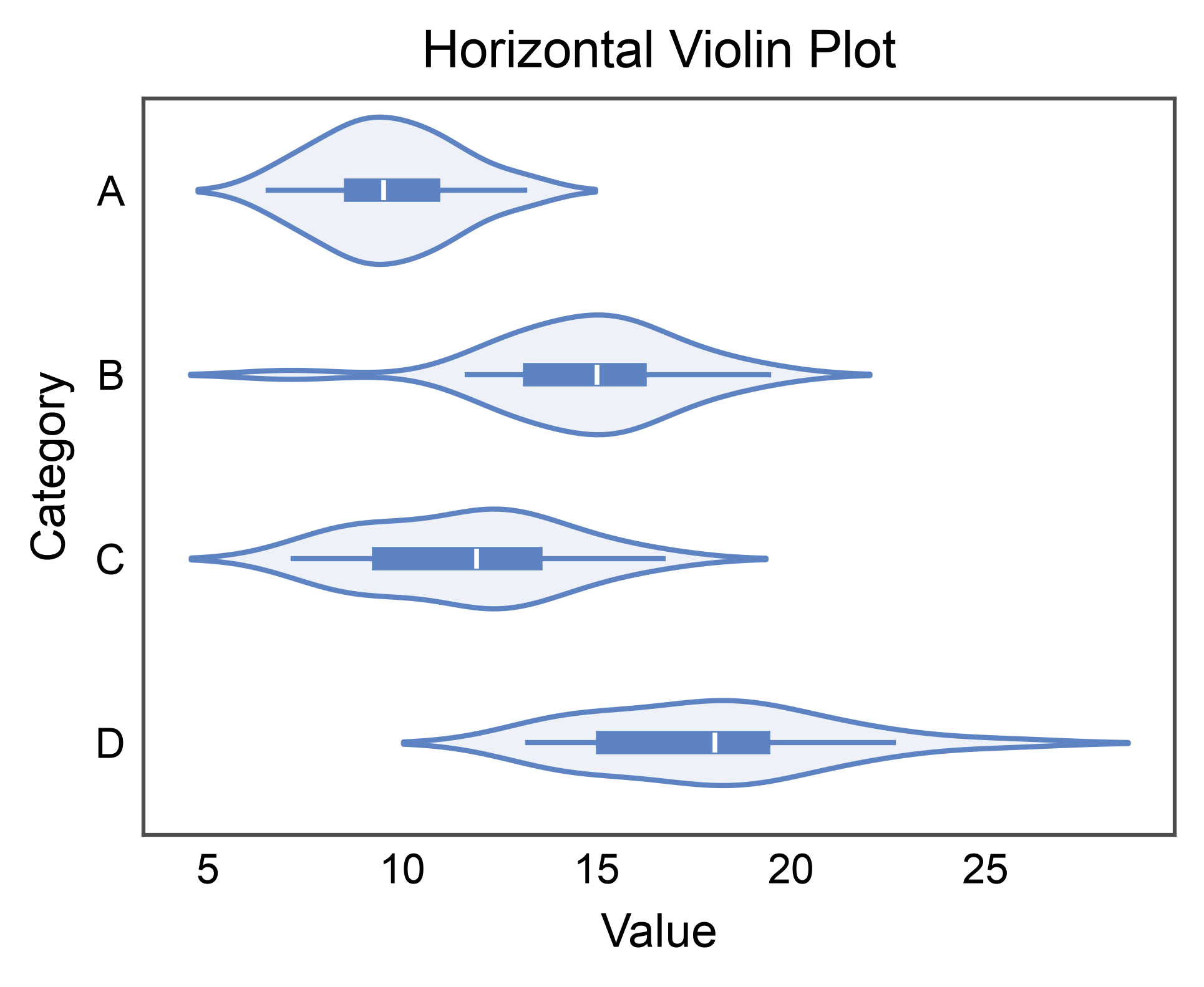
Horizontal Violin Plot
Create horizontal violin plots by swapping x and y.
ax = pp.violinplot(
    data=violin_data[violin_data['group'] == 'Group 1'],
    x='value',
    y='category',
    title='Horizontal Violin Plot',
    xlabel='Value',
    ylabel='Category',
)
pp.show()
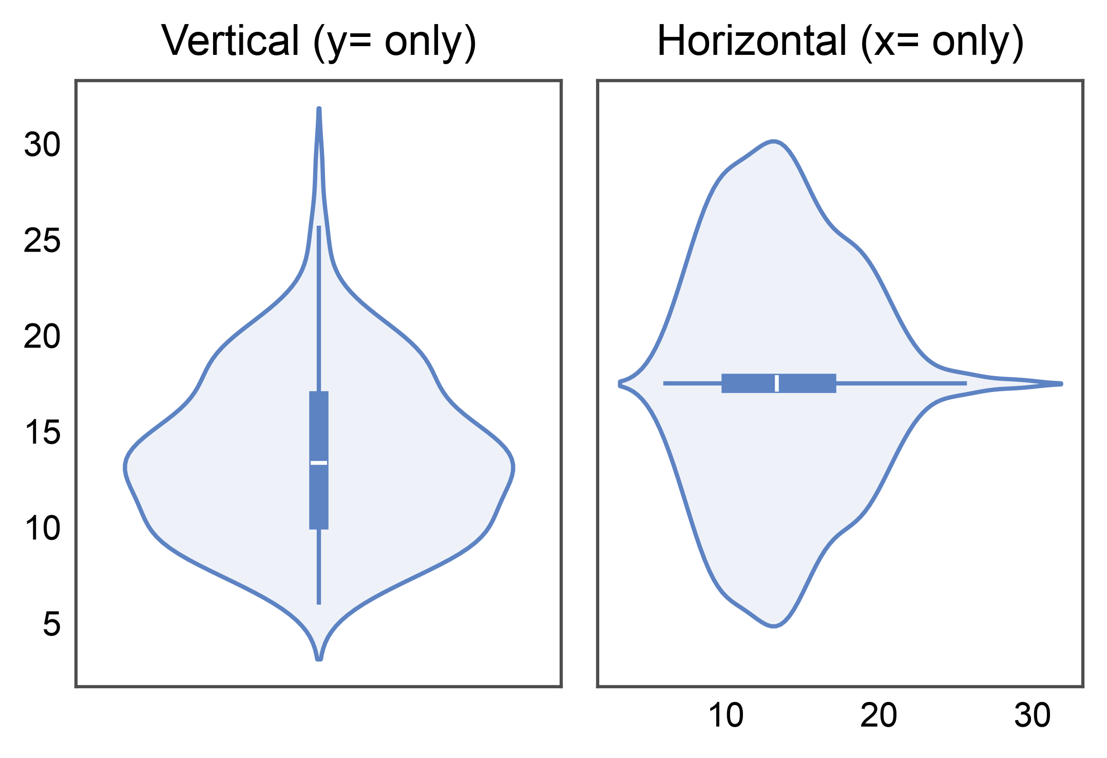
Univariate (1D) Violin Plot
Pass only x= or only y= to summarize a single distribution.
A constant categorical axis is synthesized internally so all 2D
features (hue=, side=, inner=, alpha) remain
available. The synthetic axis ticks and spine are hidden so the
result reads cleanly as a single-distribution summary. This is the
form used by pp.JointGrid.plot_marginals() to put violins on
the marginal panels of a joint plot.
fig, axes = pp.subplots(1, 2, axes_size=(40, 50))
pp.violinplot(data=violin_data, y='value', ax=axes[0], title='Vertical (y= only)')
pp.violinplot(data=violin_data, x='value', ax=axes[1], title='Horizontal (x= only)')
pp.show()
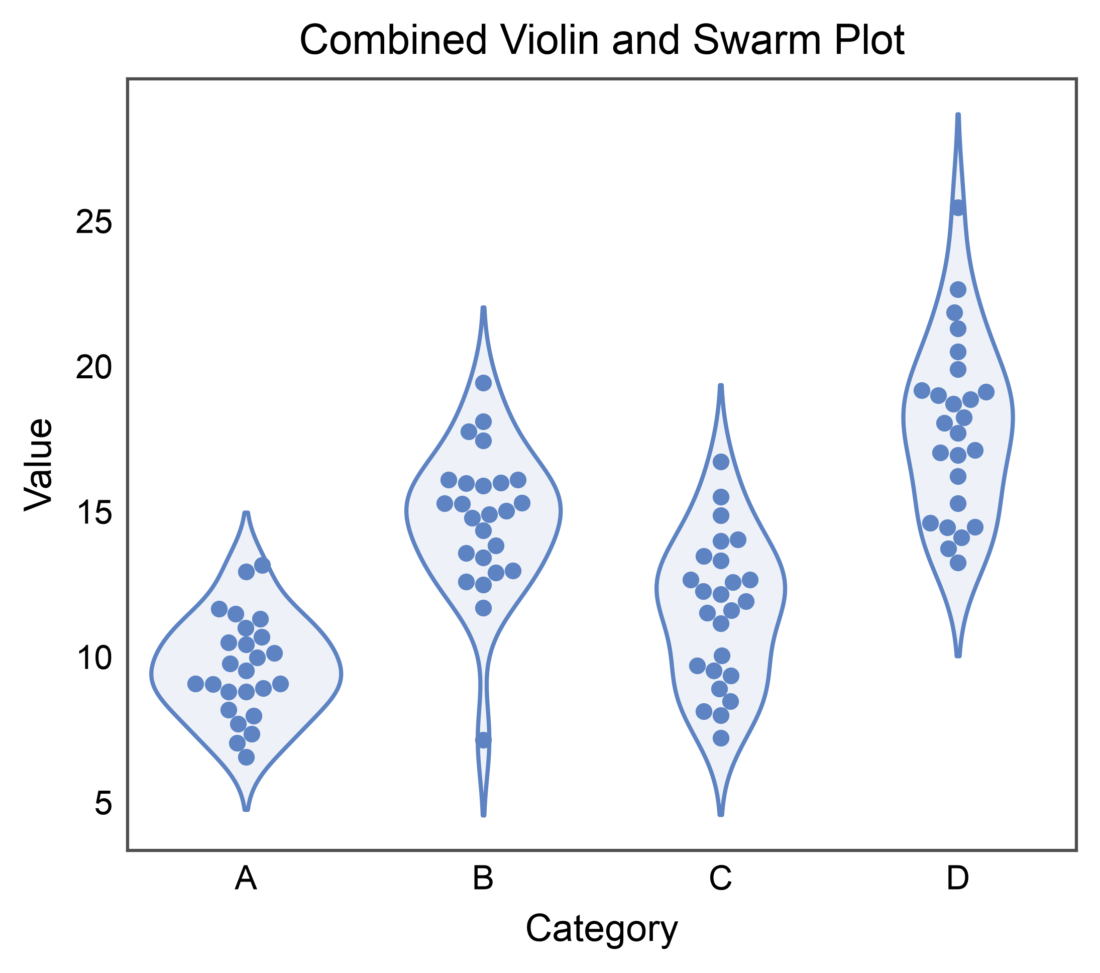
Combined Violin and Swarm Plot
Overlay swarm plot on violin plot to show distribution shape and individual data points.
fig, ax = pp.subplots(axes_size=(80, 65))

# First, create the violin plot
pp.violinplot(
    data=violin_data[violin_data['group'] == 'Group 1'],
    x='category',
    y='value',
    ax=ax,
    inner=None,
)

# Then overlay the swarm plot
pp.swarmplot(
    data=violin_data[violin_data['group'] == 'Group 1'],
    x='category',
    y='value',
    ax=ax,
    alpha=1,
    legend=False,
    size=3,
)

ax.set_title('Combined Violin and Swarm Plot')
ax.set_xlabel('Category')
ax.set_ylabel('Value')
pp.show()
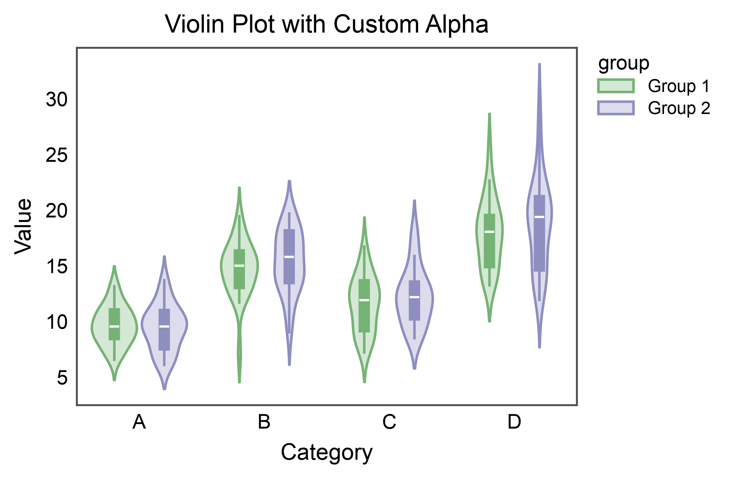
Customization
Violin Plot with Custom Alpha
Adjust transparency of violin fill.
ax = pp.violinplot(
    data=violin_data,
    x='category',
    y='value',
    hue='group',
    gap=0.1,
    title='Violin Plot with Custom Alpha',
    xlabel='Category',
    ylabel='Value',
    alpha=0.3,
)
pp.show()
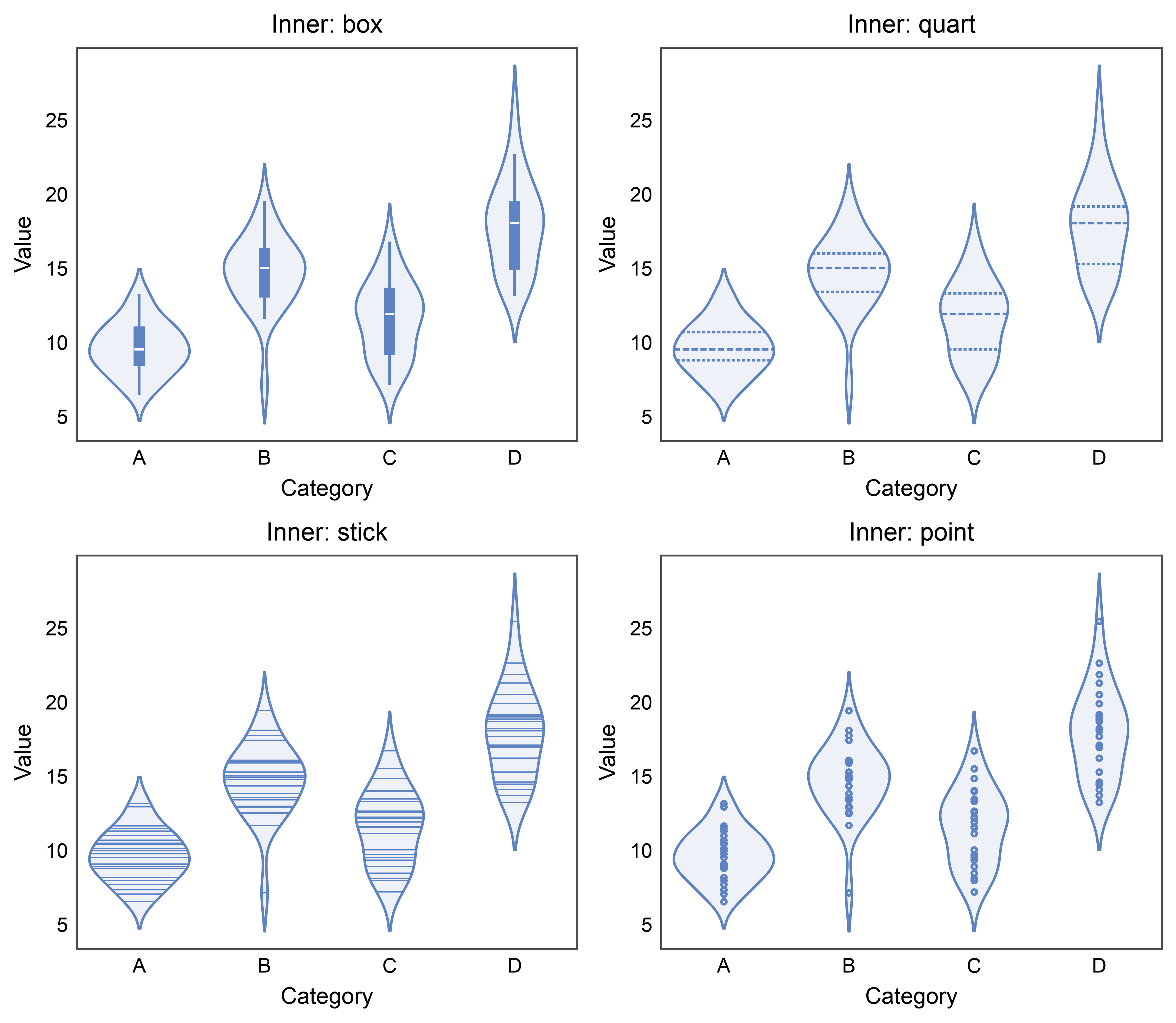
Violin Plot with Different Inner Representations
Compare different inner representations: box, quart, stick, point.
fig, axes = pp.subplots(2, 2, axes_size=(70, 55))

inner_types = ['box', 'quart', 'stick', 'point']
for ax, inner in zip(axes.flat, inner_types):
    pp.violinplot(
        data=violin_data[violin_data['group'] == 'Group 1'],
        x='category',
        y='value',
        inner=inner,
        ax=ax,
        title=f'Inner: {inner}',
        xlabel='Category',
        ylabel='Value',
    )

pp.show()
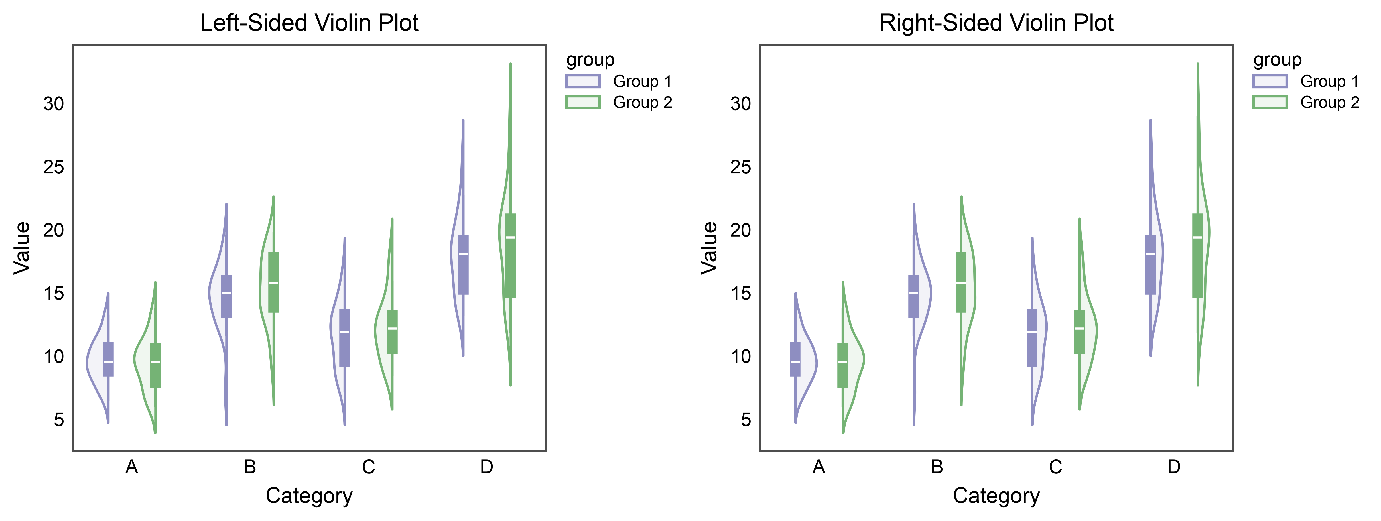
One-Sided Violin Plots
Create one-sided (half) violin plots using the side parameter.
fig, axes = pp.subplots(1, 2, axes_size=(70, 60))

# Left-sided violin
pp.violinplot(
    data=violin_data,
    x='category',
    y='value',
    hue='group',
    side='left',
    gap=0.1,
    ax=axes[0],
    title='Left-Sided Violin Plot',
    xlabel='Category',
    ylabel='Value',
    palette={'Group 1': '#8E8EC1', 'Group 2': '#75B375'},
)

# Right-sided violin
pp.violinplot(
    data=violin_data,
    x='category',
    y='value',
    hue='group',
    side='right',
    gap=0.1,
    ax=axes[1],
    title='Right-Sided Violin Plot',
    xlabel='Category',
    ylabel='Value',
    palette={'Group 1': '#8E8EC1', 'Group 2': '#75B375'},
)

pp.show()
Annotated violin stats
Violinplots share the box_stats annotation strategy with boxplots:
annotate=True labels the median by default; pass
stats=[...] to label multiple statistics per violin. See the
dedicated annotations gallery for more.
ax = pp.violinplot(
    data=violin_data,
    x='category', y='value',
    annotate={"stats": ["median", "q1", "q3"], "fmt": ".1f"},
    title="annotate={'stats': ['median', 'q1', 'q3']}",
)
pp.show()
![annotate={'stats': ['median', 'q1', 'q3']}](../_images/sphx_glr_plot_15_violin_plots_010.png)
Total running time of the script: (0 minutes 7.607 seconds)