Note
Go to the end to download the full example code.
Scatter Plot Examples
This example demonstrates scatter plot functionality in PubliPlots, including basic scatter plots, size encoding, categorical and continuous color scales, and bubble plots (categorical scatter heatmaps).
import publiplots as pp
import pandas as pd
import numpy as np
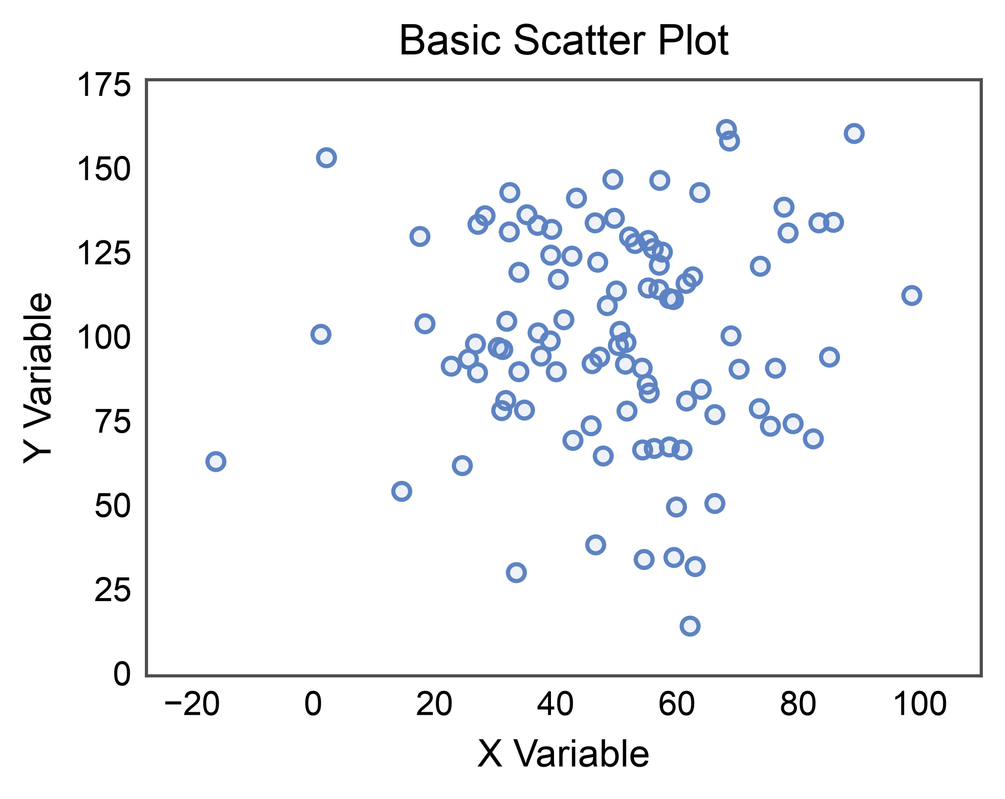
Basic Scatter Plot
Create a simple scatter plot with continuous data.
# Create scatter data
np.random.seed(444)
n = 100
scatter_data = pd.DataFrame({
    'x': np.random.normal(50, 20, n),
    'y': np.random.normal(100, 30, n)
})

# Create basic scatter plot
ax = pp.scatterplot(
    data=scatter_data,
    x='x',
    y='y',
    title='Basic Scatter Plot',
    xlabel='X Variable',
    ylabel='Y Variable',
)
ax.margins(x=0.1, y=0.1)
pp.show()
Scatter with Size Encoding
Use point size to encode an additional data dimension.
# Add size variable
scatter_data['magnitude'] = np.abs(scatter_data['x'] - 50) + np.abs(scatter_data['y'] - 100)

# Create scatter with size encoding
ax = pp.scatterplot(
    data=scatter_data,
    x='x',
    y='y',
    size='magnitude',
    title='Scatter Plot with Size Encoding',
    xlabel='X Variable',
    ylabel='Y Variable',
)
ax.margins(x=0.1, y=0.1)
pp.show()
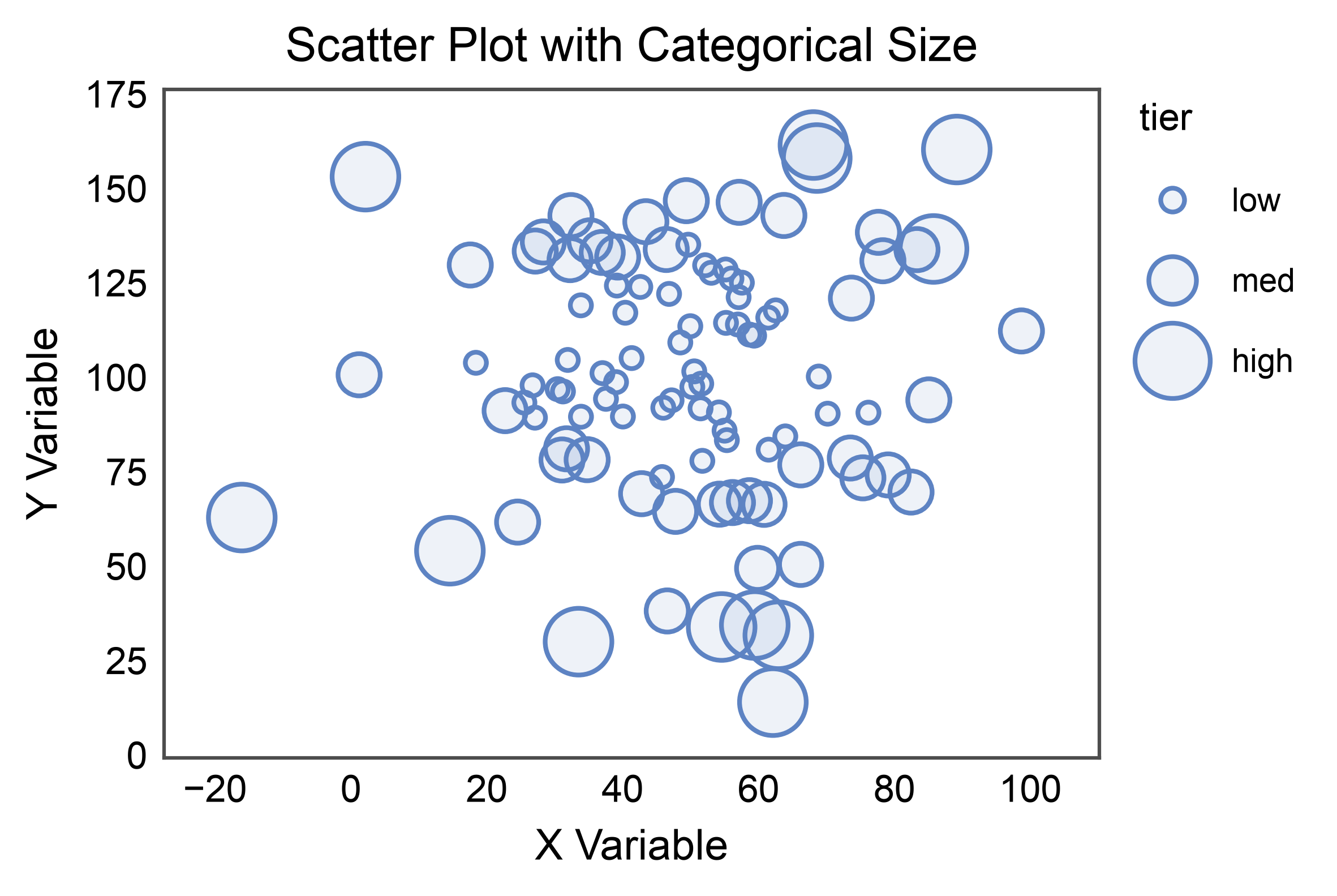
Scatter with Categorical Size
size= also accepts a categorical column. Pass an explicit
sizes={category: area_points²} map to control the area assigned to
each category; without one, publiplots interpolates evenly between the
tuple’s endpoints. The legend shows one marker per category.
scatter_data['tier'] = pd.cut(
    scatter_data['magnitude'], bins=3, labels=['low', 'med', 'high'],
)

ax = pp.scatterplot(
    data=scatter_data,
    x='x',
    y='y',
    size='tier',
    sizes={'low': 20, 'med': 80, 'high': 200},
    title='Scatter Plot with Categorical Size',
    xlabel='X Variable',
    ylabel='Y Variable',
)
ax.margins(x=0.1, y=0.1)
pp.show()
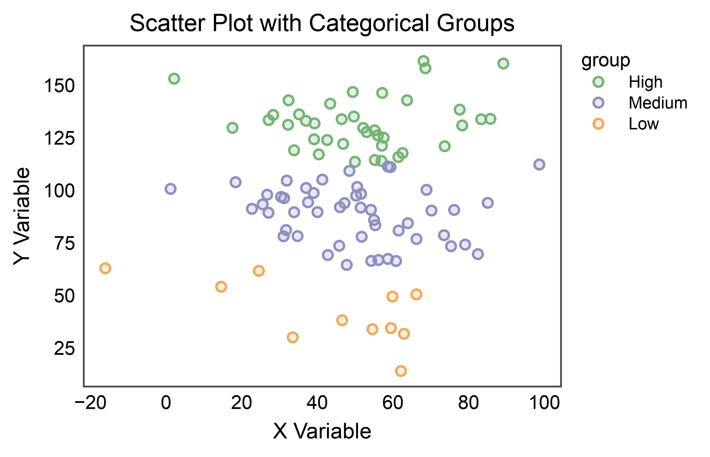
Scatter with Categorical Hue
Color points by categorical groups.
# Add categorical variable
scatter_data['group'] = pd.cut(scatter_data['y'], bins=3, labels=['Low', 'Medium', 'High'])

# Create scatter with categorical hue
ax = pp.scatterplot(
    data=scatter_data,
    x='x',
    y='y',
    hue='group',
    palette='pastel',
    title='Scatter Plot with Categorical Groups',
    xlabel='X Variable',
    ylabel='Y Variable',
    alpha=0.2,
)
pp.show()
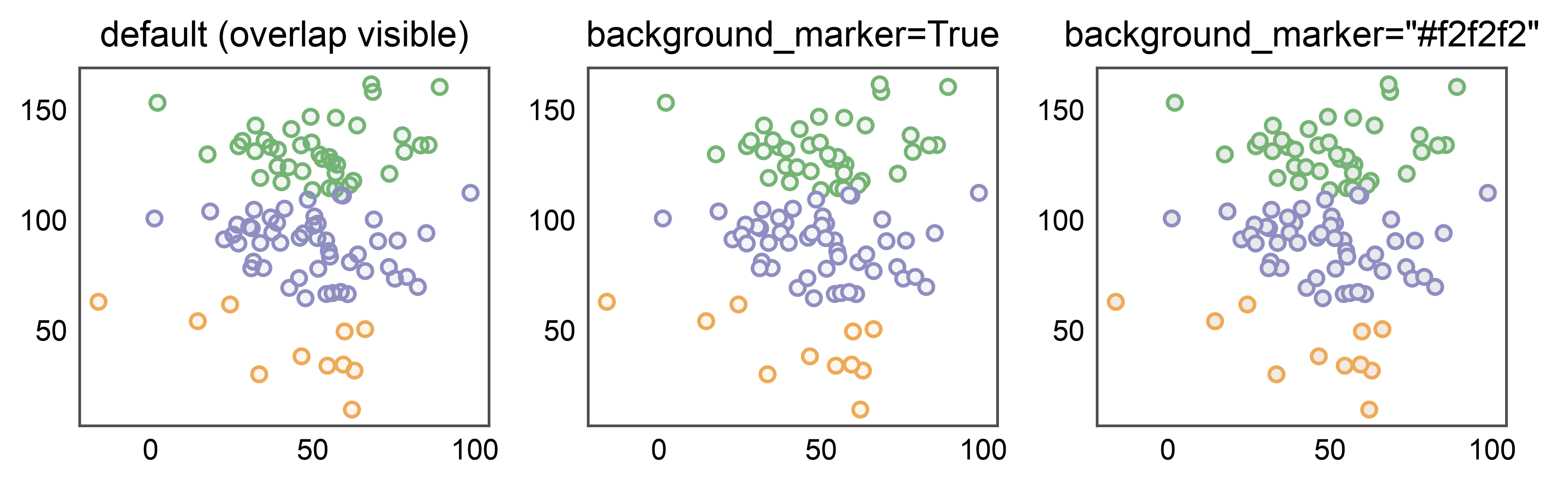
Hiding Overlap with background_marker
Scatters preserve point overlap by default so you can read density. For
figures where every point should stand on its own — small-multiples,
publication panels, categorical bubble plots — pass background_marker
to draw a solid twin under each point. True uses white; any color
string (e.g. "#f2f2f2") overrides the background color. Off by default
because duplicating every point doubles artist count.
fig, axes = pp.subplots(1, 3, axes_size=(40, 35))
for ax, bg, subtitle in zip(
    axes,
    [False, True, "#f2f2f2"],
    ['default (overlap visible)', 'background_marker=True', 'background_marker="#f2f2f2"'],
):
    pp.scatterplot(
        data=scatter_data,
        x='x', y='y', hue='group', palette='pastel',
        background_marker=bg,
        title=subtitle, ax=ax,
        legend=False,
    )
pp.show()
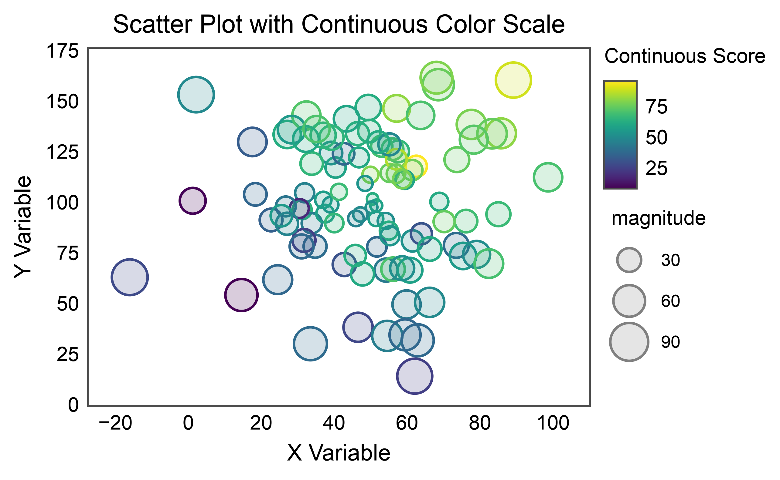
Scatter with Continuous Color Scale
Use a continuous color scale for hue encoding.
# Add continuous score
scatter_data['score'] = scatter_data['x'] * 0.5 + scatter_data['y'] * 0.3 + np.random.randn(n) * 10

# Create scatter with continuous hue
ax = pp.scatterplot(
    data=scatter_data,
    x='x',
    y='y',
    hue='score',
    size='magnitude',
    palette='viridis',
    hue_norm=(scatter_data['score'].min(), scatter_data['score'].max()),
    title='Scatter Plot with Continuous Color Scale',
    xlabel='X Variable',
    ylabel='Y Variable',
    alpha=0.2,
    legend_kws=dict(hue_label="Continuous Score"),
)
ax.margins(0.1)
pp.show()
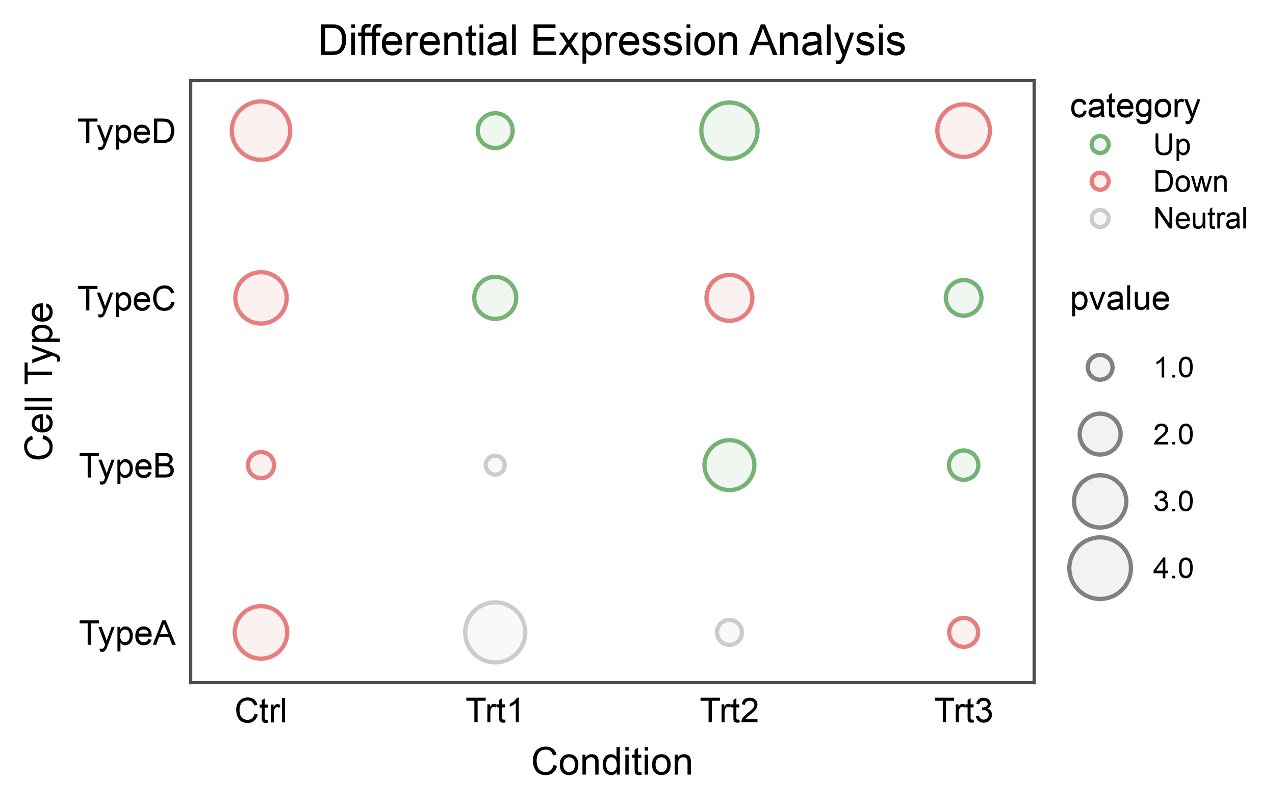
Bubble Plot (Categorical Scatter Heatmap)
Create a bubble plot with categorical x and y axes, useful for heatmaps.
# Create categorical data
np.random.seed(555)
conditions = ['Ctrl', 'Trt1', 'Trt2', 'Trt3']
cell_types = ['TypeA', 'TypeB', 'TypeC', 'TypeD']

heatmap_data = []
for condition in conditions:
    for cell_type in cell_types:
        heatmap_data.append({
            'condition': condition,
            'cell_type': cell_type,
            'pvalue': np.random.uniform(0.5, 5),
            'category': np.random.choice(['Up', 'Down', 'Neutral'])
        })

heatmap_df = pd.DataFrame(heatmap_data)

# Create bubble plot
ax = pp.scatterplot(
    data=heatmap_df,
    x='condition',
    y='cell_type',
    size='pvalue',
    hue='category',
    palette={'Up': '#75B375', 'Down': '#E67E7E', 'Neutral': '#CCCCCC'},
    title='Differential Expression Analysis',
    xlabel='Condition',
    ylabel='Cell Type',
)
pp.show()
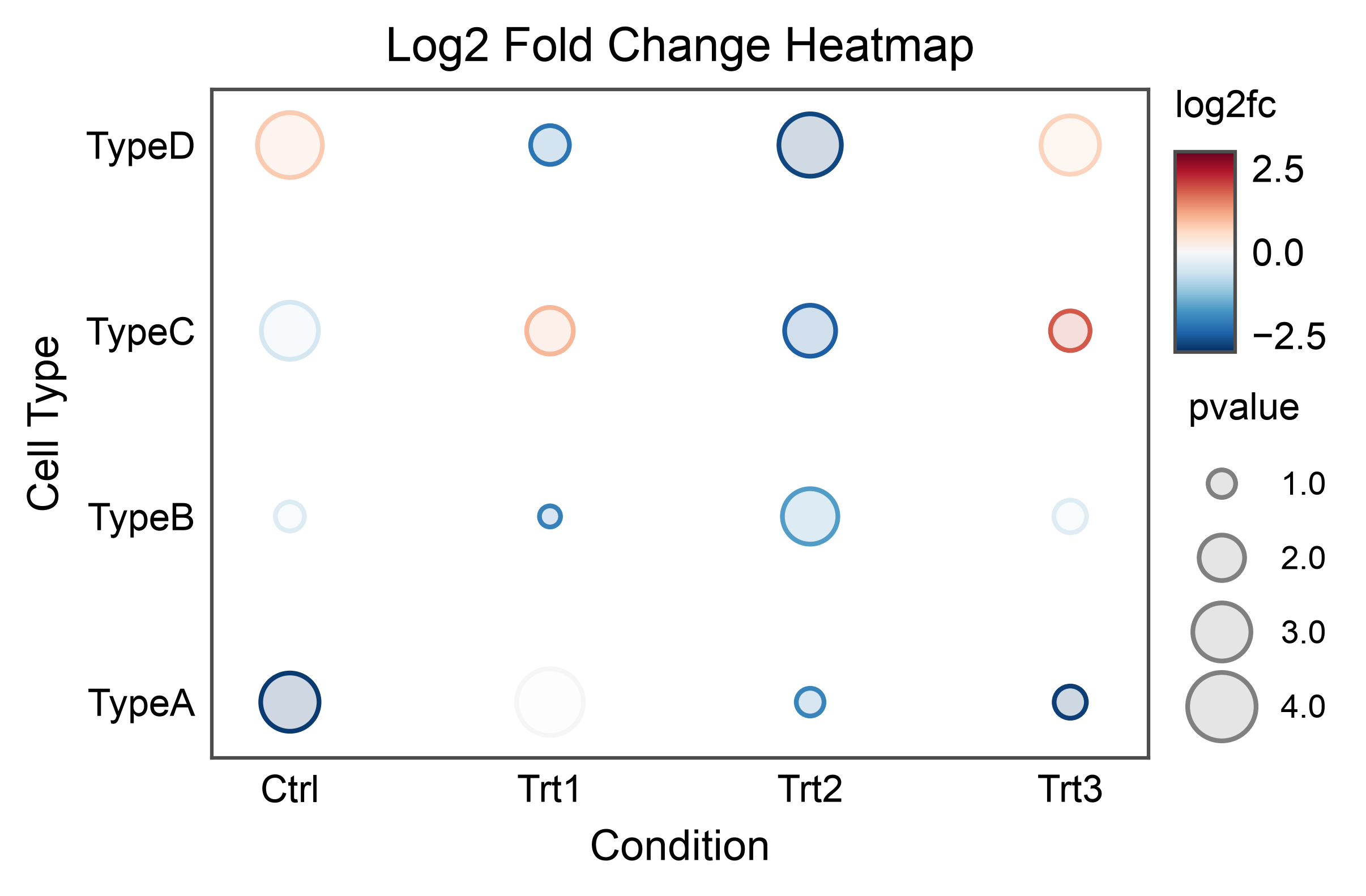
Bubble Plot with Continuous Colors
Use a continuous color scale for bubble plot values.
# Add continuous fold change
heatmap_df['log2fc'] = np.random.uniform(-3, 3, len(heatmap_df))

# Create bubble plot with continuous colors
ax = pp.scatterplot(
    data=heatmap_df,
    x='condition',
    y='cell_type',
    size='pvalue',
    hue='log2fc',
    palette='RdBu_r',  # Diverging colormap
    hue_norm=(-3, 3),
    title='Log2 Fold Change Heatmap',
    xlabel='Condition',
    ylabel='Cell Type',
    alpha=0.2,
)
pp.show()
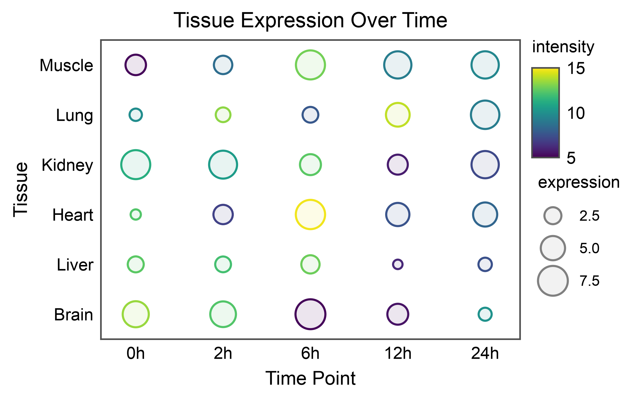
Large Bubble Plot
Create a larger bubble plot with more categories.
# Create larger dataset
np.random.seed(666)
tissues = ['Brain', 'Liver', 'Heart', 'Kidney', 'Lung', 'Muscle']
timepoints = ['0h', '2h', '6h', '12h', '24h']

large_heatmap_data = []
for tissue in tissues:
    for time in timepoints:
        large_heatmap_data.append({
            'tissue': tissue,
            'time': time,
            'expression': np.random.uniform(1, 10),
            'intensity': np.random.uniform(5, 15)
        })

large_df = pd.DataFrame(large_heatmap_data)

# Create large bubble plot
ax = pp.scatterplot(
    data=large_df,
    x='time',
    y='tissue',
    size='expression',
    hue='intensity',
    palette='viridis',
    hue_norm=(5, 15),
    title='Tissue Expression Over Time',
    xlabel='Time Point',
    ylabel='Tissue',
)
pp.show()
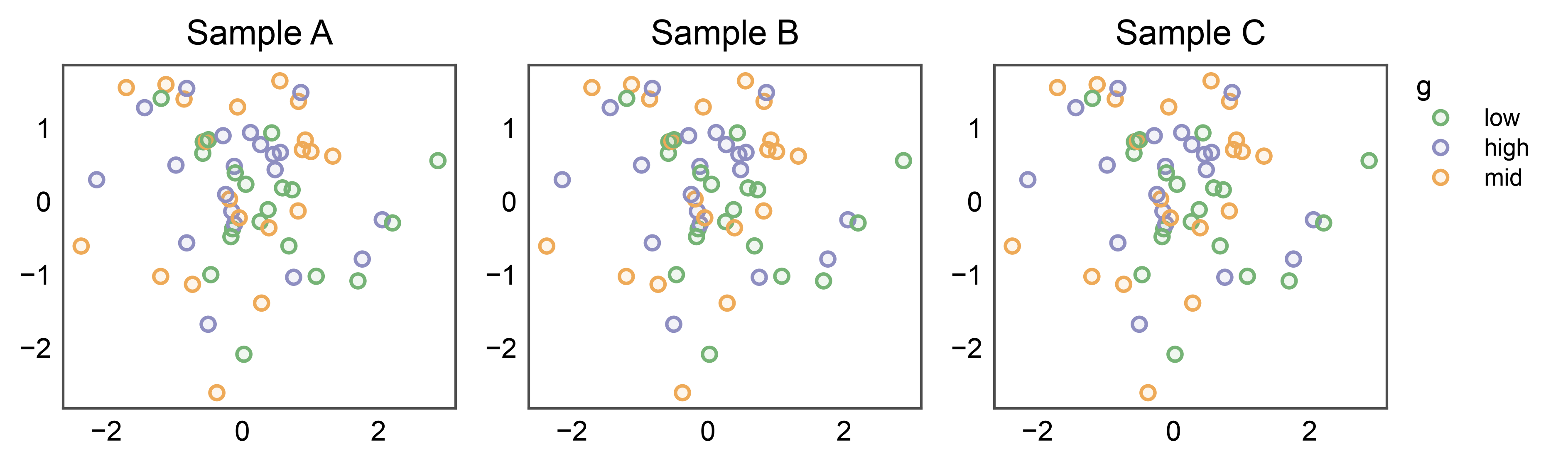
Shared Legend Across Subplots
When several subplots share the same hue variable, attach
pp.legend(anchor=...) to the figure BEFORE drawing. Every
plot function that stashes legend entries (scatter / strip / swarm /
point) sees the group, skips its own per-axis legend, and lets the
group render one unified legend on the right. The figure’s
legend_column is auto-sized from the measured group width — no
legend_column=N guess, no handles=... construction.
np.random.seed(99)
shared_df = pd.DataFrame({
    'x': np.random.randn(60),
    'y': np.random.randn(60),
    'g': np.random.choice(['low', 'mid', 'high'], 60),
})

fig, axes = pp.subplots(1, 3, axes_size=(40, 35))
pp.legend(anchor=axes[-1])   # attach BEFORE plotting
for ax, title in zip(axes, ['Sample A', 'Sample B', 'Sample C']):
    pp.scatterplot(
        data=shared_df, x='x', y='y', hue='g',
        palette='pastel', title=title, ax=ax,
    )
pp.show()
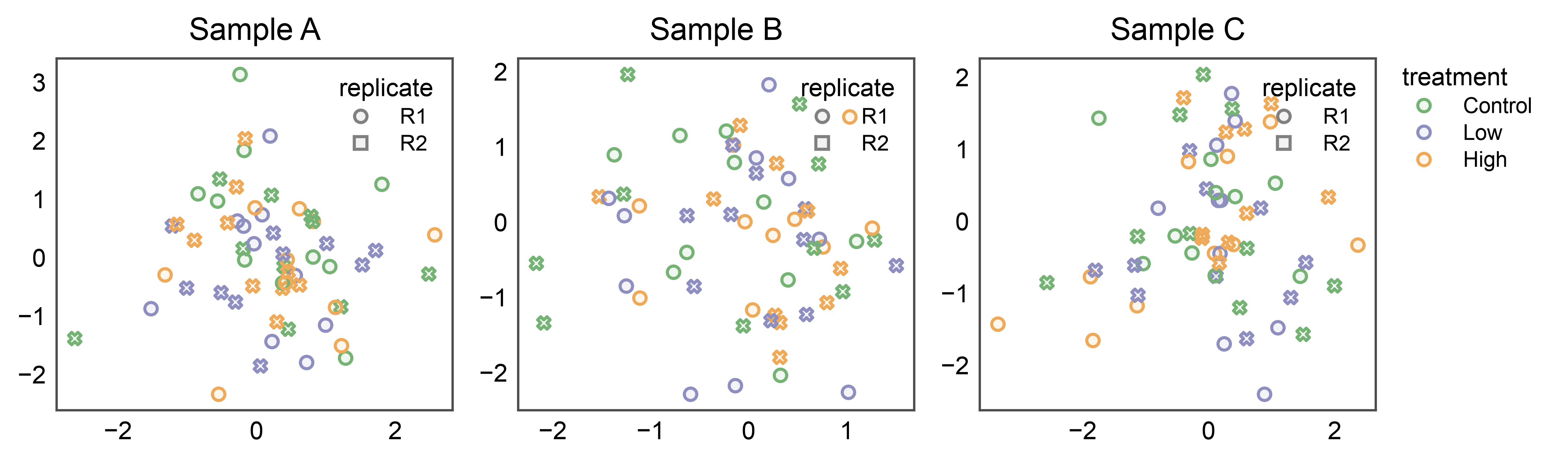
Split Legends: Shared Hue, Panel-Local Style
The inside and figure-level placements compose. When each panel uses
both hue (shared across panels — typically a palette the whole
figure agrees on) and style (panel-specific — e.g., measurement
replicate or assay version), collect only the shared entry into the
group and let legend_kws={"inside": True, ...} tuck the style
marker legend inside each panel.
np.random.seed(27)
split_df = pd.DataFrame({
    'x': np.random.randn(180),
    'y': np.random.randn(180),
    'treatment': np.tile(['Control', 'Low', 'High'], 60),
    'replicate': np.tile(['R1', 'R2'], 90),
    'sample': np.repeat(['Sample A', 'Sample B', 'Sample C'], 60),
})

fig, axes = pp.subplots(1, 3, axes_size=(45, 40))
pp.legend(anchor=axes[-1], collect=['treatment'])
for ax, sample in zip(axes, ['Sample A', 'Sample B', 'Sample C']):
    pp.scatterplot(
        data=split_df[split_df['sample'] == sample],
        x='x', y='y',
        hue='treatment', style='replicate',
        palette='pastel',
        title=sample, ax=ax,
        legend_kws={'inside': True, 'loc': 'upper right'},
    )
pp.show()
Total running time of the script: (0 minutes 8.393 seconds)