Note
Go to the end to download the full example code.
Venn Diagram Examples
This example demonstrates Venn diagram functionality in PubliPlots, supporting 2-way through 5-way Venn diagrams with customizable colors, labels, and formatting.
import publiplots as pp
import numpy as np
import matplotlib.pyplot as plt

# Set style
pp.set_notebook_style()
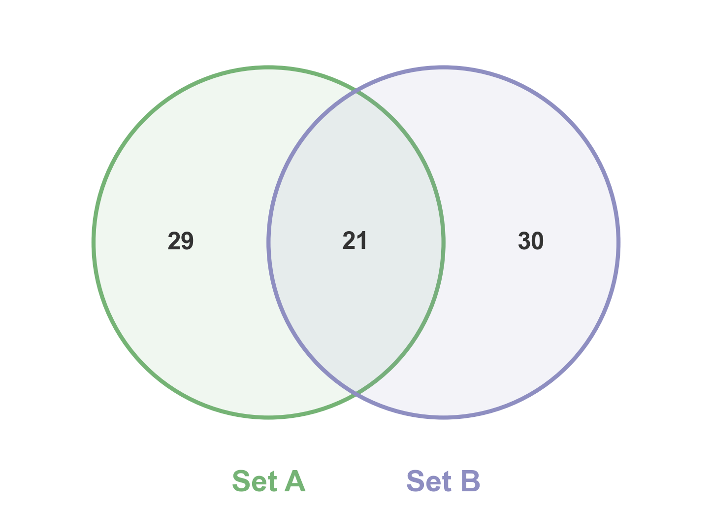
2-Way Venn Diagram
Simple 2-way Venn diagram showing set overlaps.
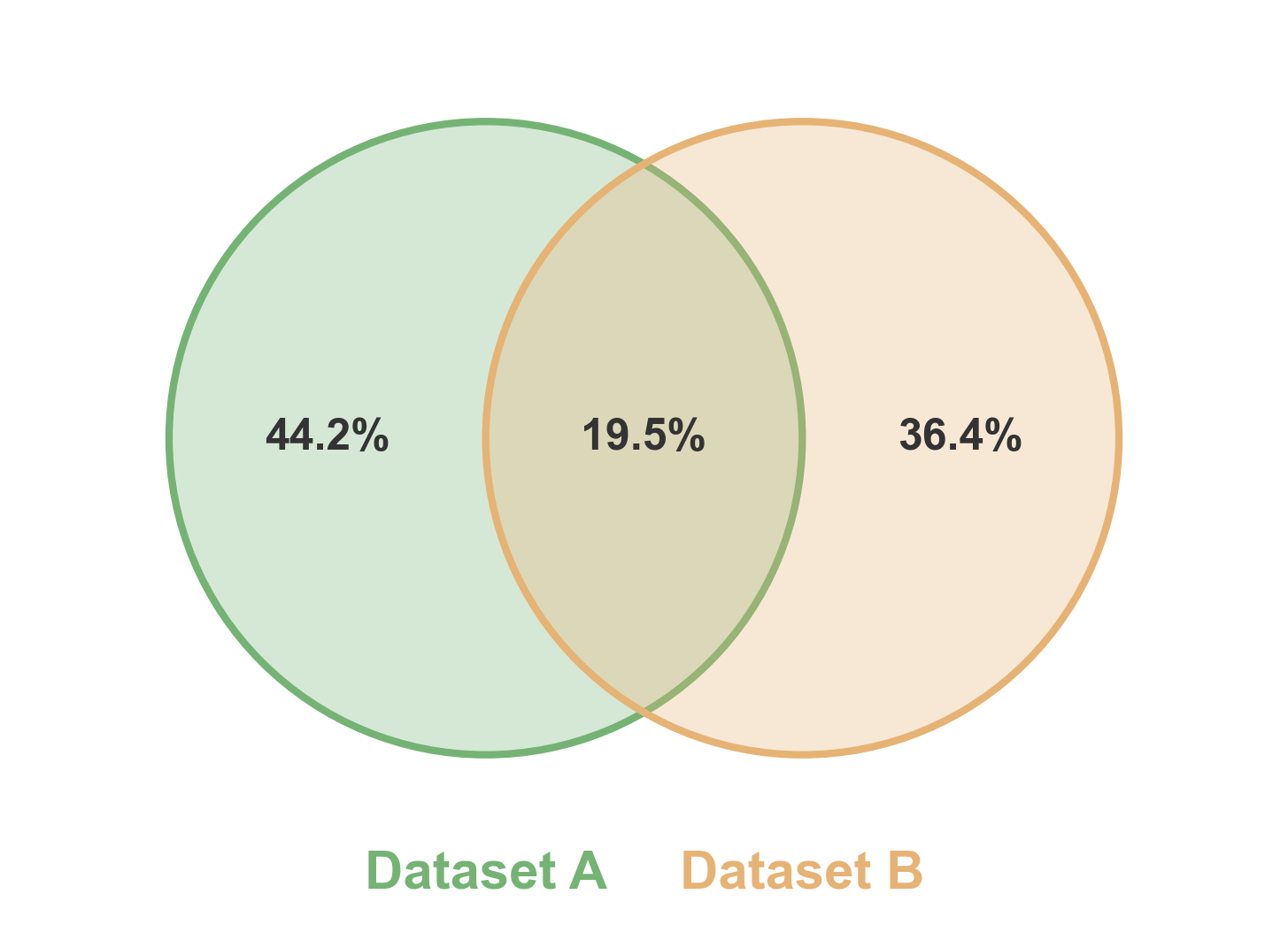
2-Way Venn with Percentage Format
Show percentages instead of sizes in the labels.
# Create two sets with overlap
np.random.seed(777)
set1 = set(np.random.randint(1, 100, 60))
set2 = set(np.random.randint(40, 140, 60))

# Create 2-way Venn with percentage format
fig, ax = pp.venn(
    sets=[set1, set2],
    labels=['Dataset A', 'Dataset B'],
    colors=['#75B375', '#E6B375'],
    fmt='{percentage:.1f}%',
    alpha=0.3,
    figsize=(6, 6)
)
plt.show()
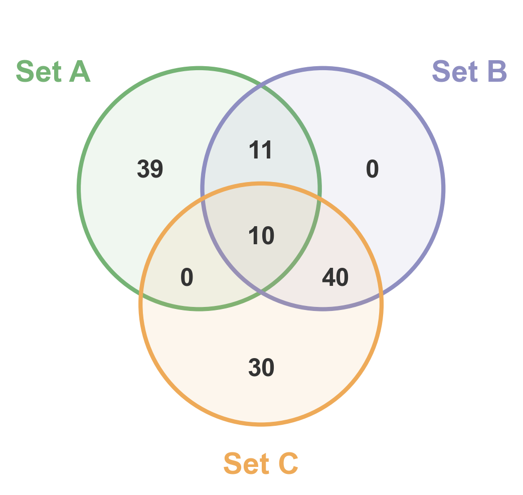
3-Way Venn Diagram
Three-way Venn diagram showing all pairwise and triple overlaps.
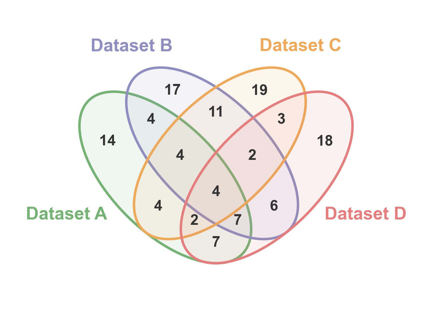
4-Way Venn Diagram
Four-way Venn diagram using ellipses to show all possible intersections.
# Create four sets with realistic overlaps
np.random.seed(888)
set1 = set(np.random.randint(1, 120, 70))
set2 = set(np.random.randint(30, 150, 75))
set3 = set(np.random.randint(60, 180, 70))
set4 = set(np.random.randint(1, 100, 65))

# Create 4-way Venn
fig, ax = pp.venn(
    sets=[set1, set2, set3, set4],
    labels=['Dataset A', 'Dataset B', 'Dataset C', 'Dataset D'],
    colors=pp.color_palette('pastel', n_colors=4),
    figsize=(6, 6),
)
plt.show()
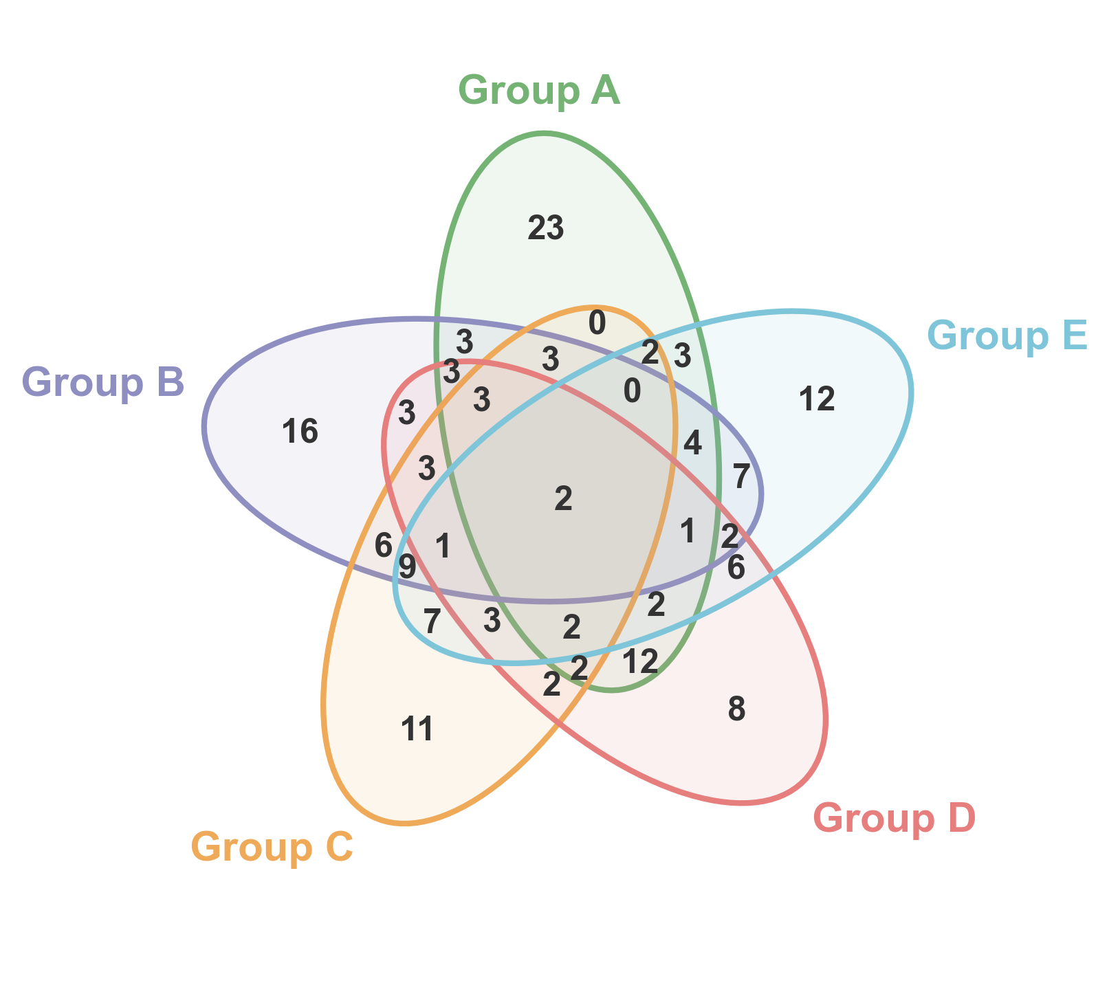
5-Way Venn Diagram
Five-way Venn diagram showing complex overlaps between multiple sets.
# Create five sets with varying overlaps
np.random.seed(999)
set1 = set(np.random.randint(1, 140, 80))
set2 = set(np.random.randint(40, 180, 85))
set3 = set(np.random.randint(80, 200, 75))
set4 = set(np.random.randint(20, 160, 70))
set5 = set(np.random.randint(60, 180, 80))

# Create 5-way Venn
fig, ax = pp.venn(
    sets=[set1, set2, set3, set4, set5],
    labels=['Group A', 'Group B', 'Group C', 'Group D', 'Group E'],
    colors=pp.color_palette('pastel', n_colors=5),
    figsize=(6, 6),
)
plt.show()
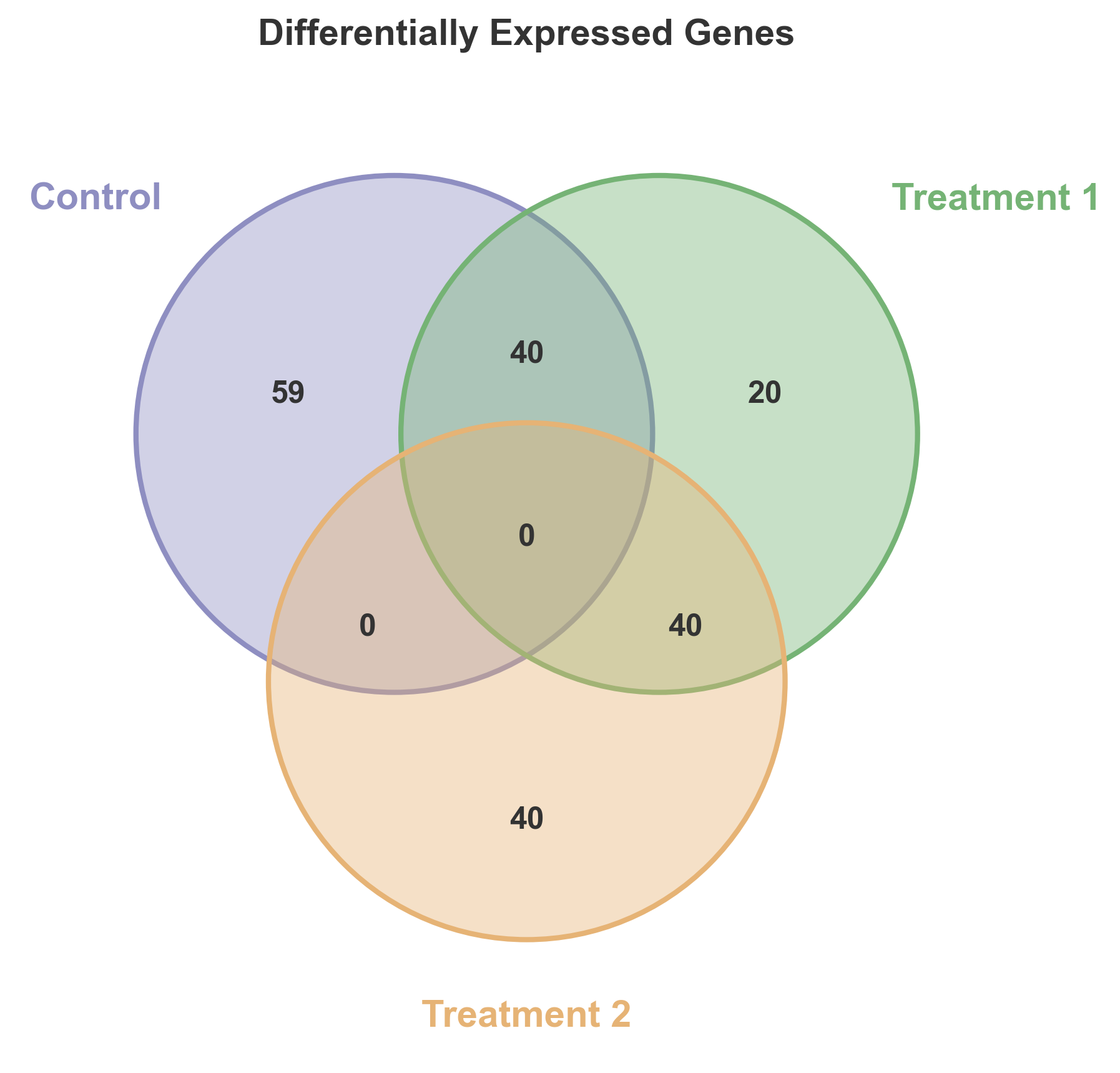
Custom Styled Venn Diagram
Demonstrate custom colors and styling options.
# Create three sets for gene analysis
genes_control = set(range(1, 100))
genes_treatment1 = set(range(60, 160))
genes_treatment2 = set(range(120, 200))

# Create custom styled Venn
fig, ax = pp.venn(
    sets=[genes_control, genes_treatment1, genes_treatment2],
    labels=['Control', 'Treatment 1', 'Treatment 2'],
    colors=['#8E8EC1', '#75B375', '#E6B375'],
    alpha=0.4,
    figsize=(7, 7),
)
plt.title('Differentially Expressed Genes', fontsize=14, fontweight='bold')
plt.show()
Total running time of the script: (0 minutes 0.718 seconds)