Note
Go to the end to download the full example code.
Scatter Plot Examples
This example demonstrates scatter plot functionality in PubliPlots, including basic scatter plots, size encoding, categorical and continuous color scales, and bubble plots (categorical scatter heatmaps).
import publiplots as pp
import pandas as pd
import numpy as np
import matplotlib.pyplot as plt

# Set style
pp.set_notebook_style()
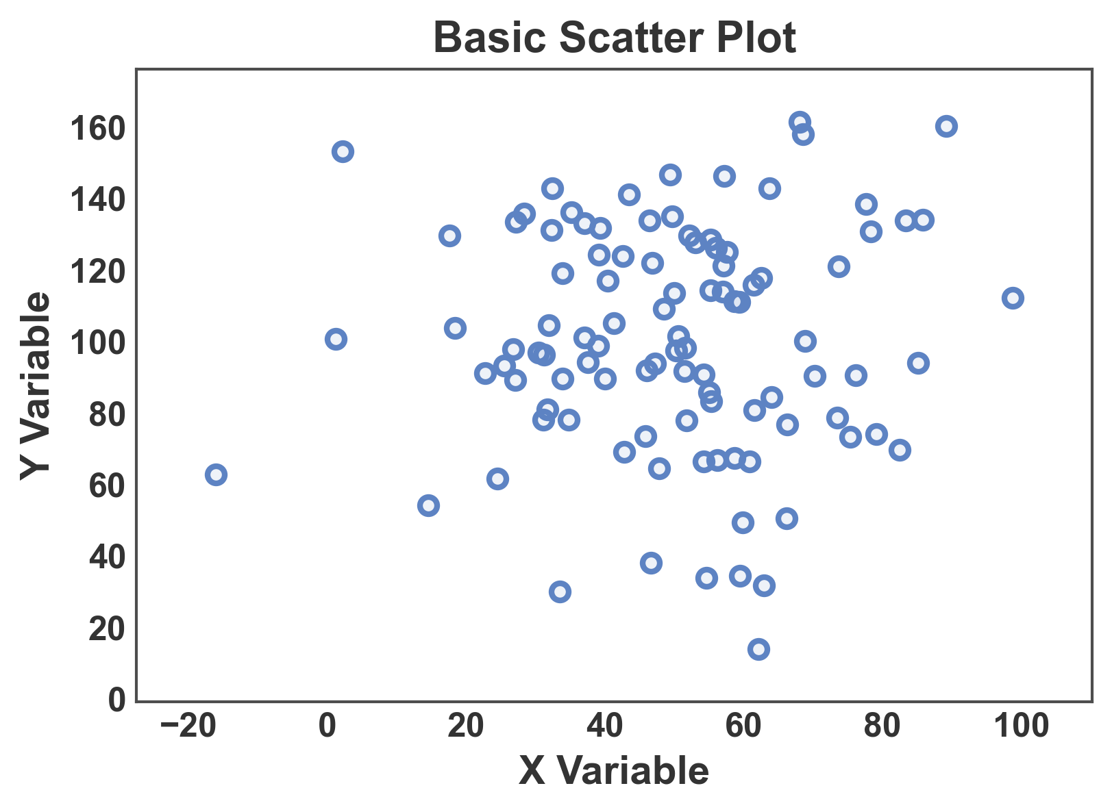
Basic Scatter Plot
Create a simple scatter plot with continuous data.
# Create scatter data
np.random.seed(444)
n = 100
scatter_data = pd.DataFrame({
    'x': np.random.normal(50, 20, n),
    'y': np.random.normal(100, 30, n)
})

# Create basic scatter plot
fig, ax = pp.scatterplot(
    data=scatter_data,
    x='x',
    y='y',
    title='Basic Scatter Plot',
    xlabel='X Variable',
    ylabel='Y Variable',
)
ax.margins(x=0.1, y=0.1)
plt.show()
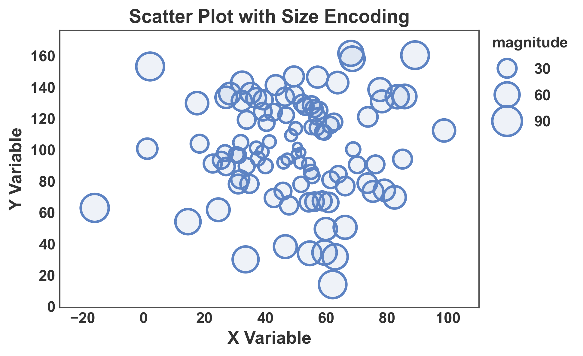
Scatter with Size Encoding
Use point size to encode an additional data dimension.
# Add size variable
scatter_data['magnitude'] = np.abs(scatter_data['x'] - 50) + np.abs(scatter_data['y'] - 100)

# Create scatter with size encoding
fig, ax = pp.scatterplot(
    data=scatter_data,
    x='x',
    y='y',
    size='magnitude',
    sizes=(50, 500),
    title='Scatter Plot with Size Encoding',
    xlabel='X Variable',
    ylabel='Y Variable',
)
ax.margins(x=0.1, y=0.1)
plt.show()
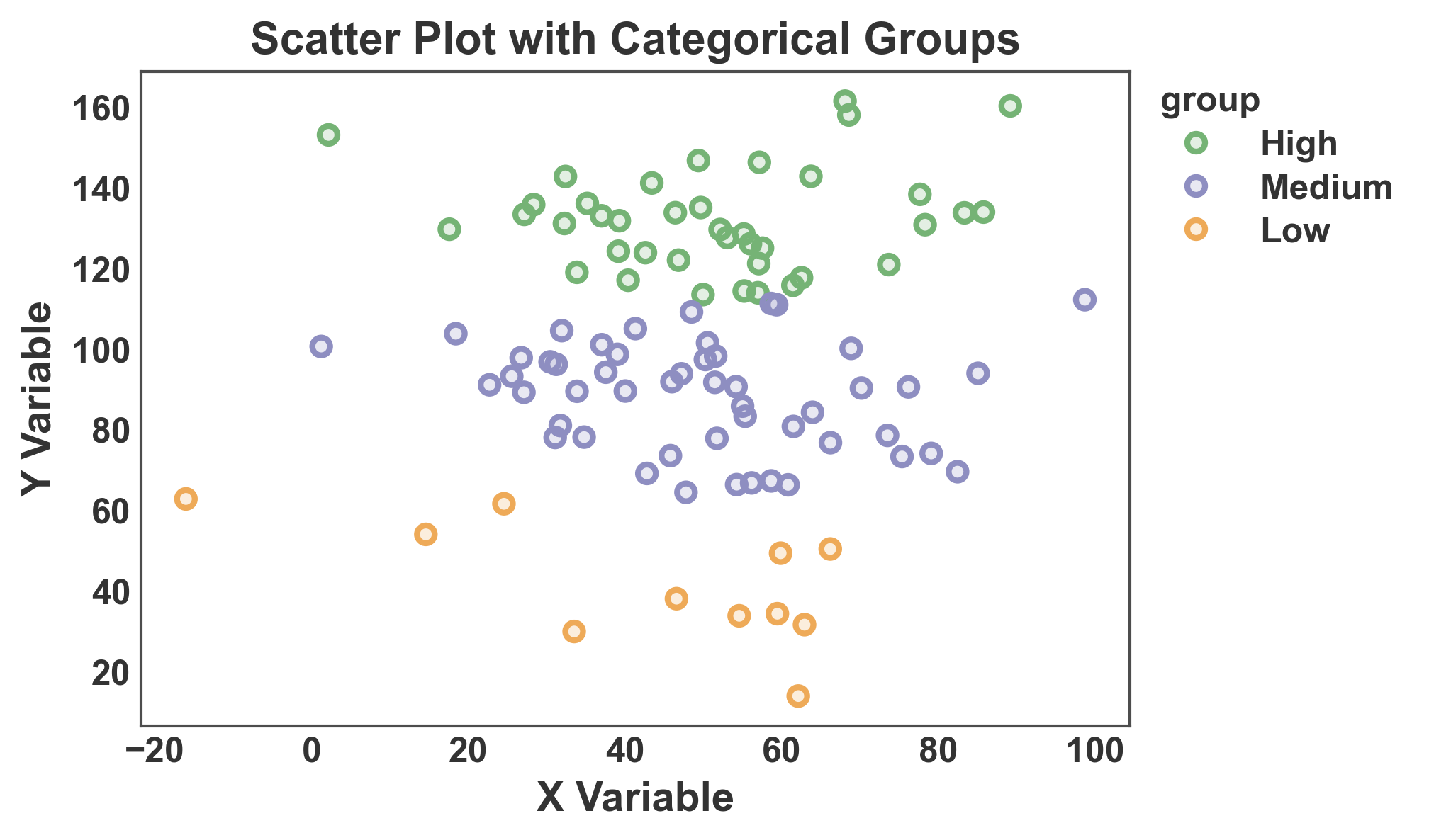
Scatter with Categorical Hue
Color points by categorical groups.
# Add categorical variable
scatter_data['group'] = pd.cut(scatter_data['y'], bins=3, labels=['Low', 'Medium', 'High'])

# Create scatter with categorical hue
fig, ax = pp.scatterplot(
    data=scatter_data,
    x='x',
    y='y',
    hue='group',
    palette='pastel',
    title='Scatter Plot with Categorical Groups',
    xlabel='X Variable',
    ylabel='Y Variable',
    alpha=0.2,
)
plt.show()
Scatter with Continuous Color Scale
Use a continuous color scale for hue encoding.
# Add continuous score
scatter_data['score'] = scatter_data['x'] * 0.5 + scatter_data['y'] * 0.3 + np.random.randn(n) * 10

# Create scatter with continuous hue
fig, ax = pp.scatterplot(
    data=scatter_data,
    x='x',
    y='y',
    hue='score',
    size='magnitude',
    palette='viridis',
    hue_norm=(scatter_data['score'].min(), scatter_data['score'].max()),
    title='Scatter Plot with Continuous Color Scale',
    xlabel='X Variable',
    ylabel='Y Variable',
    alpha=0.2,
    legend_kws=dict(hue_label="Continuous Score"),
)
ax.margins(0.1)
plt.show()

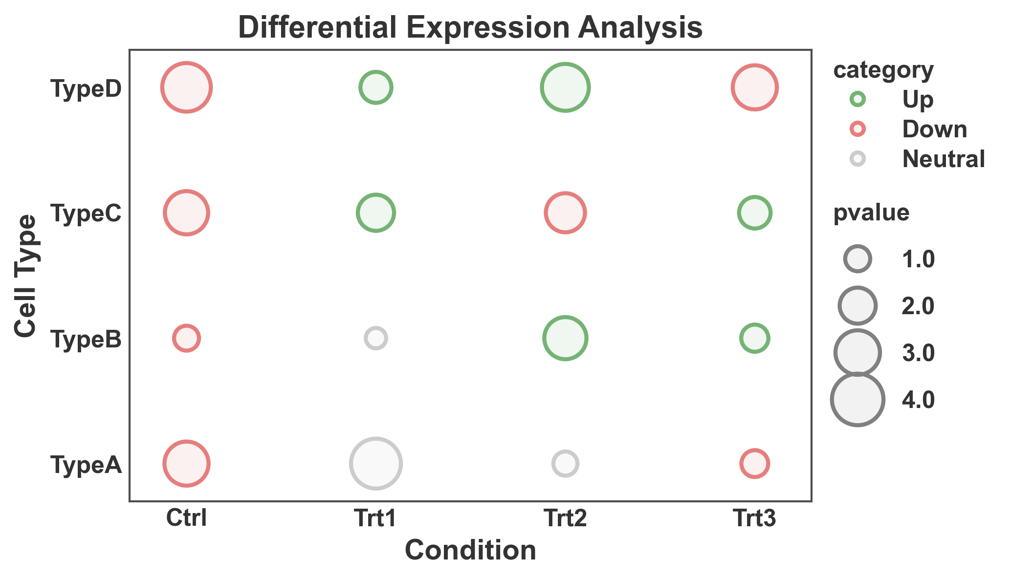
Bubble Plot (Categorical Scatter Heatmap)
Create a bubble plot with categorical x and y axes, useful for heatmaps.
# Create categorical data
np.random.seed(555)
conditions = ['Ctrl', 'Trt1', 'Trt2', 'Trt3']
cell_types = ['TypeA', 'TypeB', 'TypeC', 'TypeD']

heatmap_data = []
for condition in conditions:
    for cell_type in cell_types:
        heatmap_data.append({
            'condition': condition,
            'cell_type': cell_type,
            'pvalue': np.random.uniform(0.5, 5),
            'category': np.random.choice(['Up', 'Down', 'Neutral'])
        })

heatmap_df = pd.DataFrame(heatmap_data)

# Create bubble plot
fig, ax = pp.scatterplot(
    data=heatmap_df,
    x='condition',
    y='cell_type',
    size='pvalue',
    hue='category',
    sizes=(100, 600),
    palette={'Up': '#75B375', 'Down': '#E67E7E', 'Neutral': '#CCCCCC'},
    title='Differential Expression Analysis',
    xlabel='Condition',
    ylabel='Cell Type',
)
plt.show()
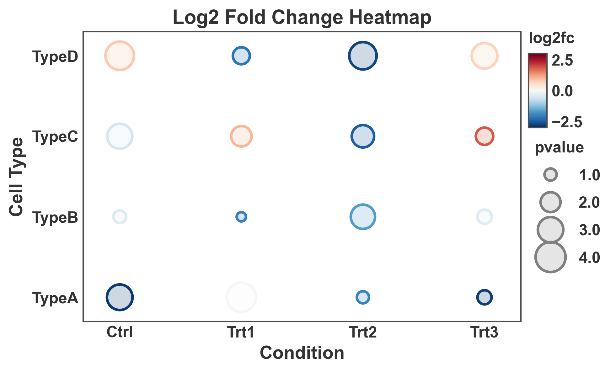
Bubble Plot with Continuous Colors
Use a continuous color scale for bubble plot values.
# Add continuous fold change
heatmap_df['log2fc'] = np.random.uniform(-3, 3, len(heatmap_df))

# Create bubble plot with continuous colors
fig, ax = pp.scatterplot(
    data=heatmap_df,
    x='condition',
    y='cell_type',
    size='pvalue',
    hue='log2fc',
    sizes=(50, 500),
    palette='RdBu_r',  # Diverging colormap
    hue_norm=(-3, 3),
    title='Log2 Fold Change Heatmap',
    xlabel='Condition',
    ylabel='Cell Type',
    alpha=0.2,
)
plt.show()
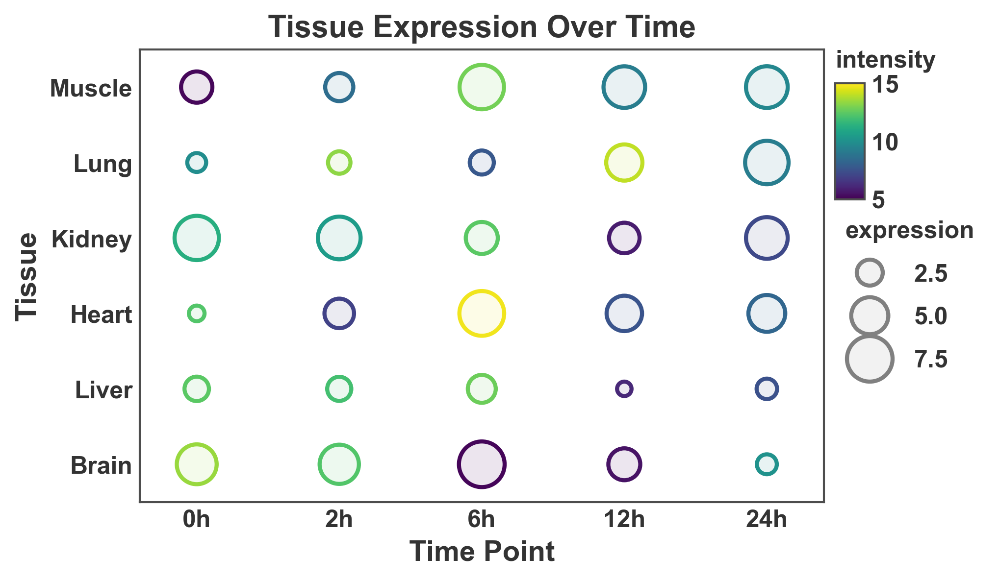
Large Bubble Plot
Create a larger bubble plot with more categories.
# Create larger dataset
np.random.seed(666)
tissues = ['Brain', 'Liver', 'Heart', 'Kidney', 'Lung', 'Muscle']
timepoints = ['0h', '2h', '6h', '12h', '24h']

large_heatmap_data = []
for tissue in tissues:
    for time in timepoints:
        large_heatmap_data.append({
            'tissue': tissue,
            'time': time,
            'expression': np.random.uniform(1, 10),
            'intensity': np.random.uniform(5, 15)
        })

large_df = pd.DataFrame(large_heatmap_data)

# Create large bubble plot
fig, ax = pp.scatterplot(
    data=large_df,
    x='time',
    y='tissue',
    size='expression',
    hue='intensity',
    sizes=(50, 500),
    palette='viridis',
    hue_norm=(5, 15),
    title='Tissue Expression Over Time',
    xlabel='Time Point',
    ylabel='Tissue',
)
plt.show()
Total running time of the script: (0 minutes 1.830 seconds)