Note
Go to the end to download the full example code.
Point Plot Examples
This example demonstrates point plot functionality in PubliPlots, showing point estimates with error bars connected by lines. Point plots are ideal for visualizing trends across categorical variables and comparing groups over time or conditions.
import publiplots as pp
import pandas as pd
import numpy as np
import matplotlib.pyplot as plt

# Set style
pp.set_notebook_style()
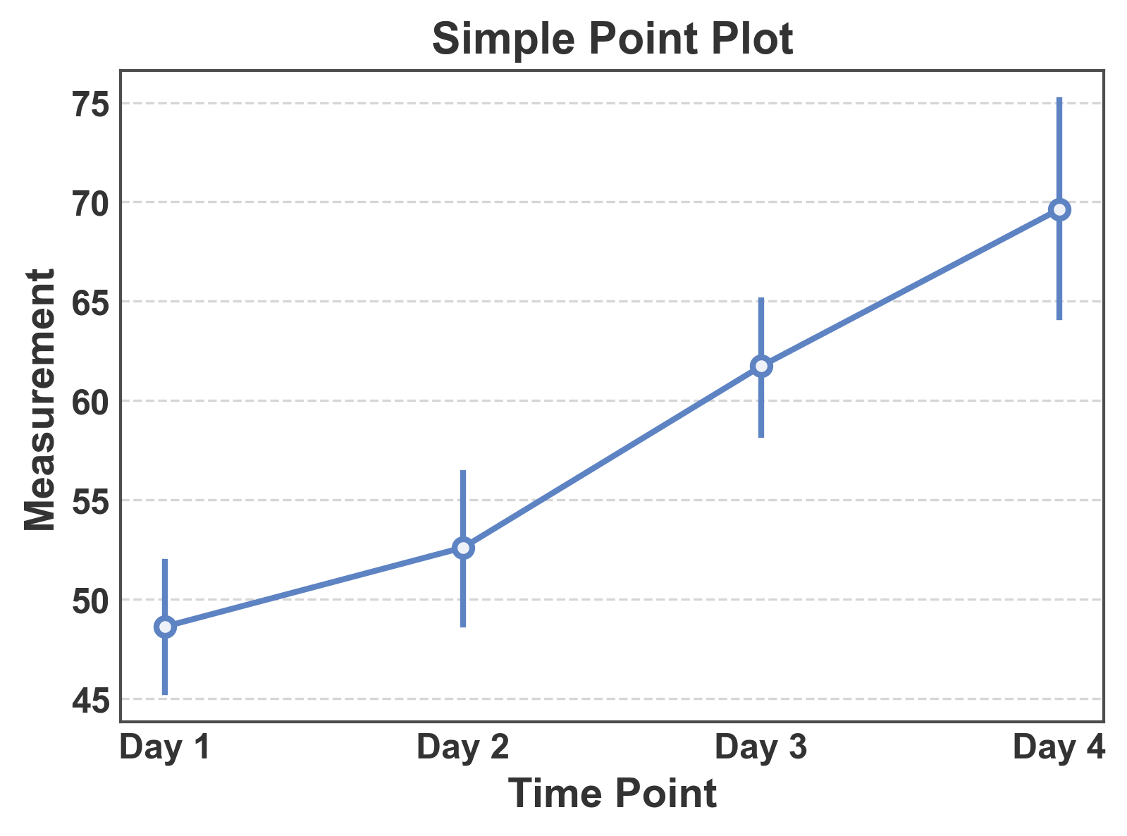
Simple Point Plot
Basic point plot showing mean values with confidence intervals.
# Create sample data
np.random.seed(42)
simple_data = pd.DataFrame({
    'time': np.repeat(['Day 1', 'Day 2', 'Day 3', 'Day 4'], 20),
    'measurement': np.concatenate([
        np.random.normal(50, 8, 20),
        np.random.normal(55, 9, 20),
        np.random.normal(62, 10, 20),
        np.random.normal(70, 12, 20),
    ])
})

# Create simple point plot
fig, ax = pp.pointplot(
    data=simple_data,
    x='time',
    y='measurement',
    title='Simple Point Plot',
    xlabel='Time Point',
    ylabel='Measurement',
)
ax.grid(axis="y")
plt.show()
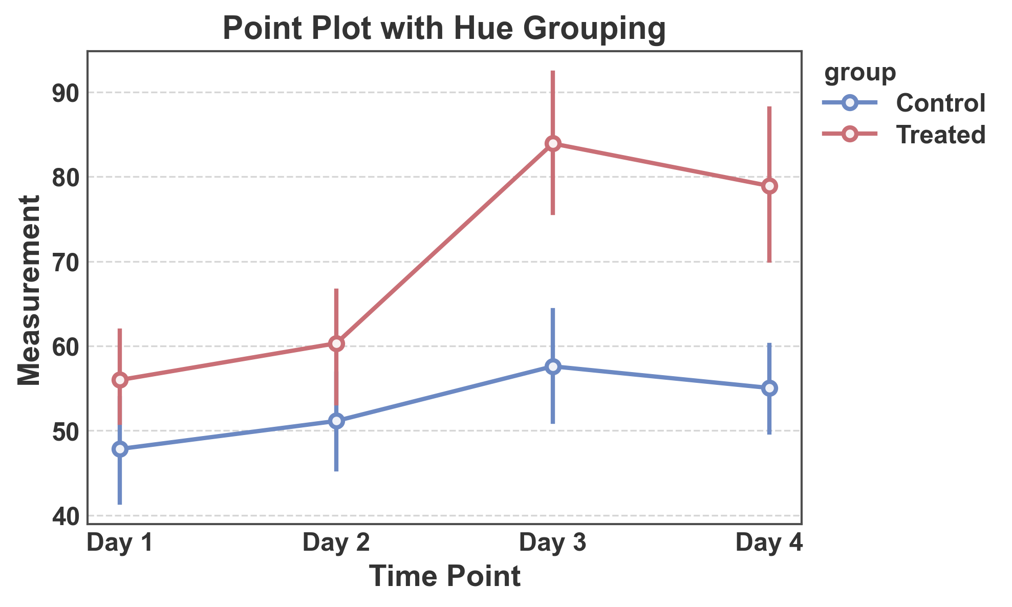
Point Plot with Hue Grouping
Compare multiple groups with different colors.
# Create grouped data
np.random.seed(123)
hue_data = pd.DataFrame({
    'time': np.repeat(['Day 1', 'Day 2', 'Day 3', 'Day 4'], 20),
    'group': np.tile(np.repeat(['Control', 'Treated'], 10), 4),
    'measurement': np.concatenate([
        np.random.normal(50, 8, 10), np.random.normal(52, 8, 10),
        np.random.normal(52, 9, 10), np.random.normal(65, 10, 10),
        np.random.normal(54, 9, 10), np.random.normal(78, 12, 10),
        np.random.normal(55, 10, 10), np.random.normal(85, 14, 10),
    ])
})

# Create point plot with hue
fig, ax = pp.pointplot(
    data=hue_data,
    x='time',
    y='measurement',
    hue='group',
    title='Point Plot with Hue Grouping',
    xlabel='Time Point',
    ylabel='Measurement',
    palette="RdGyBu_r"
)
ax.grid(axis="y")
plt.show()
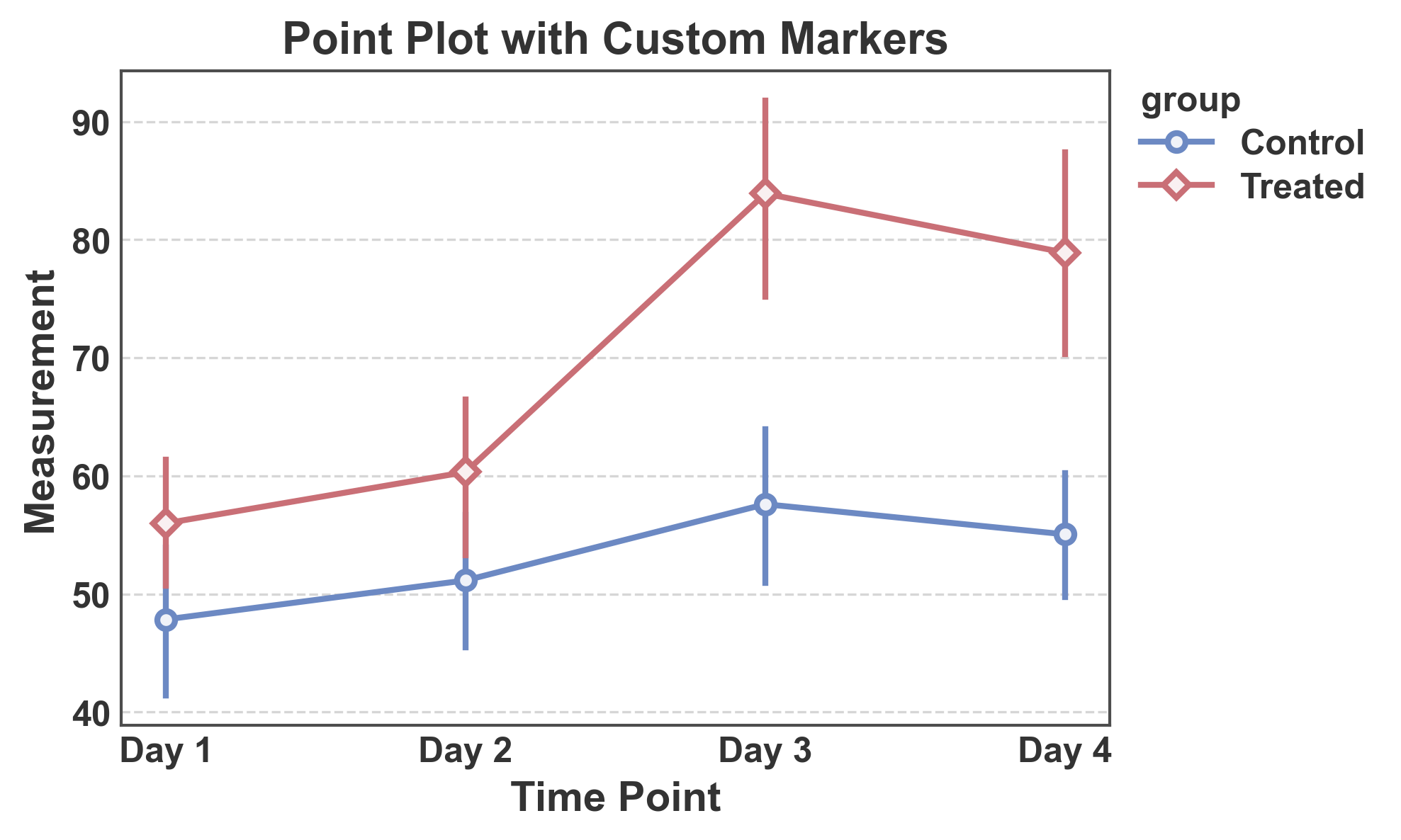
Point Plot with Custom Markers
Use different marker shapes for each group.
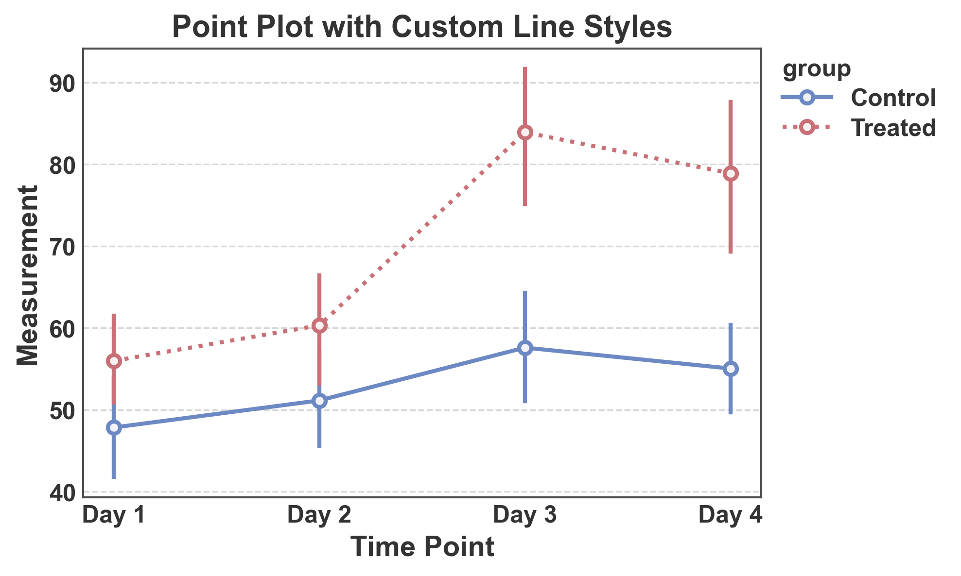
Point Plot with Custom Line Styles
Use different line styles to distinguish groups.
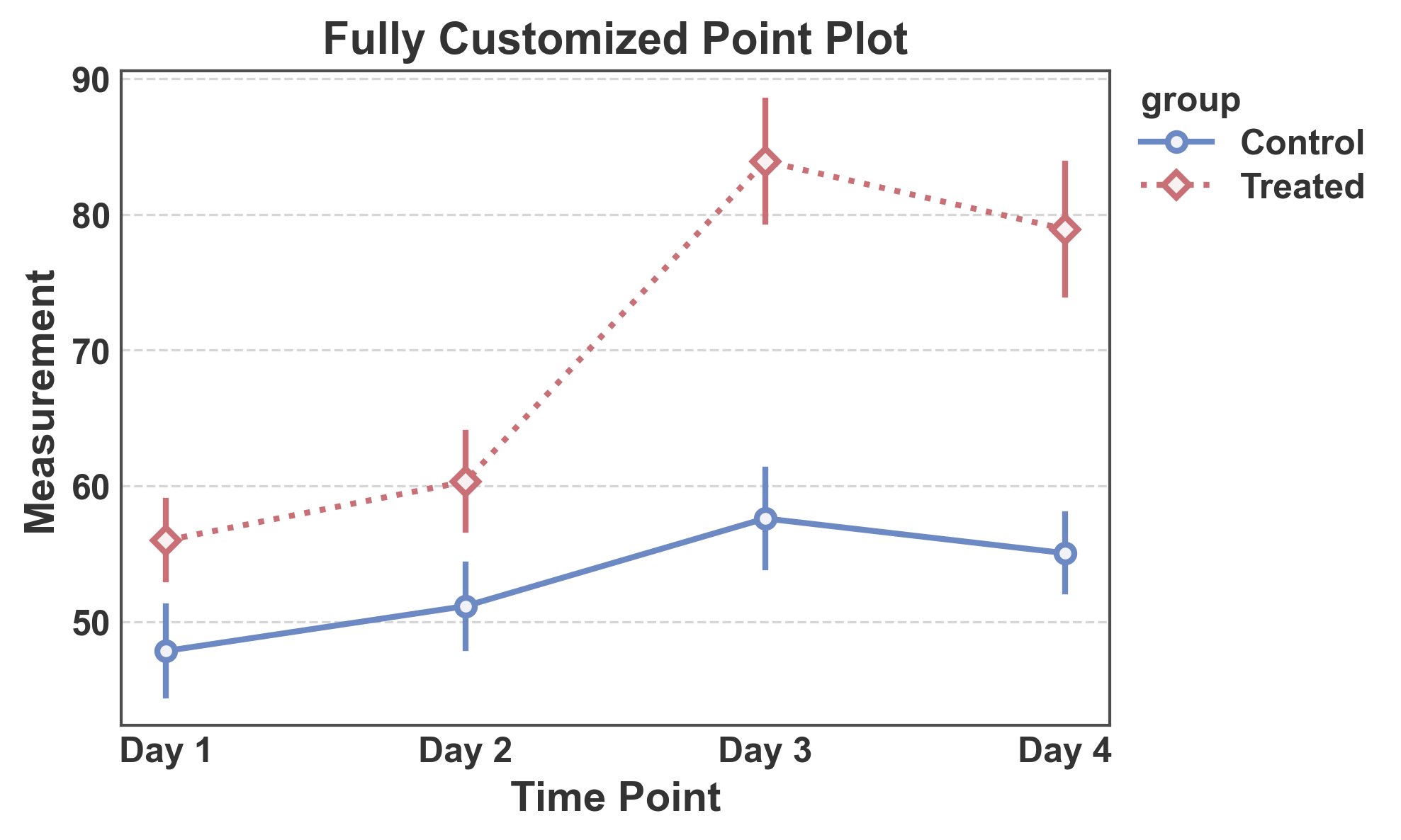
Complete Customization
Combine custom markers, line styles, and palette with error bars.
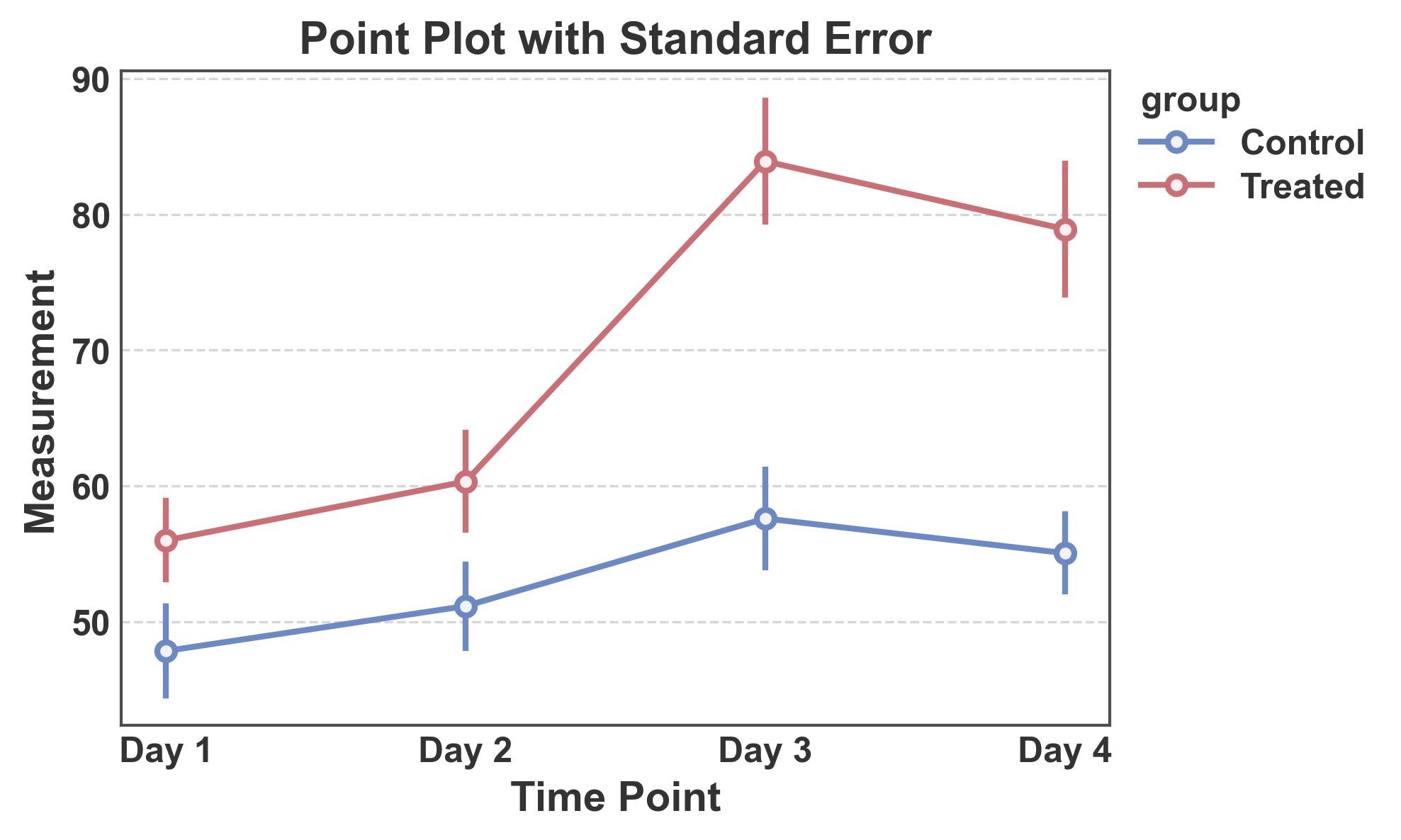
Point Plot with Standard Error
Use standard error instead of confidence intervals.
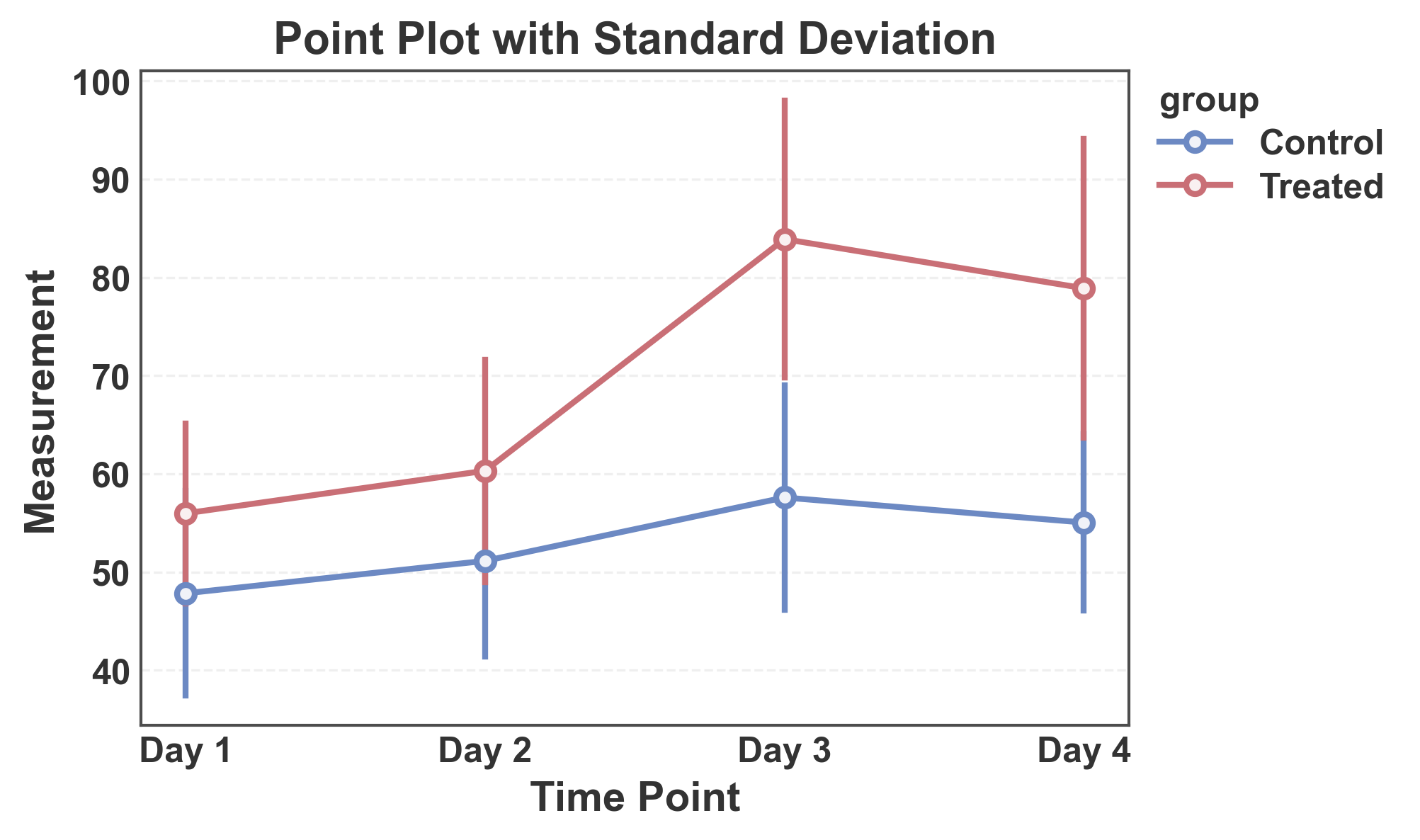
Point Plot with Standard Deviation
Show standard deviation as error bars.
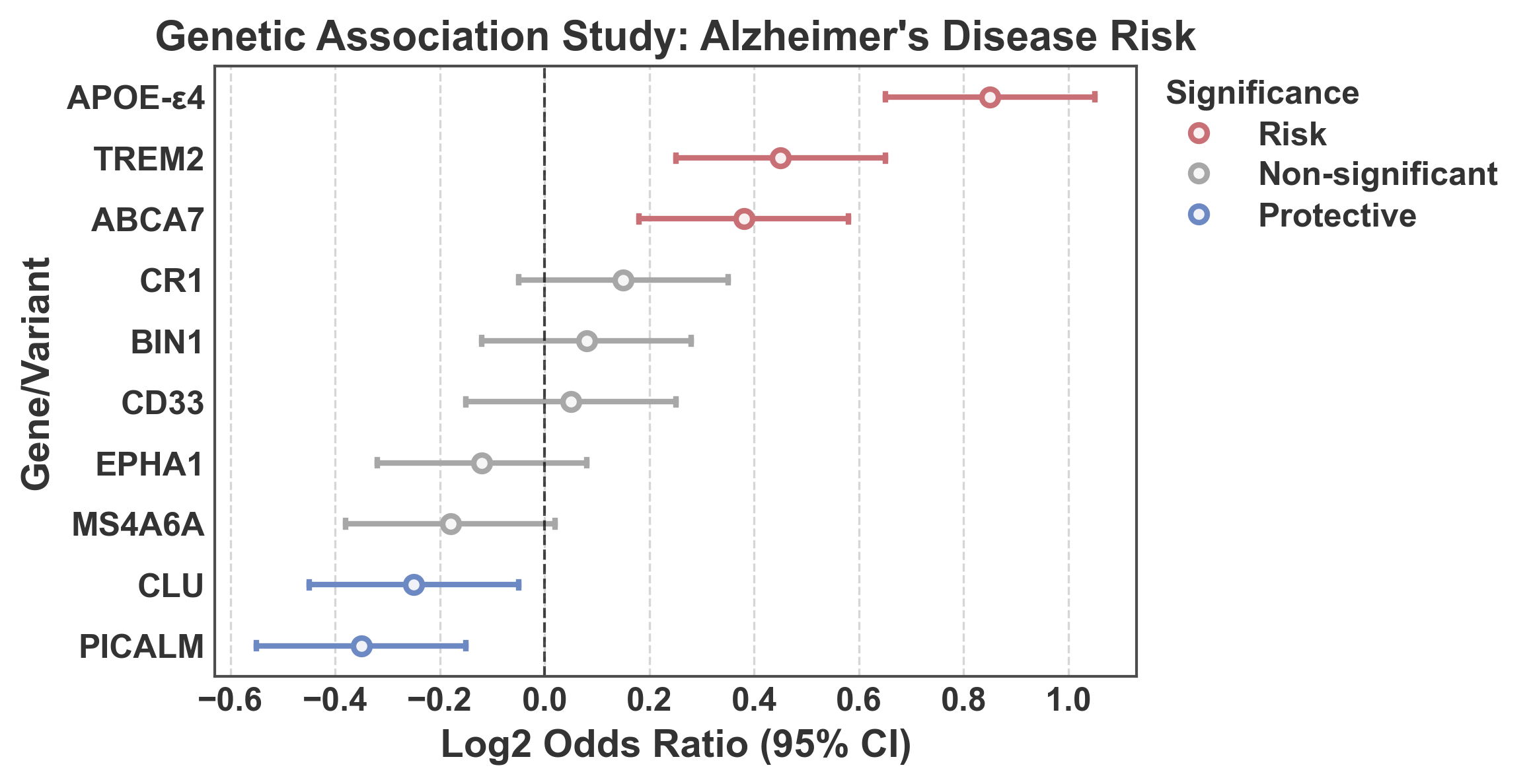
Forest Plot: Log2 Odds Ratios with Significance Coloring
Forest plot showing log2 odds ratios from a genetic association study. Points are colored based on statistical significance: - Blue (#5D83C3): Protective effect (upper CI < 1, i.e., log2(upper) < 0) - Gray (0.5): Non-significant (CI crosses 1, i.e., log2 CI crosses 0) - Red (#e67e7e): Risk effect (lower CI > 1, i.e., log2(lower) > 0)
Tip
PubliPlots supports custom precomputed error bars via
errorbar=('custom', (lower, upper)), where lower and upper
are column names in your DataFrame. This is a distinguishing feature
compared to seaborn, which only accepts long-format data for automatic
CI calculation.
Note
For more information on error bars in statistical visualization, see the excellent guide by the seaborn authors: https://seaborn.pydata.org/tutorial/error_bars.html
# Create realistic genetic association data (log2 odds ratios)
np.random.seed(101)
genetic_data = pd.DataFrame({
    'gene': [
        'APOE-ε4',
        'TREM2',
        'CLU',
        'CR1',
        'PICALM',
        'BIN1',
        'ABCA7',
        'MS4A6A',
        'CD33',
        'EPHA1',
    ],
    'log2_or': [0.85, 0.45, -0.25, 0.15, -0.35, 0.08, 0.38, -0.18, 0.05, -0.12],
    'log2_lower': [0.65, 0.25, -0.45, -0.05, -0.55, -0.12, 0.18, -0.38, -0.15, -0.32],
    'log2_upper': [1.05, 0.65, -0.05, 0.35, -0.15, 0.28, 0.58, 0.02, 0.25, 0.08],
})

# Determine significance category for coloring
def get_significance(row):
    if row['log2_upper'] < 0:
        return 'Protective'  # Protective (upper CI < 1)
    elif row['log2_lower'] > 0:
        return 'Risk'  # Risk (lower CI > 1)
    else:
        return 'Non-significant'  # Non-significant (CI crosses 1)

genetic_data['Significance'] = genetic_data.apply(get_significance, axis=1)
fig, ax = pp.pointplot(
    data=genetic_data.sort_values("log2_or", ascending=False),
    x='log2_or',
    y='gene',
    hue='Significance',
    hue_order=("Risk", "Non-significant", "Protective"),
    palette="RdGyBu",
    linestyle="none",
    errorbar=('custom', ('log2_lower', 'log2_upper')),
    capsize=0.1,
    title="Genetic Association Study: Alzheimer's Disease Risk",
    xlabel="Log2 Odds Ratio (95% CI)",
    ylabel="Gene/Variant",
)
ax.axvline(x=0, color='black', linestyle='--', linewidth=1, alpha=0.7,
           label='Null effect (OR = 1)')
ax.grid(axis='x')
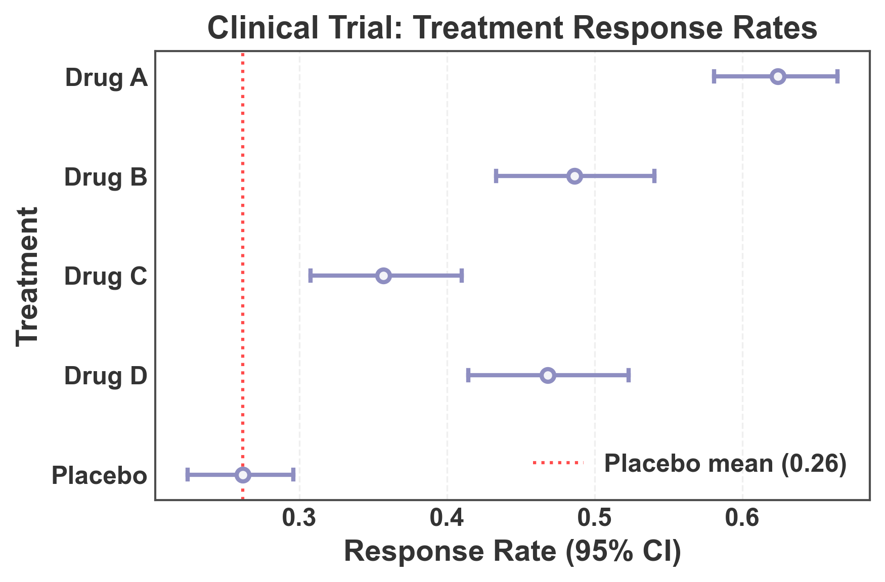
Forest Plot: Long-Format Data with Automatic CI Calculation
This example demonstrates using long-format data (typical in seaborn) where confidence intervals are automatically calculated from raw observations. This is useful when you have individual measurements rather than pre-computed summary statistics.
# Create long-format data with multiple observations per treatment
np.random.seed(202)
n_obs = 30
long_format_data = pd.DataFrame({
    'treatment': np.repeat([
        'Drug A',
        'Drug B',
        'Drug C',
        'Drug D',
        'Placebo',
    ], n_obs),
    'response': np.concatenate([
        np.random.normal(0.65, 0.15, n_obs),  # Drug A
        np.random.normal(0.48, 0.18, n_obs),  # Drug B
        np.random.normal(0.35, 0.12, n_obs),  # Drug C
        np.random.normal(0.52, 0.16, n_obs),  # Drug D
        np.random.normal(0.25, 0.10, n_obs),  # Placebo
    ])
})

# Create forest plot with automatic CI calculation
fig, ax = pp.pointplot(
    data=long_format_data,
    x='response',
    y='treatment',
    color='#8E8EC1',
    linestyle="none",
    errorbar='ci',  # Automatically calculate 95% CI from data
    capsize=0.1,
    title='Clinical Trial: Treatment Response Rates',
    xlabel='Response Rate (95% CI)',
    ylabel='Treatment',
)

# Add vertical line at placebo mean for reference
placebo_mean = long_format_data[long_format_data['treatment'] == 'Placebo']['response'].mean()
ax.axvline(x=placebo_mean, color='red', linestyle=':', linewidth=1.5,
           alpha=0.7, label=f'Placebo mean ({placebo_mean:.2f})')
ax.grid(axis='x', alpha=0.3)
ax.legend(loc='lower right')

plt.tight_layout()
plt.show()
Total running time of the script: (0 minutes 2.346 seconds)